Wednesday

Bronx Zoo Trip

You can click this image for a larger view
Pitt Big Brush Pens (Raw Sienna and Nougat) and Pilot Petit1 fountain pen with Private Reserve Copper Burst ink
Page backgrounds and borders prepared in advance with diluted acrylics
Stillman & Birn 6x8" Delta wirebound sketchbook

I made another rather quick trip to the Bronx Zoo yesterday to get in some animal gesture practice and quick sketches. The giraffes are so much easier to sketch in their winter habitat. They are closer and don't move around as much as they do out in the big field, so I'm able to do some studies of things like hooves that are hard to even see without binoculars when they're outside. The pages above were done after several pages of quick studies (a couple of those shown below ---  also clickable to enlarge).
The giraffe all the way on the right must be very old, and had deep skin wrinkles. I loved sketching him.

Cramming animals as tall as giraffes into a 6x8" sketchbook was a challenge, but it sure is convenient to travel with such a small book. Since this is a wirebound book, working across the spread wasn't an option either, but it was nice to have this great super-heavyweight Delta paper, which is not available in a hardbound book.

After spending most of our time with the giraffes, we didn't have much time left. We went to the gorilla house, but couldn't find the gorillas. We did find these cute Wolf's Monkeys (below) in a beautifully laid out exhibit. They moved so fluidly....and constantly! Even getting gesture sketches was a real challenge. I wanted to test drive my new watercolor/gouache setup, so I pulled that out and added some color, then went on to World of Birds and did the same with the Great Blue Turacos, working more directly with color on them.

I love the way my new setup for watercolor and gouache worked out, so tomorrow I'll post about how I reconfigured my palette and show an image.

Tuesday

Sketches from Tilly Foster Farm

Antique water pump and wooden bucket:
11x8.5", Wolff's Carbon Pencil and wash in a Stillman & Birn Epsilon hardbound sketchbook

I went sketching at Tilly Foster Farm a couple of days ago and stumbled upon a little museum there of antique farm equipment! It was a real gold mine for sketching opportunities! This old warped bucket and water pump caught my eye.

I also did some quick little gesture sketches of the chickens with my Pitt Brush Pens as they scuttled around their pen. Great fun! They sure do move around a lot. Now I know where the term "chicken scratch" came from.

Chicken Scratch with Pitt Brush Pens, 8.5x5.5":

Sunday

More Sun Conures

Image can be clicked for a larger, clearer view
Golden Black Gesso
Diluted Golden Interference Acrylics
Winsor Newton, Holbein, and Schmincke Gouache
Sakura Gelly Roll Pen
Stillman & Birn Epsilon 5.5x8.5" hardbound sketchbook

I was back sketching at the Animal Kingdom store again last week. As usual, I was first drawn to my avian buddies in the rain forest room. Sammie and the Cruisers were yacking up a storm, and clearly didn't like it when I paid attention to Duke, the Blue and Gold Macaw. So, I let them once again be the focus of my morning. The only full page spreads I have left in this journal are prepped with Golden Black Gesso and Interference Acrylics. I thought it would make for a good nighttime visit with the brilliance of the coloring of the conures, hence my title "Midnight with Sammie and the Cruisers," even though it wasn't midnight. I was thinking of using the other black and iridescent page spreads for some of the salt water fish that have those beautiful flourescent colors, but most of the big colorful ones were sold! I imagine they'll have some new ones before our next visit.

We only stayed for a little while because the weather was so gorgeous that we decided to go sketch at a farm after lunch. I still need to get the farm sketches photographed, so I'll share those soon.

Saturday

Sketching from Norrie Point on the Hudson River

11x17" across a two page spread in a Stillman & Birn Epsilon hardbound book
Pitt Big Brush Pens
Image can be clicked for a larger, sharper view

I spent a long and productive day along the Hudson River on Tuesday, at the New York State Department of Environmental Conservation site on Norrie Point in Staatsburg, New York. I did a couple of paintings first, and sat down to sketch at the end of the day. This cute little boat was docked right outside, so it became the most convenient subject after a day of painting atmosphere and nature. Boats are trickier than they look, so that makes them great practice subjects when sketching on the river.

I'm still really liking these Pitt Big Brush Pens, and the way they handle on this Epsilon paper by Stillman and Birn. I'd like to find a similar, lightfast type of brush pen/marker that has washable properties too, so I could take a waterbrush to it even after it's dry. Suggestions welcomed! (Must be lightfast!)

Thursday

Not Dry Media and Ink

Krylon 18K Gold Leafing Pen
on the cover of my Stillman & Birn 5.5x8.5" Epsilon hardbound book

Initially, I'd planned this to be my book for dry media and ink. That's what the Epsilon book is designed for. But it wasn't long before I saw that this paper has capabilities that go way beyond dry media and ink. I am nearly done with this volume now, so it was time to do something with the cover. I couldn't think of a more fitting title!

Wednesday

That's Life

Golden Black Gesso
Iridescent and Interference Acrylics
Krylon Gold Leafing Pen
Stillman & Birn 5.5x8.5" hardbound sketchbook

Just doodling, gold on black.

Tuesday

Noodlers Eternal Inks Preliminary Lightfastness Results

Many thanks to all of you for waiting so patiently for these preliminary results! For those who don't know what I'm talking about , you can click here to read about these lightfastness tests of the Noodler's Eternal Inks, and see how I set up the tests.

Last week, I was a guest on the Goulet Pen Company's webcast show, "Write Time at 9!" During that broadcast, I did a verbal reveal of changes to the samples. If you were unable to tune in at that time, you can watch the recorded broadcast below. I come on at about the 10:00 minute mark.


The right sides of the samples posted below were in my south-facing studio window for just six weeks, in the northeastern United States. It's the heart of winter here, when the sun is at its weakest. They got a few hours of direct sunlight a day through a screen and glass. I will be putting the samples back into a window tomorrow, and I'll do another reveal in six months to show the differences.

The tests are pretty self-explanatory. You can click any image below to see an enlargement. In the broadcast, I verbally described the changes to some of the inks, and you can click that link above if you'd like to hear more of my summary. Here on this post, I'll just list them for now in three categories:
  1. Inks that didn't change
  2. Inks that changed the most
  3. Inks that changed a little
The inks that had no visible changes so far are:
  • Black
  • Blackerase/Waterase
  • Heart of Darkness
  • Polar Black
  • X Feather
  • Lexington Gray
  • Bad Blue Heron
  • Luxury Blue
  • Polar Blue
  • Polar Green
  • Kung Te-Cheng
  • La Reine Mauve
  • #41 Brown (2012 version)
  • Polar Brown
Inks that changed the most during this time frame are:
  • Periwinkle
  • Hunter Green
  • Dostoyevsky
  • Year of the Golden Pig
  • Empire
  • Fox
  • Rachmaninoff
  • Tchaikovsky
  • Pasternak
  • Whaleman's Sepia

Inks that showed a slight change during the six weeks are:
  • El Lawrence
  • Bad Belted Kingfisher
  • Bad Green Gator
  • Socrates
  • Mata Hari's Cordial
  • Bad Black Moccasin

There are two other inks that I did not discuss in the broadcast: Whiteness of the Whale, and Blue Ghost. I did test these, but I believe I need to look at them under a blacklight, and I have not yet done that. I'll report on those when I do my follow-up on these Noodler's Eternal inks, in another six months.

So without further delay, here are the images of the samples. The right half of each page was taken down from the window, taped on the back to the half in the book, and photographed. Those artists who are interested in knowing which inks wash and the color of the wash will be able to see that in the samples. That washed area is generally where changes first appear, since there is a thinner application of the ink there.


I hope many of you have found this information useful. It's been interesting for me to see how some of my personal favorites have fared! I'll be testing another 40-50 inks very soon. Stay tuned for a list within the next couple of weeks to see if any of your favorites are among them. After they've been in the window for a month or so, I'll do a post of preliminary results like this one, followed by six month results down the road.

Monday

Black Locust Tree with Pitt Big Brush Pens

Pitt Big Brush Pens
Stillman & Birn Epsilon 5.5x8.5" hardbound sketchbook
Blue background prepared in advance with diluted acrylics

This was sketched at my friend Melissa's house. She has a back yard filled with bird feeders and beautiful trees to sketch from the windows. This Black Locust tree had interesting shapes and bark. I used my Pitt Big Brush Pens over a toned surface. I really liked the warm colors on the blue paper. I thought it would blend with the pens and make the warm grays more neutral, but actually it made them seem even warmer by comparison with the cool color of the background.

Sunday

Sketching at Melissa's House

Private Reserve Chocolat and Private Reserve Velvet Black Inks, mixed about 3:1 
in a Platinum Preppy fountain pen, and washed with a waterbrush.
A little watercolor
Stillman & Birn Epsilon 5.5x8.5" hardbound sketchbook

My friend Melissa invited a group of us over to her house to sketch on Friday. I was delighted to see that unlike mine, her amaryllis actually had a flower stalk on it --- with a bud! I knew I had to sketch that.

Since I recently found those deer jawbones to sketch, I also had to draw this deer skull that Melissa had, which seemed to be the remainder of the head!

Saturday

Golden Acrylic Neutral Grays


Golden Heavy Body Acrylic Neutral Grays, plus Black and Titanium White
Stillman and Birn 8.5x11" hardbound Epsilon Sketchbook

Those of you who have been following me for awhile have probably seen my setup for value studies in acrylic. I love doing monochrome studies this way. The Golden Paints Company makes it so easy; there's no color mixing --- just dip right into the value you want. It's been awhile since I did some of these value studies, so I pulled the container off the shelf figuring I'd clean it out, refill it, and put it to use, but the paint in it is still perfectly fine! That seal around the top of my container worked better than I thought it would. The binder and pigment separated a bit while sitting, but I sprayed in a little water, mixed it up again with a tongue depressor, and the set was good to go.

I was thinking of bringing it to open studio life drawing the next day. The longest poses in that session are only 20 minutes. I wasn't sure I could accomplish enough with acrylic paints in that time frame, and also wasn't sure I'd find the heavy body acrylics blendable enough for portraits and figures on paper. In keeping with my desire to brush up on portraiture, I decided to test drive the idea in my Epsilon sketchbook, working off an old black and white photograph of pianist Maria Teresa Carreno. She was a child prodigy who lived from 1853-1917.

As I thought, the paint didn't blend as well as I'd hoped on unprimed paper. Although I'm not necessarily unhappy with it as a study, it would have gone better with a primed surface and some of that delicious Golden AGL (Acrylic Glazing Liquid), which extends the drying time enough to blend a bit. I didn't use the AGL because I was thinking that in a sketchbook, extending the drying time might prove to be a bad idea when you need to turn the page to start the next pose, and I probably wouldn't want to bring my studio hair dryer into the life drawing session.

So, the next day, I brought traditional black and sepia dry drawing media with me to life drawing instead, and I totally bombed! I may as well have brought these after all and given it a go, so that's what I'm going to do next week. Maybe. Unless I change my mind! I think I'll give a few pages a coating of Golden Matte Medium so they won't be quite so absorbent, just in case I go through with this plan. 

Friday

Portrait Sketch of George Gershwin with Pitt Big Brush Pens

8.5x11" Stillman & Birn Epsilon hardbound sketchbook
Pitt Big Brush Pens

I've been doing a few portrait sketches from photos in the evenings, and thought I'd combine that with some other color trials of Pitt Big Brush Pens. These pens are so much fun to draw with, especially on this plate surface. They combine the glide of brushes and paint with the tactile feel of drawing. I do find myself missing my fountain pens and inks, but I need to find something more archival if I want to move some of my recent ideas from the sketchbook to something that can be framed and hung on a wall, where it might be exposed to sunlight. Most of these Pitt Brush Pens have great lightfastness ratings, and since they are individually rated, you can actually go online and select colors that have the top rating if that is important to you.

Thursday

Little Girl in the Greenhouse

Click image for a larger, clearer view
Pitt Big Brush Pens
Stillman & Birn Epsilon 5.5x8.5" hardbound sketchbook

This was my last quick sketch of the day at Adams Fairacre Farm. There were so many great statues in the greenhouse that I wished I could have stayed longer, but we all lost two hours of sketching time having an extremely enjoyable lunch in their dining area, while discussing possible future plots of Downton Abbey and admiring each others' sketchbooks! It was time well spent relaxing with fellow friends and artists.

I have to say, I really enjoyed working on the white paper these past couple of sketches! I only have one colored page spread remaining in this book, and several black ones, so I went to the few white pages remaining. It's time for me to start thinking about what journal will come next. I sure would like to work bigger if my back will stand up to me holding a larger book while sketching out in the field.

Wednesday

My guest appearance on Write Time at Nine!

For those of you who are able to tune in, I'll be a guest on Write Time at Nine tonight, the weekly webcast by the Goulet Pen Company. I'll be discussing ink lightfastness tests and will reveal the preliminary results of the testing of the Noodlers Eternal Inks. The broadcast should go live at this link at 9pm. Please tune in if you can!

Pitt Big Brush Pens in the Greenhouse

Click image for a larger, clearer view.
Pitt Big Brush Pens
Stillman & Birn Epsilon 5.5x8.5" hardbound sketchbook

It's time for sketching on some white paper! The greenhouse was filled with all sorts of statues, flowers and plants. There is a big turnover, so every time we go, the displays are different. I loved the shapes in this statue, and it was beautifully set off by the colorful flowers surrounding it. I've been making color charts on a lot of my sketches with the pens. It helps me identify the colors until I get to know them a bit better. I tested out four greens here, but decided to only use two of them. I felt the Light Green and May Green would be too bright for my subject, and the bright red was already ample distraction!

Webcast alert! Remember that tonight (Wednesday 2/15) I'll be a call-in guest for the Goulet Pen Company's webcast, Write Time at Nine. I'll put up a link here before the broadcast. The Goulets will probably get the link up before I do, so if it's not here, try their blog: http://inknouveau.com . Hope to see you there! I'll be revealing the preliminary results of the lightfastness testing that I'm doing with the Noodler's Eternal Inks, and fielding any ink-related questions pertaining to sketching and artwork.

Tuesday

More Sketching with Pitt Big Brush Pens

Pitt Big Brush Pens
Stillman & Birn Epsilon 5.5x8.5" hardbound sketchbook

Today our sketch group had its monthly sketch-out at Adams Fairacre Farm in Wappinger, NY. Patricia and I arrived at 10am and made ourselves comfortable in the dining area while waiting for the others. In honor of Valentine's Day, I had a chocolate caramel flavored coffee. It seemed like the right thing to do!

I've really been enjoying exploring all the colors and combinations of the Pitt Big Brush Pens I got recently. I'd prepared this page with a diluted teal-colored acrylic wash, followed by some iridescent/interference paint to give it some shimmer. I'd planned to use it with Private Reserve Blue Suede ink, but since I had a teal-colored Pitt Big Brush Pen with me, I pulled that out to do all the initial drawing, then added a bit of color with some of the other pens.

Webcast alert! Remember that Wednesday night (2/15) I'll be a call-in guest for the Goulet Pen Company's webcast, Write Time at Nine. I'll put up a link on my blog before the broadcast. The Goulets will probably get the link up before I do, so if it's not here, try their blog: http://inknouveau.com . Hope to see you there! I'll be revealing the preliminary results of the lightfastness testing that I'm doing with the Noodler's Eternal Inks, and fielding any ink-related questions pertaining to sketching and artwork.

Saturday

Please join me for Write Time at 9 on Wednesday

This Wednesday, February 15, I will be a guest on Write Time at 9! This is an almost-weekly webcast by the Goulet Pen Company. We will be revealing the one-month results of the lightfastness tests I've done on the Noodler's Eternal Inks, and discussing the use of fountain pens and inks for sketchbooks and fine art. Please join us to contribute information, ask questions, or just lend your support since I'm not used to public speaking! You can click here for more information on the tests, and to see how these lightfastness tests were set up.

To join in, or just sit and watch/listen, you can look for a link here on my sketches site on Wednesday evening, or on the Goulets' blog, Inknouveau.

Pitt Big Brush Pens and Some Quick Figures

This image is clickable if you wish to view an enlargement.
Quick figure sketches from photo references (The Figure in Motion)
Pitt Big Brush Pens: Dark Sepia, Raw Sienna, Light Flesh
Some blending done while wet, using Niji waterbrush
All images in this post were done in my altered book

When my order of Big Brush Pens arrived a few days ago, I did a color chart so I could see the actual colors on this paper. I set out some color groupings that I thought would work well together and provide me with at least three values. In anticipation of attending open studio life drawing the next day, I warmed up with some sketches from photo references --- easier than drawing from life, since the translation of three dimensions to two dimensions is already done for you by the camera! Still, going straight in with ink is always a challenge. I liked the way the colors worked for those sketches above, so I plan to keep that color grouping intact.

So, with at least one group of three markers that I know will work together, and some ideas for others, off we go to a session of short poses! I didn't photograph all the pages because it is such a time consuming process, but here are a few pages worth. These were all 20 minute poses, done from life. I sampled some of my other color groupings. After doing a few sketches, I did one with a more conventional drawing medium too --- a Sepia Cretacolor lead.

 Left: Pitt Big Brush Pens in Caput Mortuum, Sanguine, Cinnamon, Light Flesh
Center: Pitt Big Brush Pens in Indanthrene Blue, Ultramarine Blue, Sky Blue
Right: Sepia Cretacolor Lead, blended with a finger (and accidentally smudged by my hand!)


Pitt Big Brush Pens in Dark Sepia, Raw Sienna, and light flesh for the figure. Colors added in Deep Scarlet, Sky Blue, Ultramarine, Light Green for table and stool.

It's a tall order in short poses in life drawing to take on a medium that doesn't move much and can't be erased. But I enjoyed it, and I'm sure these Big Brush Pens will become part of my regular sketching materials for various subjects. I'm not sure if I'll be bringing the brush pens next time, or use something else; I have lots of ideas cooking in my brain. But it's always a fun time, and a great place to experiment with various approaches and mediums.

Friday

Pitt Big Brush Pens and Stillman and Birn Epsilon --- a match made in Heaven!

Pitt Warm Grey Big Brush Pens
Stillman & Birn Epsilon 8.5x11" hardbound sketchbook

I have a book of old photographs of great composers. It's in black and white, and every so often I break it open for some monochrome portrait practice while watching TV or listening to music. The other night, I decided to test drive my new Warm Grey Pitt Big Brush Pens on the silky-smooth paper of the Epsilon book. I spent about 45 minutes on this sketch of Italo Montemezzi using the photo reference. I totally fell in love with this combination of materials. I worked directly in ink, so that combined with the waterproof ink limited opportunities to blend values or make corrections. For sketching purposes I often prefer a direct approach with few changes, and I'm looking forward to working more with this combination of materials.

About the paper: The sizing on this paper lets the ink sit up on the surface. That means that it takes longer to dry, and with permanent ink, I think it's a huge benefit. I was able to move the ink around with a waterbrush or smear it with my finger if I did so quickly, so I had some blending capabilities until it set. I need to work with this combination more to learn to take better advantage of that, but I can see that it will be extremely useful. There was no bleed-through of the ink to the other side of the page, in spite of multiple coats of heavy application in some areas, and it is archival. The Epsilon paper is very smooth, allowing for easy detailing, and the brush pens move easily across the surface. I'm thinking that the points on the brush pens will be much better preserved on this type of surface than on a rougher, or even vellum texture. I absolutely loved working this size with the big brush pens. It's much more freeing than working in a smaller book with a finer point. So, I just might have to have two art journals going at the same time after all; I need to think more on this.

About the Pitt Big Brush Pens: Wow! I love these to bits! I've tried the Kuretake brush pens, Pentel brush pens, Aquash brush pens, Noodler's brush pens, and many others. These Pitt Big Brush Pens can cover so much more ground, have firmer tips with better spring, come to a nice sharp point for detail work. They put out enough ink to keep up with my sketching, are waterproof and archival, and available in 58 colors! I have not yet used them in combination with watercolors, but I have tried to budge the dry ink with a waterbrush and scrubbing with my finger to no avail. It's not going anywhere! I bought a lot of them to have working "sets" in various color groups, plus a few bright ones for those times when you need a strong spot of a bright color. I'll be showing some figure sketches tomorrow using a few different color combinations. This portrait was done with the four "Warm Grey" colors. The palette is shown on the page. I guess I could have added black to it also, but the Warm Grey V was so dark that even though I had the black out, I never used it.

Thursday

Altered Book --- A Little Side Project


Quick boat studies
11x17" across a two page spread in my altered book

Although I prefer to work just in one main art journal at a time, there are sometimes reasons for turning to something else. In this case, I didn't want to burn through a lot of good, expensive paper for quick sketches and experiments. My plan was to use this other book for short poses in life drawing sessions, as well as quick practice sketches of one kind or another that I don't want to put into my art journal. I decided to take an old 8 1/2 x 11" book which still had a good, solid binding, and gesso pages to sketch on. That way it would be very inexpensive, and the gesso would soften the background text or images to increase depth while eliminating the visual distraction or competition with the sketches.The sketch above of the boats was done over one of the maps in the book. I thought it rather appropriate that they were sketched over oceans!

I selected a book with a lot of graphical content, as well as pages of full text. I used Golden Acrylic Gesso, and also tried some pages with Golden Absorbent Ground, as well as a couple with Golden Black Gesso just for fun. I thought the Absorbent Ground might provide a better working surface if I wanted to add any watercolor washes. The sketch above of the boats was done using Pitt Brush Pens on pages coated with the Golden Absorbent Ground. (Just because I liked the idea of doing them on the page spread with the map, and that happened to be prepared that way.)


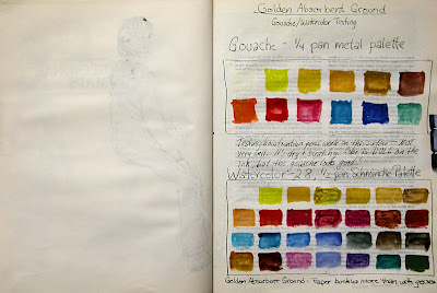
I tested out my gouache and watercolor palettes to see how the colors would look on the surface of this paper with the Absorbent Ground. Answer: Pretty dull, though in person they have more vibrancy than they do in this digital image. Plus, it wrinkled the paper more than the Golden Acrylic Gesso. Speaking of which, if buckling paper bothers you, an altered book like this is probably not something that would interest you. Even pages coated with gesso did wrinkle. Of course, this paper was designed for printed text, and not for wet media! The gesso does add strength to the paper and gives it some sizing, but at the cost of some wrinkling. I dried each page spread with a hair dryer as I went along, then set it under a very heavy coffee table book overnight to help control some of the wrinkling.

On the left side above, you can see the ink from a sketch on the previous page coming through the paper a bit. That was a blank page, so I didn't coat it with anything on either side. Pages that were sized with either the Golden Acrylic Gesso or the Golden Absorbent Ground did not bleed through, nor show ghosting of images on the reverse side of the pages. (The wrinkling on that left hand page is just from the little bit of watercolor used in that one area of the previous page, and not from applying a sizing.)

Below, the page on the left was sized with the gesso. The page on the right was only sized in one area.  I left the more graphical page text that was printed on the right side. I thought I might use it as inspiration for some doodles, and I just kind of liked it! On several of the pages, I left bits of text, titles, or graphical elements without applying gesso over them.


I took the book to life drawing a couple of weeks ago. It was my first time going to an open studio session this winter, and go figure; the model didn't show! Some people from the group took turns doing three minute poses, and then everybody went home. These were a few of the three minute poses I did to test drive the book. I used a Wolff's 6B carbon pencil with a waterbrush, and added some light washes to a couple of the figures.

From time to time, I'll be showing some of my figure work or sketches done in this book, but for the most part, it's for short poses, quick sketches, doodles, border designs that I'm working out, testing ideas for fonts, and other things where I not only don't want to waste high quality paper, but for the most part, it's not even worth taking the time to photograph, adjust and post the images! However, in the interest of exposing other artists to the potential for using old books, I thought it was worth the post. I had initial pangs of guilt about "destroying" a book. But it wasn't too hard for me to convince myself that a book is not a one-of-a-kind work of art. In this age of reusing, repurposing, recycling, and reducing waste, creating sketchbooks from old books feels like a good thing to do. If you are opposed to using a book this way, consider doing it with a phone book or old catalog!

Wednesday

The Life of an Amaryllis Part II

Watercolors, Pitt Big Brush Pens, Noodler's Sequoia ink (diluted) in a Kaweco Sport BB
Stillman & Birn 5.5x8.5" Epsilon hardbound book
Page background prepared in advance with diluted fluid and iridescent acrylics

I don't know how long it's supposed to take before an amaryllis starts to flower, but mine isn't showing any interest in doing so! This is my second sketch in this Life of an Amaryllis series. You can see the first installment here.

Monday

Giraffes at the Bronx Zoo

Click image for a larger, clearer view
Pitt Pens and Watercolor
Background prepared in advance with diluted acrylic

At the end of the day, we wound up at the giraffe house. They are indoors for the winter in a very comfortable and inviting space. The lighting was good and visibility excellent. I really fell in love with sketching these beautiful, graceful creatures. Aside from the ballet-like way in which they move, they have the most expressive faces, which became the focus of my attention. I want to go back and spend more time with them very soon.

Sunday

Siberian Tiger at the Bronx Zoo

Click image for a larger, clearer view
Pentel and Pitt Brush Pens
Watercolor
Diluted acrylic background

Fortunately one of the tigers at the zoo was lying on a rock in front of me napping! That gave me a few minutes to sketch an animal who actually stayed still. We made it a very brief stop at this exhibit because with only a lean-to for shelter, we were getting really cold! I did the border, lettering, and watercolor wash after I got home.

Saturday

Turaco and Macaws at the Bronx Zoo

Click the sketch for a larger, clearer image.
Pentel Aquash Gray brush pen
Pentel Pocket Brush Pen
Watercolor
Pitt Brush Pens
Page background prepared in advance with scumbled and sprayed diluted acrylic paint

This was my second sketch from this week's trip to the zoo, and the last one at the bird house. The Macaws were adorable! They looked like two matching bookends. Hyacinth Macaws are the largest of the Macaw family.

Friday

The forgotten turtle

Click image for a larger, clearer view.
Watercolor and fountain pen ink (Private Reserve Copper Burst)
Stillman & Birn Epsilon hardbound sketchbook

How did this little guy get forgotten amidst my sketches from the Animal Kingdom store? Anyway, here he is, sunning himself under a heat lamp and resting on a rock. I figured that since he was under the heat lamp, he would stay still so I could sketch him, and I was right!

King Vultures at the Bronx Zoo

Click image for a larger, sharper view.
Stillman & Birn Epsilon hardbound 5.5x8.5" book
Pitt Brush Pens
Watercolor
Background prepared with diluted acrylics

I went with my sketch group to the Bronx Zoo yesterday. The weather was pretty nice --- not too cold to walk around a bit. We met up in the morning at the end of the World of Birds exhibit. I'd wanted to sketch these folks the last time we went, but didn't get a chance. I made sure to do it first on this trip! The vultures weren't such cooperative models, but birds generally are not. I loved using the Pitt Brush Pens, and wished I'd had more colors with me. I only brought some warm and cool greys along on this trip. The background had been lightly toned in advance with some diluted acrylic paint, then sprayed with some sparkley iridescent paint. There's a nice shimmer to the page, which isn't evident in the photo.

Usually I do the watercolor work right there on location, and only the lettering/writing at home later, but this time I worked in monochrome on site, using just the different values of the grey pens. I added the few splashes of color back in the studio. I hadn't done it that way for quite some time, and I definitely prefer doing the color work on location also.

Thursday

Deer Jawbone

Stillman and Birn Epsilon 5.5x8.5" hardbound sketchbook
Background prepared with diluted fluid acrylics
Drawing done with Prismacolor Pencils
Border and lettering done with an Eversharp Symphony Fine point fountain pen and 
Private Reserve Copper Burst ink.

While out walking last weekend, my husband and I came upon an area covered with tan and gray fur. There in the middle were both jawbones from a deer that must have fallen victim to a pack of coyotes or some other wild animals. It was pretty creepy, but wow, what a sketching subject! I had to bring this back to the studio. Colored pencils seemed an ideal medium for some of the details and subtle coloring of the subject.

Wednesday

Found Objects

 You can click the image above for a larger, clearer view.

When I go out hiking or walking the dog, I'm often on the lookout for things to bring home to sketch. Sometimes it's a few bits of pottery, or an interesting rock, or leaves and flowers. This time I found an old rusted beer can (which my husband estimates to be about 50 years old!), an old rusted piece of a stove (I think!), and a broken piece of glass with interesting, rounded shapes. I sketched them with different values of warm and cool Pitt Brush Pens, then used some watercolor over the top.

You may notice a difference in the border style here. I've been experimenting with more decorative border and letter styles in another sketchbook, then trying some of them out here in my art journal.