Showing posts with label Portraits. Show all posts

Sunday

February Faces and Figures is Up Next!


Since the end of Holidays in Ink, everybody has been asking me, "What's Next?" My friend Melissa Fischer came up with an idea for us to do February Faces and Figures, so I'm in! Are you? There are still a few days to get yourself into gear for this next challenge.

Tuesday

Let's Change the Subject


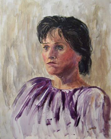
Watercolor in a Stillman & Birn Zeta hardbound book

It's that time of year when change happens. The days are getting much shorter. They are about to get shorter still when we go off Daylight Savings Time this coming weekend. The weather is getting colder. The leaves are falling off the trees. Most of them are down now, and I expect the rain that comes in a couple of days will remove most of what's left. Winter won't be far behind.

As a painter, this combination of events has many repercussions. I'm touching up plein air pieces that have been done over the past three seasons and not yet quite finished, picking out the bugs and blades of grass and bits of sand and dirt, and getting them ready for holiday sales. I'm varnishing and framing a lot of paintings (just varnished 21 pieces a few days ago), and getting them to the galleries for the holiday shows. I'm preparing for The Big Move into the studio for the winter.

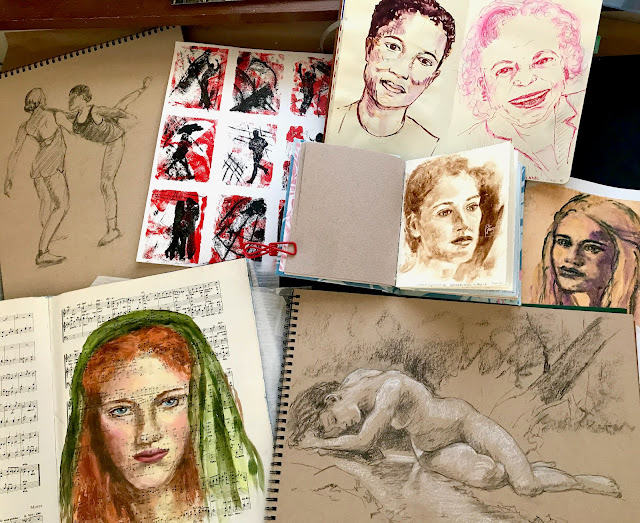
I actually look forward to this annual change. It gives me a chance to dive into other subject matter that I love, but don't have time for during the seasons of better weather. I have an opportunity to listen to great music while I work in the studio, tackle some larger pieces, and do my commission work. I can get back to open studio figure drawing and painting, portraiture, and mix it up with a bit of still life. I experiment with materials, new color combinations, and explore style.

I anticipate it won't be long before our plein air group starts our regular winter portrait sketch-a-thons. We gather in somebody's house and take turns doing 20 minute portrait sittings for one another. It's great fun, and we don't have to pay a model! I like to do some sketches from photos as a warmup for the seasonal change. This week I've been focusing on eyes. I'd like to improve my ability to capture expression this year, and a lot of that happens in the eyes. I'm not doing any underdrawing, and just going in directly with a brush and watercolors.


After doing the first few, I got frustrated with my palette, added some colors and swapped out others. I'm finding I need a slightly different selection of pigments for portrait work. Mainly I really missed my cadmium red and cadmium orange. I'm also liking ultramarine violet, and sometimes cobalt violet. I took out the phthalo blue, kept cerulean and ultramarine, and added cobalt.

I'm trying to do a quick portrait sketch after dinner at night, again without any preliminary drawing and just jumping in --- sink or swim. They're a bit fast and rough, but I'm rusty. They'll get better as the season moves along. I'm looking for photos that have good eye images, since that's my focus for now. I went straight in with color on a pre-toned surface again. (The streaky blue and red below are part of that toning process.)


Getting back to my winter fare feels good. I'm looking forward to diving in more as the weather gets colder. I feel inspired by the change. My pet birds, Mango and Coconut, will be happy to have me back in the studio. The dogs' beds are already under my work table. Bring it on!

Wednesday

Silverpoint in a Sketchbook


One of the things I experimented with in this blue Pescia book was silverpoint. Doesn't silverpoint have to be done on a hard surface with extensive preparation? Not anymore! Golden makes a Silverpoint Ground that I decided to test drive. I taped the edges of the page and gave it a couple of coats of the Silverpoint Ground. My daughter posed for me, and I sketched this in 20 minutes or so, using a silver stylus. I was really surprised by how well this technique worked out in a sketchbook! The page is 8x10", and the silverpoint sketch portion is about 8x6.5".

One of the problems with silverpoint is that there is no going back. You go right in with the silver stylus, and there is no pre-drawing nor erasing. What you put down stays there, mistakes and all. Initially, the drawing looks very light, like this one. However, over time the silver tarnishes. As it darkens and develops a beautiful patina, the contrast of the drawing increases. I wish there were a way to speed it along! One tip I can give you is that although you cannot erase, you can cover mistakes by painting on more Silverpoint Ground, waiting for it to dry, and then drawing over it. Not that I would do that. Ever. (I can't even type that with a straight face.) But in this case, I did not correct anything and it was sketched start to finish in one short sitting. Here is an image of just the sketch:


Here's a little video that's on the Golden website, which explains more about using Silverpoint Ground:


 Try it. You'll like it!

Saturday

Golden Acrylic Neutral Grays


Golden Heavy Body Acrylic Neutral Grays, plus Black and Titanium White
Stillman and Birn 8.5x11" hardbound Epsilon Sketchbook

Those of you who have been following me for awhile have probably seen my setup for value studies in acrylic. I love doing monochrome studies this way. The Golden Paints Company makes it so easy; there's no color mixing --- just dip right into the value you want. It's been awhile since I did some of these value studies, so I pulled the container off the shelf figuring I'd clean it out, refill it, and put it to use, but the paint in it is still perfectly fine! That seal around the top of my container worked better than I thought it would. The binder and pigment separated a bit while sitting, but I sprayed in a little water, mixed it up again with a tongue depressor, and the set was good to go.

I was thinking of bringing it to open studio life drawing the next day. The longest poses in that session are only 20 minutes. I wasn't sure I could accomplish enough with acrylic paints in that time frame, and also wasn't sure I'd find the heavy body acrylics blendable enough for portraits and figures on paper. In keeping with my desire to brush up on portraiture, I decided to test drive the idea in my Epsilon sketchbook, working off an old black and white photograph of pianist Maria Teresa Carreno. She was a child prodigy who lived from 1853-1917.

As I thought, the paint didn't blend as well as I'd hoped on unprimed paper. Although I'm not necessarily unhappy with it as a study, it would have gone better with a primed surface and some of that delicious Golden AGL (Acrylic Glazing Liquid), which extends the drying time enough to blend a bit. I didn't use the AGL because I was thinking that in a sketchbook, extending the drying time might prove to be a bad idea when you need to turn the page to start the next pose, and I probably wouldn't want to bring my studio hair dryer into the life drawing session.

So, the next day, I brought traditional black and sepia dry drawing media with me to life drawing instead, and I totally bombed! I may as well have brought these after all and given it a go, so that's what I'm going to do next week. Maybe. Unless I change my mind! I think I'll give a few pages a coating of Golden Matte Medium so they won't be quite so absorbent, just in case I go through with this plan. 

Friday

Portrait Sketch of George Gershwin with Pitt Big Brush Pens

8.5x11" Stillman & Birn Epsilon hardbound sketchbook
Pitt Big Brush Pens

I've been doing a few portrait sketches from photos in the evenings, and thought I'd combine that with some other color trials of Pitt Big Brush Pens. These pens are so much fun to draw with, especially on this plate surface. They combine the glide of brushes and paint with the tactile feel of drawing. I do find myself missing my fountain pens and inks, but I need to find something more archival if I want to move some of my recent ideas from the sketchbook to something that can be framed and hung on a wall, where it might be exposed to sunlight. Most of these Pitt Brush Pens have great lightfastness ratings, and since they are individually rated, you can actually go online and select colors that have the top rating if that is important to you.

Pitt Big Brush Pens and Stillman and Birn Epsilon --- a match made in Heaven!

Pitt Warm Grey Big Brush Pens
Stillman & Birn Epsilon 8.5x11" hardbound sketchbook

I have a book of old photographs of great composers. It's in black and white, and every so often I break it open for some monochrome portrait practice while watching TV or listening to music. The other night, I decided to test drive my new Warm Grey Pitt Big Brush Pens on the silky-smooth paper of the Epsilon book. I spent about 45 minutes on this sketch of Italo Montemezzi using the photo reference. I totally fell in love with this combination of materials. I worked directly in ink, so that combined with the waterproof ink limited opportunities to blend values or make corrections. For sketching purposes I often prefer a direct approach with few changes, and I'm looking forward to working more with this combination of materials.

About the paper: The sizing on this paper lets the ink sit up on the surface. That means that it takes longer to dry, and with permanent ink, I think it's a huge benefit. I was able to move the ink around with a waterbrush or smear it with my finger if I did so quickly, so I had some blending capabilities until it set. I need to work with this combination more to learn to take better advantage of that, but I can see that it will be extremely useful. There was no bleed-through of the ink to the other side of the page, in spite of multiple coats of heavy application in some areas, and it is archival. The Epsilon paper is very smooth, allowing for easy detailing, and the brush pens move easily across the surface. I'm thinking that the points on the brush pens will be much better preserved on this type of surface than on a rougher, or even vellum texture. I absolutely loved working this size with the big brush pens. It's much more freeing than working in a smaller book with a finer point. So, I just might have to have two art journals going at the same time after all; I need to think more on this.

About the Pitt Big Brush Pens: Wow! I love these to bits! I've tried the Kuretake brush pens, Pentel brush pens, Aquash brush pens, Noodler's brush pens, and many others. These Pitt Big Brush Pens can cover so much more ground, have firmer tips with better spring, come to a nice sharp point for detail work. They put out enough ink to keep up with my sketching, are waterproof and archival, and available in 58 colors! I have not yet used them in combination with watercolors, but I have tried to budge the dry ink with a waterbrush and scrubbing with my finger to no avail. It's not going anywhere! I bought a lot of them to have working "sets" in various color groups, plus a few bright ones for those times when you need a strong spot of a bright color. I'll be showing some figure sketches tomorrow using a few different color combinations. This portrait was done with the four "Warm Grey" colors. The palette is shown on the page. I guess I could have added black to it also, but the Warm Grey V was so dark that even though I had the black out, I never used it.

Sunday

Twelve Minute Portrait Sketches

(Click image to enlarge.)
These sketches were done using Sepia and White Cretacolor leads. The faces are pretty small, and I found myself wishing I'd used Prismacolor pencils instead, which can be sharpened to finer points. Nevertheless, the Cretacolors worked okay, and I just kept sharpening them as best I could. I set a timer to quickly sketch the first one. That took 12 minutes, so I kept that time frame when I did the others.

The white on the left side is a sheet of glassine, which folds into the center of the book to protect the pages from one another when the book is closed. (Click here and then scroll down to see how to make a glassine storage envelope in your sketchbook.) I did try spraying with fixative, but the color still rubbed off easily. I'd have to really saturate it in order to avoid that, and I didn't want to lose my lights. Glassine seems to be the best solution for me in a sketchbook.

As reference material for the sketches, I used the book Facial Expressions by Mark Simon. It is intended mostly as a reference tool for animators. As such, most of the expressions in the thumbnail photos of the book are very exaggerated. Still, I find it a useful reference, and each person starts off with a few more normal-looking poses.

Thursday

Acrylic Sketch of Leigh


091217-Acrylic-sketch-Leigh-16x20-450
20×16″, Golden OPEN Acrylics on canvas covered hardboard
Email me at JamieWG@aol.com if interested in this painting.
I was eager to work in a medium that would enable me to layer quickly today, so I grabbed my Golden OPEN Acrylics and a 16×20 canvas covered board for open studio portraiture. I left most of my acrylics upstate, so had to make due with what I had: Cadmium Yellow Primrose, Pyrrole Red, Transparent Red Oxide, Ultramarine Blue, Carbon Black, and Titanium White.
These paints are just sooooo much fun. I prefer them on paper or smooth hardboard rather than canvas, so next time I’ll have to remember to size some watercolor paper or matboard before I go.
Leigh was a really great and beautiful model. We’ll have her for another sitting in January, so I’ll get to sketch her again!

Monochrome Oil Sketch of Troy


091203-Troy-in-Monochrome-20x16-b-500v
20×16″, Oils on Canvas covered hardboard
Email me at JamieWG@aol.com if interested in this painting.
You may remember two weeks ago when I sketched Troy in pastel. We had no open studio last Thursday since it was Thanksgiving, but today I went back, oils in hand, for another sketch. I used Rembrandt Ivory Black, Gamblin Torrit Grey, and Winsor Newton Artist Titanium White with a little Winsor Newton Griffin Titanium White mixed in to speed drying. I also used Weber Res-n-gel medium.
Troy will keep the same pose for three weeks, and most of the artists are keeping their spots and working all three weeks on the same painting. I waited until after the posing started for any returning artists to reclaim their previous spots before setting up in a new position, but go figure…. (Yes, you know what’s coming!)… As soon as I got set up, someone came in late and said, “You’re in my spot!”
I didn’t really care where I painted from; I just didn’t want to miss the posing time. There is never enough time with the model! Anyway, this ended up being about two hours of posing time altogether. I always seem to have difficulty getting the head situated exactly where I want it on the canvas. This time, I really took my time with placement and it ended up right where I wanted it to be! Amazing!