Showing posts with label Mixed Media. Show all posts

Saturday

Holidays in Mixed Media 2023!


For the past several years, I've posted a Holidays in Ink challenge for those who wanted to play along with an easy-to-travel-with medium and sketchbook during the holiday season. I've been getting asked when I'd be posting the one for this year. I'm sorry that it is so delayed; there's only a week until I plan to start. I did Inktober this year for the first time, so I wasn't really interested in doing another ink challenge so soon. I'm up for color and using lots of different mediums. Therefore, this year I plan to do Holidays in Mixed Media! Feel free to change it and make it your own. I'm doing it with a few friends who have helped set the parameters for a holiday challenge. Here are the optional "rules" we plan to follow.

Dates: November 20-December 31, 2023. (42 days) We plan to create art at least 30 of those 42 days, whether it's for 10 minutes or 10 hours. We might create 30 pieces/sketches during that time, or just a few. They might be postcard size done in a half hour, or full sheets that we've worked on for weeks. We are not counting pages; instead, we are experimenting with processes throughout the dates of the challenge. Holidays are filled with gatherings and interruptions. We are allowing for those by planning only 30 days out of the 42.

Paper: We will be working on loose sheets of assorted types of paper, varying size, color and texture. We want to explore how various materials respond to specific papers, and the effects that creates. I also want to be able to put everything up on my studio walls as I work through the project, to analyze what I've done and guide me from one piece to the next. If I need to travel over the holidays, I can just bring a few pieces of paper with me. It's easy, and I won't be size-restricted.

Media -- Choose at least one from each of the three groups below for each piece/sketch. Of course, you may additionally use collage and anything else you wish. There is no set order for using the materials, nor a maximum limit to the number of different mediums you can use.

  • Group A. Waterproof and permanent -- This medium should be waterproof and not move once it's placed down. Examples include waterproof inks and pens, Posca or other acrylic markers, acrylic paint, etc.
  • Group B. Water Soluble - This medium can either be wet or dry, but should remain water soluble once dry. Examples are watercolor, gouache, water soluble inks or graphites, water soluble brush pens, watercolor pencils with water applied, water soluble crayons with water applied, etc.
  • Group C. Dry Media -- This can be water soluble or not, since that's not a factor when applied dry. Examples include colored pencils, oil pastels, soft pastels, graphite, charcoal, etc.

The painting at the top of this post used all three types of media. I toned the paper with very diluted yellow acrylic paint. Once dry, I painted loosely and transparently with gouache, then used violet Posca markers. Toward the end, I sketched with assorted dry media over the top. 

A note about prompts: We are not doing a prompt list this year. I might use only a few reference images, and do some series with them. Differences in materials and approaches provide variety, and for me, inspire experimentation. Those series might be interspersed with assorted sketches of different subjects. Or I might change my mind! I like the idea of leaving all my subject options open, and going with the flow this time around!

*** Since my blog subscription is no longer working, please help by sharing this project with friends and other artists. I'm not on social media these days, so I'd appreciate anything you can do to help spread the joy around via social media or email; it's always more fun and inspiring doing these things in a group!


Monday

A Three Page Spread of Collage


This three page spread is about 10x22". I didn't take photos of the individual pages, but you can click the image to get a much wider, clearer view of it. It was done around Valentine's Day, hence the hearts on the left. Those started out as red paper heart doilies. I cut out parts of them, painted them with blue acyrlic, and decorated with a gold leafing pen. The paper snowflake on the right was cut out from blue patterned origami paper, which I then added to with gold paint. It was a memory of Sandy Hook and all the paper snowflakes that I made to send there. In the center of the three page spread is a poem about snowflakes by Henry Wadsworth Longfellow. I copied it over and then painted over it with some glittery Mod Podge stuff, just to see what it would look like since I'd never used it. I kind of like it! I'm thinking I might paint over the cover of this sketchbook with it, since it's a polymer that would also protect the book.

This is the blue Pescia, 16-page journal that I discussed in yesterday's post.

Thursday

Big News from Stillman and Birn

Two page spread from a Stillman & Birn Beta prototype hardbound sketchbook
Watercolor, 6x18" (across the spread)
Click image if you'd like to see it larger

My dream has come true. Stillman and Birn has announced on their Facebook page that they will be expanding their lineup and producing hardbound sketchbooks with their extra heavy weight 180lb Beta and Delta paper. I think I've been waiting for this moment from the first time I ever opened up a sketchbook. For a multimedia artist who loves stitchbound books that open flat, this is a major event and game-changer!

The two page spread above was done in a 6x9" landscape format prototype with Beta paper. I worked across the spread to get the 18". The pages lie so flat that you can barely see the seams, and the paper is so heavy weight that there is no ghosting from images on the other side of the page. It's fabulous!

The books will be produced in the 5.5x8.5", 8.5x11", and European A4 size portrait formats, and not in this landscape 6x9" format shown above. Nevertheless, it has been a thrill to have a sneak peek and to be able to work in one of these babies, and to finally be able to share the good news. This Dogwood Blossoms sketch that I posted a few days ago was also done in this book. I now have my paws on prototypes of the 5.5x8.5" and 8.5x11" sizes, and cannot wait for a chance to dive in!

When you're short on sketch time, make a grid!

11x17", across a two page spread in a Stillman & Birn 8.5x11" hardbound sketchbook
Watercolor, Pitt Brush Pens, Fountain Pens, or whatever else I had next to me at the time!
You can click this image to enlarge it. 

It's that time of year when after a winter of being indoors and mostly sketching, I can get out and return to my life as a plein air painter! I have not stopped sketching by any means, but my more finished work is now being done in paint or on separate sheets of rag paper. (You can always check in to see those on my other blog.) 

I feel it's very important to continue sketching, and not give that up when the going gets tough. One of the things I do when time gets tight is I make a grid and sketch a series over time. I have several grids going at any given time on different themes. I try to select themes that hone specific skills. This one was started a few weeks ago as a means of practicing elipses and symmetry. Whenever I had a morning without having to immediately dash off somewhere, I sketched my coffee mug. I sketched the last mug this morning. These were all done directly in ink, so warts and all, I had to live with whatever came out of the pens. 

I'm really enjoying this larger sketchbook, and it certainly presents great opportunities for gridded series! I have a few portrait grids going (32 portrait boxes across a  two page spread!) and some other subjects too. Way fun. Great practice. Quick to do. No excuses!

Sunday

More Sun Conures

Image can be clicked for a larger, clearer view
Golden Black Gesso
Diluted Golden Interference Acrylics
Winsor Newton, Holbein, and Schmincke Gouache
Sakura Gelly Roll Pen
Stillman & Birn Epsilon 5.5x8.5" hardbound sketchbook

I was back sketching at the Animal Kingdom store again last week. As usual, I was first drawn to my avian buddies in the rain forest room. Sammie and the Cruisers were yacking up a storm, and clearly didn't like it when I paid attention to Duke, the Blue and Gold Macaw. So, I let them once again be the focus of my morning. The only full page spreads I have left in this journal are prepped with Golden Black Gesso and Interference Acrylics. I thought it would make for a good nighttime visit with the brilliance of the coloring of the conures, hence my title "Midnight with Sammie and the Cruisers," even though it wasn't midnight. I was thinking of using the other black and iridescent page spreads for some of the salt water fish that have those beautiful flourescent colors, but most of the big colorful ones were sold! I imagine they'll have some new ones before our next visit.

We only stayed for a little while because the weather was so gorgeous that we decided to go sketch at a farm after lunch. I still need to get the farm sketches photographed, so I'll share those soon.

Wednesday

That's Life

Golden Black Gesso
Iridescent and Interference Acrylics
Krylon Gold Leafing Pen
Stillman & Birn 5.5x8.5" hardbound sketchbook

Just doodling, gold on black.

Thursday

Altered Book --- A Little Side Project


Quick boat studies
11x17" across a two page spread in my altered book

Although I prefer to work just in one main art journal at a time, there are sometimes reasons for turning to something else. In this case, I didn't want to burn through a lot of good, expensive paper for quick sketches and experiments. My plan was to use this other book for short poses in life drawing sessions, as well as quick practice sketches of one kind or another that I don't want to put into my art journal. I decided to take an old 8 1/2 x 11" book which still had a good, solid binding, and gesso pages to sketch on. That way it would be very inexpensive, and the gesso would soften the background text or images to increase depth while eliminating the visual distraction or competition with the sketches.The sketch above of the boats was done over one of the maps in the book. I thought it rather appropriate that they were sketched over oceans!

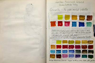
I selected a book with a lot of graphical content, as well as pages of full text. I used Golden Acrylic Gesso, and also tried some pages with Golden Absorbent Ground, as well as a couple with Golden Black Gesso just for fun. I thought the Absorbent Ground might provide a better working surface if I wanted to add any watercolor washes. The sketch above of the boats was done using Pitt Brush Pens on pages coated with the Golden Absorbent Ground. (Just because I liked the idea of doing them on the page spread with the map, and that happened to be prepared that way.)


I tested out my gouache and watercolor palettes to see how the colors would look on the surface of this paper with the Absorbent Ground. Answer: Pretty dull, though in person they have more vibrancy than they do in this digital image. Plus, it wrinkled the paper more than the Golden Acrylic Gesso. Speaking of which, if buckling paper bothers you, an altered book like this is probably not something that would interest you. Even pages coated with gesso did wrinkle. Of course, this paper was designed for printed text, and not for wet media! The gesso does add strength to the paper and gives it some sizing, but at the cost of some wrinkling. I dried each page spread with a hair dryer as I went along, then set it under a very heavy coffee table book overnight to help control some of the wrinkling.

On the left side above, you can see the ink from a sketch on the previous page coming through the paper a bit. That was a blank page, so I didn't coat it with anything on either side. Pages that were sized with either the Golden Acrylic Gesso or the Golden Absorbent Ground did not bleed through, nor show ghosting of images on the reverse side of the pages. (The wrinkling on that left hand page is just from the little bit of watercolor used in that one area of the previous page, and not from applying a sizing.)

Below, the page on the left was sized with the gesso. The page on the right was only sized in one area.  I left the more graphical page text that was printed on the right side. I thought I might use it as inspiration for some doodles, and I just kind of liked it! On several of the pages, I left bits of text, titles, or graphical elements without applying gesso over them.


I took the book to life drawing a couple of weeks ago. It was my first time going to an open studio session this winter, and go figure; the model didn't show! Some people from the group took turns doing three minute poses, and then everybody went home. These were a few of the three minute poses I did to test drive the book. I used a Wolff's 6B carbon pencil with a waterbrush, and added some light washes to a couple of the figures.

From time to time, I'll be showing some of my figure work or sketches done in this book, but for the most part, it's for short poses, quick sketches, doodles, border designs that I'm working out, testing ideas for fonts, and other things where I not only don't want to waste high quality paper, but for the most part, it's not even worth taking the time to photograph, adjust and post the images! However, in the interest of exposing other artists to the potential for using old books, I thought it was worth the post. I had initial pangs of guilt about "destroying" a book. But it wasn't too hard for me to convince myself that a book is not a one-of-a-kind work of art. In this age of reusing, repurposing, recycling, and reducing waste, creating sketchbooks from old books feels like a good thing to do. If you are opposed to using a book this way, consider doing it with a phone book or old catalog!

Monday

Giraffes at the Bronx Zoo

Click image for a larger, clearer view
Pitt Pens and Watercolor
Background prepared in advance with diluted acrylic

At the end of the day, we wound up at the giraffe house. They are indoors for the winter in a very comfortable and inviting space. The lighting was good and visibility excellent. I really fell in love with sketching these beautiful, graceful creatures. Aside from the ballet-like way in which they move, they have the most expressive faces, which became the focus of my attention. I want to go back and spend more time with them very soon.

Sunday

Siberian Tiger at the Bronx Zoo

Click image for a larger, clearer view
Pentel and Pitt Brush Pens
Watercolor
Diluted acrylic background

Fortunately one of the tigers at the zoo was lying on a rock in front of me napping! That gave me a few minutes to sketch an animal who actually stayed still. We made it a very brief stop at this exhibit because with only a lean-to for shelter, we were getting really cold! I did the border, lettering, and watercolor wash after I got home.

Saturday

Turaco and Macaws at the Bronx Zoo

Click the sketch for a larger, clearer image.
Pentel Aquash Gray brush pen
Pentel Pocket Brush Pen
Watercolor
Pitt Brush Pens
Page background prepared in advance with scumbled and sprayed diluted acrylic paint

This was my second sketch from this week's trip to the zoo, and the last one at the bird house. The Macaws were adorable! They looked like two matching bookends. Hyacinth Macaws are the largest of the Macaw family.

Friday

King Vultures at the Bronx Zoo

Click image for a larger, sharper view.
Stillman & Birn Epsilon hardbound 5.5x8.5" book
Pitt Brush Pens
Watercolor
Background prepared with diluted acrylics

I went with my sketch group to the Bronx Zoo yesterday. The weather was pretty nice --- not too cold to walk around a bit. We met up in the morning at the end of the World of Birds exhibit. I'd wanted to sketch these folks the last time we went, but didn't get a chance. I made sure to do it first on this trip! The vultures weren't such cooperative models, but birds generally are not. I loved using the Pitt Brush Pens, and wished I'd had more colors with me. I only brought some warm and cool greys along on this trip. The background had been lightly toned in advance with some diluted acrylic paint, then sprayed with some sparkley iridescent paint. There's a nice shimmer to the page, which isn't evident in the photo.

Usually I do the watercolor work right there on location, and only the lettering/writing at home later, but this time I worked in monochrome on site, using just the different values of the grey pens. I added the few splashes of color back in the studio. I hadn't done it that way for quite some time, and I definitely prefer doing the color work on location also.

Sunday

Sea Turtle tank at the Maritime Aquarium


This was my last sketch of the day. I was all out of black background pages, so I went to this page. The surface was prepared with sprayed blue and gold iridescent diluted acrylic paint with a slight pattern, created by putting a stencil over the page before spraying it. The painting was done with watercolor and gouache, and the writing with a Sakura Gelly Roll pen. The iridescent surface is beautifully shimmery in a subtle way, but I don't know if you can see that in the photo. The turtles stayed more to the background this trip. Last time they were nearly in my face the whole time I was sketching their tank!

Saturday

Sea Ravens and Wolfish from the Maritime Aquarium

Stillman & Birn 5.5x8.5" hardbound sketchbook
Golden Black Gesso
Golden Interference Fluid Acrylics
Gouache
Sakura Gelly Roll pens

This sketch was done on another spread with a background prepared in the studio in advance. The sketch itself was done on location at the Maritime Aquarium in Norwalk, CT. The gouache stood out pretty well against the black and iridescent surface, and the metallic Gelly Roll pens were the perfect defining touch for these eerie creatures of the deep!

Friday

Golden Black Gesso and Sakura Gelly Roll Pens


This was so much fun! (Image can be clicked for a larger, clearer view.) I used Golden Black Gesso to coat a few page spreads in my Stillman & Birn 5.5x8..5" Epsilon hardbound sketchbook, drying each with a hair dryer before going on to the next. One coat of the Golden Black Gesso perfectly coated the paper. I did try a couple of different dilutions of it also, but it was best right out of the jar the way it came. It applied a thin, totally opaque covering of the paper with a single coat. I used an inexpensive foam brush.

Then I diluted some Golden Fluid Acrylic Interference paints in spray bottles, using a little airbrush medium, flow release and water, and spritzed each page spread with a couple of different colors, drying them again with the hairdryer. I did this in preparation for a sketching trip to the Maritime Aquarium in Norwalk. They have a few very dark rooms with extremely interesting things and flourescent lighting, like jellyfish! This page in the book almost exactly mimics the dark, flourescent tank they were in. I grabbed a handful of Sakura Gelly Roll pens, purchased at a Jerrys store on my way to the Aquarium, and went to town with them.

The Gelly Roll pens worked fabulously on the gesso and the paper. They are very opaque, bright and smooth. I am going to get more!

Here's what the Sakura Gelly Roll pens that I got look like on black and on white. On the white paper, I brushed over the crosshatched sections with a waterbrush to see which ones will wash and which are waterproof.


That first sketch was fun, but it didn't give me exactly what I wanted. I turned to another black/interference page spread, and this time used gouache with some Gelly Roll pens over the top. I was much happier with this one!


This is something that I definitely want to spend more time exploring in the weeks to come!

Saturday

Copper Weathervanes at Adams Fairacre Farms and more glittery stuff

You can click this image for a larger, clearer view
Stillman & Birn Epsilon 5.5x8.5" Hardbound Sketchbook
Collage, ink, gesso, and acrylic background
Private Reserve Copper Burst ink in a Pilot Petit fountain pen
Noodler's Midnight Blue ink in a Kaweco Sport EF fountain pen
Watercolor
Schmincke Dry Copper Gouache

I have the most challenging time adjusting these iridescent images. The copper is really stunning, but in a photo it looks dull and brown without the shimmer of the light on it. If you can imagine the shimmer that you see in spots, spread throughout areas of the sketch, you'll have a better idea of how this looks in real life. The border and box shadow are copper iridescent acrylic, and there's a light coating on the multi-layered page background too. In fact, that background has eight layers of assorted media on it! If you click the image, you can see through parts of it to various background layers of patterned ink and shapes.

I was sketching at Adams Fairacre Farms in Wappinger, NY this past week. I had prepared several page spreads in advance, including this one with the copper background. When I walked by a display of large copper weather vanes, I knew I'd found the perfect subjects for those pages! Combined with my love of birds, it was irresistible! I sketched them with Private Reserve Copper Burst, added some Noodler's Midnight Blue for contrast, and blended/shaded a bit with a waterbrush.

I loved the Schmincke Reichgold Dry Gouache so much that a couple of weeks ago, I got three more jars of different colors:

This was a perfect opportunity to dip into the copper version, so I mixed up some of that after I got home, and added it to areas of the weathervanes, and painted the page title with it.

Wednesday

Hornbills and a BIG Pigeon at the Bronx Zoo

Warning: You are probably going to get very sick of teal and turquoise by the time I finish this sketchbook! I have fallen in love with a new ink: Private Reserve Blue Suede. I prepared some acrylic backgrounds and borders specifically to use a few new inks that interest me greatly. The writing in this image was done using my new bottle of Blue Suede. I love it.

To get to this section of World of Birds, you have to actually go outside and back in again. Unlike the area when you first enter the building, where the birds are behind glass, in this zone they are free to fly all around you. When I arrived there, my friend Bernard was already seated and admiring the birds while having his lunch. I set up and started sketching just as one of the Long-tailed Hornbills flew over to Bernard and sat on the railing in front of him, looking longingly at his sandwich. He pulled off a piece, which the Hornbill gratefully accepted and took to a tree limb. Clearly this was not the first time this bird shared lunch with a visitor, because in another minute he went back for more. He had the routine down pat.

Getting back to the sketching part of this trip, I was again fighting with the watercolor due to having put too much acrylic down on the paper. So I pulled out my Pentel Pocket Brush pen to sketch the Hornbills. My those things come in handy! They seem to write on anything, and stay there too! My plan was to do the bird's big white crown with one of those white Sharpie paint pens, but that leaked and made a big mess. Foiled again. I ended up finishing it up with white gouache that I keep in with my little watercolor kit. The gouache did a lot better on the acrylic than transparent watercolor, so I pulled out my tiny gouache kit and used that in conjunction with my mini watercolor kit for the rest of the day. People wonder why I always have so many different options with me. This is why!

Surprisingly, there were no exhibit notes nor identifying information on the hornbill in the middle of this sketch. I looked online after I got home, and it is clearly a hornbill, but even after viewing hundreds of images, I couldn't find one with the yellow around the eye that these guys had. There were at least three or four of them in the exhibit.

The Victoria Crowned Pigeon is the largest member of the pigeon family. She had beautiful muted coloring and never strayed from her nest while I was there.

Tuesday

Birds at the Bronx Zoo

I met with my sketching group in the World of Birds exhibit at the Bronx Zoo. I was especially excited about this trip because I was going back to a Stillman and Birn Epsilon book that I'd only done two sketches in previously, so it was like starting a new book. For awhile I got sidetracked and worked in way too many sketchbooks simultaneously. Finally, I exerted my willpower and narrowed the field, so in the past couple of months, I finished off three of them by consolidating my efforts in one book at a time.

It's been especially hard to let go of the last one I finished --- a Stillman and Birn Alpha hardbound book that I really loved. I did a lot of experimenting and mixed media-growing in that book, and liked what was coming out of it. I wasn't sure where this new Epsilon book was heading. But then I thought about the fact that I treated the Alpha book like a playground. It did well with a mixed media approach and I enjoyed that, so it gave me the chance to grow in that direction. It wasn't long before I remembered how much I love the feel of pen and ink and dry media on this Epsilon surface. I expect that I'll be doing a lot of drawing in the near future!

In the meantime, I prepared about 10 two-page spreads with acrylic washes and borders to see how the paper would respond in comparison to the Alpha. To my surprise, it did just fine. I think I'll not only be able to use a similar approach in this Epsilon book, but I'll like it even more for my dry media.

This page was a bit problematic because I didn't dilute the acrylic paint enough on the background wash, and the transparent watercolor did not want to adhere to the shiny smooth acrylic surface. I fought with the acrylic/watercolor combination a bit on this sketch above. The sketch was done with Noodler's North African Violet ink in a Pilot Plumix italic calligraphy pen. That is a washable ink, and I let it wash into the watercolor at will, and wrote in the species names with the same pen/ink combination.

Wednesday

Maryland Montage --- Sketching in a Moving Vehicle

Stillman & Birn Alpha 5.5x8.5" hardbound sketchbook
Noodler's Kung Te-Cheng ink in a 0.3 (fine) Platinum Preppy fountain pen
Private Reserve Sepia ink in a 1.5mm Pilot Parallel calligraphy pen
Noodler's Golden Brown ink in a Pilot Plumix italic pen
Brown Sharpie Calligraphy pen
Winsor Newton, Daniel Smith, Holbein and Schmincke watercolors
Background page toning done previously with diluted acrylic

I've done montage formats like this before in open studio life drawing, at the zoo, and other times when I was just grabbing images on the go. But this is the first time I did it in a moving car. (At least I wasn't driving!) We were on our way home from our niece's wedding in Maryland. With just two page spreads left to finish this sketchbook, I couldn't resist the temptation. It was quite an experience. I learned two important things:
  1. Drawing straight lines, in a moving vehicle at a high rate of speed with potholes and curves, is not going to happen.
  2. If you think you don't get carsick, try sketching for awhile!

Initially, I was having so much fun that all I could think about was, "Why didn't I try this sooner?" I even did another two page spread after this one, since one remaining page spread was even harder to resist than when there were two left.. By then my stomach was in knots and I was definitely done for the day. I think the next time I sketch in a car, it will be parked!


Tuesday

Wedding Flowers

My first big event of 2012 was my niece's wedding! She got married on New Year's Day, so we spent a few days in Maryland to take in the festivities. The table bouquets were white hydrangeas, assorted yellow flowers, and peacock feathers. I got to take one of them back to the hotel with me and sketched it that night during the first half of the Giant game, while the guys cheered on our home team. Even I gave in and watched the second half. Some things are a requirement!

The feathers had so much sheen to them that after I finished painting, I mixed up some of the Schmincke dry gold gouache and added some sparkle to them. Unfortunately, that isn't visible on the photo. However, you can see the coppery shimmer on the border from the iridescent acrylics that I used to prepare the page ground and border.

Inks used: Private Reserve Copper Burst and Private Reserve Sepia
Pens: Pilot Parallel 1.1mm, Pilot Petite
Winsor Newton and Daniel Smith watercolors
Winsor Newton, Schmincke and Holbein gouache
Pages prepared in advance using Golden Fluid and Golden Fluid Iridescent acrylics, and F&W Acrylic Inks
Painted across a two page spread in a 5.5x8.5" Stillman and Birn Hardcover Alpha sketchbook

Friday

Macaw and Sun Conures at Animal Kingdom --- and a claw!

Inks, watercolor, gouache and Cretacolor leads over an acrylic-toned
background and border in my 5.5x8.5" Stillman & Birn Alpha sketchbook.

I went sketching at the Animal Kingdom store in Brewster the other day. These sketches were done in the little Rain Forest room, where the birds can be safely out of their cages and entertain visitors like me! The Macaw was a riot. The entire time, he followed me around, trying to get close enough to climb up on my shoulder. He'd reach out his claw and say, "Up, up?" It was very difficult to get a sketch of him done when he kept doing things like this:
Is that the cutest bird you ever saw? I'd back up to continue my profile sketch, and he'd follow me over to my new location, foot outstretched...."Up, up?" So I eventually had to abandon that sketch in favor of birds who were more willing to ignore me!

On the other side of the rain forest were three Sun Conures that they call Sammie and the Cruisers. (I only painted two of them.) They are very bonded to one another, and reminded me so much of the colorful Jenday Conures I had, Lulu and Lucy, who I used to refer to as "Double Trouble"!

I had enough space left for one more thing on the page, and decided to do a monochrome study of an African Grey's claw as he balanced on one foot, the other held up against his body. Birds do have interesting feet!