Showing posts with label Shades of Gray Journal. Show all posts

Friday

Sketching from the Window


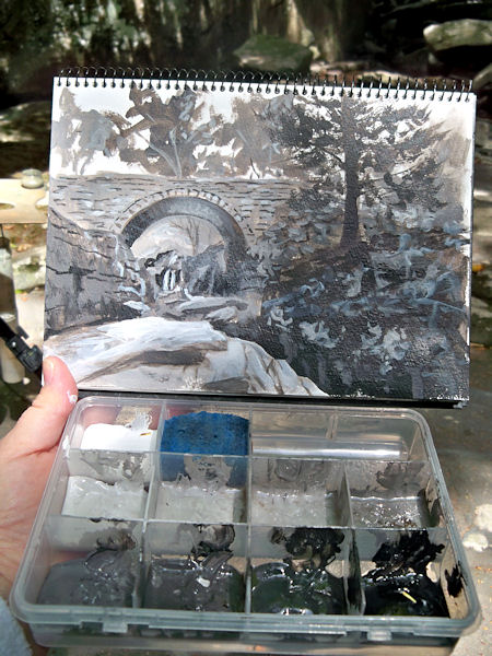
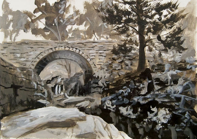
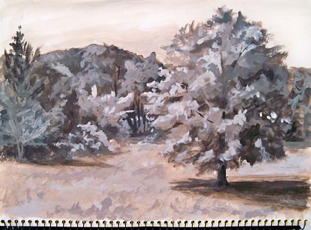
Today I did a monochrome tree sketch in acrylic, using the 14x22" spread provided by my Stillman & Birn 11x14" Alpha sketchbook. While I feel I could have worked on this much longer, I met my goals with it and also ran out of time. Sometimes I need to remind myself that I don't have to treat a sketch as if it's a finished painting! I have so many "sketches" in my books that I later wished I'd done on canvas or a piece of paper not bound into a book.


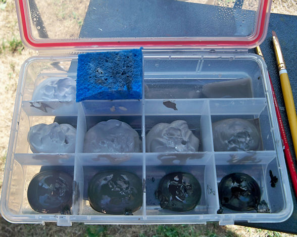
I use the Golden Heavy Body Neutral Gray acrylics when I do these. I keep them in a plastic container that has a waterproof seal. They last for years this way. I just add more paint as I run low. Having the values premixed means I don't need a palette, and I also don't need to spend time mixing.  I can just dip in and paint. The heavy bodied paints dry so fast that I can close the sketchbook pretty soon after I finish. The book is clipped to an 18x24" board, so it stays open easily. I rest the top on the window sill and the bottom on my lap as I paint. It's a very comfortable way to work if you have a really deep window ledge!

I don't do any pencil drawing when I work this way. I sketch in a few lines with light, diluted paint --- just enough to know where my basic forms will lie. Then I start blocking in the large shapes, initially working back to front, and then back and forth pushing layers and adding details as needed. I'll likely do some journaling on the left side of the page that I left blank. The S&B Alpha paper is so strong that there is no problem with painting acrylics on both sides of a page.

Saturday

Golden Acrylic Neutral Grays


Golden Heavy Body Acrylic Neutral Grays, plus Black and Titanium White
Stillman and Birn 8.5x11" hardbound Epsilon Sketchbook

Those of you who have been following me for awhile have probably seen my setup for value studies in acrylic. I love doing monochrome studies this way. The Golden Paints Company makes it so easy; there's no color mixing --- just dip right into the value you want. It's been awhile since I did some of these value studies, so I pulled the container off the shelf figuring I'd clean it out, refill it, and put it to use, but the paint in it is still perfectly fine! That seal around the top of my container worked better than I thought it would. The binder and pigment separated a bit while sitting, but I sprayed in a little water, mixed it up again with a tongue depressor, and the set was good to go.

I was thinking of bringing it to open studio life drawing the next day. The longest poses in that session are only 20 minutes. I wasn't sure I could accomplish enough with acrylic paints in that time frame, and also wasn't sure I'd find the heavy body acrylics blendable enough for portraits and figures on paper. In keeping with my desire to brush up on portraiture, I decided to test drive the idea in my Epsilon sketchbook, working off an old black and white photograph of pianist Maria Teresa Carreno. She was a child prodigy who lived from 1853-1917.

As I thought, the paint didn't blend as well as I'd hoped on unprimed paper. Although I'm not necessarily unhappy with it as a study, it would have gone better with a primed surface and some of that delicious Golden AGL (Acrylic Glazing Liquid), which extends the drying time enough to blend a bit. I didn't use the AGL because I was thinking that in a sketchbook, extending the drying time might prove to be a bad idea when you need to turn the page to start the next pose, and I probably wouldn't want to bring my studio hair dryer into the life drawing session.

So, the next day, I brought traditional black and sepia dry drawing media with me to life drawing instead, and I totally bombed! I may as well have brought these after all and given it a go, so that's what I'm going to do next week. Maybe. Unless I change my mind! I think I'll give a few pages a coating of Golden Matte Medium so they won't be quite so absorbent, just in case I go through with this plan. 

Thursday

Painting Shades of Gray in Devil's Kitchen


100916-SOG-Devils-Kitchen-with-box-600v
I went back to Devil’s Kitchen in Platte Clove, this time to capture some of the strong contrasts in the morning light. Remember this little container, filled with Golden’s Neutral Gray Heavy Body Acrylics? The lid supports my Shades of Gray watercolor sketchbook, and having the premixed shades and tints has turned value sketching from a chore into one of my favorite ways to paint.
Here’s a picture of just the sketch. You can click it to enlarge it. The actual size is about 6×9″.
100916-SOG-Platte-Clove-Devils-Kitchen-650
The deep chasm in the right foreground is called Hell’s Hole. My goal was to take the viewer along that chasm and under the bridge, to the waterfall beyond. Although I’d not planned to do a color version of this scene, now that I’ve seen it in black and white, I really want to go back and do it again in color.
If you click here, you can see this bridge painted in oils from the other side on my Hudson Valley Painter site!

Wednesday

Road Beside the Red Barns --- Monochrome Value Study


100807-SOG-4-450
This is another entry in my Shades of Gray, monochrome value study book. It was painted en plein air while out sketching with my friend Karen the other day. I’d already done the full color sketch of the red barns (which I posted a couple of days ago), and was waiting for Karen to finish up her painting. That was the perfect opportunity to pull out my container with the acrylic values already laid out and look for a second composition. I loved this curvy road going off into the distance, and it presented me with a wide range of values to work with.

Thursday

Painting Monochrome at Home --- Shades of Gray Number 3


100729-SOG-3-Artists-Nest-adj
Golden Neutral Gray Heavy Body Acrylics in a watercolor sketchbook
I’m starting to really love doing these monochrome studies. They are such wonderful practice for improving the way we see values. Having the pre-mixed Neutral Grays has made all the difference in the world, and has turned this from a tedious chore into a fascinating adventure.
I sat outside in the yard in a comfortable chair after standing up and painting all morning, and painted this study under the shade of my favorite tree, with a cool breeze blowing.

Monday

Monochrome Morning in the Back Yard


SOG-2-450
Continuing on with my monochrome value studies in acrylics, this one was added to my Shades of Gray sketchbook this morning. This was also done with the Golden Neutral Gray acrylics plus black and white. I think I’m starting to really enjoy these, much to my surprise!

Tuesday

Shades of Gray --- An Approach to Value Studies


Shades-of-Gray-Paints-600
I set out Golden Heavy Body Acrylic Titanium White, Carbon Black, and all the Neutral Grays in between that Golden makes in a plastic container with compartments and a seal. Value studies are so important, but premixing all those grays ahead of time can be cumbersome enough to put it off time and time again. Now I have no excuses, and this container makes it so easy to pop the lid and paint at a moment’s notice.
Shades-of-Gray-cover-500
This book is about 6×9″. I’m reserving it for my value studies in acrylic, and have dubbed it “Shades of Gray”.
Here’s the first page. The cow was painted from a photo I took on Friday. The little landscape was painted here by the lakeshore this morning.
Shades-of-Gray-1-500v