Showing posts with label Reviews. Show all posts

Monday

Holidays in Ink Week 3


The Holidays in Ink Challenge certainly got me out of my comfort zone this week. I had some new art adventures, discovered more about what inspires me, and had some flops and successes. Leave me a comment and let me know how it's going for you too! If you've posted your sketches somewhere, feel free to leave a link there too. If you haven't started this challenge yet, but would like to, you can read all about it and get the prompt lists (which are totally optional) at this link.

Day 7 involved a Process Prompt I knew I would put off forever if I could: Blind Contour drawing! But I was determined to tackle it. I had beautiful, fresh flowers to inspire me for the Flowers subject prompt, so that helped ease the pain. I did the sketch with a red Bic Cristal Xtra-Bold 1.6mm ballpoint pen (Amazon Affiliate Link), and then splashed some watercolor over it with a loose approach. (Image below.) Starting with the pen in the upper left hand corner and working across the page helped me guess where I was. I also tried to keep my hand still and work around a center point of the flower, then shift my hand over for the next bloom. I confess, I did peek just a few times to be sure I was filling the page! I don't think I've done blind contours since a figure drawing class 20 years ago, and it was more fun than I thought it would be. The inaccuracies gave me some interesting and unexpected shapes to work with. I like the red lines poking through the watercolor. These Bic Cristal pens are great for sketching, with their very wide ballpoints yielding lots of variation when wanted, and intense colors. At under $5 for a set of 24, the price is hard to beat for some favorite art tools during this challenge!

Wednesday

Makeup Kit to Painting Set Conversion


About five years ago, my daughter abandoned a makeup kit in the bathroom closet. It opened to reveal slide out trays with metal pans filled with eyeshadow, little screw cap pots for lip gloss, a mirror set into the lid, and even a small mascara tube. I have to confess that I coveted it from the first moment I laid eyes on it, hoping to someday convert it into a painting kit. The last time she came to visit, she gave it to me. Yes, I do wish I'd asked her sooner! 

(If the full post with images does not appear below, please click the post title above.)

Saturday

Twenty White Gouache and White Watercolor Brand Comparisons


When I want a bright white highlight on a sketch, I often count on white gouache to do the job. All whites are created equal, right? Wrong. In fact, even all Titanium Whites are not created equal. On my sketches, I've noticed if a brand of white gouache isn't a brilliant white, or isn't opaque enough, or has an annoying sheen to it. Whether this is due to different brands of the pigment itself, or differences in the color of the binders, the whites are not the same. Consistency, texture, ease of application, and sheen also vary, which affect their use and appearance.

Over the years, as I accumulated and used new gouache and watercolor whites, I made swatches of them on gray paper to see how they measured up against one another. Today, I noticed that there were 20 swatches on the sheet, so I thought it was time for a little Reveal Party.

Friday

Birthday Flowers on Blue Pescia Paper

10x8", Noodlers Luxury Blue ink in  my Pescia light blue journal

A good friend sent me flowers for my birthday during the time I was working my way through this journal. In sticking with my "Kinda Blue" theme, I did a blue-on-blue sketch of some of the flowers, using Noodlers Luxury Blue ink in a Lamy Safari fountain pen. When I was finished, I took a fairly stiff brush to the flowers to brush out some shading color from the lines. This ink is fairly waterproof, but you can get a little color to move on it, which I find useful, especially when working in monochrome. I was continually impressed by how well this printmaking paper handled assorted media. In spite of little sizing, the ink did not bleed nor feather, and painted pages dried flat. Now that I've gotten into monoprinting, I've been doing some prints on it too. Great stuff! I didn't think I'd like blue paper as much as a warmer color, but it surprised me.

Wednesday

Silverpoint in a Sketchbook


One of the things I experimented with in this blue Pescia book was silverpoint. Doesn't silverpoint have to be done on a hard surface with extensive preparation? Not anymore! Golden makes a Silverpoint Ground that I decided to test drive. I taped the edges of the page and gave it a couple of coats of the Silverpoint Ground. My daughter posed for me, and I sketched this in 20 minutes or so, using a silver stylus. I was really surprised by how well this technique worked out in a sketchbook! The page is 8x10", and the silverpoint sketch portion is about 8x6.5".

One of the problems with silverpoint is that there is no going back. You go right in with the silver stylus, and there is no pre-drawing nor erasing. What you put down stays there, mistakes and all. Initially, the drawing looks very light, like this one. However, over time the silver tarnishes. As it darkens and develops a beautiful patina, the contrast of the drawing increases. I wish there were a way to speed it along! One tip I can give you is that although you cannot erase, you can cover mistakes by painting on more Silverpoint Ground, waiting for it to dry, and then drawing over it. Not that I would do that. Ever. (I can't even type that with a straight face.) But in this case, I did not correct anything and it was sketched start to finish in one short sitting. Here is an image of just the sketch:


Here's a little video that's on the Golden website, which explains more about using Silverpoint Ground:


 Try it. You'll like it!

Monday

Monoprinting in a Sketchbook Part I

There's been a lot of buzz out there lately about the new Gelli Printing Plates, which enable artists to use traditional acrylics to create monoprints inexpensively, and without a press. I had to get on board that train! I ordered the largest size available, which is 12x14". As soon as it arrived, I dove in. My goals were to create textured backgrounds for artwork using monoprinting techniques, as well as traditional painting on the plate to directly monoprint a work of art.

I spent a couple of days creating all sorts of effects and exploring techniques. I used brayers, squeegees, textured surfaces of all kinds, stiff and soft paintbrushes, fingers, paper towels, Q tips, color shapers, put on paint and pulled out paint. I worked multiple layers on many different types of papers, and well as single-layer, brush-painted monoprints on good printing paper. I used fluid acrylics, Golden Open acrylics, and assorted mediums. I tried some interference paints, iridescent paints, and sprayers. Here are some of my more interesting results. (Believe me, with all that experimentation, there was a lot that wasn't worth sharing!)

I've always loved sketching on a prepared ground. I often pre-toned my sketchbook pages, or layered on textures using assorted tools. I've seen many YouTube videos where artists monoprinted the full sheets of paper, then  made sketchbooks out of it to get the prepared grounds. Other videos and blog posts showed printing in a hardbound book, using one side of a page at a time. The problem with either of those methods is that the left and right sides are from different prints, so they don't match. I almost always work across the spread in my hardbound sketchbooks, so that approach was not going to work for me.

Stillman and Birn to the rescue! Because their hardbound sketchbooks are designed to open flat, I thought they might enable me to print right across the spread. I opened up the book and pressed it flat down against the printing plate. And guess what. It works! Furthermore, since I was printing the background and not painting it, I didn't have problems of paint running into the gutter of the book and discoloring other pages.


Above is an 11x17" page spread of an 8.5x11" Stillman and Birn hardbound Zeta book. (It's about four layers of prints.) These new smooth surface books with heavyweight paper are ideal for monoprinting. Who knew! These will be fabulous backgrounds to paint and sketch on now.

The Gelli plate yields a great ghost image too, so it's worthwhile to have paper ready to take the second image. I decided to see if the lighter weight Epsilon books would also print well. I broke one in to be sure the spreads would lie flat enough, and started alternating between the books. That way I could get the most from my colors and textures. Below is the Epsilon spread with the second printings of some of the colors. (I don't know why it's showing sideways, but if you click the image it will right itself and enlarge.)


Below is one of my personal favorites. It was done as two printings --- the first with diluted Cerulean Blue, and then a layer of Transparent Red Oxide mixed with a little Iridescent Copper. It has a very subtle sheen, which is not visible in the digital image.


This one also has iridescent paint, and a few layers:

I'm looking forward to working on these prepared pages soon!

Why the Gelli Printing Plates are made in sizes 6x6", 8x10" and 12x14", I'll probably never know. Paper is sized 8.5x11, 8.5x17, and 11x17, or in the fine art full size sheets of 22x30 (which quarters to 11x15, and 1/8 would be 7.5x11). Therefore, the Gelli Plate sizes do not allow full use of plate nor paper. This is why there are side stripes on some of these page spreads that I printed. I tried to make the best of it. I kind of like them, and I can use them for writing text. For some of the page spreads I printed all the way to one edge, allowing the print to overlap the gutter and leave me with about 3" of unprinted space on the opposite side. Then I could either print that space separately and use it as another graphic block, or I could use it for text to accompany whatever artwork I ended up doing across the spread. I didn't take photos of those yet, so I suppose those will make their debut once the artwork is done over the top of the backgrounds and they become finished pages. However, I wish I had the option of printing across the full two sketchbook pages, and I also wish the plate would accommodate the standard 1/4 sheet size of 11x15 when I use rag paper. The awkward 12x14 plate size misses the mark on both.

Click here to go to Part 2.

Sunday

Best of the Year Part II --- Products New on the Market

I've tried a lot of new products this year. Some I loved, some I hated, and some were okay but probably won't become staples in my studio. A few I know I'll be using for many years to come. These are my favorite items new to the art market this past year. You can click the images to see larger, clearer photos.

Stillman & Birn Beta Hardbound Sketchbooks (two sizes)
Stillman & Birn new Zeta paper (soon to be available in books)

I have adored the new, extra heavyweight sketchbooks that Stillman and Birn manufactured. The 180 lb. paper takes everything I've thrown at it. These sketchbooks go everywhere with me and I can have confidence that no matter what medium I decide to use in my travels, it will work on this surface! It's such a joy to be able to work across the spread  (since the books open completely flat) and on both side of the page with no show-through or buckling. I can travel with a book half the size, and in using the full spread, I have double the space. They're amazing.

Stillman & Birn has also made a new paper called Zeta. It should be available in hardbound and wirebound books very soon. I've been able to test drive some loose sheets of the new paper, and I am chomping at the bit to get my paws on a book of it! Since I love fountain pens, the very smooth, plate-like surface of Zeta is perfect for my pen and ink work. Nothing shows through this 180 lb. paper to the other side, and the heavy weight and abundant sizing enable it to handle wet media too.

Speaking of pen and ink, here is another favorite product: the long-anticipated TWSBI Mini fountain pen:

I've always loved my larger TWSBI, but it's a bit heavy in my hand. I got a fine point TWSBI Mini when they came out a month or two ago, and it's the smoothest fine point I've ever written with. If you have a large hand, you may find the Mini a bit small, even when the cap is posted on the barrel of the pen. But for me, it's absolutely perfect. I couldn't be happier. It goes everywhere with me. I find it comfortable in my hand, it writes like a dream, and holds a ton of ink. It is currently loaded with Private Reserve Copper Burst.

I hope you'll give some of these new products a try. Many new items hit the art supply market every year, and it's hard to get around to sampling everything, but I do feel the new Stillman & Birn products and the TWSBI Mini are worthy of rave reviews from among the large number of new materials I sampled during the year.

In the past year or so, I've also been working with a lot of products that are not new to the market, but are new to me. Some of them have become favorite painting, drawing and sketching materials. I'll be featuring those in the last installment of my "Best of the Year" series, so stay tuned.

You can see "Best of the Year Part I" on this link.

Tuesday

New Product Review --- Introducing Stillman and Birn Zeta


If you're a fountain pen aficionado, sketch with ink and dip pens, love Pitt Brush pens, or the coverage you get with colored pencils on smooth paper, or mixed media on a plate-like surface of extra heavy-weight paper, you're going to adore this new Zeta paper from Stillman & Birn. Think of their fabulous Epsilon surface in a thicker, more opaque version, and you'll have a pretty good idea of what this paper is all about. When I first tried the Epsilon paper, I loved it so much that I wanted an even thicker version. Now it's here! Many thanks to Stillman & Birn for making my dream come true.

I was sent some 8.5x11" sheets of the Zeta by Stillman & Birn when it first came in from the mill in France. When I first saw and felt the Zeta paper, there seemed to be such a world of possibilities for media that would work well on it, that I didn't know where to begin. I wanted to do a sketch that would showcase the potential of this smooth, slick surface. I did a few sketches in watercolor and ink of flowers, pitchers, vases and fruit, and played with assorted inks and washes. Then I decided to sketch some of the materials I'd like to use on this paper, which became the inspiration for this particular sketch. I tossed some of my favorite pens, brushes, markers, crayons and pencils into a brightly colored little pot that I normally use for my painting water, and set out some paint tubes as foreground elements.I felt the colors in the setup were strong enough to carry a strongly colored ink. Noodler's Black Swan in Australian Roses is one of my favorites. It is not lightfast. It is not waterproof. But there is something magical about the color, so I keep a wonderful Sheaffer 100 loaded with this ink, and it is always with me. I like the way this ink weaves the color harmony of the sketch together. I started this sketch with a few pencil lines, then went right in with ink and did the drawing, working mostly front to back. I used a wet brush to create some wash effects with the ink in shadow areas, followed by the watercolor. The last step was putting in small ink details, like some of the writing on the paint tubes, which would have run if I'd done it earlier in the process. I accidentally did this sketch on the reverse side of my sheet of dark ink test swatches, which proved to be a testament to the high opacity of this paper; no ink lines showed through at all!

The way the internal and external sizing of the paper permits the paint pigment to lie on top of the page yields a wonderful brightness in the color. The pigment does not spread out and mix together like with traditional watercolor paper, so it does take some getting used to and adapting. I'm really looking forward to breaking out my gouache on this paper. I think it will be a great match. The sketch below was done with transparent watercolor and just a bit of white gouache toward the end for the lights. But actually, the sizing allows for pretty easy lifting of pigment, so I probably could have reclaimed those lights without adding white. This sketch is 8.5x11.


I also did a sketch with an ink that I know to generally be very waterproof. Since waterproof fountain pen inks are at least partially challenged by heavy sizing, I wanted to find out if Noodler's Kung Te-Cheng would run when I added watercolor. It's one of my favorite inks, and I wanted to be sure it would stay put on this paper, no matter what else I did to it. Well, as you can see, the ink did not run at all. The sketch below was done while visiting with my friend Gingie at RiverWinds Gallery in Beacon. They have so many beautiful displays there that it's a fun place to break out a sketchbook! This one is also 8.5x11"on the Zeta paper, using a Kaweco fountain pen with a broad nib and transparent watercolor.


There is so much more to explore with this paper. I can't wait to have it in sketchbook form. Finally there is an ink-friendly paper that does not show through to the other side at all, so there will be no ghosting of images when working front and back on the pages. If you enjoy working on smooth paper, this is definitely one to check out. I know I'll be going through a lot of it. If you would like to also read another artist's review of this paper, check out this post by Jeanne Powers-Forsyth.

Friday

Golden Airbrush Paints and Silverpoint Ground --- Who knew!

Golden Airbrush Acrylics on Silverpoint Ground
8.5x11 across a two page spread in a Stillman & Birn Beta (180 lb) hardbound sketchbook

A few weeks ago I went to the Golden Artist Colors factory for the day. In addition to other things, I was able to spend a few hours with tech staff to discuss some things I've been trying to achieve with acrylic paints, and possible alternative solutions to my mission. One of the things I was able to play with that day were the Golden Airbrush Paints and Silverpoint Ground. When one thinks of painting with brushes, Golden Airbrush Paints are not what come to mind! (Neither does painting on Silverpoint Ground, or using Silverpoint Ground to reclaim whites in a painting.)

Well, I was smitten with the possibilities of these paints! First of all, they are very highly pigmented, yet already in an ink-like consistency. This gives me an ideal solution to achieve watercolor-like pigmentation without the pigment disappearing on me. Furthermore, the Airbrush Paints have something that the Golden Fluids do not: retarder! Yep, the retarder is already added to the paint, so it stays workable longer on the paper, and can be lifted before it sets if you work quickly.

The down side to working with these has been finding an easy way to use them on location while out hiking. I've been experimenting with a few different ideas as I've carted them around. This sketch of Kaaterskill Falls was done on location in about 40 minutes. The pages were prepared in advance with Golden Silverpoint Ground. I applied two coats, drying with a hair dryer in between. The idea was that by sealing the surface, it would be easier for me to make use of the lifting capabilities of the Airbrush Paints. On location, I coated the entire sketch area with Transparent Red Oxide mixed with some Airbrush Medium. Then I used a piece of paper towel, sometimes dipped in water, to pull out my lights, as if I were doing an underpainting in oils. I continued to work transparently for awhile, adding darks and pulling out lights, then used more opaque paint toward the end. I used a little Silverpoint Ground for some highlights and light, opaque color mixtures. It has a very heavy Titanium Dioxide content and worked great! I'd put about 5ml into a small empty vial from an ink sample.

Transporting paints in a watery consistency has issues for sure. For one thing, I can't use the same palette that I can for oils or acrylics, nor any flat or disposable palette, for that matter. I ended up using two small, rectangular watercolor palettes that I taped together on one end so it could fold in half. I put velcro on the outside to affix it to my lap board with the sketchbook. That's worked out pretty well so far. I bring several of the small airbrush bottles of color with me, and pour them into the palette on location. Cleanup is a serious mess, and remains the biggest problem for me to resolve when out on location.

Here's a photo of the scene with my sketch. Unfortunately the sketch was in shadow and the scene in light, so it's a bit hard to see the sketch.


Tuesday

Summertime at the Beach

11x17" across a two page spread of a Stillman & Birn Beta Hardbound sketchbook
Golden Fluid Acrylics

I think this is one of the busiest summers I've ever had. In addition to lots of painting and taking a one week workshop, I've been having such a great time with my husband while he's been on vacation that it's been hard for me to keep up with photographing images and writing posts. I've been sketching like a madwoman, so I've got a lot of catching up to do!

This was sketched on location at North Lake Beach while out painting with my friend Nancy. Sometimes I just don't want the pressure of feeling like I need to turn out a "finished painting", so I relax and play in my sketchbook. This was one of those occasions when in spite of wanting to work larger, I knew I wouldn't have time to complete a large painting. I couldn't stand the thought of yet another large, unfinished painting hanging around in my studio, and I didn't want to work small. It was just what the doctor ordered for this summer day by the water. I'm liking this scene a lot and will probably go back and do a painting from here sometime soon.

I'm loving working in these Stillman & Birn Beta Hardbound sketchbooks. The 180 pound paper doesn't buckle at all, and it's possible to experiment with all sorts of grounds and surface preparation, as well as any medium. I have an 8.5x11", and also recently started a 5.5x8.5" version for when I'm out hiking and can't carry such a large book with me.

Monday

Sketching the Pinta in Acrylics

11x17" across a two page spread in a prototype Stillman & Birn Beta hardbound book
Golden Fluid Acrylics
Writing done with Pitt Big Brush Pen
Image can be clicked to enlarge it

It's so much fun to have these large pages that open flat to be able to spread out and sketch across a large expanse of paper. Since I have this extra heavyweight (180lb.) prototype book, I've been doing some sketches in acrylic too. Why be limited?!

The Nina and Pinta replica ships docked in Newburgh, and a number of us from Lower Hudson Valley Plein Air Painters went to sketch them. To our dismay, they were way out on a private marina dock, almost completely blocked from view by yachts in front of them. A restaurant next to the marina, Bill Joe's Ribworks, came to our rescue and allowed us to paint and sketch from their beautiful property, which had a perfect view of the Pinta. Bonus: We all treated ourselves to a fabulous lunch there! Be sure to check it out if you ever find yourself along the Hudson Riverfront in Newburgh.

When I closed the book, the paint in the gutter of the book was still a little damp, which is why it stuck together a bit as you can see in the center of the sketch. This book is really amazing for multi-media work and wet washes. It doesn't move at all!

Lihit Lab Teffa Pen Case and Ohto Comfort Sharp Lead Holders Reviews


This classy-looking pouch is the Lihit Lab Teffa Pen Case. I've filled it with watercolor supplies to serve as a medium size watercolor sketch kit.

Most of you have probably seen my recent review of the Nomadic PE-07 Pencil Pouch, which I use as a very lightweight sketch/watercolor kit. That one lives in my pocketbook and I do love it. It's perfect for those unexpected sketch opportunities that come along while waiting for someone or something.

But I do miss my real brushes, as well as my slightly larger palette for those real brushes. I wanted an additional kit to take hiking and plein air painting, that can work with my custom Arches Rough sketchbook, as well as with the larger 8.5x11" Stillman & Birn books. Those books require the ability to lay down more paint with larger brushes, at least half-pan size paint reservoirs, and larger mixing areas. I ordered this Lihit Lab case to serve that purpose.


As you can see, the front of the case does a great job of holding my brushes, pencils and pens. I considered putting a small piece of Velcro in the center of the upper strip to hold the brushes in place better. The Velcro would give the brushes more security, but would take up space and reduce the number I could fit in there. I decided to try it the way it is first, and it worked just fine.

The brushes were a bit too long and needed help to fit in there. I measured how long they could be, cut them down with a hacksaw, and sharpened the ends with a pencil sharpener so they could be used to scratch out twigs, branches, etc. Then I dipped the sharpened ends in Golden GAC100 to seal the wood. I used old sables and synthetics, since I didn't want to butcher any fabulous brushes that also might get lost out in the field while hiking.


On the left in the above image, you can see my latest favorite pencil lead holders. I've always loved 2mm leads, but the ordeal with trying to keep them sharpened made them difficult to use when convenience is a factor. Well, have I got great news for you! These lead holders come with a sharpener in the end. Yep, problem solved! They are only $3.30 each (and come with a lead) at Jetpens.


I have 2mm leads in many grades of hard/soft, so I made up some labels on a label-maker, and put a different lead into each of the four that I got. Here's a closeup shot of the top of the pencils so you can see where the sharpener is:


Turning over the center divider, you can see how I organized the back of this kit:


My palette and a Mini Mister slide right into the pocket together at the back of the case, and there's room above them for double clip-on oil painting palette cups to hold my water. By keeping one water cup for warm colors and one for cool, I can get by with very little water. As hikers know, water is both precious and heavy to carry! Opposite those are small web pocktes that I use for holding a mini scrubber (from the pharmacy, for brushing gums/teeth), a little vial of Pro White (in place of white tubed gouache), a kneaded eraser, and a metal binder clip.


The palette has velcro on the back of it, and gets affixed to a 9x12 piece of Coroplast (a very lightweight, corrugated plastic), which I've prepared with the other side of the velcro. The palette cups clip onto the bottom of the board, like this:


The empty side of the board then slides into the sketchbook to help keep it secure. You could use rubber bands around the board and page for additional security if you wish or use a large metal binder clip. I can sit very comfortably with everything on my lap this way, and have both hands free.


This little, light setup enables me to paint 11x17 without even having to cart an easel around with me! I put a weightless closed cell foam gardening cushion in my backpack and I can sit almost anywhere in comfort.

So, how did this work out in practice? It worked great! I've taken it out three or four times now, and have come away with a few conclusions:

  1. The Lihit Pen Case is the perfect size for this kit. If it were any bigger, I'd be cramming it with more stuff that would be heavy and unnecessary for watercolor sketching. It fits the palette and exactly what I need to go with the palette. No more, no less.
  2. I desperately need a squirrel mop brush for this kit, since this setup enables me to go large enough to make use of it. I'll have to buy one or two inexpensive ones to cut down because I am NOT butchering my Rekabs!
  3. About half of the brushes I do have in here I won't need. I'm going to whittle down the assortment before I go out again.
  4. Keeping the kneaded eraser in a plastic case is a pain in the neck and wastes time. I'm going to remove it from the case and stick it in with the brushes.

Wednesday

More Watercolor and Gouache Palette Talk


Many people have been asking me about this watercolor palette over the past couple of days. I have explained in a previous post what I did, but perhaps that got overlooked because I didn't provide a photo of the actual conversion (above). When I bought this palette, it came with twelve half pans, secured in metal holders. I hated the paints. I took out those paints, replaced the colors with my favorite tube colors, and over the years have reconfigured it many different ways.  If you're interested in one of these, I've found the palette alone for a very reasonable price at Wet Paint Art --- click here.

I really like the size of this palette. It's small and portable, even when the flaps are opened up, and not too heavy for a metal palette. If you look at the image below, you'll see that you can not only fit half pans into two rows, but if you use the middle section (which is meant to hold brushes), you can fit a third row in there too.
For a long time, that's the way I configured this palette --- with three rows of paints, like the image below:


When looking for a way to incorporate my gouache pigments in the same palette as my watercolors, I needed more space. I removed the metal plate and clips that hold the half pans in the case. By doing that, plus turning all the half pans so they ran horizontally, I could fit in another entire row of half pans! Using just the outer metal case and removing the inside dividers also lightened the palette considerably. I secured the half pans in the case using the white tacky putty you can get at Staples or in craft stores to hold posters onto walls.

In the first photo at the top of this post, the bottom row of paint is gouache. You can read more about my pigment choices and this setup on this post. Remember that if you put watercolor and gouache into the same palette, you have to be sure to keep them separate when you mix your colors! Allowing the gouache paints to migrate into the watercolor pans will diminish the transparency of your watercolors. I use the bottom metal flap to mix my gouache, and that leaves the top two, larger mixing areas for my watercolors. Since I generally go from transparent to opaque (if I go opaque at all), I use the entire palette for watercolors, then just the bottom for gouache near the end of the process. I clean off the bottom mixing area before using it again for watercolor.

Tuesday

Nomadic PE-07 Pencil Pouch Review --- Peek inside my sketch kit!


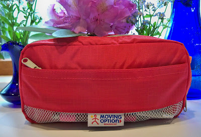
Finally, here is my review of the Nomadic PE-07 Pencil Pouch, otherwise known as my lightweight sketch kit! I'm going to give you a peek inside to share what's traveling with me everywhere these days. I bought a Nomadic Messenger Bag quite some time ago and I use it so much that I thought I couldn't go wrong with some more of their products. The pouch comes in lots of nice colors, and I love red. The small zippered compartment in the front is a very convenient place to keep items that I need to reach for first --- like a pen, pencil and eraser. I can do my initial sketch without having to even open up the bag. If I decide to paint or use brush pens, I then proceed to the larger, inside compartment.

Above is a photo of the pouch from the side, so you can see some of the nifty dividers, with supplies in there too. (The pouch looks orange in this photo, but only the inside is orange.) I like having that thin, center section with the zipper. It gives me a safe place to store my Escoda travel brushes, where they can't fall out even if the bag tips while open. I took out the pen, mini watercolor set, and waterbrush to do the sketch above out on location. Removing the rest of the contents, you can see how much I'm able to fit into this clever little bag in the image below:


Inside the pouch is stashed a mini set of gouache as well as the watercolor set, a vial that I filled with Dr. Martin's Bleedproof White, my beloved Kaweco Lilliput fountain pen, a few water brushes, three Escoda travel brushes, one travel squirrel mop brush, a small travel sable with protective sleeve, a grey Pentel Aquash brush pen, a Kuretake refillable brush pen, architect pencil, little mouth/gum scrubber to scrub out paint, Mini Mister to spritz my palette or sketch, small container of water (little yellow bottle), palette cup, two metal office binder clips to hold down sketchbook pages, UniBall Vision rollerball pen, and small piece of eraser. Whew, that was a mouthful! Typing it all out, it's hard to believe that it all fit easily into the pouch. I have since added a piece of sponge in there as well, to wipe my brushes as I paint.

This pouch is so so well designed and constructed. It has just enough compartments and dividers for me to separate items into categories, without having so many that they take up needed space or make it hard to find what I'm looking for. It weighs nothing, is small enough to stash in my purse, and super-convenient to toss it into my backpack if I'm going hiking or traveling and need an ultra-light art kit. This and a sketchbook, and I'm good to go anywhere. I've already taken it on many hikes and outings. Like all art bags and sketch kits, it will continue to change and evolve, so I'll be sure to show it again in a year or so. It will be interesting to see how the contents have changed in that time.

So, is there anything negative about this bag? Well, initially I wished it was a bit larger. However, I'm now glad that it's not. One thing I've learned about myself over time is that no matter how big a sketching bag is, I know how to fill it to the brim, and I'm going to do that! Therefore, the secret for me to traveling light is to have a small bag that can only accommodate so much. In my dreams, I have a large, light bag. It contains everything I ever wanted, and there is plenty of room left over. But in reality, my bags are always packed to the brim with way more stuff than I could ever use in a single outing. Clearly the supplies in the photo above are more than ample for a sketch outing. One day last weekend, I forced myself to cut the contents in half, and I didn't find myself missing a thing when I went to sketch! So now I can honestly say that the pouch is perfect for its intended purpose. I love it. And it's mine. And I'm not giving it up. So if you want your own, you'll just have to hustle on over to JetPens and get one for yourself.


Thursday

Big News from Stillman and Birn

Two page spread from a Stillman & Birn Beta prototype hardbound sketchbook
Watercolor, 6x18" (across the spread)
Click image if you'd like to see it larger

My dream has come true. Stillman and Birn has announced on their Facebook page that they will be expanding their lineup and producing hardbound sketchbooks with their extra heavy weight 180lb Beta and Delta paper. I think I've been waiting for this moment from the first time I ever opened up a sketchbook. For a multimedia artist who loves stitchbound books that open flat, this is a major event and game-changer!

The two page spread above was done in a 6x9" landscape format prototype with Beta paper. I worked across the spread to get the 18". The pages lie so flat that you can barely see the seams, and the paper is so heavy weight that there is no ghosting from images on the other side of the page. It's fabulous!

The books will be produced in the 5.5x8.5", 8.5x11", and European A4 size portrait formats, and not in this landscape 6x9" format shown above. Nevertheless, it has been a thrill to have a sneak peek and to be able to work in one of these babies, and to finally be able to share the good news. This Dogwood Blossoms sketch that I posted a few days ago was also done in this book. I now have my paws on prototypes of the 5.5x8.5" and 8.5x11" sizes, and cannot wait for a chance to dive in!

Wednesday

Willow Tree in the Front Yard and Lilliput Review

11x17" across a two page spread in an 8.5x11" Stillman & Birn Epsilon hardbound sketchbook
Ink and Watercolor

I've been admiring the character these willow trees on our property, and looking forward to an opportunity to get out and sketch them. Yesterday after dinner, I was finally able to give into that temptation and scoot outside for 20 minutes or so. I set my stool in front of this massive willow tree and took out my beloved Kaweco Lilliput fountain pen, which is filled with Platinum Carbon Black ink. I love this pen. When closed, it is teeny tiny and perfect for my small sketching kit. The cap screws onto the back, so it posts firmly, and becomes long enough to sketch comfortably. If you click that link above, you can see lots of different views of the pen with a penny for size reference. Below is a photo of it next to my new (ultra-cool and more about this soon) Uni Gel pencil, so you can get an idea of the size compared with a mechanical pencil. I think this photo actually makes it appear larger than it is though.


I'm a big fan of Kaweco fountain pens and have quite an assortment. They are smooth, wet writers and highly reliable. The plastic-barrel Kaweco Sport pens can be converted to eyedropper pens, but since the ink can corrode metal, the Lilliput model cannot be converted. It has other benefits though, like its compact size, and the way it slips into my small sketch bag like a long silver bullet. It never leaks. It always starts right up. It writes like a dream and can keep up with my quick sketching without skips. For a little pen to slip into a pocket or small pouch, it simply can't be beat.

You can see in the photo above that the Lilliput pen, when posted with the cap, is certainly an adequate size for writing and sketching. It is thinner than a regular fountain pen, though that doesn't bother me.

After drawing for awhile, I decided to entertain my inner color junkie, and pulled out my mini watercolor set. That and a waterbrush were all I needed to complete the large, two-page spread. These three items --- Lilliput, waterbrush, and mini pan set, could have fit into a pocket. The little watercolor set can be found at Wet Paint. I pop out the kids' paints and substitute with my artist grade tube colors. For this sketch, I used Winsor Newton French Ultramarine, Aureolin, Brown Madder, and Daniel Smith Quinacridone Gold.

Tomorrow I'll take you on a tour of the little red bag in the photo. It is host to the contents of my current "small sketch kit". I can toss that pouch into any bag or backpack and I'm ready to go on a sketch outing.

Sunday

Review of the Hero 86 Fountain Pen and some Vulture Sketches

Iroshizuku Yama-Guri ink in a Hero 86 "Fude" nib fountain pen


I'd been hearing about these "fude nib" fountain pens for quite some time. The nib is bent upward so that by writing with it at different angles, you can vary the width of the line. I tried to get photos, but my camera just isn't good enough to capture the details on the nib. In searching online for a link so that you could see some images, I came across this review of the same pen, which has excellent photos to accompany it, so you can check it out there.

A friend tipped me off to a seller who had them on Ebay for $5, so I figured for that price I couldn't go wrong. (That seller is now sold out, but they are available through http://isellpens.com .) I did my usual soapy water -- clean water flush and dry, and inked it up the next evening with Iroshizuku Yama-Guri ink, which is a nicely-flowing ink in the brown family. Using the end of the nib, I was able to get an extremely fine, yet still wet line. It was a great pen/ink combination for quick, thin-lined wirey gesture sketches of this vulture. I did them from photos I'd taken that day at the Bronx Zoo, since I didn't have enough time to sketch them on location. In addition to that wonderful fast, juicy, thin line, I was able to then lay the broader area of the tip down to get in my dark shaded areas and accents. In fact, I loved the pen so much that I buzzed through five pages of sketches and then went right to my computer to order the only three that the Ebay seller had left.

The pen is rather heavy, and you may or may not like that "rocket ship" look! It does come with a converter, so it's very easy to fill. I've also been told that the nib for this pen will fit on a standard Noodler's Flex Pen or a TWSBI! Although I do have both of those, I haven't yet tried it. So if you don't like the pen body, there are other options, and it might be worth it for the nib.

If you like to sketch with fountain pens, this is definitely one that you'll want to check out. Sailor also makes these types of fude nib fountain pens at reasonable prices. I've been playing with a couple of the Sailors over the past day or so too. I'm certainly becoming a fan of this type of nib.

Friday

Watercolor and Gouache are cohabitating in my palette!

Lexington Gray ink in a Lamy Safari fountain pen
Watercolor and Gouache
Stillman & Birn Epsilon 8.5x11" hardbound sketchbook

I finally found a way to set up my palette to fit watercolor and gouache together. I test drove it the other day and it worked fabulously well. A number of people have been asking me about this palette and how I did the reconfiguration, so here goes.....

I bought this palette online from Wet Paint Art Supply  in Minnesota. Apparently they are only made by special order, so Wet Paint ordered a bunch. Their customers liked them so much that they sold out almost immediately and ordered a lot more! The palette only comes with 12 colors (in two rows of six), with room for a third row of your own half pans and colors, for a total of 18. So, how did I transform this into something that will hold 32 half pans and one whole pan?

There is a metal plate with holders for the pans. It weighs a ton. I took that out. I fiddled with half pans in the empty space to see how many I could fit, and what the best configuration would be. I discovered that four rows of seven colors each would fit with the pans placed vertically,  but that I could squeeze in a fifth row if I had the pans run horizontally. In that last row, because of the curves on the corners of the palette, only five would fit. But I could fit a whole pan vertically in place of one of the half pans --- there was enough space to accommodate that. I am always needing extra white gouache when I'm painting with gouache, so I decided I'd keep my white in that one.

I took out a roll of adhesive magnetic strip. It comes rolled up like a roll of tape. I bought mine a long time ago and I don't remember what brand it was, but it looks something like this. I bought it in a craft store. I cut five strips that fit across the width of the palette. Since they were curled from being in the roll, I heated them with a hair dryer, which softened them a bit, and pressed them under a few very heavy coffee table books overnight. The next day, they were flat. With the adhesive side up (bare magnetic side down), I placed them in the palette, approximating where they would go.

I'd already decided which colors would go where the night before. I filled the pans that weren't already loaded, and wrote the names of the colors on each pan with a black fine point Sharpie. Starting with the top row, I peeled the paper strip off the magnet, revealing the adhesive, and stuck each pan down onto the adhesive strip, working across the row. I put in three rows of watercolor pigments (21 colors), then the 12 pans of gouache.

One thing about working watercolor and gouache together is that the opacity of the gouache, plus the chalkiness of white paint, can get into your transparent watercolor and destroy all that beautiful luminosity. This is why I always kept them in separate palettes. Since this metal palette has two sides, it keeps them separated easily. I'm used to having just two mixing areas for watercolor --- one for warm colors and one for cool. So the two sides of the top mixing area provide the wells I need. However, for gouache I need more areas, since I have to be able to mix value as well as color. All those little wells in the lower area are perfect for my gouache!

I was also able to eliminate the opaque watercolors from my palette. Usually I have cadmium red, a couple of cadmium yellows, cadmium orange, chromium oxide green, and a couple of other opaque watercolors in my watercolor palette. Now I can just substitute gouache when I need those, and keep all my watercolors transparent. That gives me an even larger color range than I had before.

I made the chart above so that I could keep track of what colors were in which pans, until I get to know my own system better. I also knew that initially, I'd be making some changes; that's why I numbered the pans on my sketch, instead of writing in color names. When I change a color, I can just change the name on the numbered list of pigments. I've already swapped out a few and shifted some around.

I've been looking for a way to do this for several years, but never found quite the right thing. This works for me at last!

Saturday

Golden Acrylic Neutral Grays


Golden Heavy Body Acrylic Neutral Grays, plus Black and Titanium White
Stillman and Birn 8.5x11" hardbound Epsilon Sketchbook

Those of you who have been following me for awhile have probably seen my setup for value studies in acrylic. I love doing monochrome studies this way. The Golden Paints Company makes it so easy; there's no color mixing --- just dip right into the value you want. It's been awhile since I did some of these value studies, so I pulled the container off the shelf figuring I'd clean it out, refill it, and put it to use, but the paint in it is still perfectly fine! That seal around the top of my container worked better than I thought it would. The binder and pigment separated a bit while sitting, but I sprayed in a little water, mixed it up again with a tongue depressor, and the set was good to go.

I was thinking of bringing it to open studio life drawing the next day. The longest poses in that session are only 20 minutes. I wasn't sure I could accomplish enough with acrylic paints in that time frame, and also wasn't sure I'd find the heavy body acrylics blendable enough for portraits and figures on paper. In keeping with my desire to brush up on portraiture, I decided to test drive the idea in my Epsilon sketchbook, working off an old black and white photograph of pianist Maria Teresa Carreno. She was a child prodigy who lived from 1853-1917.

As I thought, the paint didn't blend as well as I'd hoped on unprimed paper. Although I'm not necessarily unhappy with it as a study, it would have gone better with a primed surface and some of that delicious Golden AGL (Acrylic Glazing Liquid), which extends the drying time enough to blend a bit. I didn't use the AGL because I was thinking that in a sketchbook, extending the drying time might prove to be a bad idea when you need to turn the page to start the next pose, and I probably wouldn't want to bring my studio hair dryer into the life drawing session.

So, the next day, I brought traditional black and sepia dry drawing media with me to life drawing instead, and I totally bombed! I may as well have brought these after all and given it a go, so that's what I'm going to do next week. Maybe. Unless I change my mind! I think I'll give a few pages a coating of Golden Matte Medium so they won't be quite so absorbent, just in case I go through with this plan.