Here's the post that many have been eagerly awaiting....
THE PROMPT LIST!
If you haven't yet seen the post with the dates and other details of the Holidays in Ink Challenge, you can find it here. Please read that first, as it is not repeated here.
The prompts below are an Inspiration Library for when you're stumped for what to draw, or you can do them all, or do none of them. The prompts are meant to be combined in your sketches, not just used individually. Don't get overwhelmed by how many there are; combining them in sketches is part of the challenge. There is no requirement that you do the prompts. The real goal is to finish your sketchbook!
I will do things a bit differently this year, and skip around in my book from day to day. You can work on pages over multiple days, and/or multiple pages in one day. You do you. Pack the pages, and fill that book!
I've divided the prompts below into loose categories. Do them in whatever order you wish, according to how much time you have, what you feel like doing, or if you are traveling.
It's almost that time! You're invited to join me and a bunch of my friends for this fun, educational, and motivational, annual adventure. We'll combine inks with other media to complete a sketchbook during the holiday season. This post outlines what you need to know in order to play along.
DATES:
Monday, November 21, 2022 - Friday, January 6, 2023
GOAL:
Based on how quiet or hectic your personal holiday season is, select or make a sketchbook that you will easily be able to fill during those dates. When November 21 arrives, start your book. Use some ink. Incorporate other media if you wish. That's it!
SUGGESTIONS:
THE SKETCHBOOK
You do not have to complete a page a day, nor even a sketch every day. Well, of course you could. But I will not be doing that. Personally, I've opted to complete 36, two-page spreads during the 47 days of Holidays in Ink. I found a fabric with ravens in moonlight that I loved, turned it into bookcloth, and made my sketchbook a couple of weeks ago.
Here's a flip-through for you of the art journal from the Holidays in Ink Challenge! I'll be back with another post to further discuss the materials I ended up using most in this sketchbook. If you have any favorites among these inks or sketches, I'd love to know!
Holidays in Ink has just begun today! If you didn't have a chance to get started, don't worry; this Challenge is not a Sketch-a-Day type. Rather, you choose the sketchbook you think you can fill during the next six weeks. The goal is to complete the book. You still have plenty of time to do that before January 2, when Holidays in Ink ends!
In the meantime, if your studio is anything like mine or friends of mine, you're probably struggling with getting your inks organized. I don't like dipping into the bottles because it can contaminate the inks. I don't like the skinny plastic vials because they are too thin for some pens or brushes to dip in, and also they are so deep that the ink gets on areas where I'll be putting my hand when I write. My solution has been to get packs of 5ml. glass bottles from Dollar Tree. I can dip into these without making such a mess. They are more convenient to store because they aren't as tall, making them less likely to tip over too. I refill these little bottles using a pipette as needed, so there is zero risk of contaminating my large bottles of ink as I move from color to color.
Holidays in Ink 2021-22 is almost here! Everything you need to know is in this post.
DATES: Monday, November 22 through Sunday, January 2 (Six weeks/42 Days)
GOAL: Complete your sketchbook within the specified 42 days, regardless of how many days you sketch. (Select your sketchbook accordingly!) Pages must be filled and must include ink. Those are the only rules. If you wish, you can use some or all of the prompts below, either individually (one per sketch) or by combining them in your sketches (two or more in a single sketch).
SOCIAL MEDIA: There is certainly no requirement to post or share your work, but if you wish to do so, you can use the #holidaysinink hashtag.
PROMPT LIST (optional):
Take several days to do one prompt, or do several prompts in one day, or even a few in a single sketch. Skip around; there is no official order to the list. (If the Prompt List does not appear below, click to see the rest.)
Everybody has been asking me if I am planning another Holidays in Ink challenge this year, and the answer is most definitely, "YES!" I hope you'll join me from Monday, November 22 through Sunday, January 2 to complete this challenge. Melissa Fischer is teaming up with me once again to come up with prompt lists that can inspire us and improve our art.
Your mission, should you decide to accept it, is to complete a Holidays in Ink sketchbook from cover to cover during the dates of the challenge. That's it. You don't have to follow prompt lists nor make your own sketchbook if you don't want to.
If you'd like to play along with us, here's how you can get ready:
Look at your own hectic, topsy-turvy calendar for the six weeks beginning November 22. According to your schedule/travel plans/family gatherings, etc., and how large you plan to work, calculate how many pages you can realistically fill during that time. (I don't mean a two minute sketch on a page; I mean filled pages, even if it takes a few days to fill a page.) That will be your personal goal for the challenge. Select an appropriate sketchbook based on that information. Make sure it's paper you love, that will handle ink however you like to work. Or you can make a sketchbook, or cut paper to size and use a folder as your "book". Make sure you have a couple of extra pages in the back of your book to test out inks and materials, and a title page or two in the front.
Compile a list of any additional supplies you'll need, or things you'd like to try that you don't have. Order those now, so you'll have them in plenty of time. Supply chain issues could leave you stranded if you wait till the last minute. Consider doing this with a friend or two or three, and sharing some new inks among you to divide the costs. (If you'd like to check out some of my favorite materials from last year's challenge, you can see them on this post.)
If you've never done bookbinding, this is a great opportunity to take on a bookbinding project before the challenge begins! (Make a small one first to test drive the process.) There are lots of great YouTube videos on bookbinding, with hundreds of options to explore. I especially like Sea Lemon and Nik the Booksmith on YouTube.
There will be a prompt list posted before the challenge starts, for those of you who would like to work from a list. If you want to be sure not to miss the posts related to this challenge, you can subscribe to this blog by entering your email address on the upper right. You will then receive email notifications of new posts.
I'm doing my paper and materials testing now, and will probably bind my own sketchbook for the challenge, or rebind an existing book. Melissa and I have ordered the new Diamine Inkvent 2021 Calendar, so we will be exploring the 25 brand new inks in that collection, as well as using inks we already have. We're looking forward to lots of linework with fountain pens, dip pens, and even ballpoints (great for travel!), plus wet on wet washes, calligraphy and lettering, and more compositional study. We hope you'll join us! Stay tuned for the prompt lists.
Happy New Year, everybody! I can't believe Holidays in Ink is over. I'm still mentally processing everything from this challenge. Here's a video tour of the sketchbook I created during the challenge.
A note about the figurative works: Except for the dancers in primary colors, they were done during weekly figure drawing Zoom sessions that I do with a few friends. We've been working from master paintings, allowing 20 minutes for each. The figures are therefore a bit more stylized than they would be if we'd been using photographs.
I've been excited to have a go at the Black and White on Toned Paper prompt (Process #6). When working on a toned surface, I nearly always select a warm color or neutral gray. This time, I decided to pick up the cool colors of sky and water, using a sheet of periwinkle-colored cardstock that has been living in the studio closet for several years. I'm loving the strong contrasts and power of these Notan style sketches. I used the paper color as my midtone value, adding just black and white for lights and darks. I definitely want to do more of these moving forward.
I made Sumi ink this week for the first time, using a Sumi ink stick and stone.
I can't believe we're more than half way through this challenge, and heading into Week 4. If you're doing the challenge also, let me know in the comments how it's going. I'm glad there are still over two and a half weeks left, since I still have a lot of untapped prompts, and nearly 30 blank pages remaining in this sketchbook!
The sketch above, in bright, primary colors, was the result of several days spent mostly doing monochromatic work. I was DYING for some bright color at that point, so I pulled out my most saturated, brightest watercolors, and gifted myself with a fiesta day of color intensity. Normally I'd do a composite with several different poses, but I loved the image of this dancer, so I sketched the same pose several times, as if it were a dance company chorus, letting the colors mingle and the images float across the page from one to the next. The linework was added after the watercolor dried.
How are you all doing at the start of Week 2 of the Holidays in Ink Challenge? Please let me know in the comments! I began Day 1 on November 24 with the page spread of herons and flamingos above. The first page or two in a new sketchbook is always a bit intimidating for me, so I selected a more familiar subject from the prompt list to begin. I've been wanting to study the leg anatomy of the longer-legged birds, heads of herons, and upside-down beaks of flamingos, so I did some anatomy studies on the page as well. My process prompt was Line Quality. I aimed for longer, more expressive lines, and to avoid chicken-scratchy, short, choppy strokes. (Materials list for all of the sketches in this post is at the end.)
It's hard to believe that the Holidays in Ink Challenge will be starting in a week! I'm getting so excited about it that it's difficult to stop myself from diving in for a head start. Grabbing supplies for the project from my studio shelves, drawers, and boxes is part of what's made me so eager. Here are some mouth-watering images of some of the things I intend to savor over the next couple of months. I've added Amazon Affiliate links to make it easier for you to source any of these supplies that you might want to add to your own.
During the busy holiday season, I'll be taking this Holidays in Ink Challenge, enabling me to just sketch with pen and paper when the going gets tough! Come play along if your life gets as hectic as mine from Thanksgiving through New Year's Day, or if you'd like a challenge to push your artistic boundaries and inspire you. Many artists have asked me to include a list of prompts. As a result, I've decided to make two lists ("Subject Prompts" and "Process Prompts"), which are included below. It's posted well in advance of the start date, so you'll have time to gather whatever you need in materials or references to complete your personal challenge.
Here in the northeastern United States, October is the month when we plein air painters flock outside to capture the very short burst of peak color in the landscape. It's a time I look forward to all year. Not only is it the best color we will get, but it's the last opportunity before colder temperatures drive us indoors. I've always lamented the fact that Inktober happens in October. I love working in ink, but it's the last thing I want to do in October. Every winter, I come up with a personal, motivational studio art project to expand my own horizons, and try to make the most of the days indoors. This year, from Thanksgiving until after New Year's Day, I'm going to do Holidays in Ink. You're all invited to join me if you'd like an interesting art challenge around the holidays. Here are the basic details:
For landscape painters, being able to capture the character of a tree, or the silhouette of a distant tree line, is an important aspect of making a successful painting. Project Megasketch gifted me with ample time to study many different ways of drawing and painting these beautiful and graceful living structures. Toward the end of the project, I combined what I'd practiced with some experimental approaches. I hope this post inspires you to push forward with a favorite subject of your own to develop skills and style. It doesn't have to be trees!
Ink and wash, from one of my own photos
Some I sketched from my own reference photos, like the unique tree (above) that resides at the Bronx Zoo. I tried to keep in mind what I'd learned about tree contours in the time I'd spent with the online
11x17" across a two page spread in a Stillman & Birn Epsilon Hardbound sketchbook
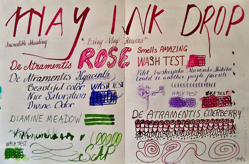
De Atramentis Rose
De Atramentis Hyacinth
De Atramentis Elderberry
Diamine Meadow
and Pilot Iroshizuku Murasaki-Shikibu inks
Assorted dip pens
At the beginning of every month, five vials of ink samples arrive in my mailbox via the Goulet Pen Company Ink Drop. I don't always have time to test drive all of them right away, but this month I pulled them out and played with a bunch of dip pens to see what the colors looked like and how they washed with a wet brush. Every color was a winner, and I found myself surprised by how much I enjoyed working with the scented inks like the Rose and Hyacinth.
None of these inks are "archival" in terms of being able to hang a sketch on a wall where it would be exposed to sunlight. But they should fare fine inside a sketchbook as long as it's not dipped in water!
Many thanks to all of you for waiting so patiently for these preliminary results! For those who don't know what I'm talking about , you can click here to read about these lightfastness tests of the Noodler's Eternal Inks, and see how I set up the tests.
Last week, I was a guest on the Goulet Pen Company's webcast show, "Write Time at 9!" During that broadcast, I did a verbal reveal of changes to the samples. If you were unable to tune in at that time, you can watch the recorded broadcast below. I come on at about the 10:00 minute mark.
The right sides of the samples posted below were in my south-facing studio window for just six weeks, in the northeastern United States. It's the heart of winter here, when the sun is at its weakest. They got a few hours of direct sunlight a day through a screen and glass. I will be putting the samples back into a window tomorrow, and I'll do another reveal in six months to show the differences.
The tests are pretty self-explanatory. You can click any image below to see an enlargement. In the broadcast, I verbally described the changes to some of the inks, and you can click that link above if you'd like to hear more of my summary. Here on this post, I'll just list them for now in three categories:
Inks that didn't change
Inks that changed the most
Inks that changed a little
The inks that had no visible changes so far are:
Black
Blackerase/Waterase
Heart of Darkness
Polar Black
X Feather
Lexington Gray
Bad Blue Heron
Luxury Blue
Polar Blue
Polar Green
Kung Te-Cheng
La Reine Mauve
#41 Brown (2012 version)
Polar Brown
Inks that changed the most during this time frame are:
Periwinkle
Hunter Green
Dostoyevsky
Year of the Golden Pig
Empire
Fox
Rachmaninoff
Tchaikovsky
Pasternak
Whaleman's Sepia
Inks that showed a slight change during the six weeks are:
El Lawrence
Bad Belted Kingfisher
Bad Green Gator
Socrates
Mata Hari's Cordial
Bad Black Moccasin
There are two other inks that I did not discuss in the broadcast: Whiteness of the Whale, and Blue Ghost. I did test these, but I believe I need to look at them under a blacklight, and I have not yet done that. I'll report on those when I do my follow-up on these Noodler's Eternal inks, in another six months.
So without further delay, here are the images of the samples. The right half of each page was taken down from the window, taped on the back to the half in the book, and photographed. Those artists who are interested in knowing which inks wash and the color of the wash will be able to see that in the samples. That washed area is generally where changes first appear, since there is a thinner application of the ink there.
I hope many of you have found this information useful. It's been interesting for me to see how some of my personal favorites have fared! I'll be testing another 40-50 inks very soon. Stay tuned for a list within the next couple of weeks to see if any of your favorites are among them. After they've been in the window for a month or so, I'll do a post of preliminary results like this one, followed by six month results down the road.
My friend Melissa invited a group of us over to her house to sketch on Friday. I was delighted to see that unlike mine, her amaryllis actually had a flower stalk on it --- with a bud! I knew I had to sketch that.
Since I recently found those deer jawbones to sketch, I also had to draw this deer skull that Melissa had, which seemed to be the remainder of the head!
This Wednesday, February 15, I will be a guest on Write Time at 9! This is an almost-weekly webcast by the Goulet Pen Company. We will be revealing the one-month results of the lightfastness tests I've done on the Noodler's Eternal Inks, and discussing the use of fountain pens and inks for sketchbooks and fine art. Please join us to contribute information, ask questions, or just lend your support since I'm not used to public speaking! You can click here for more information on the tests, and to see how these lightfastness tests were set up.
To join in, or just sit and watch/listen, you can look for a link here on my sketches site on Wednesday evening, or on the Goulets' blog, Inknouveau.
When my order of Big Brush Pens arrived a few days ago, I did a color chart so I could see the actual colors on this paper. I set out some color groupings that I thought would work well together and provide me with at least three values. In anticipation of attending open studio life drawing the next day, I warmed up with some sketches from photo references --- easier than drawing from life, since the translation of three dimensions to two dimensions is already done for you by the camera! Still, going straight in with ink is always a challenge. I liked the way the colors worked for those sketches above, so I plan to keep that color grouping intact.
So, with at least one group of three markers that I know will work together, and some ideas for others, off we go to a session of short poses! I didn't photograph all the pages because it is such a time consuming process, but here are a few pages worth. These were all 20 minute poses, done from life. I sampled some of my other color groupings. After doing a few sketches, I did one with a more conventional drawing medium too --- a Sepia Cretacolor lead.
Left: Pitt Big Brush Pens in Caput Mortuum, Sanguine, Cinnamon, Light Flesh
Center: Pitt Big Brush Pens in Indanthrene Blue, Ultramarine Blue, Sky Blue
Right: Sepia Cretacolor Lead, blended with a finger (and accidentally smudged by my hand!)
Pitt Big Brush Pens in Dark Sepia, Raw Sienna, and light flesh for the figure. Colors added in Deep Scarlet, Sky Blue, Ultramarine, Light Green for table and stool.
It's a tall order in short poses in life drawing to take on a medium that doesn't move much and can't be erased. But I enjoyed it, and I'm sure these Big Brush Pens will become part of my regular sketching materials for various subjects. I'm not sure if I'll be bringing the brush pens next time, or use something else; I have lots of ideas cooking in my brain. But it's always a fun time, and a great place to experiment with various approaches and mediums.
Private Reserve Copper Burst ink in a Pilot Petit fountain pen
Noodler's Midnight Blue ink in a Kaweco Sport EF fountain pen
Watercolor
Schmincke Dry Copper Gouache
I have the most challenging time adjusting these iridescent images. The copper is really stunning, but in a photo it looks dull and brown without the shimmer of the light on it. If you can imagine the shimmer that you see in spots, spread throughout areas of the sketch, you'll have a better idea of how this looks in real life. The border and box shadow are copper iridescent acrylic, and there's a light coating on the multi-layered page background too. In fact, that background has eight layers of assorted media on it! If you click the image, you can see through parts of it to various background layers of patterned ink and shapes.
I was sketching at Adams Fairacre Farms in Wappinger, NY this past week. I had prepared several page spreads in advance, including this one with the copper background. When I walked by a display of large copper weather vanes, I knew I'd found the perfect subjects for those pages! Combined with my love of birds, it was irresistible! I sketched them with Private Reserve Copper Burst, added some Noodler's Midnight Blue for contrast, and blended/shaded a bit with a waterbrush.
I loved the Schmincke Reichgold Dry Gouache so much that a couple of weeks ago, I got three more jars of different colors:
This was a perfect opportunity to dip into the copper version, so I mixed up some of that after I got home, and added it to areas of the weathervanes, and painted the page title with it.