Showing posts with label Floral. Show all posts

Saturday

Project Megasketch -- A Perfect Solution for Your Winter Blues


If you're an artist who doesn't like winter, maybe this post is for you! I used to hate winter. If you live in a cold climate and you're a plein air painter, you probably know what I'm talking about.  One solution for the Winter Blues is to give yourself a special winter art project to break free from your own mold.

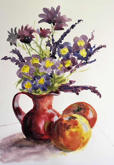
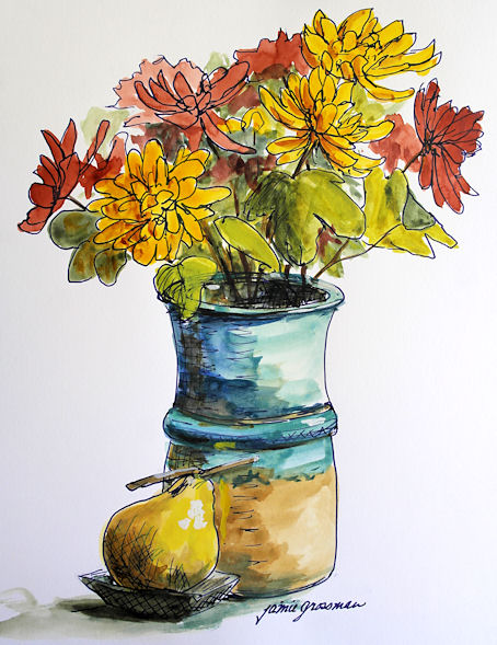
Last winter, I embarked upon a drawing/painting/sketching challenge to see objects in a different way, and learn to capture them faster. My hope was that when I ventured out again in the spring to paint, the drawing/blocking in stage would be quicker and more accurate. I wanted to tackle subjects that I found difficult, or required a lot of maintenance and practice, such as perspective, drawing straight lines and round elipses, and being able to sketch a portrait likeness in just a few minutes. I wanted to improve on capturing the elegance and directions of tree branches, the graceful movements of animals, the bustling activity of people walking, and copy some works of the masters to explore their methods. I experimented with mixed media, and broke out all those fun art supplies that I rarely have time to use, or that have been sitting on the shelf untested.


I dubbed this venture Project Megasketch, and began it last November. I finished in April. Maybe it can help you get through the Winter Blues this year, while venturing into new art territory. For those who want to give it a try yourselves, or just follow my project along for ideas, stay tuned. Yours may have different subject matter and goals, but you can create a project that will benefit your art with the development of skills and exploration of techniques by following the process. I'll post regular prompts and examples from my project to help get you started and inspire you in the weeks and months to come. There aren't many rules to follow.

Project Megasketch Rules:


  1. Complete 600 pages, minimum size 9x12"-11x15", in any media. (Or set a different number of pages and size if that's too overwhelming. Make the challenge your own.)
  2. Fill each page. No cheating with half-empty pages!
  3. Work for sale or publication doesn't count. (More about this below.)
  4. Set dates to start and finish. It's okay to adjust that later if you have to. Life happens!
  5. Challenge yourself, but have some fun too.
  6. Trust the process.


Having read this far, if you're still interested, get a few sketchbooks the same size, or one enormous

Monday

Last of the Rose of Sharon


You know the summer season is winding down when your very last Rose of Sharon bush has nearly finished blooming. I'm trying to make the most of the few blossoms that are left. This is across a two page spread in a Stillman & Birn Alpha Softcover sketchbook.

Saturday

Just Splashing Around


Every once in awhile, we need to just throw paint. That's what I was in the mood for when I did these two acrylic sketches! They were done from life, from potted plants in my studio. I let the paint spatter and drip, painted into it, made some drips, and just kept doing that until I had enough! This two page spread is about 14x10" in my homemade blue Pescia journal. It was painted with the same Golden Airbrush paints described in my previous post, as well as some Golden Fluid Acrylics for a bit more body to the paint.

I still have two blank pages to fill in this journal. I think my "Kinda Blue" theme played itself out. I was ready to be cheerful by the time I got to the paint-slinging phase here! I will definitely finish it up though as soon as the desire to sketch on something blue surfaces.

Thank you for following along through this journal. This week I'll be posting my review of the new Golden High Flow acrylics.

Tuesday

New Product Review --- Introducing Stillman and Birn Zeta


If you're a fountain pen aficionado, sketch with ink and dip pens, love Pitt Brush pens, or the coverage you get with colored pencils on smooth paper, or mixed media on a plate-like surface of extra heavy-weight paper, you're going to adore this new Zeta paper from Stillman & Birn. Think of their fabulous Epsilon surface in a thicker, more opaque version, and you'll have a pretty good idea of what this paper is all about. When I first tried the Epsilon paper, I loved it so much that I wanted an even thicker version. Now it's here! Many thanks to Stillman & Birn for making my dream come true.

I was sent some 8.5x11" sheets of the Zeta by Stillman & Birn when it first came in from the mill in France. When I first saw and felt the Zeta paper, there seemed to be such a world of possibilities for media that would work well on it, that I didn't know where to begin. I wanted to do a sketch that would showcase the potential of this smooth, slick surface. I did a few sketches in watercolor and ink of flowers, pitchers, vases and fruit, and played with assorted inks and washes. Then I decided to sketch some of the materials I'd like to use on this paper, which became the inspiration for this particular sketch. I tossed some of my favorite pens, brushes, markers, crayons and pencils into a brightly colored little pot that I normally use for my painting water, and set out some paint tubes as foreground elements.I felt the colors in the setup were strong enough to carry a strongly colored ink. Noodler's Black Swan in Australian Roses is one of my favorites. It is not lightfast. It is not waterproof. But there is something magical about the color, so I keep a wonderful Sheaffer 100 loaded with this ink, and it is always with me. I like the way this ink weaves the color harmony of the sketch together. I started this sketch with a few pencil lines, then went right in with ink and did the drawing, working mostly front to back. I used a wet brush to create some wash effects with the ink in shadow areas, followed by the watercolor. The last step was putting in small ink details, like some of the writing on the paint tubes, which would have run if I'd done it earlier in the process. I accidentally did this sketch on the reverse side of my sheet of dark ink test swatches, which proved to be a testament to the high opacity of this paper; no ink lines showed through at all!

The way the internal and external sizing of the paper permits the paint pigment to lie on top of the page yields a wonderful brightness in the color. The pigment does not spread out and mix together like with traditional watercolor paper, so it does take some getting used to and adapting. I'm really looking forward to breaking out my gouache on this paper. I think it will be a great match. The sketch below was done with transparent watercolor and just a bit of white gouache toward the end for the lights. But actually, the sizing allows for pretty easy lifting of pigment, so I probably could have reclaimed those lights without adding white. This sketch is 8.5x11.


I also did a sketch with an ink that I know to generally be very waterproof. Since waterproof fountain pen inks are at least partially challenged by heavy sizing, I wanted to find out if Noodler's Kung Te-Cheng would run when I added watercolor. It's one of my favorite inks, and I wanted to be sure it would stay put on this paper, no matter what else I did to it. Well, as you can see, the ink did not run at all. The sketch below was done while visiting with my friend Gingie at RiverWinds Gallery in Beacon. They have so many beautiful displays there that it's a fun place to break out a sketchbook! This one is also 8.5x11"on the Zeta paper, using a Kaweco fountain pen with a broad nib and transparent watercolor.


There is so much more to explore with this paper. I can't wait to have it in sketchbook form. Finally there is an ink-friendly paper that does not show through to the other side at all, so there will be no ghosting of images when working front and back on the pages. If you enjoy working on smooth paper, this is definitely one to check out. I know I'll be going through a lot of it. If you would like to also read another artist's review of this paper, check out this post by Jeanne Powers-Forsyth.

Friday

Sketching with Mary on a Rainy Day

6x18", Watercolor
Across a two page spread in a Stillman & Birn Beta hardbound 6x9" sketchbook (prototype)

It's not always easy to find a composition that will work across a two page spread in a landscape format book. My friend Mary had this long boat sculpture that helped ease my way across the spread! She came over to sketch on a rainy day in April. We set out spring flowers from our gardens and all sorts of odds and ends and had a blast. Bleeding Hearts and Bluebells were in abundance that day.

Thursday

Big News from Stillman and Birn

Two page spread from a Stillman & Birn Beta prototype hardbound sketchbook
Watercolor, 6x18" (across the spread)
Click image if you'd like to see it larger

My dream has come true. Stillman and Birn has announced on their Facebook page that they will be expanding their lineup and producing hardbound sketchbooks with their extra heavy weight 180lb Beta and Delta paper. I think I've been waiting for this moment from the first time I ever opened up a sketchbook. For a multimedia artist who loves stitchbound books that open flat, this is a major event and game-changer!

The two page spread above was done in a 6x9" landscape format prototype with Beta paper. I worked across the spread to get the 18". The pages lie so flat that you can barely see the seams, and the paper is so heavy weight that there is no ghosting from images on the other side of the page. It's fabulous!

The books will be produced in the 5.5x8.5", 8.5x11", and European A4 size portrait formats, and not in this landscape 6x9" format shown above. Nevertheless, it has been a thrill to have a sneak peek and to be able to work in one of these babies, and to finally be able to share the good news. This Dogwood Blossoms sketch that I posted a few days ago was also done in this book. I now have my paws on prototypes of the 5.5x8.5" and 8.5x11" sizes, and cannot wait for a chance to dive in!

Friday

Another Card for Mom


I've been sketching quite a bit lately, but haven't had enough time at the computer to get all the images photographed and posted! Today is my Mom's birthday. A few days ago, I went out and picked daffodils, and painted them in gouache on a card I made for her with some Aquarius II paper. It's a tri-fold, primed with diluted acrylic paint and some sprayed iridescent paints.

If you haven't read the recent post by Robert Genn about the importance of sketches and small studies, it's a great read, as well as a reminder of the important role this kind of work plays in the creative process and artistic development.

Wednesday

Flowers for Mom

Watercolor on acrylic-primed Strathmore Aquarius II watercolor paper

I made some cards to send letters to my Mom, who is over 1,000 miles away from me. I cut about a half dozen cards from Aquarius II paper, and toned a few of them with some diluted acrylic traditional and iridescent paints. The surfaces have just a bit of shimmer to them. After I took this photo, I signed the image and put a border around the sketch. I forgot to take another photo of it when it was finished, and now it's already been sent off to her.

These flowers were from a family birthday party that my husband and I attended, so it was a perfect addition to the letter telling her about the event. It does take a lot of time to make cards for people, but what a nice way to be able to share our sketches!


Pitt Big Brush Pens in the Greenhouse

Click image for a larger, clearer view.
Pitt Big Brush Pens
Stillman & Birn Epsilon 5.5x8.5" hardbound sketchbook

It's time for sketching on some white paper! The greenhouse was filled with all sorts of statues, flowers and plants. There is a big turnover, so every time we go, the displays are different. I loved the shapes in this statue, and it was beautifully set off by the colorful flowers surrounding it. I've been making color charts on a lot of my sketches with the pens. It helps me identify the colors until I get to know them a bit better. I tested out four greens here, but decided to only use two of them. I felt the Light Green and May Green would be too bright for my subject, and the bright red was already ample distraction!

Webcast alert! Remember that tonight (Wednesday 2/15) I'll be a call-in guest for the Goulet Pen Company's webcast, Write Time at Nine. I'll put up a link here before the broadcast. The Goulets will probably get the link up before I do, so if it's not here, try their blog: http://inknouveau.com . Hope to see you there! I'll be revealing the preliminary results of the lightfastness testing that I'm doing with the Noodler's Eternal Inks, and fielding any ink-related questions pertaining to sketching and artwork.