Showing posts with label pen and ink. Show all posts

Tuesday

Noodlers Eternal Inks Preliminary Lightfastness Results

Many thanks to all of you for waiting so patiently for these preliminary results! For those who don't know what I'm talking about , you can click here to read about these lightfastness tests of the Noodler's Eternal Inks, and see how I set up the tests.

Last week, I was a guest on the Goulet Pen Company's webcast show, "Write Time at 9!" During that broadcast, I did a verbal reveal of changes to the samples. If you were unable to tune in at that time, you can watch the recorded broadcast below. I come on at about the 10:00 minute mark.


The right sides of the samples posted below were in my south-facing studio window for just six weeks, in the northeastern United States. It's the heart of winter here, when the sun is at its weakest. They got a few hours of direct sunlight a day through a screen and glass. I will be putting the samples back into a window tomorrow, and I'll do another reveal in six months to show the differences.

The tests are pretty self-explanatory. You can click any image below to see an enlargement. In the broadcast, I verbally described the changes to some of the inks, and you can click that link above if you'd like to hear more of my summary. Here on this post, I'll just list them for now in three categories:
  1. Inks that didn't change
  2. Inks that changed the most
  3. Inks that changed a little
The inks that had no visible changes so far are:
  • Black
  • Blackerase/Waterase
  • Heart of Darkness
  • Polar Black
  • X Feather
  • Lexington Gray
  • Bad Blue Heron
  • Luxury Blue
  • Polar Blue
  • Polar Green
  • Kung Te-Cheng
  • La Reine Mauve
  • #41 Brown (2012 version)
  • Polar Brown
Inks that changed the most during this time frame are:
  • Periwinkle
  • Hunter Green
  • Dostoyevsky
  • Year of the Golden Pig
  • Empire
  • Fox
  • Rachmaninoff
  • Tchaikovsky
  • Pasternak
  • Whaleman's Sepia

Inks that showed a slight change during the six weeks are:
  • El Lawrence
  • Bad Belted Kingfisher
  • Bad Green Gator
  • Socrates
  • Mata Hari's Cordial
  • Bad Black Moccasin

There are two other inks that I did not discuss in the broadcast: Whiteness of the Whale, and Blue Ghost. I did test these, but I believe I need to look at them under a blacklight, and I have not yet done that. I'll report on those when I do my follow-up on these Noodler's Eternal inks, in another six months.

So without further delay, here are the images of the samples. The right half of each page was taken down from the window, taped on the back to the half in the book, and photographed. Those artists who are interested in knowing which inks wash and the color of the wash will be able to see that in the samples. That washed area is generally where changes first appear, since there is a thinner application of the ink there.


I hope many of you have found this information useful. It's been interesting for me to see how some of my personal favorites have fared! I'll be testing another 40-50 inks very soon. Stay tuned for a list within the next couple of weeks to see if any of your favorites are among them. After they've been in the window for a month or so, I'll do a post of preliminary results like this one, followed by six month results down the road.

Thursday

Little Girl in the Greenhouse

Click image for a larger, clearer view
Pitt Big Brush Pens
Stillman & Birn Epsilon 5.5x8.5" hardbound sketchbook

This was my last quick sketch of the day at Adams Fairacre Farm. There were so many great statues in the greenhouse that I wished I could have stayed longer, but we all lost two hours of sketching time having an extremely enjoyable lunch in their dining area, while discussing possible future plots of Downton Abbey and admiring each others' sketchbooks! It was time well spent relaxing with fellow friends and artists.

I have to say, I really enjoyed working on the white paper these past couple of sketches! I only have one colored page spread remaining in this book, and several black ones, so I went to the few white pages remaining. It's time for me to start thinking about what journal will come next. I sure would like to work bigger if my back will stand up to me holding a larger book while sketching out in the field.

Tuesday

More Sketching with Pitt Big Brush Pens

Pitt Big Brush Pens
Stillman & Birn Epsilon 5.5x8.5" hardbound sketchbook

Today our sketch group had its monthly sketch-out at Adams Fairacre Farm in Wappinger, NY. Patricia and I arrived at 10am and made ourselves comfortable in the dining area while waiting for the others. In honor of Valentine's Day, I had a chocolate caramel flavored coffee. It seemed like the right thing to do!

I've really been enjoying exploring all the colors and combinations of the Pitt Big Brush Pens I got recently. I'd prepared this page with a diluted teal-colored acrylic wash, followed by some iridescent/interference paint to give it some shimmer. I'd planned to use it with Private Reserve Blue Suede ink, but since I had a teal-colored Pitt Big Brush Pen with me, I pulled that out to do all the initial drawing, then added a bit of color with some of the other pens.

Webcast alert! Remember that Wednesday night (2/15) I'll be a call-in guest for the Goulet Pen Company's webcast, Write Time at Nine. I'll put up a link on my blog before the broadcast. The Goulets will probably get the link up before I do, so if it's not here, try their blog: http://inknouveau.com . Hope to see you there! I'll be revealing the preliminary results of the lightfastness testing that I'm doing with the Noodler's Eternal Inks, and fielding any ink-related questions pertaining to sketching and artwork.

Saturday

Please join me for Write Time at 9 on Wednesday

This Wednesday, February 15, I will be a guest on Write Time at 9! This is an almost-weekly webcast by the Goulet Pen Company. We will be revealing the one-month results of the lightfastness tests I've done on the Noodler's Eternal Inks, and discussing the use of fountain pens and inks for sketchbooks and fine art. Please join us to contribute information, ask questions, or just lend your support since I'm not used to public speaking! You can click here for more information on the tests, and to see how these lightfastness tests were set up.

To join in, or just sit and watch/listen, you can look for a link here on my sketches site on Wednesday evening, or on the Goulets' blog, Inknouveau.

Tuesday

Little Juniper Bonsai

Click image for a larger, clearer view
Page was prepared with diluted acrylic paints--fluids and iridescent
Sketch Ink is Private Reserve Copper Burst in a Pilot Petit
Writing ink is Private Reserve Sepia and Noodler's Golden Brown
Sketchbook is a Stillman & Birn Epsilon, 5.5x8.5" hardbound

I was walking around the greenhouse at Adams Fairacre Farms in Wappinger, New York. As I rounded a corner, I noticed a little bonsai garden tucked away on one of the display tiers. I fell in love with this twisty little juniper bonsai. It made a perfect pen and ink subject. I definitely want to do more of these next time I go back there! I selected this teal page spread for it's greenish tones, and also because I felt this color ink would stand out so nicely against it. I just got a bottle of this Private Reserve Copper Burst, and it immediately became my favorite brown ink.

Saturday

Copper Weathervanes at Adams Fairacre Farms and more glittery stuff

You can click this image for a larger, clearer view
Stillman & Birn Epsilon 5.5x8.5" Hardbound Sketchbook
Collage, ink, gesso, and acrylic background
Private Reserve Copper Burst ink in a Pilot Petit fountain pen
Noodler's Midnight Blue ink in a Kaweco Sport EF fountain pen
Watercolor
Schmincke Dry Copper Gouache

I have the most challenging time adjusting these iridescent images. The copper is really stunning, but in a photo it looks dull and brown without the shimmer of the light on it. If you can imagine the shimmer that you see in spots, spread throughout areas of the sketch, you'll have a better idea of how this looks in real life. The border and box shadow are copper iridescent acrylic, and there's a light coating on the multi-layered page background too. In fact, that background has eight layers of assorted media on it! If you click the image, you can see through parts of it to various background layers of patterned ink and shapes.

I was sketching at Adams Fairacre Farms in Wappinger, NY this past week. I had prepared several page spreads in advance, including this one with the copper background. When I walked by a display of large copper weather vanes, I knew I'd found the perfect subjects for those pages! Combined with my love of birds, it was irresistible! I sketched them with Private Reserve Copper Burst, added some Noodler's Midnight Blue for contrast, and blended/shaded a bit with a waterbrush.

I loved the Schmincke Reichgold Dry Gouache so much that a couple of weeks ago, I got three more jars of different colors:

This was a perfect opportunity to dip into the copper version, so I mixed up some of that after I got home, and added it to areas of the weathervanes, and painted the page title with it.

Friday

Louise King Mud Ponies on Parade

Click image for a larger, clearer view.
Stillman & Birn Gamma 9x6" Hardbound Sketchbook
Private Reserve Velvet Black ink
Private Reserve Chocolat ink mixed with PR Velvet Black
Noodler's Sequoia ink pluse PR Chocolat/Velvet Black mix

I sketched my little herd across the two page spread using fountain pens filled with the listed inks. Afterwards, they were washed with a waterbrush. This Gamma paper has an ivory-toned surface that lends itself to certain colors and applications. I like these inks on it a lot. This sketchbook opens up to a large spread of 18". It's nice to have that spacious feel to expand a sketch, and still have room to write a bit!

Back in the days when my sister lived in New York, she gave me a Louise King "Mud Pony" clay sculpture as a holiday gift for a few years in a row. I've always treasured this little herd of ponies, and I'd like to get a few more of them too....someday! Here's a little video about her and her clay horses:


Wednesday

Noodler's Eternal Inks Lightfast Testing Preliminary Report

Brian Goulet of the Goulet Pen Company contacted me regarding some lightfastness testing I've been doing on a number of inks. So far I've tested 39 fountain pen inks. (If you haven't seen those results, you can click here and then keep scrolling down to see them all.) Whether or not lightfastness is an important issue is a decision you need to make for yourself, and your particular applications. Having the information available is always a good thing, and it gives us one more factor to consider when choosing an ink for a specific job.

In the interest of providing information to his customers, Brian suggested a collaborative venture to test all of the Noodler's Eternal inks, and have those results available on Inknouveau. Although some of my previous testing did include some of these inks, having them all done together at the same time, and available both there on Brian's site, and here on my blog, will be a good resource for those times when some UV resistance is important. The line of Noodler's Eternal Inks that we are testing includes the following:
  • Noodler's Bad Black Moccasin
  • Noodler's Black
  • Noodler's Blackerase Waterase
  • Noodler's El Lawrence
  • Noodler's Heart of Darkness
  • Noodler's Polar Black
  • Noodler's X-Feather
  • Noodler's Lexington Gray
  • Noodler's Whiteness of the Whale
  • Noodler's Blue Ghost
  • Noodler's Bad Belted Kingfisher
  • Noodler's Bad Blue Heron
  • Noodler's Luxury Blue
  • Noodler's Periwinkle
  • Noodler's Polar Blue
  • Noodler's Bad Green Gator
  • Noodler's Hunter Green
  • Noodler's Polar Green
  • Noodler's Dostoyevsky
  • Noodler's Year of the Golden Pig
  • Noodler's Empire Red
  • Noodler's Fox
  • Noodler's Rachmaninoff
  • Noodler's Socrates
  • Noodler's Tchaikovsky
  • Noodler's Kung Te-Cheng
  • Noodler's La Reine Mauve
  • Noodler's Mata Hari's Cordial
  • Noodler's Pasternak
  • Noodler's #41 Brown (2012)
  • Noodler's Polar Brown
  • Noodler's Whaleman's Sepia

I selected a Stillman & Birn Alpha 7x10" Wirebound book as my paper to do the tests. It's nicely sized, acid free, archival, heavy weight, doesn't have too much tooth, and is a clean bright white. Brian sent the 32 ink samples to me, and I got busy making swabs, crosshatches and washes to test in my studio window.

The ink samples were sorted by color group according to where Brian placed them in the Goulet Swab Shop, then by alphabetical order within that group. The swabs were done with Q-tips --- twice across on the top swab, and once across on the lower swab. All writing was done with a glass dip pen (including the crosshatched sections), which was washed and dried between samples. Artists who use fountain pens are often interested in knowing how much an ink's lines will wash with a water-filled brush after the ink is dry, so I washed a portion of the crosshatched sections with a wet brush. That also spread the ink thinner, providing additional information as the UV light interacts with the ink. Here are the prepared pages. You can click on any image for a larger, clearer version:

Black, Gray, White, Clear (Blue Ghost):
  

(My apologies for some ghosting on a couple of these images, due to the next page showing through a bit. I didn't realize that was happening until I was adjusting the images, and it's not too relevant at this stage in the process.)

Blues:


Greens, Turquoise, Yellow:


Red, Pink, Magenta:

Purples:

Browns:
The pages were then cut down the centers vertically, so that the name of the ink and half of each swatch is on each side. The right sides of the pages were placed in my south-facing studio window. The left sides will remain in the closed, wirebound book, where they will be in total darkness. Here they are, all set to go:

Most fountain pen inks are more fugitive than you'd think. That may not matter if whatever you write will not be exposed to UV light in its application, but it is certainly a reason to keep all of your inks stored in darkness.  Even colors in artists' paints that fade very quickly, like genuine alizarin crimson, take many times longer to show signs of change than fountain pen inks. Some inks start fading in just a matter of days. Others take six months or more.

I actually did this almost a month ago, so I will be posting preliminary results in about a week. That will give you an idea of which inks fade the fastest. I can tell you that a lot of them already have changed. So, stay tuned, especially if your favorite ink is on that list!

Thursday

Private Reserve Blue Suede Ink Review

You can click on any of the images below to get a larger, clearer view.

Stillman & Birn Epsilon 5.5x8.5" Hardbound book
Border prepared with Golden and F&W Acrylics
Private Reserve Blue Suede ink, washed with a waterbrush

Private Reserve Blue Suede ink is so color-saturated that I probably should have put up a sunglasses warning icon at the top of the post! As winter gets colder, this color conjures up images of clear Caribbean waters and tropical skies. I love it. Not only is it colored strongly enough to create great washes, but it also shades when writing with it.

Here are some closeups of writing done with this ink using several different pens. These were done in a Stillman and Birn Alpha book, and posted previously in my long post on shading inks (though not in this closeup form.)

First up are three dip pens. Each crosshatched section was allowed to dry, and then washed with a brush dipped in water.


Below is Blue Suede with three fountain pens, which display better shading than the dip pens did:


I liked the broad range of shading that was present with the flex nib, so I wrote up a page of quotations, posted below. (Check out that first one from Erma Bombeck! Can any of you relate to that? LOL)

The writing in this sketch was also done with Blue Suede.

So, what's not to love? Well, I do wish the ink would hold a bit more line when washing with a wet brush. I had to go back once it was dry and restate some of the linework on the sketch where I had washed a lot, and put the darkest darks back in. Still, it didn't give up the line as easily as many others do. I haven't tested it for lightfastness yet, so we'll put that assessment on hold for now, and I'll start testing it soon, along with some other new samples. In the meantime, if you love teal and turquoise, you're definitely going to want a bottle of Private Reserve Blue Suede!

Monday

Part V of Stillman and Birn Alpha Review --- Working on the White Paper

Early on in my Stillman & Birn Alpha review series, many viewers were asking, "What if I only work on white paper?" I am hoping that this installment of the review will be helpful to those of you who are wondering about the Alpha paper's performance with wet and dry media directly on the white paper, with no toning or other preparation of the surface. (If you have not seen the previous installments of this review series, click here to go to Part I. Each post will link you to the next post in the series.)

To help you see the differences in the various Stillman and Birn papers with dry media, I cut a strip of each type of their paper, made some swatches on them with Prismacolor Black colored pencil, Wolff's 6B Carbon Pencil, and brown ink (drawn with a fountain pen), and ink and wash, and glued them into my Alpha book. You can click the image below to get an up-close view.


My assessment is that for dry media like colored pencil, the S&B Epsilon book yields the greatest value range and smoothness of application. It's a plate smooth paper, so the pencils make fuller contact with the paper. The Alpha and Gamma papers, which have a little more tooth to them, don't cover quite as fully, but still perform well. The Beta and Delta books show the most white in the swatches, since it's even more difficult than the Alpha to get into the tooth of the paper. Those uncovered areas (which I refer to as pinholes) reflect light, which translates as not being as dark a swatch. I did a colored pencil sketch on the Epsilon paper a few months ago, and was very impressed by that paper. The Prismacolor pencils loved the Epsilon surface, and my fountain pen glided across the paper like an ice skater. The Alpha actually does well with dry media, just not quite as well as the Epsilon, in my opinion.

You can see in the pen swatches above that all of the papers took a Medium nib fountain pen just fine, and did a fine job with the wash too, though there is a difference in the feel when using fountain pens with less tooth vs. more tooth. I've been using fountain pens a lot on the Alpha paper and it's great for both pen and wash and pen alone. I have never encountered bleed-through with any of my fountain pen inks.

Below is a watercolor and ink sketch that I did across a two page spread of an 8.5x11" Stillman & Birn Alpha Hardbound book. I have been very pleased with the brilliance of the watercolor on the Alpha paper. The paper is sized internally and externally, so the paint sits nicely on the surface. The vellum surface, as you can see here, does not present a problem for pens.


There is some very minimal buckling of the paper with the watercolor. It would bother me in a painting that I'm going to mat and frame, but in a sketchbook I kind of like it. It gives the paper character!

I turned the page of the sketch above and photographed the top of the reverse side of  the page that has most of the writing on it. If you look at the image below, you'll see that there is a very slight ghosting of the watercolor border, page title and text. Initially, I thought this would really bother me. But in practice, it does not. Once I work on the reverse side, I only notice it if I'm looking for it. However, it does show in photos. When you photograph or scan your work, you might encounter something like this (below) which is visible along with your image on that page.


There may be times when this is an important factor, and other times when it doesn't matter. My suggestion is to skip a page when you encounter a situation where it matters. This can either be done by sketching only on the right hand sides, (skipping each left side), or sketching across every other two page spread, leaving the back sides blank. All of the ink samples in this post were written back to back on the paper, and you can see that even with these ink tests, the opacity of the paper was not a problem!

All in all, the S&B Alpha Hardbound book impressed me. I threw a lot of different media at this book, turned pages into envelopes, removed the center spreads of the signatures, used multiple layers of acrylics, pastel ground, pastels, Cretacolor leads, inks, watercolor, gouache and pencil. The binding held together nice and tight, and I didn't find one situation where I couldn't "follow the paint" and do what I wanted to do. I would highly recommend this as a multi media book. Even though officially the book is good for "dry media and light washes," I was able to do much more with it without difficulty.

Wednesday

Shading Inks Testing, Reviews, and Selections

When I recently did this sketch and discovered the joys of Noodler's Black Swan in Australian Roses ink, I decided that I need to find more inks that give me that kind of variety in both color and value, otherwise known as inks with "shading". I started to revisit samples I'd acquired previously when I wasn't looking for that particular characteristic, and ordered a bunch of new samples to try too. I started testing them with three different dip pens: a glass pen, a Speedball B-5 nib, and a Brause 2mm italic calligraphy nib. I also drew a crosshatched section on each sample with each nib, and once dry, went back and brushed it with a water-filled brush to see how much the ink would (or wouldn't) wash, the color of the wash, and if it would leave enough of the lines behind to hold onto my drawing in sketches. I should have included Black Swan in Australian Roses in the tests just so I'd have the samples to show, but since I already had a bottle of it and already knew I loved it, I didn't have to prove that one to myself!

The fourteen inks tested here are:
  • Noodler's Golden Brown
  • Noodler's Apache Sunset
  • Private Reserve Orange Crush
  • Private Reserve Shoreline Gold
  • Noodler's Habanero
  • Noodler's Cayenne
  • Noodler's Antietum
  • Caran d'Ache Sunset
  • Private Reserve Blue Suede
  • Private Reserve Naples Blue
  • Private Reserve Tropical Blue
  • Private Reserve Sepia
  • Private Reserve Copper Burst
  • Rohrer & Klingner Alt Goldgrun (misspelled in my test --- sorry!)
These tests were done in a 5.5x8.5" Stillman & Birn Alpha Hardbound sketchbook. It is an archival, acid-free paper, 100 lb (150 gsm), internally sized and surface sized, with a vellum surface. I selected that paper because it is one I use often for my art journals, so it was most important for me to know how the inks would perform on that particular paper. You might get completely different results with different paper, different pens, and even a different amount of pressure or speed in your writing. In other words, your mileage may vary!

I tried to get the color as good as I could in the images, but there was so much color and light bouncing around the white pages and light filters that I could never even get both sides of the page to light up the same way. So, my apologies for my poor photography skills, but I still think you can get a pretty good idea of what these look like. Each image can be clicked to enlarge it.


I have to say that I was thrilled with almost all of these. A couple of notes from these samples:
  • Noodler's Golden Brown and Private Reserve Sepia are both great inks with wonderful shading. They are not exactly the same, but they are certainly in the same color family. You probably will want to choose between the two of them. Golden Brown is more yellow, and Sepia is a yellowish raw sienna color (sort of like Winsor Newton Raw Sienna, if you're familiar with it).
  • Private Reserve Copper Burst did not shade for me. However, it is such a fabulous color that I plan to get a bottle to use with watercolor. Most browns veer to yellow, orange or red when dissolved with a wet brush. This one does not. It holds its color, which is neutral enough to be of great use to me. Also, in writing with it, it has a lovely shimmer. Bonus!
  • Noodler's Antietum was another ink that didn't provide much shading, but is such an interesting and highly saturated color that I think there is a bottle of it in my future.
  • Rohrer and Klingner Alt Goldgrun seemed to shade well in these very wet dip pens, so it was one of the samples I inked up in a fountain pen. But in an 0.5 Preppy, the result was highly disappointing, and much too light to be useful to me for drawing purposes. So, I am still looking for a good green with shading....

I inked up a vintage Eversharp Symphony piston-fill Flex pen with a Fine nib with the Noodler's Golden Brown, and one with a Broad nib with the Private Reserve Suede Blue, and quickly dashed off a couple of pages of quotes to see how they'd look with these pens. Surprisingly, the Golden Brown didn't shade in that particular pen. (You'll have to click this one to get a sharper image if you want to see it better.)


I inked up a bunch of pens with these and other favorites from the samples, to see how they'd perform in various fountain pens. The ones I felt worthy of putting into fountain pens were:
  • Noodler's Apache Sunset
  • Noodler's Cayenne
  • Caran d'Ache Sunset
  • Noodler's Golden Brown
  • Private Reserve Sepia
  • Private Reserve Naples Blue
  • Iroshizuki Kon-Peki (not shown in the test samples above)
  • Private Reserve Tropical Blue
  • Noodler's Black Swan n Australian Roses (not shown in samples above)
  • Private Reserve Blue Suede
If you click the images below, they will enlarge so that you can read about my impressions and what pens I used. (In posting these photos, I can see that the image below isn't as clear as I thought it would be, so I will type out the handwritten text when I get back later today or tonight, to make it easier to read.)


Special mention should go to two wonderful shading inks that I did not put into fountain pens only because there was so much similarity in this color range. They are
  • Private Reserve Orange Crush and 
  • Noodler's Habanero.
They are both highly saturated inks with orange-yellow-red components that wash well and provide a lot of value and color variation.

I hope this write-up was helpful to those of you who share my current quest for inks that provide shading. I'll be doing some lightfastness testing of these inks too, and will have some preliminary results to share in another month or so. Hopefully there will also be some artwork to post with these new inks!

Thursday

Meercat Haven Gesture Sketching

You can click the image above for a larger, clearer view. I think the text is clear enough on the clicked image to be legible, so I'm not going to retype it here unless somebody complains! ;)

When I did my page preparations, I painted this border with sepia colored acrylic paint. Then I painted the entire page with diluted Golden Fluid Acrylic Interference Blue. When the Interference colors are painted on a dark background, there is a color shift when the light hits. That's why you can see bits of blue on the border, which is much more obvious when looking at the pages in person. The white portion of the page has a beautiful satiny sheen from the Interference Blue, though the color shift is most obvious against a dark background. This was a very interesting experiment using a dark background and corresponding color complement in interference paint. I definitely plan to explore more of this!

Because of that color shift, it was difficult to select a color to sketch with, but the combination seemed to unify into a muted reddish-brownish-violet tone, which suited my favorite mix of Private Reserve Velvet Black Ink and Private Reserve Chocolat. I used a waterbrush to wash some of the lines.

Saturday

Sea Turtles and Fish at the Maritime Aquarium

This sketch was done in an 8.5x5.5" Stillman and Birn Alpha sketchbook. The page border and background were prepared in advance, using diluted acrylic paints, including some iridescent and interference colors, giving the page some shimmer. The sketch itself was then done on location, using a Kaweco EF fountain pen filled with Noodler's Midnight Blue ink, and washed a bit in areas with a waterbrush. Then I pulled out my little pan watercolor set to add a bit of warm color to the turtles. The color on the small text is Iroshizuku Kon-Peki, written with a Platinum Preppy 0.5 (medium) pen. It's a gorgeous turquoise that displays fabulous shading variations in the lines. I got a sample of it, and now that I've tried it, if it weren't $28, I'd get a bottle of it for sure! The page title was written with a Sharpie Calligraphy marker. I bought a couple of multi-color packs of those on an errand to an office supply store with my husband. They come in really handy for those times when I need a special color that I don't have inked up in a wide-nibbed pen. The turquoise seemed perfect for this page spread.

Well, let me tell ya, these turtles are just fascinated by sketching materials! There were three of them in the huge tank, and they swam back and forth and back and forth in front of me the entire time I was sketching. That doesn't make them good models however; they weren't still for even an instant. In fact, every photo I took at the aquarium is blurry from the motion of the creatures, except for the ones that were dead and stuffed!

So, I did the best I could. I decided to make one turtle going in each direction. That way, I could try to add a line to one or the other whenever one swam by me. It was a great challenge! They were so personable that I probably would have been very happy just staying there and sketching the turtles and fish in that one tank all day. As usual, I got the sketching/color done on location, then filled in the text after I got home.

I really love the way the scumbled background turned out on this page. I want to set up more pages like this one!

Part III Stillman and Birn Alpha Review and Creating a Font

To read this review starting with Part I, click here.

Somebody wrote to me yesterday and asked, "Isn't part of the pleasure the feel of the paper itself?  Wouldn't gessoing it, or adding any other sort of prep to it ruin that?"

It's a really great question! Yes, the feel of the paper is important to me, and in fact, most of my sketchbooks to date have been done with traditional sketching media directly on the paper. I will definitely be including that kind of work in a future installment of this review. Perhaps I should have done that first, since that's how most folks use a sketchbook! But I am really eager to branch out into different types of page layouts and materials, so my current need is to find a sketchbook that can not only work for traditional dry sketching media and watercolor, but for other types of page preparation as well --- acrylic, pastel ground, collage, etc.

As for the preparation of the surface ruining the feel of the paper, it really depends on how much is applied. A very light coating of acrylic or acrylic ink, heavily diluted with water so that its only use is to lightly tint the page, has surprisingly little effect on the paper. The more pigment and medium you add, the greater the change, and of course gesso would totally transform the surface. When I did the watercolor over the shimmery iridescent acrylic, I purposely selected a heavily painted page to test the limits of the combination of materials, even though most of the time I'll be working on a surface with so little acrylic on it, if any, that it won't matter.

I do plan to also review the book with examples of various types of pencils, inks, watercolor, and ink and wash over just the plain paper, since I'll be working that way as well. Issues such as paper smoothness/tooth and transparency do become much more significant then.

In my previous journals over the past six months or so, and in this one so far, I'd mostly used a writing font that had been sent to me by a calligrapher friend. It was a really nice tall, informal font that was quick to write. I found it pretty ideal for my journal writing to accompany the sketches. But one thing I found out is that it didn't photograph very well. It was a very thin, monoline font, and was sometimes difficult to read when photographed and posted. I also wanted a font that was more personalized, so I spent a few days developing Jamie's Journaling Font! I wanted the font to be clean and easy to read, with bolder lines, few flourishes, and no serifs. I'm sure that I'll make a couple of changes to it; I still need to make some decisions regarding the upper case Y and lower case r and d. Other changes will probably evolve too as I use it. My plan is to use it while I do this experimental journal, so that it will be flowing better by the time I move to a larger one. Here is the unveiling of my new font!


The letters are rounder and bolder. It seems to work well with both italic and round nibs, and with or without a slant. I can't wait to try my flex nibs with it, but haven't had a chance to do so yet.

I wrote out the font with various pens and inks on a page that had been previously prepared and then coated with Matte Medium. Using a template, I drew the lines for the writing with pencil. I learned two things while doing this page:

  1. Pencil lines over Matte Medium are almost impossible to erase. I gave up and decided to leave the lines on the page. But much more importantly
  2. The Matte Medium will destroy my fountain pen nibs! It was like writing on sandpaper. Just the other day, I took a scratchy-writing fountain pen and dragged it across a piece of very find sandpaper in a few different directions to see if it would improve the nib, and I totally ruined the pen. Matte Medium puts a lot of tooth on the paper, much like a very fine sandpaper. So please, folks, do not use fountain pens over Matte Medium!

I started wondering what would happen to the stitching and binding with all these extra layers of medium on the pages. The paper itself handles it great, but by thickening so many pages with extra mediums, paint, collage, etc., I knew pretty soon the book would not be able to close completely, or might die in trying!  I thought it would be wise to start removing some pages to allow extra room in the book. I'd already prepared pages beyond the center of the first signature, so I went to the center spread of each remaining signature, where the stitching can be seen, and carefully removed the middle two-page spread from each. I'll see as I go through the book if I need to do more than that or not.

After all this testing in the studio, I was really eager to take the book out on the road and apply all of this to a real sketching situation. Experimentation in the studio is one thing, but working out on location is quite another. Other issues come into play, which I'll be discussing in tomorrow's post. Click here to go to Part IV.

Thursday

Stillman and Birn Alpha Hardbound Sketchbook Testing and Review Part I

 Click here to skip to Part II, if you've already read Part I.

Having recently completed a journal, I've been dealing with the issue of "What Will I Do Next?" In order to make that determination, I started experimenting with the kind of work I want to do in an assortment of sketchbooks, to determine which one(s) will give me what I want. Of course there is always the Make Your Own option, but I'd much rather be sketching than making sketchbooks, if I can find something that works for me.

I decided that I don't want to give up the ability to work across two page spreads, so that immediately eliminated all spiral books. Working across the two pages enables me to sketch twice the size of the book, eliminating half the weight and not having to carry such a large book when I go out on location. Plus, when I'm done with a sketchbook, I like having the book as a hardcover volume of my life that can sit on a shelf and look like a book. A bunch of spiral sketchpads don't convey the message that this is an art journal as opposed to a sketchpad, and should be treated with a little respect!

Stillman & Birn is a relatively new sketchbook company that just started turning out books in February, but already the high quality of their paper and durability of their books are making them a favorite choice among art journal aficionados. I decided to test the limits of a Stillman and Birn Alpha hardbound sketchbook to see if it would perform well enough to serve my needs. I had previously reviewed the S&B Beta Wirebound Sketchbook. Had that been available as a hardbound book I could have stopped right there, but it's only made in wirebound form. I also did a lot of multi-media work in a Stillman and Birn Delta book (all my zoo sketches, for example), which is the same paper as the Beta but ivory-colored, and also available only as wirebound.  I really need a stitchbound, hardcover book at this time.

The Alpha was the natural next choice, since I want a bright white paper in a hardcover book that can handle some wet media. The Fabriano Venezia book that I just completed has great paper, but it was such a struggle to keep it open when working that I'd rather find an alternative. I want to work much larger now, but for test purposes, I selected a 5.5x8.5" Alpha book to run my tests in the studio and take for test drives out sketching on location.

Having made the hardbound book decision, the time had come to start throwing assorted media at it, and see how it holds up. There were many questions to consider, among them:
  • How will the paper withstand spraying water, brushing on and scrubbing acrylics and inks (sometimes multiple times), and drying with a hair dryer?
  • Will the cover and stitching hold up as I go through the book?
  • Will the paper dry flat?
  • How will the transparency of the paper be affected?
  • Will fountain pens still take to the surface after other media is applied, or will the paper pill too much for smooth application?
  • How will watercolor, gouache, colored pencil, brush pens, flex pens, Cretacolor leads, ink and wash, and pastel react to this paper with and without prepared surfaces of other media?
  • Can the binding and stitching handle removal of the center spread of each signature to give some room for collage work and extra media on the pages?
So far, I've been preparing pages in advance with Golden Fluid Acrylics, F&W Acrylic Inks, and various acrylic mediums, then testing other mediums over the top. In many instances, this practice has become as much or more of a test of how various media react than of the paper itself, but that's only because the paper has been able to handle it! I prepared about 10 page spreads at a time, drying each one thoroughly with a hair dryer before proceeding to the next. Then I'd set the journal under a very heavy coffee table-type book overnight. The pages did flatten completely. Score two big points!

I had a ton of trouble photographing these pages. Clearly there is a scanner somewhere in my future. The background above looks green on my computer, but it's actually yellow, and I have not been able to adjust it to resemble the actual page, no matter how hard I've tried. The page was brushed yellow acrylic paint diluted with water, then blotted with a paper towel to give a mottled surface, and dried with a hair dryer. The red border was then painted on, dried with the hair dryer, and the striping and curly corners added with a Krylon 18K Gold Leafing Pen. (I love that thing!) Sometimes I just can't help myself. In my representational artwork, I never get to play with gold, glittery stuff and very highly saturated color, so I truly enjoy going a bit over the top in my art journals.

Once that preparation of the page was finished, I pulled out my new Sheaffer 100 pen, filled with the new formulation of Noodler's #41 Brown (2012), to see if it would take well enough to the surface. This was dependent on whether or not the paper held up to the abuse I'd already heaped upon it, and also whether this particular pen with this exact ink would adhere to the acrylic-primed surface. Well, no problems on any counts! The paper was still perfectly intact, the pen glided over the surface, and the ink laid down quickly and without skipping. Then I painted the barrel of the pen with watercolor, and that also took without problems.


Encouraged by that first success, I decided to see how my other fountain pens and favorite inks would perform on a similarly-prepared surface. This time, I got some sparkle into the paper itself by using a Golden Fluid Acrylic Gold paint, heavily diluted with some medium and lots of water, and dried with a hair dryer. The blue border was then sponge-painted on.

I tested the following pens on the page:
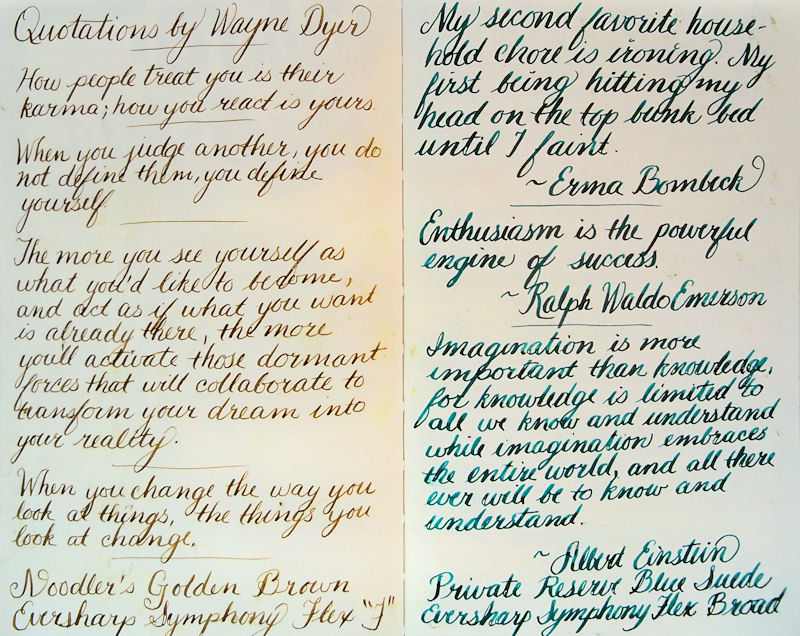
  • Noodler's Flex Pen
  • Eversharp Symphony Flex Pen Fine nib
  • Eversharp Symphony Flex Pen Broad nib
  • Pilot Plumix
  • Sheaffer 100 Fine nib
  • Kaweco Ice Extra Fine nib
  • Sheaffer VFM
  • Lamy Safari with Broad nib
  • Lamy Safari Medium Nib
  • Lamy Safari Extra Fine nib
  • Lamy Safari Fine nib 
  • Platinum Preppy 0.5 nib (medium)
  • Platinum Preppy 0.3 nib (fine)

And the following inks:
  • Noodler's Bulletproof Black
  • Caran d'Ache Grand Canyon
  • Noodler's Midnight Blue
  • Noodler's Tiananmen
  • Noodler's Kung Te-Cheng
  • Platinum Carbon Black
  • J. Herbin Poussiere de Lune
  • Noodler's La Reine Mauve
  • Aurora Black
  • Noodler's Passternak
  • Private Reserve Velvet Black
  • J. Herbin Cacao du Bresil
  • Noodler's Sequoia
  • Noodler's Purple Wampum
  • Private Reserve Chocolat mixed with Private Reserve Black Velvet ("Chocolat Velvet")
  • Noodler's Zhivago
  • Noodler's Black Swan in Australian Roses
  • Noodler's #41 Brown (old version)
  • Noodler's Lexington Gray
  • Noodler's Mata Haris Cordial
  • Noodler's Mandalay Maroon

I also washed a bit of each ink with a clean waterbrush to see if the ink would wash well or (if bulletproof) if it would stay put even with the light acrylic coating on the pages.

The paper held up so well to the complete wetting, drying, and flattening that not one pen skipped on the paper. The inks washed or didn't wash the same as they would or wouldn't on any other surface. So, pen and ink over a page prepared with diluted acrylic is definitely a winning combination on this paper. Once the page was done, I added the gold borders with the Krylon 18K pen. 'Just couldn't help myself!

The time had come to do some testing with watercolors over acrylic --- a dubious-sounding combination. To make it even more challenging, I decided to do the test on a page that was pretty heavily coated with glimmery Golden Fluid Iridescent Pearl. The acrylic was much less diluted than the previous pages I'd tested.

The apple on the upper left was painted with a waterbrush (the kind with the water in the barrel of the brush). The apple on the lower right was painted with a traditional brush, allowing me to get a higher concentration of paint on the brush. The paper was definitely sealed by the acrylic this time, so I struggled with color lifting when I'd go in to get more paint down. This made it a challenge to get dark values. On the other hand, lifting color when you wanted to was a walk in the park! The paper itself behaved perfectly. It handled all the layers of media flawlessly. Although I was disappointed in how the acrylic and watercolor interacted while I was painting, when I looked at it the next day, I loved the effect! You can't see it much in the photo, but because the prepared page is iridescent acrylic, and the watercolor is transparent, the glistening shows through the color and the apples sparkle in the light! It's so cool!

The next day, I put in a call to Golden Acrylics tech guru, Mike Townsend, to find out if there is a better way to get watercolor to take on an acrylic-coated surface. I'll tell y'all about our chat and show results from applying his suggestions tomorrow. Stay tuned! Click here to go to Part II.

Sunday

Rain, Rain


It was pouring rain on Tuesday night and Wednesday. Rainy days are the perfect times to pull out those little antique shop items, paint flowers, clean the studio, or make some progress on a large painting. Since I was waiting for company to arrive, the little antique shop items won out. I picked up these three charming, cobalt blue vases over the summer and have been looking forward to their sketchbook debut ever since! Although they are actually blue, I didn't happen to have a blue pen inked up at the time, so these were sketched with Noodler's Purple Wampum, one of my favorite washable inks. I used a waterbrush over the ink lines to create the washes.

This was done in a 6x9" Fabriano Venezia journal across the two page spread. I only have two pages left in this journal --- the first and the last. Finishing up those pages will close a pretty big chapter in my life, since I started this book on February 1, 2011. I left the first page blank to title it when I was done. It's time for me to start thinking of a title!

Saturday

The Wedding Day

My sister made these charming favors herself for her wedding guests. There was one at each place setting, with delicious chocolates and almonds inside. She let me bring home all the empty pots that guests left on the tables, so I can use them to hold paint and water in the studio! I really like having this memory of her special day, and every time I fill up a little pot with water, I think of her.

After the luncheon reception, my husband and I were able to go for a four mile walk on the beach and catch the sunset over the Gulf, before meeting up with everybody for a late dinner. There were tons of shells, and I collected an assortment to sketch in our hotel room. These are a few of the ones we picked up that day.

Friday

Traveling to Florida

My sister got married last weekend in Florida, so my husband and I flew down for the wedding. I didn't get much of a chance to sketch this trip, but managed a few pages. This one was on the way down, when I grabbed a few minutes while waiting for the bus to take us to the airport, and again in the waiting area before boarding the plane. We took off 20 minutes early, so that waiting period was a lot shorter than I thought it would be!

Tuesday

A Special Gift


This statue has waited a long time to make it into my sketchbook! I really enjoyed using a monochromatic approach. It seemed to suit the subject and my mood at the time!

Saturday

The Many Sides of Mr Lute


11x17" across a two page spread in a 8.5x11" Stillman & Birn Epsilon book
Noodler's Zhivago in a Lamy Safari B nib
Private Reserve Chocolat mixed 1:1 with Private Reserve Velvet Black in an 05 Platinum Preppy
Noodler's Wampum in an 05 Platinum Preppy
Cacao du Bresil in an 03 Platinum Preppy
Noodler's Midnight Blue in a 6mm Pilot Parallel

I found this porcelain lute player in a post holiday sale at Christmas Tree Shoppe one year. He makes an occasional appearance in my sketches and doodles. I thought several sketches of him on the page would present good drawing challenges and a unified theme. I jumped right in with ink, and a Niji Waterbrush was used to do the washes.

I love the blend of the Private Reserve Chocolat and Private Reserve Velvet Black. It tones down the red of the Chocolat washes just enough, and amplifies the value range. Furthermore, after sitting in a Preppy fountain pen for a few months without being used, it started up immediately when I turned it over to draw!