Monday

May Ink Drop

11x17" across a two page spread in a Stillman & Birn Epsilon Hardbound sketchbook
De Atramentis Rose
De Atramentis Hyacinth
De Atramentis Elderberry
Diamine Meadow
and Pilot Iroshizuku Murasaki-Shikibu inks
Assorted dip pens

At the beginning of every month, five vials of ink samples arrive in my mailbox via the Goulet Pen Company Ink Drop. I don't always have time to test drive all of them right away, but this month I pulled them out and played with a bunch of dip pens to see what the colors looked like and how they washed with a wet brush. Every color was a winner, and I found myself surprised by how much I enjoyed working with the scented inks like the Rose and Hyacinth.

None of these inks are "archival" in terms of being able to hang a sketch on a wall where it would be exposed to sunlight. But they should fare fine inside a sketchbook as long as it's not dipped in water!

Sunday

Spring Flowers from My Garden

11x17" across a two page spread of a Stillman & Birn Epsilon Hardbound book
Watercolor and Pitt Big Brush Pens

Sometimes it's easier to tackle a single rectangle than to take on an entire two page spread, so I really enjoy setting up grids for various series of things I want to paint when I'm short on time. You can click the image above for a larger view of the sketch.

Here's my setup below, as I finished up the final section. I have a piece of Coroplast (corrugated plastic that is nearly weightless) to which I velcro my palette and clip on my palette cups. It extends under part of the book, which weights it down so it won't fall over. That leaves me hands free.

Tuesday

Nomadic PE-07 Pencil Pouch Review --- Peek inside my sketch kit!


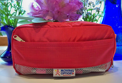
Finally, here is my review of the Nomadic PE-07 Pencil Pouch, otherwise known as my lightweight sketch kit! I'm going to give you a peek inside to share what's traveling with me everywhere these days. I bought a Nomadic Messenger Bag quite some time ago and I use it so much that I thought I couldn't go wrong with some more of their products. The pouch comes in lots of nice colors, and I love red. The small zippered compartment in the front is a very convenient place to keep items that I need to reach for first --- like a pen, pencil and eraser. I can do my initial sketch without having to even open up the bag. If I decide to paint or use brush pens, I then proceed to the larger, inside compartment.

Above is a photo of the pouch from the side, so you can see some of the nifty dividers, with supplies in there too. (The pouch looks orange in this photo, but only the inside is orange.) I like having that thin, center section with the zipper. It gives me a safe place to store my Escoda travel brushes, where they can't fall out even if the bag tips while open. I took out the pen, mini watercolor set, and waterbrush to do the sketch above out on location. Removing the rest of the contents, you can see how much I'm able to fit into this clever little bag in the image below:


Inside the pouch is stashed a mini set of gouache as well as the watercolor set, a vial that I filled with Dr. Martin's Bleedproof White, my beloved Kaweco Lilliput fountain pen, a few water brushes, three Escoda travel brushes, one travel squirrel mop brush, a small travel sable with protective sleeve, a grey Pentel Aquash brush pen, a Kuretake refillable brush pen, architect pencil, little mouth/gum scrubber to scrub out paint, Mini Mister to spritz my palette or sketch, small container of water (little yellow bottle), palette cup, two metal office binder clips to hold down sketchbook pages, UniBall Vision rollerball pen, and small piece of eraser. Whew, that was a mouthful! Typing it all out, it's hard to believe that it all fit easily into the pouch. I have since added a piece of sponge in there as well, to wipe my brushes as I paint.

This pouch is so so well designed and constructed. It has just enough compartments and dividers for me to separate items into categories, without having so many that they take up needed space or make it hard to find what I'm looking for. It weighs nothing, is small enough to stash in my purse, and super-convenient to toss it into my backpack if I'm going hiking or traveling and need an ultra-light art kit. This and a sketchbook, and I'm good to go anywhere. I've already taken it on many hikes and outings. Like all art bags and sketch kits, it will continue to change and evolve, so I'll be sure to show it again in a year or so. It will be interesting to see how the contents have changed in that time.

So, is there anything negative about this bag? Well, initially I wished it was a bit larger. However, I'm now glad that it's not. One thing I've learned about myself over time is that no matter how big a sketching bag is, I know how to fill it to the brim, and I'm going to do that! Therefore, the secret for me to traveling light is to have a small bag that can only accommodate so much. In my dreams, I have a large, light bag. It contains everything I ever wanted, and there is plenty of room left over. But in reality, my bags are always packed to the brim with way more stuff than I could ever use in a single outing. Clearly the supplies in the photo above are more than ample for a sketch outing. One day last weekend, I forced myself to cut the contents in half, and I didn't find myself missing a thing when I went to sketch! So now I can honestly say that the pouch is perfect for its intended purpose. I love it. And it's mine. And I'm not giving it up. So if you want your own, you'll just have to hustle on over to JetPens and get one for yourself.


Saturday

Waiting for My Car

6x18", across the two page spread of a Stillman & Birn prototype hardbound Beta sketchbook

I got a flat tire on my way home from delivering paintings to a show a couple of weeks ago! I was driving around looking for a good sketching location when I heard a strange noise and pulled over to the side of the road. Fortunately, at that point I was only five minutes from my husband's office, and what a guy! He came over and changed the tire for me. 

The next morning I took my car to the repair shop for a new tire and an oil change. They were so fast that I didn't even have time to finish my sketch. I didn't realize at the time that the bright red car on the left belonged to the guy who did the work on my car. He was happy to see it immortalized in my sketchbook! I told them if they had taken longer, I would have been able to finish my sketch. They replied that if they hadn't been so slow, I'd not have had time to sketch!

Friday

Sketching with Mary on a Rainy Day

6x18", Watercolor
Across a two page spread in a Stillman & Birn Beta hardbound 6x9" sketchbook (prototype)

It's not always easy to find a composition that will work across a two page spread in a landscape format book. My friend Mary had this long boat sculpture that helped ease my way across the spread! She came over to sketch on a rainy day in April. We set out spring flowers from our gardens and all sorts of odds and ends and had a blast. Bleeding Hearts and Bluebells were in abundance that day.

Thursday

Big News from Stillman and Birn

Two page spread from a Stillman & Birn Beta prototype hardbound sketchbook
Watercolor, 6x18" (across the spread)
Click image if you'd like to see it larger

My dream has come true. Stillman and Birn has announced on their Facebook page that they will be expanding their lineup and producing hardbound sketchbooks with their extra heavy weight 180lb Beta and Delta paper. I think I've been waiting for this moment from the first time I ever opened up a sketchbook. For a multimedia artist who loves stitchbound books that open flat, this is a major event and game-changer!

The two page spread above was done in a 6x9" landscape format prototype with Beta paper. I worked across the spread to get the 18". The pages lie so flat that you can barely see the seams, and the paper is so heavy weight that there is no ghosting from images on the other side of the page. It's fabulous!

The books will be produced in the 5.5x8.5", 8.5x11", and European A4 size portrait formats, and not in this landscape 6x9" format shown above. Nevertheless, it has been a thrill to have a sneak peek and to be able to work in one of these babies, and to finally be able to share the good news. This Dogwood Blossoms sketch that I posted a few days ago was also done in this book. I now have my paws on prototypes of the 5.5x8.5" and 8.5x11" sizes, and cannot wait for a chance to dive in!

Dogwood Blossoms

Image can be clicked for a larger version
6x18" on Stillman & Birn Beta paper
Watercolor

My favorite way to work in watercolor is to Just Do It. No pencil lines (or just a few for compositional guidance), no ink......Just straight in directly with a brush and pigment, getting as much down in a single pass as possible. There's something very unique about the way watercolor glows and jumps off the page when it's not fussed with. About six months ago, I ditched the non-transparent colors in my watercolor palette, and found that also made a huge difference in getting the paint and paper to give each other their very best.

That's not to say that I don't need to occasionally bail myself out with opaque lights like Cadmium Yellow or even Titanium White, or that I don't enjoy working with opaque color at times too --- especially on a toned surface. I do. But in restructuring my palette over the past six months, I decided to use gouache for that purpose. After all, if you need to go opaque, that's the way to do it. I took one of the Schmincke palettes that comes with two rows of half pans, removed the metal plate, and squeezed five (yes, five!) rows of half pans into it. Three of those rows were watercolor, and two were gouache. You may recall the post I did about that palette not too long ago. Here's my color chart from that set, as of last week:

It gave me a lot to choose from, but it proved to be heavy for hiking in the mountains. So last week, I pulled out my old palette, which is this one:


I discovered that by removing the metal plate and turning the half pans sideways, I could fit a fourth row into that smaller palette, and it's a lot lighter too. It was hard deciding which colors would stay and which would go, but this is the configuration I eventually ended up with:
 Yep, I'm down to one row of gouache, and kept three rows of transparent watercolor pigments. The dogwood blossoms sketch was one of my test drives for this new setup. So far, it seems to be working, and I'm happy with the lighter weight. Of course, when I need to travel super-light, I can always resort to the mini set I posted yesterday.

This is all a long-winded way of saying that as artists, our ideas continue to change, evolve, and come back around. It's all part of the fun of exploring our world of materials. What we work with depends on what we're painting, what we're painting on, how much time we have, what we're able to carry, and where we're going. And of course as watercolor painters well know, one can never have too many palettes! ;)

I know I promised a tour of my little red sketch kit for today, but I realized I need to take one more photo and do the image adjustment before I can write that post. It will come soon though!

Wednesday

Willow Tree in the Front Yard and Lilliput Review

11x17" across a two page spread in an 8.5x11" Stillman & Birn Epsilon hardbound sketchbook
Ink and Watercolor

I've been admiring the character these willow trees on our property, and looking forward to an opportunity to get out and sketch them. Yesterday after dinner, I was finally able to give into that temptation and scoot outside for 20 minutes or so. I set my stool in front of this massive willow tree and took out my beloved Kaweco Lilliput fountain pen, which is filled with Platinum Carbon Black ink. I love this pen. When closed, it is teeny tiny and perfect for my small sketching kit. The cap screws onto the back, so it posts firmly, and becomes long enough to sketch comfortably. If you click that link above, you can see lots of different views of the pen with a penny for size reference. Below is a photo of it next to my new (ultra-cool and more about this soon) Uni Gel pencil, so you can get an idea of the size compared with a mechanical pencil. I think this photo actually makes it appear larger than it is though.


I'm a big fan of Kaweco fountain pens and have quite an assortment. They are smooth, wet writers and highly reliable. The plastic-barrel Kaweco Sport pens can be converted to eyedropper pens, but since the ink can corrode metal, the Lilliput model cannot be converted. It has other benefits though, like its compact size, and the way it slips into my small sketch bag like a long silver bullet. It never leaks. It always starts right up. It writes like a dream and can keep up with my quick sketching without skips. For a little pen to slip into a pocket or small pouch, it simply can't be beat.

You can see in the photo above that the Lilliput pen, when posted with the cap, is certainly an adequate size for writing and sketching. It is thinner than a regular fountain pen, though that doesn't bother me.

After drawing for awhile, I decided to entertain my inner color junkie, and pulled out my mini watercolor set. That and a waterbrush were all I needed to complete the large, two-page spread. These three items --- Lilliput, waterbrush, and mini pan set, could have fit into a pocket. The little watercolor set can be found at Wet Paint. I pop out the kids' paints and substitute with my artist grade tube colors. For this sketch, I used Winsor Newton French Ultramarine, Aureolin, Brown Madder, and Daniel Smith Quinacridone Gold.

Tomorrow I'll take you on a tour of the little red bag in the photo. It is host to the contents of my current "small sketch kit". I can toss that pouch into any bag or backpack and I'm ready to go on a sketch outing.

Tuesday

Fawn's Leap Watercolor Sketch

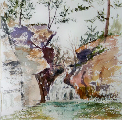
As if the hike up to Codfish point the day before wasn't thrilling enough for one weekend, the following morning, we finally made it to Fawn's Leap. This is one of the most painted and sketched waterfalls of the Hudson River School artists. It lies deep in a ravine along Kaaterskill Creek. The steep slopes on either side make access challenging. Then just for good measure, you have to pick your way across rocks in the rushing water to get to a point where you can see the whole waterfall. Fortunately for me, there was a downed tree trunk there, supported by a rock. That's where I sat, mid-stream, to do this little watercolor sketch. Even though the water levels are pretty low this spring, while I was painting with my legs dangling down from the suspended tree trunk, one of my boots got soaked when I wasn't paying attention. I was sure I was going to lose a few brushes in the process, but seemed to arrive back home with all my gear (and myself) intact!

Here's the full two-page spread (7.5x15") in my custom Arches sketchbook:

This location is to die for, and I am definitely going to have to figure out a way to go back with a large panel and acrylics or oils, though I have no idea how I'd set it all up there. Where there's a will......

Monday

Up on Plattekill Mountain

 7.5x15", watercolor on Arches Rough
Text is Noodler's Kung Te-Cheng ink in a Platinum Preppy fountain pen

Back in December, I placed an order with Small Oak Press for two custom sketchbooks --- one to be made out of Arches Bright White Rough 140 pound paper, and the other of Stonehenge white. They were my holiday gift to myself, and they arrived last week. I took the Arches book out hiking over the weekend. I expected it to be difficult to dive into the first page spread of an $80 sketchbook, but when the time came, I found it surprisingly easy to let it happen. Perhaps I felt I deserved to paint on great rag paper after hiking two and a half miles uphill!

We hiked up Plattekill Mountain to Codfish Point. There was a stone throne that somebody made in an old quarry up there, facing Hudson Valley views that span 60 miles of the Hudson River off in the distance. It was the perfect spot for a weary painter to take a break, have lunch, and enjoy the vista. I pulled out my watercolors while my husband went off to take some photos and explore down the trail for a few minutes.

Saturday

Outside My Window

This is another card I made for my mom a few weeks ago, but I never got around to adjusting and posting the photo. Sometimes when it's just too cold, as it was on this chilly morning in mid-March, I'd sketch something from my window. In this case, I selected a favorite tree and my awesome favorite TWSBI pen, filled with Noodler's La Reine Mauve ink. It's a great ink for sketching cards because it is totally waterproof. If the envelope happens to get wet on the way to its destination, the sketch will survive intact, and the writing inside the card too!

The card was made with Strathmore Aquarius II paper, and painted with diluted Golden Fluid Acrylics.

Friday

Another Card for Mom


I've been sketching quite a bit lately, but haven't had enough time at the computer to get all the images photographed and posted! Today is my Mom's birthday. A few days ago, I went out and picked daffodils, and painted them in gouache on a card I made for her with some Aquarius II paper. It's a tri-fold, primed with diluted acrylic paint and some sprayed iridescent paints.

If you haven't read the recent post by Robert Genn about the importance of sketches and small studies, it's a great read, as well as a reminder of the important role this kind of work plays in the creative process and artistic development.

Thursday

When you're short on sketch time, make a grid!

11x17", across a two page spread in a Stillman & Birn 8.5x11" hardbound sketchbook
Watercolor, Pitt Brush Pens, Fountain Pens, or whatever else I had next to me at the time!
You can click this image to enlarge it. 

It's that time of year when after a winter of being indoors and mostly sketching, I can get out and return to my life as a plein air painter! I have not stopped sketching by any means, but my more finished work is now being done in paint or on separate sheets of rag paper. (You can always check in to see those on my other blog.) 

I feel it's very important to continue sketching, and not give that up when the going gets tough. One of the things I do when time gets tight is I make a grid and sketch a series over time. I have several grids going at any given time on different themes. I try to select themes that hone specific skills. This one was started a few weeks ago as a means of practicing elipses and symmetry. Whenever I had a morning without having to immediately dash off somewhere, I sketched my coffee mug. I sketched the last mug this morning. These were all done directly in ink, so warts and all, I had to live with whatever came out of the pens. 

I'm really enjoying this larger sketchbook, and it certainly presents great opportunities for gridded series! I have a few portrait grids going (32 portrait boxes across a  two page spread!) and some other subjects too. Way fun. Great practice. Quick to do. No excuses!

Wednesday

Flowers for Mom

Watercolor on acrylic-primed Strathmore Aquarius II watercolor paper

I made some cards to send letters to my Mom, who is over 1,000 miles away from me. I cut about a half dozen cards from Aquarius II paper, and toned a few of them with some diluted acrylic traditional and iridescent paints. The surfaces have just a bit of shimmer to them. After I took this photo, I signed the image and put a border around the sketch. I forgot to take another photo of it when it was finished, and now it's already been sent off to her.

These flowers were from a family birthday party that my husband and I attended, so it was a perfect addition to the letter telling her about the event. It does take a lot of time to make cards for people, but what a nice way to be able to share our sketches!


Monday

Polar Bear Play and more zoo sketches

Pitt Big Brush Pens in a Stillman & Birn 6x8" Delta

Our sketch group was back at the Bronx Zoo on Thursday. It was a spectacularly warm day, so we spent much of the time finally being able to sketch comfortably outdoors. We weren't the only ones with the idea to visit the zoo on that beautiful day; that was the most crowded I've seen it all winter! We started out with the Polar Bear. I'd been wanting to sketch him for so long, and this seemed my best opportunity, since he was outside. He was engaged in his morning rest, but did keep moving and looking around --- not nearly as still as our figure models in life drawing! One thing about drawing animals is that you realize that even though you thought the poses in life drawing were way too short, at least the models don't move much once they assume their pose!

I went past the Polar Bear again later in the day on my way back to the car. He was swimming in his deep pool, diving, splashing, and playing with pool toys! Who knew that Polar Bears would play like that? He'd throw them up in the air and chase them under the water. It was very entertaining to watch.

From there we went over to Jungle World to see what was there. Even though we've gone several times this winter, we never went there. Well, that is the greatest place to sketch!!!


The gorgeous black panther was lying on a thick log in his exhibit, which gave me a chance to examine that huge paw that he left stretched downward over the limb. The Malayan Tapir was in the exhibit just across from him, and I'd never seen one of those before. They have fabulous shapes to sketch. There was so much in this exhibit to draw, but since it was indoors, I felt it would be best to save it for cold or rainy weather, and I ventured back outside.


The deer in this herd didn't stay still for long. Even the ones lying down shifted position frequently, plus they were far away and hard to see well. I tried to capture some gestures though, and study the way they move and are put together.. I'd brought binoculars with me, but found that they are really impractical. By the time you look through them, find your subject and focus, the subject has moved on.


I love sketching camels. Like giraffes, I find they have fascinating, expressive faces. I did a quick portrait sketch of this one, and was about to start another when we were asked by the zoo staff to move. They were trying to move one of the camels from the enclosure into a building, and didn't want anybody to become a victim of a recalcitrant camel, so I only have this one to show.

All in all, it was another great day at the zoo! When I get home, I look at my photos and always wish I'd taken more. I get so absorbed in my sketches that I forget to take photos.

Sunday

More Watercolors from Open Studio Life Drawing

11x17" across a two page spread in my altered book
Watercolor
 
In a session of short poses in life drawing, I find there is not enough time to draw and paint each pose. Some open studios have longer poses, but in our sessions, the longest pose is 20 minutes. If I plan to paint, my only option is to start throwing paint from the moment the model takes the pose, and hope for the best! There is no time to draw first, or correct, or fiddle much. I like doing them in montage formats like this, but every once in awhile I pull out a single sheet of nice paper and do a separate painting, like I did for the one at this link.

Thursday

Afternoon in the Figure Studio

11x17" across the spread in an altered book
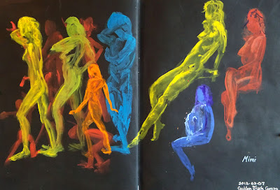
Golden Black Gesso
Winsor Newton, Holbein, and Schmincke Gouache

These poses were just 30 seconds to a few minutes each in an open studio life drawing session with a fabulous model. Since the poses are so short, I usually do them in some sort of a montage format. I had this page spread prepared in advance using Golden Black Gesso, and since I happened to have gouache and watercolor with me yesterday (thanks to my new palette setup), I thought it would be fun to play with different gouache colors on the black background. I loved the way it turned out, and my only regret was that I hadn't prepared more pages this way. I think I'm going to prepare some black supports with "glittery stuff" like I used for some of my aquarium sketches, and bring them to life drawing next week. Way fun!

(Sorry about the glare on the right page; I just couldn't seem to get an image without glare on one side or the other.)

Sunday

Review of the Hero 86 Fountain Pen and some Vulture Sketches

Iroshizuku Yama-Guri ink in a Hero 86 "Fude" nib fountain pen


I'd been hearing about these "fude nib" fountain pens for quite some time. The nib is bent upward so that by writing with it at different angles, you can vary the width of the line. I tried to get photos, but my camera just isn't good enough to capture the details on the nib. In searching online for a link so that you could see some images, I came across this review of the same pen, which has excellent photos to accompany it, so you can check it out there.

A friend tipped me off to a seller who had them on Ebay for $5, so I figured for that price I couldn't go wrong. (That seller is now sold out, but they are available through http://isellpens.com .) I did my usual soapy water -- clean water flush and dry, and inked it up the next evening with Iroshizuku Yama-Guri ink, which is a nicely-flowing ink in the brown family. Using the end of the nib, I was able to get an extremely fine, yet still wet line. It was a great pen/ink combination for quick, thin-lined wirey gesture sketches of this vulture. I did them from photos I'd taken that day at the Bronx Zoo, since I didn't have enough time to sketch them on location. In addition to that wonderful fast, juicy, thin line, I was able to then lay the broader area of the tip down to get in my dark shaded areas and accents. In fact, I loved the pen so much that I buzzed through five pages of sketches and then went right to my computer to order the only three that the Ebay seller had left.

The pen is rather heavy, and you may or may not like that "rocket ship" look! It does come with a converter, so it's very easy to fill. I've also been told that the nib for this pen will fit on a standard Noodler's Flex Pen or a TWSBI! Although I do have both of those, I haven't yet tried it. So if you don't like the pen body, there are other options, and it might be worth it for the nib.

If you like to sketch with fountain pens, this is definitely one that you'll want to check out. Sailor also makes these types of fude nib fountain pens at reasonable prices. I've been playing with a couple of the Sailors over the past day or so too. I'm certainly becoming a fan of this type of nib.

Friday

Watercolor and Gouache are cohabitating in my palette!

Lexington Gray ink in a Lamy Safari fountain pen
Watercolor and Gouache
Stillman & Birn Epsilon 8.5x11" hardbound sketchbook

I finally found a way to set up my palette to fit watercolor and gouache together. I test drove it the other day and it worked fabulously well. A number of people have been asking me about this palette and how I did the reconfiguration, so here goes.....

I bought this palette online from Wet Paint Art Supply  in Minnesota. Apparently they are only made by special order, so Wet Paint ordered a bunch. Their customers liked them so much that they sold out almost immediately and ordered a lot more! The palette only comes with 12 colors (in two rows of six), with room for a third row of your own half pans and colors, for a total of 18. So, how did I transform this into something that will hold 32 half pans and one whole pan?

There is a metal plate with holders for the pans. It weighs a ton. I took that out. I fiddled with half pans in the empty space to see how many I could fit, and what the best configuration would be. I discovered that four rows of seven colors each would fit with the pans placed vertically,  but that I could squeeze in a fifth row if I had the pans run horizontally. In that last row, because of the curves on the corners of the palette, only five would fit. But I could fit a whole pan vertically in place of one of the half pans --- there was enough space to accommodate that. I am always needing extra white gouache when I'm painting with gouache, so I decided I'd keep my white in that one.

I took out a roll of adhesive magnetic strip. It comes rolled up like a roll of tape. I bought mine a long time ago and I don't remember what brand it was, but it looks something like this. I bought it in a craft store. I cut five strips that fit across the width of the palette. Since they were curled from being in the roll, I heated them with a hair dryer, which softened them a bit, and pressed them under a few very heavy coffee table books overnight. The next day, they were flat. With the adhesive side up (bare magnetic side down), I placed them in the palette, approximating where they would go.

I'd already decided which colors would go where the night before. I filled the pans that weren't already loaded, and wrote the names of the colors on each pan with a black fine point Sharpie. Starting with the top row, I peeled the paper strip off the magnet, revealing the adhesive, and stuck each pan down onto the adhesive strip, working across the row. I put in three rows of watercolor pigments (21 colors), then the 12 pans of gouache.

One thing about working watercolor and gouache together is that the opacity of the gouache, plus the chalkiness of white paint, can get into your transparent watercolor and destroy all that beautiful luminosity. This is why I always kept them in separate palettes. Since this metal palette has two sides, it keeps them separated easily. I'm used to having just two mixing areas for watercolor --- one for warm colors and one for cool. So the two sides of the top mixing area provide the wells I need. However, for gouache I need more areas, since I have to be able to mix value as well as color. All those little wells in the lower area are perfect for my gouache!

I was also able to eliminate the opaque watercolors from my palette. Usually I have cadmium red, a couple of cadmium yellows, cadmium orange, chromium oxide green, and a couple of other opaque watercolors in my watercolor palette. Now I can just substitute gouache when I need those, and keep all my watercolors transparent. That gives me an even larger color range than I had before.

I made the chart above so that I could keep track of what colors were in which pans, until I get to know my own system better. I also knew that initially, I'd be making some changes; that's why I numbered the pans on my sketch, instead of writing in color names. When I change a color, I can just change the name on the numbered list of pigments. I've already swapped out a few and shifted some around.

I've been looking for a way to do this for several years, but never found quite the right thing. This works for me at last!

Wednesday

Bronx Zoo Trip

You can click this image for a larger view
Pitt Big Brush Pens (Raw Sienna and Nougat) and Pilot Petit1 fountain pen with Private Reserve Copper Burst ink
Page backgrounds and borders prepared in advance with diluted acrylics
Stillman & Birn 6x8" Delta wirebound sketchbook

I made another rather quick trip to the Bronx Zoo yesterday to get in some animal gesture practice and quick sketches. The giraffes are so much easier to sketch in their winter habitat. They are closer and don't move around as much as they do out in the big field, so I'm able to do some studies of things like hooves that are hard to even see without binoculars when they're outside. The pages above were done after several pages of quick studies (a couple of those shown below ---  also clickable to enlarge).
The giraffe all the way on the right must be very old, and had deep skin wrinkles. I loved sketching him.

Cramming animals as tall as giraffes into a 6x8" sketchbook was a challenge, but it sure is convenient to travel with such a small book. Since this is a wirebound book, working across the spread wasn't an option either, but it was nice to have this great super-heavyweight Delta paper, which is not available in a hardbound book.

After spending most of our time with the giraffes, we didn't have much time left. We went to the gorilla house, but couldn't find the gorillas. We did find these cute Wolf's Monkeys (below) in a beautifully laid out exhibit. They moved so fluidly....and constantly! Even getting gesture sketches was a real challenge. I wanted to test drive my new watercolor/gouache setup, so I pulled that out and added some color, then went on to World of Birds and did the same with the Great Blue Turacos, working more directly with color on them.

I love the way my new setup for watercolor and gouache worked out, so tomorrow I'll post about how I reconfigured my palette and show an image.

Tuesday

Sketches from Tilly Foster Farm

Antique water pump and wooden bucket:
11x8.5", Wolff's Carbon Pencil and wash in a Stillman & Birn Epsilon hardbound sketchbook

I went sketching at Tilly Foster Farm a couple of days ago and stumbled upon a little museum there of antique farm equipment! It was a real gold mine for sketching opportunities! This old warped bucket and water pump caught my eye.

I also did some quick little gesture sketches of the chickens with my Pitt Brush Pens as they scuttled around their pen. Great fun! They sure do move around a lot. Now I know where the term "chicken scratch" came from.

Chicken Scratch with Pitt Brush Pens, 8.5x5.5":

Sunday

More Sun Conures

Image can be clicked for a larger, clearer view
Golden Black Gesso
Diluted Golden Interference Acrylics
Winsor Newton, Holbein, and Schmincke Gouache
Sakura Gelly Roll Pen
Stillman & Birn Epsilon 5.5x8.5" hardbound sketchbook

I was back sketching at the Animal Kingdom store again last week. As usual, I was first drawn to my avian buddies in the rain forest room. Sammie and the Cruisers were yacking up a storm, and clearly didn't like it when I paid attention to Duke, the Blue and Gold Macaw. So, I let them once again be the focus of my morning. The only full page spreads I have left in this journal are prepped with Golden Black Gesso and Interference Acrylics. I thought it would make for a good nighttime visit with the brilliance of the coloring of the conures, hence my title "Midnight with Sammie and the Cruisers," even though it wasn't midnight. I was thinking of using the other black and iridescent page spreads for some of the salt water fish that have those beautiful flourescent colors, but most of the big colorful ones were sold! I imagine they'll have some new ones before our next visit.

We only stayed for a little while because the weather was so gorgeous that we decided to go sketch at a farm after lunch. I still need to get the farm sketches photographed, so I'll share those soon.

Saturday

Sketching from Norrie Point on the Hudson River

11x17" across a two page spread in a Stillman & Birn Epsilon hardbound book
Pitt Big Brush Pens
Image can be clicked for a larger, sharper view

I spent a long and productive day along the Hudson River on Tuesday, at the New York State Department of Environmental Conservation site on Norrie Point in Staatsburg, New York. I did a couple of paintings first, and sat down to sketch at the end of the day. This cute little boat was docked right outside, so it became the most convenient subject after a day of painting atmosphere and nature. Boats are trickier than they look, so that makes them great practice subjects when sketching on the river.

I'm still really liking these Pitt Big Brush Pens, and the way they handle on this Epsilon paper by Stillman and Birn. I'd like to find a similar, lightfast type of brush pen/marker that has washable properties too, so I could take a waterbrush to it even after it's dry. Suggestions welcomed! (Must be lightfast!)

Thursday

Not Dry Media and Ink

Krylon 18K Gold Leafing Pen
on the cover of my Stillman & Birn 5.5x8.5" Epsilon hardbound book

Initially, I'd planned this to be my book for dry media and ink. That's what the Epsilon book is designed for. But it wasn't long before I saw that this paper has capabilities that go way beyond dry media and ink. I am nearly done with this volume now, so it was time to do something with the cover. I couldn't think of a more fitting title!

Wednesday

That's Life

Golden Black Gesso
Iridescent and Interference Acrylics
Krylon Gold Leafing Pen
Stillman & Birn 5.5x8.5" hardbound sketchbook

Just doodling, gold on black.

Tuesday

Noodlers Eternal Inks Preliminary Lightfastness Results

Many thanks to all of you for waiting so patiently for these preliminary results! For those who don't know what I'm talking about , you can click here to read about these lightfastness tests of the Noodler's Eternal Inks, and see how I set up the tests.

Last week, I was a guest on the Goulet Pen Company's webcast show, "Write Time at 9!" During that broadcast, I did a verbal reveal of changes to the samples. If you were unable to tune in at that time, you can watch the recorded broadcast below. I come on at about the 10:00 minute mark.


The right sides of the samples posted below were in my south-facing studio window for just six weeks, in the northeastern United States. It's the heart of winter here, when the sun is at its weakest. They got a few hours of direct sunlight a day through a screen and glass. I will be putting the samples back into a window tomorrow, and I'll do another reveal in six months to show the differences.

The tests are pretty self-explanatory. You can click any image below to see an enlargement. In the broadcast, I verbally described the changes to some of the inks, and you can click that link above if you'd like to hear more of my summary. Here on this post, I'll just list them for now in three categories:
  1. Inks that didn't change
  2. Inks that changed the most
  3. Inks that changed a little
The inks that had no visible changes so far are:
  • Black
  • Blackerase/Waterase
  • Heart of Darkness
  • Polar Black
  • X Feather
  • Lexington Gray
  • Bad Blue Heron
  • Luxury Blue
  • Polar Blue
  • Polar Green
  • Kung Te-Cheng
  • La Reine Mauve
  • #41 Brown (2012 version)
  • Polar Brown
Inks that changed the most during this time frame are:
  • Periwinkle
  • Hunter Green
  • Dostoyevsky
  • Year of the Golden Pig
  • Empire
  • Fox
  • Rachmaninoff
  • Tchaikovsky
  • Pasternak
  • Whaleman's Sepia

Inks that showed a slight change during the six weeks are:
  • El Lawrence
  • Bad Belted Kingfisher
  • Bad Green Gator
  • Socrates
  • Mata Hari's Cordial
  • Bad Black Moccasin

There are two other inks that I did not discuss in the broadcast: Whiteness of the Whale, and Blue Ghost. I did test these, but I believe I need to look at them under a blacklight, and I have not yet done that. I'll report on those when I do my follow-up on these Noodler's Eternal inks, in another six months.

So without further delay, here are the images of the samples. The right half of each page was taken down from the window, taped on the back to the half in the book, and photographed. Those artists who are interested in knowing which inks wash and the color of the wash will be able to see that in the samples. That washed area is generally where changes first appear, since there is a thinner application of the ink there.


I hope many of you have found this information useful. It's been interesting for me to see how some of my personal favorites have fared! I'll be testing another 40-50 inks very soon. Stay tuned for a list within the next couple of weeks to see if any of your favorites are among them. After they've been in the window for a month or so, I'll do a post of preliminary results like this one, followed by six month results down the road.

Monday

Black Locust Tree with Pitt Big Brush Pens

Pitt Big Brush Pens
Stillman & Birn Epsilon 5.5x8.5" hardbound sketchbook
Blue background prepared in advance with diluted acrylics

This was sketched at my friend Melissa's house. She has a back yard filled with bird feeders and beautiful trees to sketch from the windows. This Black Locust tree had interesting shapes and bark. I used my Pitt Big Brush Pens over a toned surface. I really liked the warm colors on the blue paper. I thought it would blend with the pens and make the warm grays more neutral, but actually it made them seem even warmer by comparison with the cool color of the background.

Sunday

Sketching at Melissa's House

Private Reserve Chocolat and Private Reserve Velvet Black Inks, mixed about 3:1 
in a Platinum Preppy fountain pen, and washed with a waterbrush.
A little watercolor
Stillman & Birn Epsilon 5.5x8.5" hardbound sketchbook

My friend Melissa invited a group of us over to her house to sketch on Friday. I was delighted to see that unlike mine, her amaryllis actually had a flower stalk on it --- with a bud! I knew I had to sketch that.

Since I recently found those deer jawbones to sketch, I also had to draw this deer skull that Melissa had, which seemed to be the remainder of the head!