Tuesday

Review of the Nomadic Wise-Walker Messenger Bag


I have been dreaming of getting this Nomadic messenger bag for sketching materials ever since I saw it on the internet. The messenger bag I'd been using for sketching supplies was a bit larger than what I needed, and had a couple of serious drawbacks that the Nomadic bag addressed. My husband got it for me as a Mother's Day gift, and it is just perfect for my needs! I unpacked my old bag last night and loaded up the new one.


Here's the front of the bag. I selected the blue color, and it's a nice dark, neutral navy. It has a zippered pocket right on the front where you can keep identification, money, or anything you might need to get to quickly without having to open up the whole bag. As you can see, it easily stands upright, which is an important factor for me, since I keep lots of fountain pens inside it.


One thing this bag has that my other lacked is this wide, long shoulder pad. Since the strap adjusts from both sides, I finally have a bag that allows me to shorten the strap enough while keeping the shoulder pad centered. This is an excellent feature that more bags and straps should employ.


On each side, there is a mesh compartment for a water bottle. This particular bottle is oversized at 20 oz, yet still fits in there. A regular 16 oz. bottle would fit better. Not having to carry the water inside the bag is a great feature. It makes it much easier to take a sip while walking without having to open up the bag, or to pour extra water into a palette cup for painting. My old bag didn't have these water holders on the sides.

The bag is divided into two main sides. I set up one for sketching materials, and one for painting. Usually I do one and then the other, so it helps to have my materials organized this way. Here's a peek at the sketching side:


As you can see, there's room straight across the bag for loads of pens, pencils, waterbrushes and markers. A pocket in the front of that compartment can hold my sketchbook. There is another large pocket behind the pens that runs the length of the bag. I keep some tissues, erasers, a ruler, viewfinder, and other sketching supplies in there.


One really neat feature is these mesh pockets because they are translucent. I label all my pens so I can tell what ink is in which pen. I used to have to remove them from the pockets of my old messenger bag to read the labels and find the pen I needed, but now I can store them with the labels facing outward, and I can see what every color is! This is a huge advantage for me and a timesaver.

Turning the bag around and lifting the big flap, you can see into the main compartment of the bag:


If you carry a 9x12" spiral sketchbook, this is where you'll probably be keeping it, and it will fit easily. In front of that large, open area there is a zippered compartment where I keep my watercolor sets:


There are also pockets in front for brushes, waterbrushes, pens, and other supplies. You wouldn't believe how much this side of the bag can hold, even though the bag is not that large. I emptied out this  side to show you (below).


  • Viewfinder
  • Sunglasses
  • Reading glasses
  • Extra clips
  • Palette cup
  • Lots of waterbrushes and travel brushes
  • Correction fluid
  • Two watercolor sets
  • Hand wipes
  • Small sketchbook
  • Insect repellent
  • Sponges
  • Date stamp
  • Masking tape
  • 7x10 watercolor block
  • Drawing board
  • Tissues
  • Paper towels
  • Viewfinder
  • Small water bottle
  • Garbage bag
There's actually plenty of room left for my camera, binoculars, and sun visor. I don't necessarily carry this much when I go out sketching, but it's nice to know that it will all fit when I go off on a trip; then I can leave whatever I won't be needing in the car, or wherever I'm staying if I'm traveling. There are a few more compartments in this bag that I haven't detailed in this post because I'm not even using them yet! I'm sure that as I get out there and start painting and sketching with it, I'll reorganize it a bit and shift some of these items into those other pockets.

If you think you'd like a Nomadic Wise-Walker too, you can find them at Jetpens in black, blue or gray. You can see lots more photos of the bag there as well.

Monday

Sketching Karen's Waterfalls


I've been painting and sketching the waterfalls on my own property lately, so when my friend Karen invited me to come and paint hers for a change, I jumped at the opportunity. My friend Gretchen came along too, and the three of us set up to paint beside this waterfall.

There's a reason why our town was nicknamed The Land of Falling Waters by the Indians. There's nowhere you can go in that town and not hear the sound of rushing water from a nearby waterfall, especially in spring. Much of the water that comes down from the Catskill Mountains passes through our town of rocky ledges, spilling over into waterfalls on its journey to the Hudson River.

As I often do when checking out a new location, I just packed some sketching materials. I didn't know how far we'd have to trek to the falls, or what spots would yield the most interesting compositions, or if there would be somewhere to set up an easel. I brought some ink pens and watercolors, and my Fabriano Venezia Journal that I'm working through. After doing the sketch above mostly in watercolor, I moved further upstream to take on a larger waterfall.


I did the one above with Private Reserve Black Velvet ink, then worked my lights and darks with a waterbrush, taking the wash color from the washable ink lines. After that, I added some watercolor.

I moved back near where I'd done the first sketch, and this time did a composition that included more of the foreground, with the waterfall peeking through between the trees below me.

I think I like this last composition best. I'd like to return to do an oil painting, as well as additional sketches of other waterfalls on the property.

Tuesday

Five Minute Portraits on a Prepared Background


You can click the image above to enlarge it.

Well, I have to say, this was really fun! I prepared a background using diluted Golden Fluid Acrylics. I wasn't sure how a fountain pen would respond to the prepared surface, but it worked quite well! In fact, the pen skipped less over the surface than it did before, and it washed with the waterbrush just fine. This is Noodler's Sequoia ink, sketched with a Platinum Preppy pen. I'm still setting the timer for five minutes.....

Saturday

Scrambled Easter Eggs --- Mixing Inks


The Goulet Pen Company has an "Ink Drop" program where they send you five fountain pen ink samples at the beginning of each month. It's a lot of fun to experiment with the inks that seem to magically appear in my mailbox every four weeks or so. In April they sent out five unnamed vials of samples as an "Easter Egg Hunt", and we were supposed to try to guess what the inks were. Great fun.

Yesterday I was looking at these five samples and it occurred to me that they might provide an nice muted, dark color that would wash easily when mixed together. So, I put one eyedropper full of each color into a vial, shook it up, and loaded up my Lamy Safari fountain pen with the resulting mixture. To test drive the result, I used photo references from the Weekend Drawing Event on the Wetcanvas website, and gave myself just a couple of minutes for each sketch, to explore the properties of the ink.

I was really surprised and pleased by how much the colors separated with the waterbrush wash after I'd done the initial drawing. The initial color was a beautiful navy blue, but it washed into shades of blue, blue-green, and violet. If you click the drawing above and take a closer look, I think you'll be able to see it. I love it when these unexpected things happen! I'll definitely be using this mixture some more. I think it might work beautifully for some architectural drawings.

Wednesday

Sketchcrawl in Hudson NY


Click any image to enlarge.

Today I went sketching in Hudson, New York with artist friends Janice Filkins and Gretchen Kelly. The City of Hudson is an old Hudson River town with fabulous architecture. It's filled with restaurants, antique shops, galleries, and small stores. You could stand just about anywhere and find something to sketch or paint!

We started out at the Hudson Opera House. I brought my Stillman & Birn Beta Series sketchbook that I reviewed yesterday, along with ink pens and watercolors. The sketch above is the Hudson Opera House, done from across the street with Private Reserve Chocolat ink and a waterbrush.


From there, we walked a couple of blocks to the exquisite Hudson Courthouse. This was done with Private Reserve Velvet Black and a waterbrush. The foliage was just starting to bud and there were flowering trees all over the town.


From the walkway to the courthouse, you can turn in any direction and find a charming scene to sketch. I could have stayed right there all day! I turned to the left and painted this row of colorful buildings. After two monochrome sketches, I desperately needed a color fix, so after drawing with ink and brushing out some values, I broke out my Koi watercolor kit to add splashes of color.

I am loving this Beta sketchbook! I've always been partial to stitch-bound/hardcover books, but I'm finding different advantages to working in a spiral.

Tuesday

Stillman & Birn Beta Series Sketchbook Review


Above is a waterfall sketch that I did last night while test driving the Stillman & Birn Beta Series sketchbook. There are five different paper types in the S&B sketchbook lineup. I've been working with all of them, and as I accumulate enough knowledge about their performance, I'll post reviews here. Hopefully I'll be reviewing all five within the next few weeks.

Features of the Beta series are a heavy, bright white paper with some texture and excellent sizing. Although it is called "rough surface", I don't find it to be rough at all compared with the rough watercolor papers I've used. It weighs in at 180lb --- 270gsm. As you can see from the color brilliance in the sketch above, this paper really allows the color to sit up on top and show itself well. There is no show-through from one page to the next, and the paper doesn't buckle with my watercolor work.

I use fountain pens with various inks and waterbrushes in my sketchbooks too, so I put this book through its paces with my pens too.

Using a hard touch with the fountain pens sometimes resulted in the tip catching in the paper fibers, but with a light touch it was not at all a problem. You can see that the writing is not skipping, and the inks sit on top of the paper enough to wash beautifully with a waterbrush. The little watercolor test revealed the same brilliant color results  as on the sketch.


If you've lamented over the fact that watercolor sketchbooks are often only available in landscape format, you can now celebrate! These babies are available in 6x8, 7x10, and 9x12 portrait formats, plus a 7x7" square! For those who prefer stitch-bound books, that will be your only disappointment, as these are only available spiral bound. I'm one of those folks who definitely prefers a stitch-bound book, but this spiral series will end up converting me when I need the heavier paper.

Here's a link to a series of posts done using this sketchbook.

These sketchbooks are available at Utrecht Art Supplies and Wet Paint Art Supplies.

Saturday

Rondo's Loyal, Royal Subjects --- International Fake Journal Month

Rondo's International Fake Journal, continued. Click image to enlarge. If you'd like to see the rest of Rondo's journal, click the "International Fake Journal" category in the left sidebar.

This entry was sketched first with a fountain pen filled with J. Herbin's Gris Nuage. You can see some of the remaining lines. They look just like light pencil. I love that ink! It's subtle and doesn't overpower the watercolor.

Thursday

A Peek Inside My Sketching Bag

You can click on any images in this post to enlarge them.

Everybody always wants to know what's in my sketching bag, so I thought I'd take a post and open up the bag to show what materials go with me lately. This bag came with my Plein Air Pro easel. It's actually way too small for that. Although it just barely holds the easel, it cannot fit any of the supplies you need to go along with an easel --- like paint and water and mosquito repellent! Meanwhile, my sketching supplies were in need of a larger bag, so it was re-purposed to accommodate them, and the easel moved into a roomy backpack. This messenger-style bag fit the bill perfectly, with numerous pockets, a nice carry strap, and it's super lightweight.

 From the side, you can see that it has a zipper to expand/contract the entire back compartment. This is so convenient for when I want to lighten my load. I just remove a bunch of stuff and zip that up for a smaller bag, and I'm good to go anywhere.


With the front flap up, you can see all those great pockets for pens, pencils and brushes. The left hand pocket holds all my fountain pens. I've been experimenting with lots of different inks lately.
I spread out all the pens in this pocket to show you how I've been keeping track of what ink is in what pen while I'm test driving so many inks. My husband has a little label maker that's come in really handy, so I always know what I'm working with.
Most of these are Platinum Preppy fountain pens with a 05 nib. Some have been converted to eyedropper pens (as I explained on a previous post), others I'm refilling cartridges with, and I also use a couple with converters. They're very fast to write with and can easily keep up with my quick sketching. The three colored pens up front are Lamy Safari pens. I like that I can easily switch out nibs on these from extra fine to broad, and they write very smoothly.

 A separate pocket holds some mini misters for my watercolors, my beautiful Escoda sable travel brushes and a travel squirrel mop, a little brush thing for scrubbing from the pharmacy, and a correction pen. I see here that one of my Escoda brushes is missing. I probably put it in the wrong pocket and it will turn up somewhere....


The next couple of pockets hold my wonderful Kuretake brush pen, pencils, calligraphy pens, Uniballs, waterbrushes.....and OH! There's the missing Escoda travel brush, off cavorting with the calligraphy pens. :)

The middle section of the messenger bag is where I keep my sketchbooks and a foamcore board and clips. With a stitch-bound, hardcover sketchbook, I keep it open fully by placing the foamcore behind the open sketchbook, and clipping each side to the foamcore. There is no added weight to carry, and it's been a perfect solution to the deep gutter problem.

Now for that BIG back compartment....Let's take all that stuff out of there.

Inside you'll find:
  • sun visor
  • sun block
  • bug repellent
  • extra pair of sunglasses
  • inexpensive reading glasses
  • a couple of small watercolor sets
  • date stamp and ink pad that I always stamp my sketches with
  • pack of Pitt brush pens
  • masking tape
  • white-out
  • small bottle of water
  • pack of tissues (or cut up paper towel sheets clipped together, or both)
  • palette cup that clips onto the watercolor set
  • extra clips which are always needed for something
  • masking tape
  • white gouache
  • sponge
  • plastic ruler
  • small plastic container with kneaded eraser inside. 


This is what the little black watercolor set in the photo looks like when it's opened up. The middle row is supposed to hold a travel brush, but I put extra half pans in there so I can carry more colors. This is my favorite set for sketching. When I use a waterbrush, I don't need to clip on the little palette cup. I set a piece of sponge into a full pan to clean the waterbrush as I go. I can just wring it out when it gets soaked. If I need a larger one, I use one of the clips to attache the extra sponge to the kit.

To the items shown above, I might add:
  • A bottle of drinking water
  • Car/house keys
  • Cellphone
  • Wallet
  • Camera
  • Binoculars (depending on where I'm going to sketch)
  • Snack/Sandwich if I'll be out all day
  • Pack stool with shoulder strap

Materials lists of course change over time. Sometimes I empty a lot of it and go with gouache, or colored pencils, or even acrylics to work with in my sketchbooks. Part of the joy of working in sketchbooks is multi-media experimentation.

I hope you enjoyed this browse through my sketching bag.

Monday

Rondo Goes to the Catskills


Here's Rondo at one of his favorite spots. We call this one "Mossy Falls" due to the abundance of beautifully colored moss that covers the rocks. There's a smaller waterfall that he likes to play in, but with all the rain we had over the weekend, there was way too much forceful water rushing over the rocks to let him do that. I was afraid he'd get swept away!

Winsor Newton and Holbein watercolors. Platinum Preppy pen with Whaleman's Sepia ink. (Lettering with a Pilot Parallel.)

Rondo is not a model

Rondo sleeps for long periods of time without batting an eyelash, but he hates to model for me. Dogs must have a sixth sense about knowing when somebody is staring at them. No sooner do I lift a pen than he gets up and changes position. The best I can get from life are quick gesture sketches. They were done on graph paper and glued into my journal.
These were done with Private Reserve Velvet Black ink in a Platinum Preppy pen, washed with a watercolor brush just a bit in shadow areas, then Koi watercolors surrounded the sketches.

Wednesday

Roz Waves to Rondo


Rondo's adventures continue during International Fake Journal Month. You can see the series by clicking here. The posts will appear in reverse order, from the most recent down to the first of the series. The explanation about IFJM appears in the bottom post.

Sunday

The Treat Cabinet


When Rondo wants a snack, he tap dances on the laminate floor in the kitchen, next to the cabinet where we keep his treat. On rare occasions, we've forgotten to close that cabinet door, and he's helped himself to an entire bag of doggie junk food!

This sketch was done with Iroshizuku Yama-guri ink, in a Lamy Safari fountain pen with an "M" nib, and washed with a waterbrush.

Lightfastness Results

Note: Too see all of my lightfastness tests to date, click here.

You may recall that I started a series of Lightfastness Tests back in early March. Samples were taped to the windows in my southern exposure studio on March 10. It is now exactly one month later, and I took them down and photographed the results of one month's exposure through double pane window glass. Given that it's taken even the most fugitive oil paints six months to show signs of change when I've tested oil paints, I was quite suprised that after only 30 days, nearly all of these ink samples had faded or shifted (some more than others). Below are some larger images of the test results. You can click on these to see them even bigger:


You can click all of the images here to get large views of the samples and form your own opinions. The biggest surprise for me was the Baystate Blue. Out of the 13 inks I tested in this round, I consider that and the Diamine Red Dragon to be the Biggest Losers. After checking at the two week mark, I figured the Baystate Blue would just lose the intensity of the color, but even the more muted blue left behind is starting to fade. The Kung Te-Cheng was the clear winner in the Lightfastness category.


Some of the inks are presenting only the slightest shift in color at this point, or slight fading. Inks that I feel are holding up pretty well include:
Noodler's Kung Te-Cheng (the winner!)
J. Herbin Rouge Hematite (huge surprise that it's holding up this well, but it is lightening slightly)
Noodler's Nightshade (turning a bit more red)
Noodler's Sequoia (graying slightly)
Noodler's Navy (fading just a hair)

Some colors are exhibiting strong shifts in color, or fading in only certain components of their mix.
Noodler's Kiowa Pecan is losing the red coponent and becoming more yellow
Noodler's Walnut is also losing red and becoming more yellowish brown
Noodler's Whaleman's Sepia is losing the bluer elements, and the ink is shifting to red/pink.
Private Reserve Avocado is fading
Private Reserve Velvet Black is shifting color
Private Reserve Chocolat is losing a little intensity

Enlarge the images above and form your own conclusions. I'll probably photograph them again at the three month mark. If you'd like to see what this looked like before I put it in the window, here is a link to my previous post.

I have about 20--25 more ink samples to put up in the window today, so stay tuned for results on different inks in another month.

Friday

Adding Color to Monochrome Work

(Click image if you'd like to see it larger.)

For many reasons, I decided to add watercolor to my monochrome sketch of this scene. You can see my previous post at this link, with the monochrome image. I broke up the background too much for a monochrome piece, and it became jumbled. The dog, signs, and bright red fire hydrant biscuit jar, didn't stand out and form the triangular composition that I had intended. With the color added, I think the composition falls more into place. The background is unified, and the sketch has better balance and cohesion.

Wednesday

Showing Off


This was sketched with Quink Black ink, a Pilot Parallel calligraphy fountain pen on its side, and a waterbrush to do the washes. This paper is a little rough for a steel calligraphy nib, so I did the writing on the top of the page with a marker. You can click the image to enlarge it, if you'd like a closer look.

The Quink ink washes into a subtle blue-gray and the tiniest hint of raw sienna color. It's quite nice.

Monday

Rondo Goes to the Spa plus Reviews of Private Reserve Chocolat ink and Platinum Preppy Fountain Pen


This sketch was done with Private Reserve Chocolat. Initially, I wasn't so crazy about this ink because so much red appeared in the wash areas. However, as I used it more, I was able to control it better, and keep the ink more to the brown tones by putting down a lot of ink and not overbrushing. Now I love this ink! It's got a deep, rich, chocolate brown color that allows for plenty of value changes. Also, in spots where there was a lot of water but not much brush action, you can see it separate into red and green. If you look at the area above the flag, you can see that happening. (You might have to click the image to enlarge it in order to see the effect.) How cool is that?!

I used a Platinum Preppy fountain pen with a .05 nib for this one. I find this fountain pen to be very fast, so it can keep up with my quick sketching and lay down plenty of ink. They only cost a few dollars, so I have a lot of them and swap them out as I work with different colors. I converted this one to an eyedropper pen so it can hold lots of ink, and I don't need a cartridge nor converter. Brian Goulet has a wonderful video showing how easy it is to do this conversion.


The Goulet Pen Company sells the O rings and silicone grease that you need in order to do the conversion, as well as the .05 Preppy pens.

Sunday

Fine China for Gourmet Dining and Review of Noodler's Nightshade Ink


(Click image to enlarge)
This is Rondo's fine china. In case you're wondering, yes, this really is what his bowls look like, except they're yellow!

This journal is about 6.5x9", so this sketch is 6.5x18 across the two page spread. Now you can see why I don't like spiral journals! I really like expanding beyond the center line, so I feel limited by journals with a crater in the middle. Of course, stitch-bound journals with a really deep gutter are also difficult to work with. The paper in this Art Spiral book is a little different on one side than the other, but it worked out okay.

This ink is Noodler's Nightshade, one of my favorites. I generally prefer neutral colors, and though this is on the borderline, it doesn't cross over into screaming raspberry or violet. It's just muted enough to make it work, and vivid enough for some excitement. Lines can wash away if you're not a bit careful with the waterbrush, but the ink is so strong that it only takes a small touch to get plenty of wash going. I've also found that if I pass over a line with the brush and let it set, I can wash it again when it's dry and my lines will stay.


Saturday

International Fake Journal Month --- The World According to Rondo

It's "International Fake Journal Month"! What that means is that hundreds of sketch artists around the globe will be taking on a new persona, who will compose their April sketchbook journal. I have chosen my Bichon Frise, Rondo, to introduce you to his kingdom. My journal is titled The World According to Rondo. Here he is on one of his thrones, doing what he does best: supervising.

Along with Rondo's adventures, I'll be discussing inks this month. Each post will feature a new ink I've been working with, so if you're interested in inks that work well for sketching purposes, stay tuned! This sketch was done with Private Reserve Velvet Black. I love the rich darkness of this ink, which makes the values spring to life. It washes into a subtle violet with a waterbrush, which I find so much more appealing than the blacks that just wash to gray. It also holds a line really well, so even though I can use it for ink and wash techniques, the lines of my sketch stay put.

The sketchbook I'll be using as my fake journal is a Maruman Art Spiral. It's very heavily sized and works well for wash techniques, and at 24 pages long, it's ideal for this project. Those who know me are aware of my intense dislike for spiral journals, so I hope I survive the month with this one. The spiral is very small, so hopefully it will be less pesky than most, and I'll be able to do some two-page spreads.

If you'd like to keep following as I showcase more inks and Rondo's little world, just add your email address in the Subscribe box on the right sidebar. I don't plan to post every day, since I have some painting commissions to do and shows I need to paint for, and of course plein air season is getting underway! But I do hope to get in at least 10 sketches in this project, and maybe more.

(Too see all of my International Fake Journal posts, click here. They will appear in reverse order --- from the newest down to the oldest.)

Wednesday

Entertainment for Seagulls

Did you ever feel like you were just entertainment for seagulls? I was painting along the Hudson Riverfront in Newburgh, New York one day. These seagulls found me to be the most entertaining thing they'd seen for quite some time! They all lined up and watched me while I painted the river. I took a few photos of them before I left and sketched this tonight from one of the photos.

Tuesday

Three Gray Inks Reviewed --- J. Herbin Gris Nuage, Noodler's Lexington Gray, Diamine Grey


I want a gray ink to use with watercolors, so I've spent the past two or three days testing several candidates. Each of the little sketches above was done with one ink, so I could start to get an idea of how they would perform when used with watercolors.


  • J. Herbin Gris Nuage is a very light, silvery ink. It looks purplish in the bottle. If you want something to use with watercolor that leaves a very light line like a hard pencil, or to fill a brush for light midtone areas, this is the perfect ink for that. 
  • Noodler's Lexington Gray is my personal favorite so far. It's completely bulletproof, considerably darker than the Gris Nuage, and is not as blue-violet in color. It's a nice mid-to-dark value, so it's easy to see on the page. The lines are not as obvious as with dark black ink, so it has less of an outlined, coloring book look to it, and it allows the color to sing, since it doesn't overpower with value.
  • Diamine Grey is highly washable. It's a nice color and value, but it washes so easily that I can't keep my lines. It mixes with the color and everything gets dirty.
This was a very valuable test for me. I think there's a bottle of Noodler's Lexington Gray in my future!

Saturday

The Old Tioronda Hat Works Factory

Yesterday I went back to Madam Brett Park in Beacon, NY and sketched the old, abandoned Tioronda Hat Works factory buildings. Built in the 1800s, this factory was powered by the creek and waterfall that I sketched and painted the day before. I really didn't have time yesterday to pull out my oil paints, so that gave me a chance to test drive this Noodler's Nightshade fountain pen ink. I thought I'd find it too strong in color, but I think I like it for some monochrome work! It seemed to suit these old brick buildings.

Friday

Tioronda Falls Ink and Wash


9x12" across a two page spread in my Fabriano Venezia book

I'm still working on my ink and wash ideas. I did this with a Platinum Preppy fountain pen with a .5 nib and Private Reserve Velvet Black ink. I can't even say what a fun time it was doing this sketch! Going out for plein air work with just a sketchbook, pen, and waterbrush is extremely liberating! No easels, paints, brushes, solvents, and umbrellas to cart around. I could get used to this! I have a couple of technical issues that I need to resolve in terms of getting this medium to do what I want it to do, but each time I sketch with it, I learn something.

Monday

Breakfast Sketch with Color


I decided to take the plunge and go ahead and add watercolor over my ink and wash sketch from this morning. Am I ever glad I did! I think the color component takes it to a whole new level, without losing any of the impact of the original ink and wash, which remains visible through the transparent watercolor. Now I'm more excited than ever about pursuing this further, and taking it into the plein air realm as well. I think it might translate well to acrylic also, which could mean big canvases with lots of contrast and subtle coloration on the way later in the season as this develops.


If you'd like to see the initial ink and wash that this started with, or read a transcription of the full text, just scroll down to my post from this morning. If you're viewing this off my blog, you can click here instead.

Breakfast Sketch

Written text transcription: For an artist, few things are more exciting than falling in love with a new medium. I've never been a huge fan of working in monochrome, but I am loving ink and wash! Who knew that a fountain pen, washable ink, and a waterbrush could be so much fun! The dramatic contrasts and subtle colors that appear with the "right" ink seem to be captivating my artistic side lately.
Platinum Preppy .5 with Private Reserve Velvet Black

I purchased this Marilyn Price pitcher on Saturday night at RiverWinds Gallery. I put some flowers in it and set it on the breakfast table, knowing I'd be sketching or painting it (or both!) at the first opportunity. I'll probably do an oil painting of it this week too.

I'm looking forward to exploring more inks and refining my process with ink and wash. Once I feel I have a better grip on this medium, I'll do some on nice watercolor paper that I can offer for sale. Until that time, they'll only be posted here on my Sketches blog.

I don't know if you can see the subtle violets in that appear in the washes of this Velvet Black ink. If you saw it side by side with a traditional black, you'd see the difference for sure. I'm thinking about adding some red and yellow watercolor to this sketch. If I do, I'll post it again with the changes.

Saturday

New Inks to Play With, WooHoo!


I had 13 ink samples come in a couple of days ago:
Noodler's Nightshade
Noodler's Sequoia
Noodler's Walnut
Noodler's Navy
Noodler's Pecan
Noodler's Whaleman's Sepia
Noodler's Kung Te-Cheng
Noodler's Baystate Blue
Private Reserve Velvet Black
Private Reserve Avocado
Private Reserve Chocolat
Diamine Red Dragon
J. Herbin Rouge Hematite

I played with the samples on a sheet of an 11x14" Raffine sketchbook, since this paper is well sized to allow the ink to move with water. I was especially interested in seeing which ones would wash with a waterbrush, and for how long they'd retain that characteristic, and which ones stayed put.


The ones that washed the best and longest have small stars next to the name on the test sheet. I kept returning to the samples and going over parts of the writing with a waterbrush. The Noodler's Kung Te-Cheng is definitely Bulletproof. All of the others washed more than that one, with several contenders for ink and wash work.

The bottom row of inks is from the March Ink Drop from Goulet Pens. For those not familiar with the Ink Drop, you pay $10 a month, and each month five ink samples show up in your mailbox! You also get a 10% discount on full bottles of that month's inks, in case you fall in love with one of the samples. Other member discounts are also offered.

In addition to knowing how much the different inks wash, I am interested in finding out which ones are lightfast. I cut pieces of Strathmore 500 Plate Bristol for this. I know the ink sinks in a lot more on this; maybe it would have been better to do it on a different surface, but I'll see how this goes. Perhaps I will size the paper myself for the next batch.


A heavy line of the ink was drawn with a Q tip, going back and forth four times. Then I washed with a waterbrush to draw down some of the ink into a wash line below. I wrote the ink names in on each side with a bamboo dip pen, and the strips were cut in half. The left halves will go into a south facing window. The right halves will be stashed in a wooden box so they will not be exposed to light. I'll keep comparing them over time, and will add each month's Ink Drop samples to the test. I'll report back as I check on the samples being tested.

I've selected Noodler's Nightshade and Private Reserve Velvet Black to experiment with first for artwork, and have loaded up a couple of fountain pens from the samples. You can expect to see some of the results from those soon.

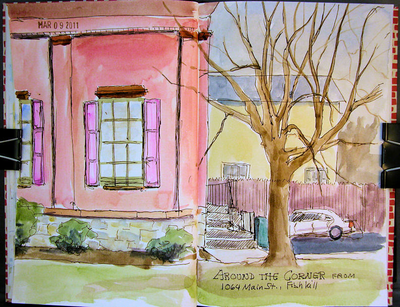
Around the Corner from Main Street


I went out to paint with my friend Virginia the other day. It was supposed to be 50 degrees and sunny, so we were pretty excited about having a nice day for some plein air work. Well, foiled again! It was freezing cold and overcast. We pulled off onto a side street where there was room to park, and did sketches from the warm comfort of our cars!
This is across a two page spread in my Fabriano Venezia book. It’s getting really difficult to keep this book opened fully enough to sketch and paint across the center. I might have to ditch it for a different journal. I love the paper, but this binding could be a dealbreaker. I’ve cut a piece of foamcore to the width of the open book, and I can clip each side of the journal to the foamcore back to keep it open. I’ll see if this works out over the long run, or if I’ll have to make a change.
I’m also starting to think that I should separate these sketches from my artwork for sale, and post them to a different blog. More on that if and when I get the other blog up and running!

Wednesday

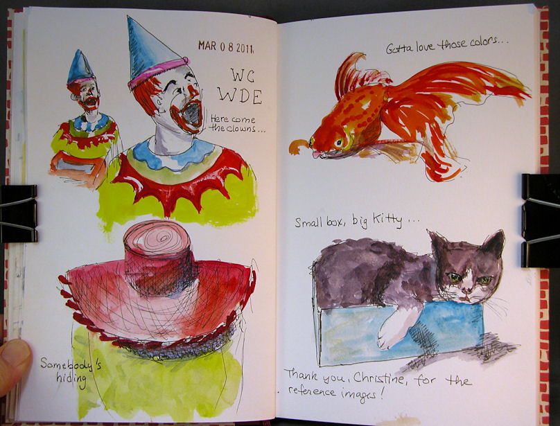
Sketches from the WC WDE


About 9x12 across a two page spread in my Fabriano Venezia journal.
Materials:
Lamy Safari EF fountain pen with Noodler's Bulletproof Black ink
Winsor Newton and Holbein watercolors
A teeeeeny bit of white gouache
Escoda sable brushes sizes 6 and 2

My husband was at a meeting last night, so I figured I'd do a little sketching. I went to the Wetcanvas website to check out the Weekend Drawing Event images, and they looked like a lot of fun! I sketched the first few that grabbed me looking at the computer screen. I did the sketches all in ink first, then went back and painted them with watercolor. Fun, fun.

Monday

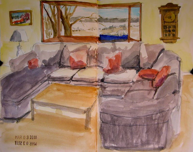
Rondo on the Window Ledge


Click image for a clearer, larger picture.
Size is about 9×12, across a two-page spread in my Fabriano Venezia sketchbook.
My dog’s favorite spot is up on the bay window in the living room, where he can survey his kingdom. He can see all the way across the lake, as well as up the driveway. Best of all, it’s near the kitchen, where he never misses an opportunity to sucker somebody into feeding him.
This was done with my little 24-color Koi set and a single waterbrush that comes with the set. I am hoping to do more plein air sketches this year, and this is probably the most convenient way to do it, so I’m practicing. However, I miss the color saturation of my artist grade watercolors.

Wednesday

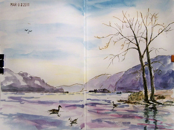
Sketching Along the Hudson River


About 9×12″
Ink and watercolor in my stitch-bound, Fabriano Venezia book
I heard it was going to be 51 degrees and sunny today, so I packed a big smile and headed out the the Newburg waterfront along the Hudson River to paint with my friend Virginia Donovan. Clearly the weather forecast was merely a trick played on me by the weatherman to get me to give up the comfort of my warm studio. In addition to colder-than-forecasted temperatures, there was a stiff wind blowing.
I thought about painting from my car, but I much preferred the downriver view, which wasn’t visible from the parking lot. Determined to work outside, I donned a heavy coat, hat, and fingerless gloves. I figured I could at least make it through a sketch or two. This one began with a Lamy Safari fountain pen with an EF nib and Noodler’s #41 Brown ink. Once I got the elements placed and the trees drawn, I broke out a waterbrush and a Sakura Koi 24 pan watercolor set.
I was accompanied by some adorable seagulls and the honking of Canadian Geese. There were still large chunks of ice floating by in the river. By the time I finished the sketch, I was feeling pretty warm. I started a small painting which I’ll have to finish in the studio, since we decided to break and go out for lunch. The afternoon was overcast and there were snow flurries on the way home! Nevertheless, it really felt great to get out and do a little plein air work again.
I’ve been doing a lot of sketching lately, though I haven’t been posting most of them. I always feel that things should be displayed in a more “finished” state than what I generally do in a sketch, but lately a lot of people have commented that they love seeing the sketches. If you have an opinion about this, please let me know. One thought I’ve had is to create a second blog and post just the sketches there; then those who are interested in seeing only finished pieces wouldn’t have to subscribe, and those who want to see the sketches can see them on the other site.