Monday

Part V of Stillman and Birn Alpha Review --- Working on the White Paper

Early on in my Stillman & Birn Alpha review series, many viewers were asking, "What if I only work on white paper?" I am hoping that this installment of the review will be helpful to those of you who are wondering about the Alpha paper's performance with wet and dry media directly on the white paper, with no toning or other preparation of the surface. (If you have not seen the previous installments of this review series, click here to go to Part I. Each post will link you to the next post in the series.)

To help you see the differences in the various Stillman and Birn papers with dry media, I cut a strip of each type of their paper, made some swatches on them with Prismacolor Black colored pencil, Wolff's 6B Carbon Pencil, and brown ink (drawn with a fountain pen), and ink and wash, and glued them into my Alpha book. You can click the image below to get an up-close view.


My assessment is that for dry media like colored pencil, the S&B Epsilon book yields the greatest value range and smoothness of application. It's a plate smooth paper, so the pencils make fuller contact with the paper. The Alpha and Gamma papers, which have a little more tooth to them, don't cover quite as fully, but still perform well. The Beta and Delta books show the most white in the swatches, since it's even more difficult than the Alpha to get into the tooth of the paper. Those uncovered areas (which I refer to as pinholes) reflect light, which translates as not being as dark a swatch. I did a colored pencil sketch on the Epsilon paper a few months ago, and was very impressed by that paper. The Prismacolor pencils loved the Epsilon surface, and my fountain pen glided across the paper like an ice skater. The Alpha actually does well with dry media, just not quite as well as the Epsilon, in my opinion.

You can see in the pen swatches above that all of the papers took a Medium nib fountain pen just fine, and did a fine job with the wash too, though there is a difference in the feel when using fountain pens with less tooth vs. more tooth. I've been using fountain pens a lot on the Alpha paper and it's great for both pen and wash and pen alone. I have never encountered bleed-through with any of my fountain pen inks.

Below is a watercolor and ink sketch that I did across a two page spread of an 8.5x11" Stillman & Birn Alpha Hardbound book. I have been very pleased with the brilliance of the watercolor on the Alpha paper. The paper is sized internally and externally, so the paint sits nicely on the surface. The vellum surface, as you can see here, does not present a problem for pens.


There is some very minimal buckling of the paper with the watercolor. It would bother me in a painting that I'm going to mat and frame, but in a sketchbook I kind of like it. It gives the paper character!

I turned the page of the sketch above and photographed the top of the reverse side of  the page that has most of the writing on it. If you look at the image below, you'll see that there is a very slight ghosting of the watercolor border, page title and text. Initially, I thought this would really bother me. But in practice, it does not. Once I work on the reverse side, I only notice it if I'm looking for it. However, it does show in photos. When you photograph or scan your work, you might encounter something like this (below) which is visible along with your image on that page.


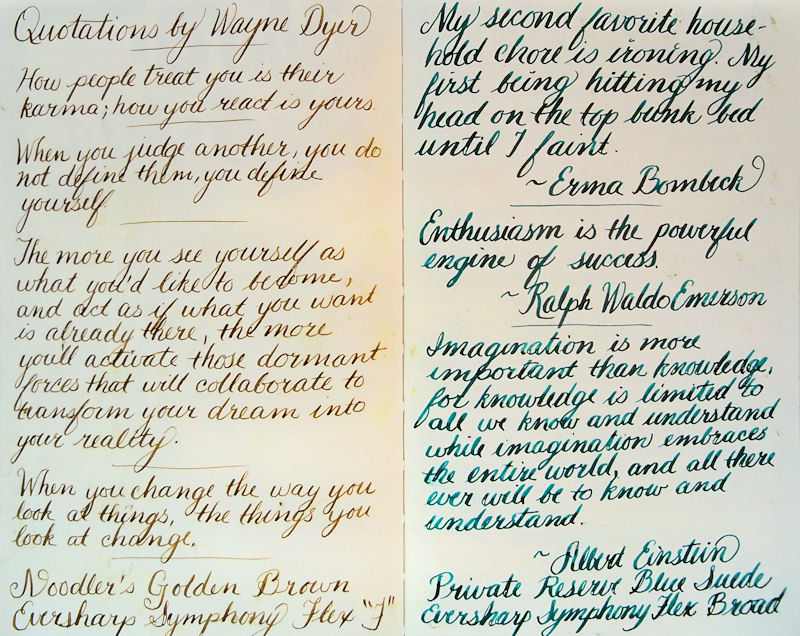
There may be times when this is an important factor, and other times when it doesn't matter. My suggestion is to skip a page when you encounter a situation where it matters. This can either be done by sketching only on the right hand sides, (skipping each left side), or sketching across every other two page spread, leaving the back sides blank. All of the ink samples in this post were written back to back on the paper, and you can see that even with these ink tests, the opacity of the paper was not a problem!

All in all, the S&B Alpha Hardbound book impressed me. I threw a lot of different media at this book, turned pages into envelopes, removed the center spreads of the signatures, used multiple layers of acrylics, pastel ground, pastels, Cretacolor leads, inks, watercolor, gouache and pencil. The binding held together nice and tight, and I didn't find one situation where I couldn't "follow the paint" and do what I wanted to do. I would highly recommend this as a multi media book. Even though officially the book is good for "dry media and light washes," I was able to do much more with it without difficulty.

Thursday

Driving Through the Garden State

I had some journaling templates tucked into my messenger bag on the way home from Maryland. By the time I finished my Maryland Montage, we'd crossed into New Jersey, and I wanted to do something different for the next page spread. I used the templates as stencils for the rectangular shapes -- about the only way to draw straight lines in a moving car! Then I did these little scene captures in ink and watercolor while driving through the state. The page background color and border had been previously painted with diluted acrylic.

This sketchbook is now finished! I have a couple of test pages that I haven't shown yet, but I'll be showing those soon, along with a couple of wrap-up review segments about this Stillman & Birn Alpha hardbound sketchbook.

Wednesday

Maryland Montage --- Sketching in a Moving Vehicle

Stillman & Birn Alpha 5.5x8.5" hardbound sketchbook
Noodler's Kung Te-Cheng ink in a 0.3 (fine) Platinum Preppy fountain pen
Private Reserve Sepia ink in a 1.5mm Pilot Parallel calligraphy pen
Noodler's Golden Brown ink in a Pilot Plumix italic pen
Brown Sharpie Calligraphy pen
Winsor Newton, Daniel Smith, Holbein and Schmincke watercolors
Background page toning done previously with diluted acrylic

I've done montage formats like this before in open studio life drawing, at the zoo, and other times when I was just grabbing images on the go. But this is the first time I did it in a moving car. (At least I wasn't driving!) We were on our way home from our niece's wedding in Maryland. With just two page spreads left to finish this sketchbook, I couldn't resist the temptation. It was quite an experience. I learned two important things:
  1. Drawing straight lines, in a moving vehicle at a high rate of speed with potholes and curves, is not going to happen.
  2. If you think you don't get carsick, try sketching for awhile!

Initially, I was having so much fun that all I could think about was, "Why didn't I try this sooner?" I even did another two page spread after this one, since one remaining page spread was even harder to resist than when there were two left.. By then my stomach was in knots and I was definitely done for the day. I think the next time I sketch in a car, it will be parked!


Tuesday

Wedding Flowers

My first big event of 2012 was my niece's wedding! She got married on New Year's Day, so we spent a few days in Maryland to take in the festivities. The table bouquets were white hydrangeas, assorted yellow flowers, and peacock feathers. I got to take one of them back to the hotel with me and sketched it that night during the first half of the Giant game, while the guys cheered on our home team. Even I gave in and watched the second half. Some things are a requirement!

The feathers had so much sheen to them that after I finished painting, I mixed up some of the Schmincke dry gold gouache and added some sparkle to them. Unfortunately, that isn't visible on the photo. However, you can see the coppery shimmer on the border from the iridescent acrylics that I used to prepare the page ground and border.

Inks used: Private Reserve Copper Burst and Private Reserve Sepia
Pens: Pilot Parallel 1.1mm, Pilot Petite
Winsor Newton and Daniel Smith watercolors
Winsor Newton, Schmincke and Holbein gouache
Pages prepared in advance using Golden Fluid and Golden Fluid Iridescent acrylics, and F&W Acrylic Inks
Painted across a two page spread in a 5.5x8.5" Stillman and Birn Hardcover Alpha sketchbook

Monday

Breaking in Your Stillman and Birn Alpha, Gamma or Epsilon Hardbound Sketchbook So It Lies Flat

For all of you kindred spirits who share my infatuation with Stillman & Birn Alpha, Gamma or Epsilon  hardbound sketchbooks, I have some great information to share with you! I was talking on the phone last week with Stillman and Birn co-owner Michael Kalman, and he told me that their hardbound books have been designed to open completely flat, and they have a flexible binding! Yep, that's right!

In order to achieve this, you have to break in the book before you use it by opening to the center of the book and bending the pages and covers back 360 degrees so they touch. Then go through the book and do that throughout the book, gently bending the pages and covers back.  I know you're thinking the whole book will fall apart. That's what I thought, and I would never in a million years have done it if he hadn't told me. But when I got off the phone with him, I went straight to the new S&B sketchbook I was about to start, and did exactly what he said. My husband walked in and was horrified --- he thought I was destroying the book until I explained it to him.

After bending the pages and covers gently all the way back from the middle of the book, I did the same thing from the center of each signature (where the stitching is). Then I again started from the middle, working toward the front, opening every page spread that way; then I did the same from the middle toward the back. Don't use every ounce of brute strength that you have, because if you try hard enough to pull the book apart, you will probably be able to do that!  When I was finished going through the whole book twice like that, every single page spread laid down flat. No deep gutters to cross! It was a miracle. I am sooooo excited about this! It works. Try it.

The reason why you want to do this before working in an S&B book is because if you paint across the two page spreads like I do, adding that flexibility to the binding reveals more of the white paper in the gutter area. If I were to do it to my almost-completed Alpha book, I'd have a white vertical stripe down the center of nearly every painting I've done in that book. I have noticed while working through the book that as it has broken in a little bit by itself, some of that white in the middle has been revealed on some of the page spreads. Not only will the books lie much flatter by breaking them in ahead of time, but it will also stop those white center areas from appearing later on as the binding gives with use.

The S&B hardbound books apparently have a triple binding process that involves three different types of adhesion. It is this triple process that enables them to undergo bending the binding and page spreads back that way without damage to the spine, and keeping all the pages intact. This is such wonderful news for those of us who work across the two-page spreads; I had to share!

Sunday

Butterfly Fish, Flame Angel, and Painted Glass Fish --- and happy new year!

Watercolor on acrylic-prepared surface in my 5.5x8.5" 
Stillman & Birn Alpha hardbound book.

Happy New Year to all my visitors. I hope that 2012 brings you all joy, good health, prosperity, and let's not forget.....creativity. Of course I'm also wishing for world peace and tolerance, the end of famine and natural disasters, health care for all, and a better economy!

This was my last sketch of the day at Animal Kingdom. When I do these on location, I leave the writing for after I get home. That enables me to get as many sketches done on location as I can, without being slowed down by the journaling part of it. Sometimes it takes me a few days to get that done and get the images photographed, adjusted, and loaded up here.

The sign on the tank identified that yellow and white fish as a Spotted Butterfly, but when I looked online yesterday, the "Spotted Butterfly Fish" I saw didn't look anything like this one! So, I'm not quite sure what this one is, but he does look like some kind of Butterfly fish. The little glass fish were highly florescent --- gorgeous little creatures! They weren't in the same tank, but I didn't want to miss the opportunity to sketch them, so I put them in here.

Saturday

Discus Fish at Animal Kingdom

Noodler's Apache Sunset ink, Private Reserve Naples Blue ink, watercolor
in a Stillman & Birn Alpha hardbound sketchbook.

Discus fish are among the most beautiful of the freshwater species. They had some wonderful specimens at Animal Kingdom. They must be very shy because no matter which one I was sketching, that one would become aware of the fact I was staring, and would try to find a place in the tank to hide. They come from the Brazilian Amazon River and often are caught live there and transported to pet stores. I was feeling like I  needed florescent paints to capture their colors! I pulled out the most brillian cyans I had on hand --- Private Reserve Naples Blue ink and Winsor Blue watercolor.

Friday

Macaw and Sun Conures at Animal Kingdom --- and a claw!

Inks, watercolor, gouache and Cretacolor leads over an acrylic-toned
background and border in my 5.5x8.5" Stillman & Birn Alpha sketchbook.

I went sketching at the Animal Kingdom store in Brewster the other day. These sketches were done in the little Rain Forest room, where the birds can be safely out of their cages and entertain visitors like me! The Macaw was a riot. The entire time, he followed me around, trying to get close enough to climb up on my shoulder. He'd reach out his claw and say, "Up, up?" It was very difficult to get a sketch of him done when he kept doing things like this:
Is that the cutest bird you ever saw? I'd back up to continue my profile sketch, and he'd follow me over to my new location, foot outstretched...."Up, up?" So I eventually had to abandon that sketch in favor of birds who were more willing to ignore me!

On the other side of the rain forest were three Sun Conures that they call Sammie and the Cruisers. (I only painted two of them.) They are very bonded to one another, and reminded me so much of the colorful Jenday Conures I had, Lulu and Lucy, who I used to refer to as "Double Trouble"!

I had enough space left for one more thing on the page, and decided to do a monochrome study of an African Grey's claw as he balanced on one foot, the other held up against his body. Birds do have interesting feet!

Wednesday

Shading Inks Testing, Reviews, and Selections

When I recently did this sketch and discovered the joys of Noodler's Black Swan in Australian Roses ink, I decided that I need to find more inks that give me that kind of variety in both color and value, otherwise known as inks with "shading". I started to revisit samples I'd acquired previously when I wasn't looking for that particular characteristic, and ordered a bunch of new samples to try too. I started testing them with three different dip pens: a glass pen, a Speedball B-5 nib, and a Brause 2mm italic calligraphy nib. I also drew a crosshatched section on each sample with each nib, and once dry, went back and brushed it with a water-filled brush to see how much the ink would (or wouldn't) wash, the color of the wash, and if it would leave enough of the lines behind to hold onto my drawing in sketches. I should have included Black Swan in Australian Roses in the tests just so I'd have the samples to show, but since I already had a bottle of it and already knew I loved it, I didn't have to prove that one to myself!

The fourteen inks tested here are:
  • Noodler's Golden Brown
  • Noodler's Apache Sunset
  • Private Reserve Orange Crush
  • Private Reserve Shoreline Gold
  • Noodler's Habanero
  • Noodler's Cayenne
  • Noodler's Antietum
  • Caran d'Ache Sunset
  • Private Reserve Blue Suede
  • Private Reserve Naples Blue
  • Private Reserve Tropical Blue
  • Private Reserve Sepia
  • Private Reserve Copper Burst
  • Rohrer & Klingner Alt Goldgrun (misspelled in my test --- sorry!)
These tests were done in a 5.5x8.5" Stillman & Birn Alpha Hardbound sketchbook. It is an archival, acid-free paper, 100 lb (150 gsm), internally sized and surface sized, with a vellum surface. I selected that paper because it is one I use often for my art journals, so it was most important for me to know how the inks would perform on that particular paper. You might get completely different results with different paper, different pens, and even a different amount of pressure or speed in your writing. In other words, your mileage may vary!

I tried to get the color as good as I could in the images, but there was so much color and light bouncing around the white pages and light filters that I could never even get both sides of the page to light up the same way. So, my apologies for my poor photography skills, but I still think you can get a pretty good idea of what these look like. Each image can be clicked to enlarge it.


I have to say that I was thrilled with almost all of these. A couple of notes from these samples:
  • Noodler's Golden Brown and Private Reserve Sepia are both great inks with wonderful shading. They are not exactly the same, but they are certainly in the same color family. You probably will want to choose between the two of them. Golden Brown is more yellow, and Sepia is a yellowish raw sienna color (sort of like Winsor Newton Raw Sienna, if you're familiar with it).
  • Private Reserve Copper Burst did not shade for me. However, it is such a fabulous color that I plan to get a bottle to use with watercolor. Most browns veer to yellow, orange or red when dissolved with a wet brush. This one does not. It holds its color, which is neutral enough to be of great use to me. Also, in writing with it, it has a lovely shimmer. Bonus!
  • Noodler's Antietum was another ink that didn't provide much shading, but is such an interesting and highly saturated color that I think there is a bottle of it in my future.
  • Rohrer and Klingner Alt Goldgrun seemed to shade well in these very wet dip pens, so it was one of the samples I inked up in a fountain pen. But in an 0.5 Preppy, the result was highly disappointing, and much too light to be useful to me for drawing purposes. So, I am still looking for a good green with shading....

I inked up a vintage Eversharp Symphony piston-fill Flex pen with a Fine nib with the Noodler's Golden Brown, and one with a Broad nib with the Private Reserve Suede Blue, and quickly dashed off a couple of pages of quotes to see how they'd look with these pens. Surprisingly, the Golden Brown didn't shade in that particular pen. (You'll have to click this one to get a sharper image if you want to see it better.)


I inked up a bunch of pens with these and other favorites from the samples, to see how they'd perform in various fountain pens. The ones I felt worthy of putting into fountain pens were:
  • Noodler's Apache Sunset
  • Noodler's Cayenne
  • Caran d'Ache Sunset
  • Noodler's Golden Brown
  • Private Reserve Sepia
  • Private Reserve Naples Blue
  • Iroshizuki Kon-Peki (not shown in the test samples above)
  • Private Reserve Tropical Blue
  • Noodler's Black Swan n Australian Roses (not shown in samples above)
  • Private Reserve Blue Suede
If you click the images below, they will enlarge so that you can read about my impressions and what pens I used. (In posting these photos, I can see that the image below isn't as clear as I thought it would be, so I will type out the handwritten text when I get back later today or tonight, to make it easier to read.)


Special mention should go to two wonderful shading inks that I did not put into fountain pens only because there was so much similarity in this color range. They are
  • Private Reserve Orange Crush and 
  • Noodler's Habanero.
They are both highly saturated inks with orange-yellow-red components that wash well and provide a lot of value and color variation.

I hope this write-up was helpful to those of you who share my current quest for inks that provide shading. I'll be doing some lightfastness testing of these inks too, and will have some preliminary results to share in another month or so. Hopefully there will also be some artwork to post with these new inks!

Tuesday

Studio Assistant

As I've been working my way through this Stillman & Birn Alpha journal, and doing my multi-part review, many people have asked me, "What if I work on the white paper instead of pages prepared with a colored ground? How will the paper perform then?" Of course with a sketchbook, that's how most folks work! So I saved several page spreads of plain paper toward the back of the book, and will write something up about working on the plain paper in a couple of days.

I've been wanting a studio assistant for a long time! This particular one doesn't do much, but she can manage to hold onto my wonderful TWSBI ROC 100,  which is more than I can do sometimes. This sketch was done across a two page spread using a 6mm Pilot Parallel with blue ink. I've used this pen often for title lettering, but have never tried sketching with it. It has a very wide, stiff nib, so unless the paper is absolutely, perfectly flat, the pen skips spots. That means it doesn't write evenly in a sketchbook. I thought that might make it interesting for sketching though. The pen is designed to give that very wide 6mm line on one end, and very thin line about 0.3-0.5mm when used on its side. I'm not quite sure yet how I feel about the result, but I think it's worthy of further experimentation. I have these pens in all the other sizes too, which I've found much more useful so far than this 6mm one, yet there's something I really like about the way this pen lays down the lines.

My initial intent was to leave the entire sketch blue, coloring in only the TWSBI pen with red and purple. (It's currently filled with purple ink.) But then I thought adding the red to the cloth all the objects were resting on would give the blue a bit more pop and add another dimension to the sketch. I used Winsor Newton Cadmium Red and Permanent Rose watercolor. It wasn't necessarily a bad idea to do that, but it did completely change the focal point away from my studio assistant holding the pen! So I decided that since I did that, I may as well mix up a little of that Schmincke bottle of gold gouache powder, and color the bottle and a bit on the red beside it. Sometimes it's better to stick with the original plan, and sometimes it's better to let the painting lead you to a different idea. I'm not sure which one this was!

Sunday

Merry Christmas from the Sweet Shop

Ink and watercolor in my 5.5x8.5" Stillman & Birn Alpha sketchbook. Image can be clicked to enlarge.

Merry Christmas to all my viewers! Wishing you all a joyous holiday.

Saturday

Lunch Break

(Click image for a larger, clearer view.)

When my sketching group goes to Adams, we all meet in the cafe area for lunch at noon. It's a golden opportunity to catch some quick gesture sketches of customers at a nearby register, or seated in the cafe. I sketched them in with Noodler's Luxury Blue ink in a Pilot Plumix italic pen, and used the same ink for the smaller writing on the page. (The large title is watercolor, painted with a brush.) This ink washes just a tiny bit with a water-filled brush, and I supplemented that with watercolor over the top of the ink sketch.

People often ask how I select my colors for a given scene. Often my choices are inspired by one of the borders or backgrounds that I pre-painted in my book. Other times I know what colors I want to use when I look at the scene, and I look for a painted page spread that will accommodate those colors. For this scene, I really wanted a white page to sketch on. Any border colors would have worked as long as I had the white center; I'd just sketch with the colors present in the border. But I have to confess, I was really happy to come to this blue border and be able to put the Luxury Blue ink to good use! It's become one of my favorites.

Friday

Review of Schmincke Reichgold Dry Gouache --- Glittery Glimmery Glam!

(Image is clickable if you'd like to see it larger and sharper.)

When I got home from Adams the other day after doing this sketch, I did the writing with the same pens and inks that I used on the sketch posted yesterday. But it seemed a little stark to me. It needed just a touch of something glittery for some extra holiday cheer. I was going to add some gold touches with the Krylon 18K Gold Leafing Pen, but then I got another idea...

A few weeks ago, I was in the Jerrys Artarama store in Norwalk, and I stumbled upon a bottle of Schmincke Reichgold Dry Gouache. It's metallic gold with a gouache binder in powdered form that you mix up as needed. I had to try it! It's been sitting in my studio ever since. I pulled it out and using a small palette knife, set some out on a piece of glass. I took a couple of drops of water and mixed it up with the palette knife on the glass surface, then painted some bits onto the wreath. I know you might only be able to make out a few dabs of it on the wreath; it's hard to see in photos, just like the iridescent paint, but I absolutely love this stuff! I wish you could all see it in person. It mixes up very easily and has a more textural look to it than the pen. When you mix it, you can understand why it is sold in a dry, powdered form. The metal particles separate easily from the water and binder once it's mixed up, so liquifying it as needed is definitely the way to go with this product.

Here's what the bottle and powder look like:

The photo makes the bottle look huge, but it's only 20ml. Very small. The mix remains soluble in water. I left  some to dry on the glass, then went back with a wet brush and it sprang right back to life. The small quantity I'd put out was just begging to be all used up and it reconstituted so easily that I went ahead and added it to some other sketches too. Some does come off after it's dry if you rub a finger across a painted area, so it doesn't set as permanently as the gold pen or gold acrylic paint.

The fact that the gold gouache remains soluble is a big factor, because that means it won't destroy my brush if I'm out on location and can't wash the brush right away. Although the gold leafing pen is easier to carry around and use, the gouache has some advantages. I can use more water and less powder to add a little shimmer to a colored area, or  instead paint something solid gold with very little dilution of the product. This makes it more versatile in its application. Apparently it can also be mixed into paints, though I haven't tried that...yet! 

Thursday

Returning to Adams Fairacre Farms

I had so much fun the last time I sketched at the new Adams Fairacre Farms in Wappinger that I couldn't wait to get back there for Round 2. They must have sold a huge number of poinsettia plants, because the huge tree of them that I sketched last time was gone!

I started out the morning in their greenhouse again, sketching with Noodler's Sequoia ink and watercolors in a fine-nib fountain pen, in my Stillman & Birn Alpha 5.5x8.5" hardbound book. Because of the fairly intense color of the prepared background, I ended up switching to gouache to finish off the sketch. I always make sure to have gouache with me for emergencies like this. Since I like to travel light, I made a tiny gouache kit from a mini Altoids container and Sculpey clay.

 The holes in the clay were made with the back of a pencil. (That and the quarter should give you an idea of how tiny this is!) I was able to make 15 holes for colors. Since the Altoids tin is metal, I baked the whole thing in the oven, Sculpey, tin and all. Once it was cool, I coated the inside with a few coats of Golden GAC 100 to seal it. I'm not sure if that step was necessary or not, but since I had it on hand, I went ahead and did it. I've been using it for several months now, and it's really come in handy on a number of occasions.

The smaller text on the page was written with a 1:1 dilution of the Sequoia ink in a different, broad-nibbed pen. (A Kaweco Sport) Sometimes it just seems too saturated to me for writing, and I happen to like the more olive-like green I get when I dilute it. You can see the difference in the value and color between that green text, and the thinner, darker green of the lines for the hanging baskets of plants. The page title was written with a 2.4mm Pilot Parallel, using a red Pilot ink cartridge. Having a red calligraphy pen all set to go has turned out to be a good thing during the holiday season!

Tuesday

The Life of an Amaryllis Part I

You can click the image for a larger, clearer view.

A few weeks ago, I prepared two, two-page spreads with pastel ground. I just wanted to experiment with the Golden Acrylic Ground for Pastels to see what it was like. I used one for a pastel sketch that is still evolving, and I thought I'd use Wolff's Carbon Pencils for this second one. What I really like about the Wolff's pencils is that:
  1. they give beautiful, rich darks, and
  2. they wash with a wet brush.
This means I can play both wet and dry, and layer to my heart's content. They are a blend of graphite and charcoal that merges the smoothness of graphite with the depth of charcoal. I used only a 6B here, drawing first, then washing a bit. I went back and forth that way, then dove in for the kill with the dark accents. I should have stopped there. But I liked the rich darks so much that I started doing more and more, and well, you know how that goes. It passed that delicious al dente stage and became a bit overcooked.

Pastel ground is not friendly to fountain pens. They write fine on it, but the ground has a fine texture to it that will destroy nibs, so I did the writing with a Pilot Plumix on Borden & Riley 108 lb. Pen and Ink paper, and glued it onto the adjacent page. The purple writing was a Sharpie felt tip calligraphy pen, so I really didn't care what would happen to that one! I used that directly on the pastel ground.

I'm excited about this amaryllis series! It will be fun to explore the changes and have the chance to observe it more closely as I sketch, and it gives me something interesting to draw inside from life, for those times when I can't get out on location. I really hate working from photos.

Sunday

Twelve Minute Portrait Sketches

(Click image to enlarge.)
These sketches were done using Sepia and White Cretacolor leads. The faces are pretty small, and I found myself wishing I'd used Prismacolor pencils instead, which can be sharpened to finer points. Nevertheless, the Cretacolors worked okay, and I just kept sharpening them as best I could. I set a timer to quickly sketch the first one. That took 12 minutes, so I kept that time frame when I did the others.

The white on the left side is a sheet of glassine, which folds into the center of the book to protect the pages from one another when the book is closed. (Click here and then scroll down to see how to make a glassine storage envelope in your sketchbook.) I did try spraying with fixative, but the color still rubbed off easily. I'd have to really saturate it in order to avoid that, and I didn't want to lose my lights. Glassine seems to be the best solution for me in a sketchbook.

As reference material for the sketches, I used the book Facial Expressions by Mark Simon. It is intended mostly as a reference tool for animators. As such, most of the expressions in the thumbnail photos of the book are very exaggerated. Still, I find it a useful reference, and each person starts off with a few more normal-looking poses.

Saturday

My Favorite Potter, Marilyn Price

You can click on the image above to enlarge it and read the text.

This sketch was done in my Stillman and Birn Alpha sketchbook. The page was first colored using diluted Golden Fluid Acrylics (standard colors and iridescent) and F&W Acrylic Inks, and the border painted. The sketch was then done on location, using a Kaweco Sport fountain pen with an extra-fine nib, filled with Noodler's Midnight Blue ink. Shadow areas were washed in using a waterbrush, followed by the inclusion of watercolor to finish it off. The title was written using a Brause italic dip pen, and for the smaller text, I used a smaller-nibbed italic pen (Pilot Plumix). Both were loaded with Noodler's Luxury Blue ink --- a really nice midtone blue.

People are always asking me what materials I go out sketching with. I'll have to post another peek into my current messenger bag soon. The contents do change from time to time, depending on where I'm going, what I want to work with, whether I'll be standing or sitting, and how far I'll have to walk.

RiverWinds Gallery is loaded with work by this favorite potter of mine, Marilyn Price, at very reasonable prices. I especially love using her gorgeous pitchers as flower vases. They also have quite a few of my paintings there, and other fine art, jewelry, and handmade gift items. Definitely worth a trip for holiday shopping!

Friday

Sketching at RiverWinds Gallery

RiverWinds Gallery is located in Beacon, New York. They carry a lot of my paintings as well as work by other artists. They also have fabulous handmade pottery and jewelry, framed photographs, and other handmade gift items. This varied assortment of art is beautifully set up on shelves and cases around the gallery. If you're still out there looking for holiday gifts and close enough to Beacon to make the drive, it's a great place to do holiday shopping.

Our sketching group was invited to sketch there this past week. Having sketched there before, I was very excited about another opportunity. Four of us fell in love with this setup of sunflowers and yarn bowls (by potter Marilyn Price). We pulled up chairs around it and got to work with whatever mediums we had on hand.

I selected this page spread in my sketchbook that I'd previously prepared with lavender, pink, and blue shiny iridescent acrylics, and started out by sketching with a fountain pen filled with Noodler's Black Swan in Australian Roses. I used a waterbrush to create an ink and wash, and then splashed on some color near the end of the process. The writing was done with the same ink, which tied the color harmony together quite nicely.

Thursday

Meercat Haven Gesture Sketching

You can click the image above for a larger, clearer view. I think the text is clear enough on the clicked image to be legible, so I'm not going to retype it here unless somebody complains! ;)

When I did my page preparations, I painted this border with sepia colored acrylic paint. Then I painted the entire page with diluted Golden Fluid Acrylic Interference Blue. When the Interference colors are painted on a dark background, there is a color shift when the light hits. That's why you can see bits of blue on the border, which is much more obvious when looking at the pages in person. The white portion of the page has a beautiful satiny sheen from the Interference Blue, though the color shift is most obvious against a dark background. This was a very interesting experiment using a dark background and corresponding color complement in interference paint. I definitely plan to explore more of this!

Because of that color shift, it was difficult to select a color to sketch with, but the combination seemed to unify into a muted reddish-brownish-violet tone, which suited my favorite mix of Private Reserve Velvet Black Ink and Private Reserve Chocolat. I used a waterbrush to wash some of the lines.

Wednesday

Shark Tank at the Maritime Aquarium

You can click the image above to see a larger, clearer image. I'm sorry about the glare on these pages, but due especially to the iridescent and interference paint used, the sparkly surfaces of the pages in my sketchbook reflect a lot of light.

This was another really dark room where a book light would have come in handy. I sketched in brown ink and then added a little watercolor. Even though the scene was quite neutral in color, I felt it needed a bit more than the ink alone would give me. The glittery blue border and background were done in advance. In preparation for my aquarium visit, I got several pages ready in blues, though I ended up using just two of them, and used previously prepared spreads for the rest. This particular one turned out to be ideal for the shark tank.

While I was sitting there sketching, a woman walked in with her toddler son. He walked wide-eyed up to the tank, pointed to a large fish with a chunk of flesh taken out of him, and said, "Oh, look! That fish got bit REALLY BAD, Mommy! Those sharks are mean!"

Mom seemed pretty horrified, but I'm sure she didn't want her son having nightmares about shark attacks. She picked him up and said, "Oh no, Sweetie, they were just playing! It was an accident....Just a little rough play!"

She looked at me and I looked at her and we both giggled.

Tuesday

Sea Life from the Coral Reefs

(Click image if you'd like to see a larger version.)

This two page spread in my Stillman and Birn Alpha Hardbound sketchbook was prepared in advance using Fluid and Iridescent Fluid Acrylics. It was exactly what I was looking for to capture some small sketches of different tanks as I passed by. There was quite a bit of acrylic on the surface here. I didn't think watercolor would take well enough to it, nor provide enough variation in terms of light colors, so I used a tiny gouache set that I made out of a mini Altoids tin and Sculpey clay.

I came upon a huge tank of jellyfish lit from above in a very dark room. I was almost hypnotized by their beautiful floating, changing shapes and subtle coloring as they glowed in the light. I used white gouache against a dark golden-colored background, but felt it wasn't quite dark enough. When I got home, I darkened around the painted shapes with more gouache, letting some of the iridescent gold peek through.

The coral was behind glass, and I sketched it with a Kaweco Extra Fine nib fountain pen, filled with Noodler's Midnight Blue. I didn't think it would take to this surface, but it surprised me and did just fine! I used a waterbrush a little to spread some of the color for shadow areas.

Next up were some of the brilliantly-colored fish from the coral reefs. They were truly in perpetual motion, but I did the best I could. The blue fish in the top right box was such a bright color that I don't think he could be duplicated in paint, but I tried!

Monday

Eerie Creatures at the Aquarium


Can you believe how ugly these creatures are? As if the dead birds I'd sketched weren't enough, I rounded the corner and came upon this eerie tank of Wolfish and Sculpins. It was dark and mysterious, and the colors were all muted except for the brilliant yellows and oranges of the Sculpins. Incredibly strange as they were, I just had to sketch them. The Sculpin was actually on the other side of the tank when I began, and I'd not planned to put him into the sketch, but when he swam around and came to rest nearly under my nose, with his bright coloring and fascinating shapes, there was no way I was going to leave him out of the picture.

This paper started off as white pages in my Stillman & Birn Alpha hardbound sketchbook. The brown and gold background and page borders were done in advance in the studio using Golden Fluid Acrylics and F&W Acrylic Inks. Working on a toned surface often helps me to set up the scene for a sketch. The only down side is that I end up having to skip around the book when I look for just the right background color and border for a particular page. Even though the six pages of aquarium sketches I did that day seem like a cohesive group, they are not all on adjacent pages in the book.

I started this sketch with two fountain pens --- one filled with Noodler's Midnight Blue, and the other filled with a mix of Private Reserve Velvet Black and Private Reserve Chocolat. I figured those would give me a warm and a cool, and with the addition of a waterbrush for shading and wash, I'd have everything I needed. But that was before the Sculpin forced himself into the scene, and I decided to add in quite a bit of watercolor when I made the decision to include him.

It was really dark in the room! Dim lights were on inside the tank, but I could barely see what I was sketching, and wished I'd had the foresight to leave my little book light in my messenger bag. I'd removed it to lighten up the bag as much as possible, but I'll definitely bring it next time. It's a Mighty Bright Music Light and has a clip to affix it to a music stand, which I use to clip it to the book. It has a little arm that opens up and it's highly adjustable. It folds into a small pouch and is fabulous for nocturnes, candlelight sketching opportunities, or power failures, as I recently learned!

The text was written with a TWSBI Broad-nib fountain pen and Noodler's La Reine Mauve ink when I returned to the studio. The TWSBI is a really bold, wet writer, and La Reine Mauve is one of my favorite inks --- deep purple and waterproof. Once I added the purple watercolor into the sketch, I knew that would be the pen and ink combination I'd be using to write the text. I generally do the writing after I get back, using a color that I feel will help tie it all together.

Sunday

Common Loon and Northern Harrier at the Maritime Center

Watercolor on an acrylic-prepared background, in a Stillman & Birn Alpha Hardbound sketchbook. Painted on location at Maritime Aquarium in Norwalk CT.

I know you're thinking, "Wait a minute! Those aren't fish! What are they doing in an aquarium sketch?"

Okay, you're right. But after sketching the turtles and fish that I posted yesterday, who all swam by so fast that everything looked blurry by the time I was finished, I was up for something still. And these were in a glass case. Dead. You can't get much more still than that. Besides, I have been very interested in sketching birds lately. This gave me an opportunity to do some up close work from life without them moving around or flying away. These two certainly weren't going anywhere.

I generally mix most of my colors, but I truly missed the convenience of having Payne's Gray and Sepia at my disposal. Neither is in my tiny travel palette. I think I'm going to have to find a way to oust two colors so that I can have those when I sketch. In addition to whole pans and half pans for watercolor, somebody should make quarter pans!

Saturday

Sea Turtles and Fish at the Maritime Aquarium

This sketch was done in an 8.5x5.5" Stillman and Birn Alpha sketchbook. The page border and background were prepared in advance, using diluted acrylic paints, including some iridescent and interference colors, giving the page some shimmer. The sketch itself was then done on location, using a Kaweco EF fountain pen filled with Noodler's Midnight Blue ink, and washed a bit in areas with a waterbrush. Then I pulled out my little pan watercolor set to add a bit of warm color to the turtles. The color on the small text is Iroshizuku Kon-Peki, written with a Platinum Preppy 0.5 (medium) pen. It's a gorgeous turquoise that displays fabulous shading variations in the lines. I got a sample of it, and now that I've tried it, if it weren't $28, I'd get a bottle of it for sure! The page title was written with a Sharpie Calligraphy marker. I bought a couple of multi-color packs of those on an errand to an office supply store with my husband. They come in really handy for those times when I need a special color that I don't have inked up in a wide-nibbed pen. The turquoise seemed perfect for this page spread.

Well, let me tell ya, these turtles are just fascinated by sketching materials! There were three of them in the huge tank, and they swam back and forth and back and forth in front of me the entire time I was sketching. That doesn't make them good models however; they weren't still for even an instant. In fact, every photo I took at the aquarium is blurry from the motion of the creatures, except for the ones that were dead and stuffed!

So, I did the best I could. I decided to make one turtle going in each direction. That way, I could try to add a line to one or the other whenever one swam by me. It was a great challenge! They were so personable that I probably would have been very happy just staying there and sketching the turtles and fish in that one tank all day. As usual, I got the sketching/color done on location, then filled in the text after I got home.

I really love the way the scumbled background turned out on this page. I want to set up more pages like this one!

Friday

Hudson River and Palisades Pastel Sketch

This pastel sketch is about 7x9", in my Stillman & Birn Alpha book. It was done on a page with a prepared border, but for the first time, I encountered something that I think looks a whole lot better without the border. I coated the inside part of the two-page spread with Golden Acrylic Ground for Pastels.

The sketch is based on these four sketches that I did on location plus photos I took there, as preparatory work for a large commissioned oil painting. When I was finished with the sketch, I was so glad that the pieces of glassine were already cut and tucked neatly into the book pocket! (Click here and then scroll down that page, to see the glassine pocket and instructions on making one.) That made it super easy to position them over the pages, glue down the edges with a glue stick, and close the book!

Here's what the sketch looks like with the full pages showing, including the border. You can see how the glassine covers get pulled aside to view the sketch. I had to glue the glassine down onto the side borders, so those became partially obscured .
Although I've done loads of pastel work, I don't think I've ever done it across a two page spread before. It was definitely a challenge getting those chunky sticks into the center, but it's a nice change of pace in leafing through the book. I was glad I gave it a try. I might try one on the plain paper too, without painting it first with the Pastel Ground.

Thursday

Tree Study


This tree study was sketched from my studio window with my Stillman and Birn 5.5x8.5" Alpha book. I used Caran d'Ache Supracolor II Soft pencils in Umber and White. I felt I needed to be able to go just a hair darker, so I added a Wolff's Carbon 6B pencil toward the end. These are all water soluble. I wanted to keep the water option open, but I decided I liked it the way it was, and only worked dry.

There is gold acylic paint added to the Sepia background color. You can see a bit of that shimmer where the light glare is in the photo. A little touch of that glow on the pages is a beautiful thing, but it's hard to capture in a photograph.

The little bit of white on the top left is a lifted-up sheet of glassine that I glued to the page to protect the pencil work, to keep it from smudging onto the facing page when the book is closed or somebody's leafing through the it. I realized that if I do more work in pencil, charcoal, or pastel (and I intend to), I'll need to have some small glassine sheets on hand to put over the work as I do it; otherwise some of those pieces would be ruined before I even got home from my sketching location. I can also use a sheet under my hand as I sketch with smudgy media, to prevent my hand from smearing the page. I went on an anti-smudge campaign!


Yep, I made an envelope as part of the book to store sheets of glassine. I keep a glue stick in my messenger bag with my sketching supplies, so gluing it in on location whenever necessary will now be very easy. To make this pocket, here's what I did:
  1. I knew this would take up extra space in the book, so to avoid bulging, I went to the very last signature in the book, and carefully removed the center page spread, tearing down the middle and removing both sides.
  2. I selected the two pages I planned to use to make each side of the pocket, and cut a semi-circle out of the top of the first page, to make it easier to remove the glassine. (To do that, I drew the arc, then put a cutting mat underneath the sheet, and cut it out with an xacto knive.)
  3. Using one of the pieces of paper that I removed from the book, I made a one-inch wide "tape" the height of the page, and folded it lengthwise with a bone folder. I did the same for the width of the page. Holding those two so that they overlapped on the lower right corner at a right angle, I placed them on a cutting board and made a 45 degree cut through all four layers. That way, when glued into the book, there would be no overlapping, and they would lie flat.
  4. I used a glue stick to coat the paper "tape" and the outside page edges, and glued it all together.
  5. I cut a 16x20" sheet of glassine into eight, 5x8" pieces, which fit exactly into the little envelope holder.
Voila! It's worked perfectly. The only thing I'll add is that when you glue glassine onto the pages, it's better to glue it from the side than from the top. The page curls at the top and bottom, so it's easier to lift the glassine from the side than it is from the bottom.

Monday

Sketching at the Jefferson Valley Mall

I went to the Jefferson Valley Mall with a group of artist friends, where we were nearly evicted by a security guard for sketching! These were done on pages I'd prepared in the S&B Alpha sketchbook that I've been reviewing.


Sunday

Part IV of Stillman and Birn Alpha Review --- Road Trip!

To read this review from the beginning (Part I), click here.

Finally the time had come to take the Alpha sketchbook on the road and answer questions that come into play in a real sketching situation. The questions I wanted to be able to answer by the end of the day were:

  1. Was this particular book a good size to hold while sketching standing up or sitting down, in terms of size and weight?
  2. Did it stay open pretty well, or did I have to wrestle with the pages as I sketched?
  3. Is the gutter in the center of the book too deep to comfortably work across two-page spreads?
  4. Did the pages buckle as I painted on top of the prepared surface?
  5. Is the result of doing prepared pages before going out sketching worth the time invested, or the expense of a book constructed well enough to handle that process?

I went with my sketching group to Adams Fairacre Farms. They recently opened a huge, new store in Wappinger, New York, complete with a greenhouse, gift shop, prepared foods section, seating area to eat, and full service grocery store. I asked the manager if it would be okay for us to spend the day sketching there, and she was very welcoming! Five of us assembled there at 10am to sketch. The holiday displays were stunning, food was delicious, and we got to do grocery and gift shopping too.

I started out in the greenhouse, where the splash of color of the poinsettias would surely satisfy the color junkie within me. Standing up as I sketched in my initial lines, I found this size book very comfortable to hold. No backache! Also, the pages were flexible and light enough so that they didn't do battle with me in trying to keep the book open. However, I wasn't expecting the book to be quite so cooperative. In anticipation of battle, I had cut a piece of coroplast (nearly weightless, corrugated plastic) to the size of the open sketchbook, and stuck it in my messenger bag along with two large metal binder clips. Since I had that with me and it is such a convenience, after awhile I pulled it out and clipped the open sketchbook to the board.


The book was small enough for me to also hold my tiny watercolor set in my left hand, while holding the book on my left arm, and my right hand could wield the waterbrush. Still no backache! This answered my big question about whether or not I could comfortably paint standing up with this book. No problem at all.

That inner color junkie still wasn't fulfilled, so I went into the adjoining store and set a small three-legged stool in front of this incredible poinsettia tree display. (See below. The arch beyond the tree leads into the garden center/greenhouse.)


Although I hadn't planned on having enough space to set out a stool and actually be comfortable, there were some open areas around the store that made it easy to do so, and I had a pack stool in my car. I was definitely getting a good feel for this setup by now. With two watercolors done, there was no page wrinkling. I suspect that the small bit of acrylic on the paper helped to minimize additional buckling.

It was noon and time for the group to assemble in the eating area for lunch. I managed to get in a rough pen and ink sketch while chatting with the other artists. I found myself wishing that the book didn't have as deep a gutter. This was more of an issue in drawing, and especially writing, than it was in painting. Drawing across the gutter wasn't a smooth ride, but it wasn't as bad as using a spiral either. Writing text across it wasn't going to happen without planning for the breaks between words to fall in the center. Still, the cohesiveness of the two page spread is way better than with a wirebound or spiral bound book. IMPORTANT NOTE: Since doing this review, I learned from the company that you can break in the book before you start working on it, so that the pages will lie completely flat. I did a blog post about it, which you can see by clicking here. There is no gutter problem at all with this book if you follow that breaking-in procedure! (Not currently recommended for the 4x6" books, but you can do it with all their other hardbound sizes.)


After lunch, I went to the gift area, where there was a lot of open space and large displays of decorated Christmas trees, holiday lights, and even Santa flying a chopper suspended from the ceiling. Not only was the scene utterly captivating for somebody who likes lights and sparkly stuff like Yours Truly, but by sheer coincidence I'd arrived at a page with a border that had red, green and gold.


By this time, I'd answered the questions that were on my list for the day. To recap:
  1. Was this particular book a good size to hold while sketching standing up or sitting down, in terms of size and weight? The size was easy to hold, small enough that I could still hold my tiny watercolor set, and light enough so that I didn't get a backache. However, I really would like to work larger, mostly because I like these prepared borders on the pages, and they eat up a lot of my available painting space. The larger book (8.5x11") might be too large or heavy for this particular situation though, and there is no size in between. I'd have to go out with the larger book and give it a try sketching on location to know if that would be doable for me.
  2. Did it stay open pretty well, or did I have to wrestle with the pages as I sketched? The book stayed open fairly well. I still had to hold open the pages, since they don't open completely flat like a Moleskine, but I didn't find it nearly as cumbersome as the very slightly larger Fabriano Venezia, which has stiff, heavy pages that require serious wrestling talent. It was made even easier by clipping the book to my open coroplast support, with very little additional weight. 
  3. Is the gutter in the center of the book too deep to comfortably work across two-page spreads? It wasn't so awkward for painting, but was more so for drawing, and quite awkward for writing across the center. Still, way better than a spiral or wirebound book, in terms of wanting the two halves to feel like a whole in the end. IMPORTANT NOTE: Since doing this review, I learned from the company that you can break in the book before you start working on it, so that the pages will lie completely flat. I did a blog post about it, which you can see by clicking here.
  4. Did the pages buckle as I painted on top of the prepared surface? No!
  5. Is the result of doing prepared pages before going out sketching worth the time invested, or the expense of a book constructed well enough to handle that process? I am loving the finished pages with the borders and prepared surfaces, and I think they definitely enhance the sketches and contribute to my art form. In terms of the expense of a book that can take that amount of media without falling apart, it's well worth it to me. They are a collection of my artwork when finished, as well as a life journal, and I want them to last forever. So far, I'm a happy camper.
To see Part V of this review, which covers working on the plain white paper in wet and dry media, click here.

Saturday

Part III Stillman and Birn Alpha Review and Creating a Font

To read this review starting with Part I, click here.

Somebody wrote to me yesterday and asked, "Isn't part of the pleasure the feel of the paper itself?  Wouldn't gessoing it, or adding any other sort of prep to it ruin that?"

It's a really great question! Yes, the feel of the paper is important to me, and in fact, most of my sketchbooks to date have been done with traditional sketching media directly on the paper. I will definitely be including that kind of work in a future installment of this review. Perhaps I should have done that first, since that's how most folks use a sketchbook! But I am really eager to branch out into different types of page layouts and materials, so my current need is to find a sketchbook that can not only work for traditional dry sketching media and watercolor, but for other types of page preparation as well --- acrylic, pastel ground, collage, etc.

As for the preparation of the surface ruining the feel of the paper, it really depends on how much is applied. A very light coating of acrylic or acrylic ink, heavily diluted with water so that its only use is to lightly tint the page, has surprisingly little effect on the paper. The more pigment and medium you add, the greater the change, and of course gesso would totally transform the surface. When I did the watercolor over the shimmery iridescent acrylic, I purposely selected a heavily painted page to test the limits of the combination of materials, even though most of the time I'll be working on a surface with so little acrylic on it, if any, that it won't matter.

I do plan to also review the book with examples of various types of pencils, inks, watercolor, and ink and wash over just the plain paper, since I'll be working that way as well. Issues such as paper smoothness/tooth and transparency do become much more significant then.

In my previous journals over the past six months or so, and in this one so far, I'd mostly used a writing font that had been sent to me by a calligrapher friend. It was a really nice tall, informal font that was quick to write. I found it pretty ideal for my journal writing to accompany the sketches. But one thing I found out is that it didn't photograph very well. It was a very thin, monoline font, and was sometimes difficult to read when photographed and posted. I also wanted a font that was more personalized, so I spent a few days developing Jamie's Journaling Font! I wanted the font to be clean and easy to read, with bolder lines, few flourishes, and no serifs. I'm sure that I'll make a couple of changes to it; I still need to make some decisions regarding the upper case Y and lower case r and d. Other changes will probably evolve too as I use it. My plan is to use it while I do this experimental journal, so that it will be flowing better by the time I move to a larger one. Here is the unveiling of my new font!


The letters are rounder and bolder. It seems to work well with both italic and round nibs, and with or without a slant. I can't wait to try my flex nibs with it, but haven't had a chance to do so yet.

I wrote out the font with various pens and inks on a page that had been previously prepared and then coated with Matte Medium. Using a template, I drew the lines for the writing with pencil. I learned two things while doing this page:

  1. Pencil lines over Matte Medium are almost impossible to erase. I gave up and decided to leave the lines on the page. But much more importantly
  2. The Matte Medium will destroy my fountain pen nibs! It was like writing on sandpaper. Just the other day, I took a scratchy-writing fountain pen and dragged it across a piece of very find sandpaper in a few different directions to see if it would improve the nib, and I totally ruined the pen. Matte Medium puts a lot of tooth on the paper, much like a very fine sandpaper. So please, folks, do not use fountain pens over Matte Medium!

I started wondering what would happen to the stitching and binding with all these extra layers of medium on the pages. The paper itself handles it great, but by thickening so many pages with extra mediums, paint, collage, etc., I knew pretty soon the book would not be able to close completely, or might die in trying!  I thought it would be wise to start removing some pages to allow extra room in the book. I'd already prepared pages beyond the center of the first signature, so I went to the center spread of each remaining signature, where the stitching can be seen, and carefully removed the middle two-page spread from each. I'll see as I go through the book if I need to do more than that or not.

After all this testing in the studio, I was really eager to take the book out on the road and apply all of this to a real sketching situation. Experimentation in the studio is one thing, but working out on location is quite another. Other issues come into play, which I'll be discussing in tomorrow's post. Click here to go to Part IV.

Friday

Part II of Stillman and Birn Alpha Hardbound Sketchbook Testing and Review

To see Part I of this review, click here. Each image in the post below can be clicked to enlarge it.

Since I was having difficulty getting the watercolor to take on the page prepared with a fairly heavy layer of acrylic (See the Part I link above), I wondered if the paper would hold up to using other grounds that might be more successful for my application. I thought perhaps adding Golden Absorbent Ground to my paint would help. This kind of experimentation can become a long, convoluted path to a solution, so I decided to attempt to find a more direct approach to my destination by calling Mike Townsend at Golden Paints tech support. I'm so glad I did that!

"Right thinking, wrong product!" Mike said. He suggested I try their Matte Medium mixed into the paint or over top of my prepared surface instead, explaining that it would give additional tooth for the watercolor to hold, while remaining transparent on my prepared pages.

I was delighted to hear that advice because
  1. I already have several bottles of it, and
  2. Golden Matte Medium happens to be one of my favorite products on the face of the earth.
When I first was advised to use it for something, I loved it so much that I started putting it on everything. I probably would have used it for a dessert topping if it were edible! I was more than happy to try it in my sketchbook.

I tried using it a few different ways. On the page below, I mixed Golden Iridescent Bright Gold Fluid Acrylic with water and Golden Matte Medium. I dried it with a hair dryer, and then the image was painted with watercolor and the writing done. The Alpha paper dried almost completely flat with the hair dryer, so painting on it was not a problem.

The additional tooth provided by the Matte Medium definitely allowed more pigment to go down on the page. This wasn't a great choice of things to paint to showcase that, but you can see that I was able to get plenty of red paint down on that little bottle, and the fountain pen still wrote just fine on the surface. However, Matte Medium is called that for a reason, and I lost the glossy sheen that I was so attracted to. The gold no longer shimmered through the watercolor, and it looked like I'd painted over a yellow page, not gold. (It's hard to see those kinds of differences in a photo, so you'll just have to take my word for it, or better yet, give it a try!)

I wanted to see better comparisons of watercolor on the paper with and without the Matte Medium coating. I painted the page below with Golden Fluid Acrylic Iridescent Pearl (a pretty substantial covering of it), dried it with a hair dryer, sponge painted the border, dried that, then applied Golden Matte Medium diluted about 4:1 with water (80% Matte Medium), and coated only the right side of the page with it.


The first thing I noticed is that the iridescence is all but gone on the Matte Medium-coated right side, even though in a photo they both look the same. The right side pretty much just looks like just white paper, but the left side glistens.

I then painted watercolor samples on each side, using the same colors and same brushes, so I could assess the differences. It will definitely take some practice to work well on these surfaces, but as I worked down the pages, doing one color at a time on each page, then going to the next color, it was possible to get a much more even and complete coat of paint on the side with the Matte Medium. That's a good thing......sometimes. But I'd lost the iridescence in the process, so unless I was working on a base of colored paint, I may as well have painted on the white paper surface without any acrylic, and made it a lot easier for myself! This would be good to use over a colored acrylic ground though.

The left side, which had the iridescent glossy surface, did not take the watercolor paint as well for sure. However, the open areas where there is less paint allow the shimmer to show through the watercolor, and I get the beautiful glimmery background. That's a good thing too!

Doing this direct comparison helped me learn what I can expect using either a Matte-Medium coated or uncoated surface. Watercolor is unpredictable enough without adding more unknown variables to the process! If you want as much shimmer as possible, don't coat the surface. If you're not using iridescent paint, Matte Medium will help watercolor paint adhere to the surface.

But wait! Isn't this supposed to be a sketchbook review, not a discussion of paint products and process? So, why am I even calling this "Part II of Stillman and Birn Alpha Hardbound Sketchbook Testing and Review"?  Well, I'm learning that a sketchbook that meets all your needs is, in a way, invisible. It's like painting on a canvas or linen that's prepared exactly the way you like it. You can then paint without thinking about your surface. There is enough to concentrate on with just painting! What I haven't had to say is a testament to the non-issues I've had with this book. I haven't needed two extra hands to hold the book open while I work. I haven't had a wet binding fall apart on me. I haven't had pages pill and prevent me from writing, or tear out of the book. I haven't encountered extra layers of paint and medium being too much for the stitching to hold the pages together. As far as the Alpha hardbound sketchbook is concerned, I have been able to do everything I've wanted to do. Detailing these processes says everything about the book's capabilities and what it can handle. I haven't yet tried anything that it can't do.There are now over 20 two-page spreads of acrylic page preparations done in this book, with most of them already covered with additional mediums of one kind or another, and the book is holding up great.

Some folks wrote to me or posted questions that I thought would be worth including here. Feel free to email/post any additional questions you might have, and I'll include them in tomorrow's post --- hopefully with answers!
Q: Where can I find the Stillman & Birn sketchbooks?
A: Here is a link to a page on their website that lists stores and online venues that carry their books.

Q: Did you have any bleed through to the following pages? I am just about ready for a new sketchbook and am thinking about the Alpha. I do pen and ink with watercolor washes.
A:  I've never had bleed-through in this book with any of my ink/watercolor testing, which has been pretty extensive. I'm quite sure you'd be safe with the Alpha!

Q: What is the difference between the Noodler's Zhivago and Noodler's Sequoia ink that you've used in the page of ink samples posted yesterday?
A: I can see that they look nearly identical in that image! They are both nice, fairly neutralized greens in wash. When writing with the Zhivago, the ink is so dark that it appears black. When used with water as a wash, the black lines wash very little, and the green washes a lot. So the effect is that it blossoms with color, yet leaves behind crisp lines. The Sequoia ink is a dark green, but not so dark that it ever looks black. The color washes a bit more, and it doesn't leave such edgy lines behind. Even though the wash colors might appear similar in the image, the effects of the two inks are actually quite different.

Q: It looks like Noodler's Bulletproof Black (in that same image) washes and isn't so "bulletproof"! What's up with that?
A: The Noodler's Bulletproof inks vary in their water resistance depending on what paper you use. That Bulletproof Black bonds with the cellulose fibers of the paper, so it depends on how much fiber the ink reaches, sizing of the paper, thickness of the ink layer, etc. For more information on that and other black inks that are declared water resistant/waterproof, you can check this post.

There will be another review installment tomorrow, when I'll discuss some alterations I made to the book, the designing of a journaling font for writing, more about the effects of Matte Medium, and page transparency.

To read Part III of this review, click here.