Showing posts with label Acrylics. Show all posts

Sunday

More Sun Conures

Image can be clicked for a larger, clearer view
Golden Black Gesso
Diluted Golden Interference Acrylics
Winsor Newton, Holbein, and Schmincke Gouache
Sakura Gelly Roll Pen
Stillman & Birn Epsilon 5.5x8.5" hardbound sketchbook

I was back sketching at the Animal Kingdom store again last week. As usual, I was first drawn to my avian buddies in the rain forest room. Sammie and the Cruisers were yacking up a storm, and clearly didn't like it when I paid attention to Duke, the Blue and Gold Macaw. So, I let them once again be the focus of my morning. The only full page spreads I have left in this journal are prepped with Golden Black Gesso and Interference Acrylics. I thought it would make for a good nighttime visit with the brilliance of the coloring of the conures, hence my title "Midnight with Sammie and the Cruisers," even though it wasn't midnight. I was thinking of using the other black and iridescent page spreads for some of the salt water fish that have those beautiful flourescent colors, but most of the big colorful ones were sold! I imagine they'll have some new ones before our next visit.

We only stayed for a little while because the weather was so gorgeous that we decided to go sketch at a farm after lunch. I still need to get the farm sketches photographed, so I'll share those soon.

Saturday

Golden Acrylic Neutral Grays


Golden Heavy Body Acrylic Neutral Grays, plus Black and Titanium White
Stillman and Birn 8.5x11" hardbound Epsilon Sketchbook

Those of you who have been following me for awhile have probably seen my setup for value studies in acrylic. I love doing monochrome studies this way. The Golden Paints Company makes it so easy; there's no color mixing --- just dip right into the value you want. It's been awhile since I did some of these value studies, so I pulled the container off the shelf figuring I'd clean it out, refill it, and put it to use, but the paint in it is still perfectly fine! That seal around the top of my container worked better than I thought it would. The binder and pigment separated a bit while sitting, but I sprayed in a little water, mixed it up again with a tongue depressor, and the set was good to go.

I was thinking of bringing it to open studio life drawing the next day. The longest poses in that session are only 20 minutes. I wasn't sure I could accomplish enough with acrylic paints in that time frame, and also wasn't sure I'd find the heavy body acrylics blendable enough for portraits and figures on paper. In keeping with my desire to brush up on portraiture, I decided to test drive the idea in my Epsilon sketchbook, working off an old black and white photograph of pianist Maria Teresa Carreno. She was a child prodigy who lived from 1853-1917.

As I thought, the paint didn't blend as well as I'd hoped on unprimed paper. Although I'm not necessarily unhappy with it as a study, it would have gone better with a primed surface and some of that delicious Golden AGL (Acrylic Glazing Liquid), which extends the drying time enough to blend a bit. I didn't use the AGL because I was thinking that in a sketchbook, extending the drying time might prove to be a bad idea when you need to turn the page to start the next pose, and I probably wouldn't want to bring my studio hair dryer into the life drawing session.

So, the next day, I brought traditional black and sepia dry drawing media with me to life drawing instead, and I totally bombed! I may as well have brought these after all and given it a go, so that's what I'm going to do next week. Maybe. Unless I change my mind! I think I'll give a few pages a coating of Golden Matte Medium so they won't be quite so absorbent, just in case I go through with this plan. 

Tuesday

Wedding Flowers

My first big event of 2012 was my niece's wedding! She got married on New Year's Day, so we spent a few days in Maryland to take in the festivities. The table bouquets were white hydrangeas, assorted yellow flowers, and peacock feathers. I got to take one of them back to the hotel with me and sketched it that night during the first half of the Giant game, while the guys cheered on our home team. Even I gave in and watched the second half. Some things are a requirement!

The feathers had so much sheen to them that after I finished painting, I mixed up some of the Schmincke dry gold gouache and added some sparkle to them. Unfortunately, that isn't visible on the photo. However, you can see the coppery shimmer on the border from the iridescent acrylics that I used to prepare the page ground and border.

Inks used: Private Reserve Copper Burst and Private Reserve Sepia
Pens: Pilot Parallel 1.1mm, Pilot Petite
Winsor Newton and Daniel Smith watercolors
Winsor Newton, Schmincke and Holbein gouache
Pages prepared in advance using Golden Fluid and Golden Fluid Iridescent acrylics, and F&W Acrylic Inks
Painted across a two page spread in a 5.5x8.5" Stillman and Birn Hardcover Alpha sketchbook

Saturday

Part III Stillman and Birn Alpha Review and Creating a Font

To read this review starting with Part I, click here.

Somebody wrote to me yesterday and asked, "Isn't part of the pleasure the feel of the paper itself?  Wouldn't gessoing it, or adding any other sort of prep to it ruin that?"

It's a really great question! Yes, the feel of the paper is important to me, and in fact, most of my sketchbooks to date have been done with traditional sketching media directly on the paper. I will definitely be including that kind of work in a future installment of this review. Perhaps I should have done that first, since that's how most folks use a sketchbook! But I am really eager to branch out into different types of page layouts and materials, so my current need is to find a sketchbook that can not only work for traditional dry sketching media and watercolor, but for other types of page preparation as well --- acrylic, pastel ground, collage, etc.

As for the preparation of the surface ruining the feel of the paper, it really depends on how much is applied. A very light coating of acrylic or acrylic ink, heavily diluted with water so that its only use is to lightly tint the page, has surprisingly little effect on the paper. The more pigment and medium you add, the greater the change, and of course gesso would totally transform the surface. When I did the watercolor over the shimmery iridescent acrylic, I purposely selected a heavily painted page to test the limits of the combination of materials, even though most of the time I'll be working on a surface with so little acrylic on it, if any, that it won't matter.

I do plan to also review the book with examples of various types of pencils, inks, watercolor, and ink and wash over just the plain paper, since I'll be working that way as well. Issues such as paper smoothness/tooth and transparency do become much more significant then.

In my previous journals over the past six months or so, and in this one so far, I'd mostly used a writing font that had been sent to me by a calligrapher friend. It was a really nice tall, informal font that was quick to write. I found it pretty ideal for my journal writing to accompany the sketches. But one thing I found out is that it didn't photograph very well. It was a very thin, monoline font, and was sometimes difficult to read when photographed and posted. I also wanted a font that was more personalized, so I spent a few days developing Jamie's Journaling Font! I wanted the font to be clean and easy to read, with bolder lines, few flourishes, and no serifs. I'm sure that I'll make a couple of changes to it; I still need to make some decisions regarding the upper case Y and lower case r and d. Other changes will probably evolve too as I use it. My plan is to use it while I do this experimental journal, so that it will be flowing better by the time I move to a larger one. Here is the unveiling of my new font!


The letters are rounder and bolder. It seems to work well with both italic and round nibs, and with or without a slant. I can't wait to try my flex nibs with it, but haven't had a chance to do so yet.

I wrote out the font with various pens and inks on a page that had been previously prepared and then coated with Matte Medium. Using a template, I drew the lines for the writing with pencil. I learned two things while doing this page:

  1. Pencil lines over Matte Medium are almost impossible to erase. I gave up and decided to leave the lines on the page. But much more importantly
  2. The Matte Medium will destroy my fountain pen nibs! It was like writing on sandpaper. Just the other day, I took a scratchy-writing fountain pen and dragged it across a piece of very find sandpaper in a few different directions to see if it would improve the nib, and I totally ruined the pen. Matte Medium puts a lot of tooth on the paper, much like a very fine sandpaper. So please, folks, do not use fountain pens over Matte Medium!

I started wondering what would happen to the stitching and binding with all these extra layers of medium on the pages. The paper itself handles it great, but by thickening so many pages with extra mediums, paint, collage, etc., I knew pretty soon the book would not be able to close completely, or might die in trying!  I thought it would be wise to start removing some pages to allow extra room in the book. I'd already prepared pages beyond the center of the first signature, so I went to the center spread of each remaining signature, where the stitching can be seen, and carefully removed the middle two-page spread from each. I'll see as I go through the book if I need to do more than that or not.

After all this testing in the studio, I was really eager to take the book out on the road and apply all of this to a real sketching situation. Experimentation in the studio is one thing, but working out on location is quite another. Other issues come into play, which I'll be discussing in tomorrow's post. Click here to go to Part IV.

Friday

Part II of Stillman and Birn Alpha Hardbound Sketchbook Testing and Review

To see Part I of this review, click here. Each image in the post below can be clicked to enlarge it.

Since I was having difficulty getting the watercolor to take on the page prepared with a fairly heavy layer of acrylic (See the Part I link above), I wondered if the paper would hold up to using other grounds that might be more successful for my application. I thought perhaps adding Golden Absorbent Ground to my paint would help. This kind of experimentation can become a long, convoluted path to a solution, so I decided to attempt to find a more direct approach to my destination by calling Mike Townsend at Golden Paints tech support. I'm so glad I did that!

"Right thinking, wrong product!" Mike said. He suggested I try their Matte Medium mixed into the paint or over top of my prepared surface instead, explaining that it would give additional tooth for the watercolor to hold, while remaining transparent on my prepared pages.

I was delighted to hear that advice because
  1. I already have several bottles of it, and
  2. Golden Matte Medium happens to be one of my favorite products on the face of the earth.
When I first was advised to use it for something, I loved it so much that I started putting it on everything. I probably would have used it for a dessert topping if it were edible! I was more than happy to try it in my sketchbook.

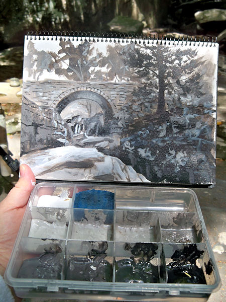
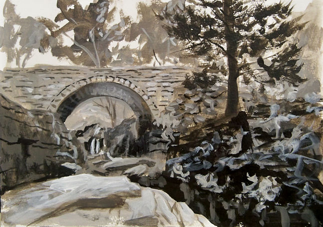
I tried using it a few different ways. On the page below, I mixed Golden Iridescent Bright Gold Fluid Acrylic with water and Golden Matte Medium. I dried it with a hair dryer, and then the image was painted with watercolor and the writing done. The Alpha paper dried almost completely flat with the hair dryer, so painting on it was not a problem.

The additional tooth provided by the Matte Medium definitely allowed more pigment to go down on the page. This wasn't a great choice of things to paint to showcase that, but you can see that I was able to get plenty of red paint down on that little bottle, and the fountain pen still wrote just fine on the surface. However, Matte Medium is called that for a reason, and I lost the glossy sheen that I was so attracted to. The gold no longer shimmered through the watercolor, and it looked like I'd painted over a yellow page, not gold. (It's hard to see those kinds of differences in a photo, so you'll just have to take my word for it, or better yet, give it a try!)

I wanted to see better comparisons of watercolor on the paper with and without the Matte Medium coating. I painted the page below with Golden Fluid Acrylic Iridescent Pearl (a pretty substantial covering of it), dried it with a hair dryer, sponge painted the border, dried that, then applied Golden Matte Medium diluted about 4:1 with water (80% Matte Medium), and coated only the right side of the page with it.


The first thing I noticed is that the iridescence is all but gone on the Matte Medium-coated right side, even though in a photo they both look the same. The right side pretty much just looks like just white paper, but the left side glistens.

I then painted watercolor samples on each side, using the same colors and same brushes, so I could assess the differences. It will definitely take some practice to work well on these surfaces, but as I worked down the pages, doing one color at a time on each page, then going to the next color, it was possible to get a much more even and complete coat of paint on the side with the Matte Medium. That's a good thing......sometimes. But I'd lost the iridescence in the process, so unless I was working on a base of colored paint, I may as well have painted on the white paper surface without any acrylic, and made it a lot easier for myself! This would be good to use over a colored acrylic ground though.

The left side, which had the iridescent glossy surface, did not take the watercolor paint as well for sure. However, the open areas where there is less paint allow the shimmer to show through the watercolor, and I get the beautiful glimmery background. That's a good thing too!

Doing this direct comparison helped me learn what I can expect using either a Matte-Medium coated or uncoated surface. Watercolor is unpredictable enough without adding more unknown variables to the process! If you want as much shimmer as possible, don't coat the surface. If you're not using iridescent paint, Matte Medium will help watercolor paint adhere to the surface.

But wait! Isn't this supposed to be a sketchbook review, not a discussion of paint products and process? So, why am I even calling this "Part II of Stillman and Birn Alpha Hardbound Sketchbook Testing and Review"?  Well, I'm learning that a sketchbook that meets all your needs is, in a way, invisible. It's like painting on a canvas or linen that's prepared exactly the way you like it. You can then paint without thinking about your surface. There is enough to concentrate on with just painting! What I 
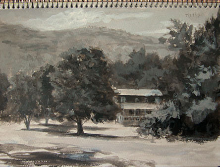
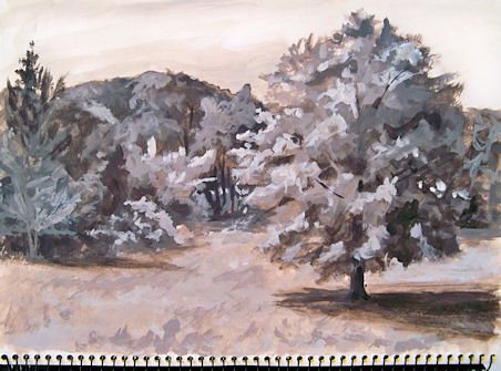
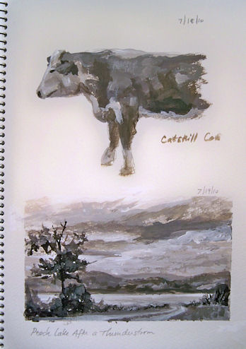
haven't had to say is a testament to the non-issues I've had with this book. I haven't needed two extra hands to hold the book open while I work. I haven't had a wet binding fall apart on me. I haven't had pages pill and prevent me from writing, or tear out of the book. I haven't encountered extra layers of paint and medium being too much for the stitching to hold the pages together. As far as the Alpha hardbound sketchbook is concerned, I have been able to do everything I've wanted to do. Detailing these processes says everything about the book's capabilities and what it can handle. I haven't yet tried anything that it can't do.There are now over 20 two-page spreads of acrylic page preparations done in this book, with most of them already covered with additional mediums of one kind or another, and the book is holding up great.

Some folks wrote to me or posted questions that I thought would be worth including here. Feel free to email/post any additional questions you might have, and I'll include them in tomorrow's post --- hopefully with answers!
Q: Where can I find the Stillman & Birn sketchbooks?
A: Here is a link to a page on their website that lists stores and online venues that carry their books.

Q: Did you have any bleed through to the following pages? I am just about ready for a new sketchbook and am thinking about the Alpha. I do pen and ink with watercolor washes.
A:  I've never had bleed-through in this book with any of my ink/watercolor testing, which has been pretty extensive. I'm quite sure you'd be safe with the Alpha!

Q: What is the difference between the Noodler's Zhivago and Noodler's Sequoia ink that you've used in the page of ink samples posted yesterday?
A: I can see that they look nearly identical in that image! They are both nice, fairly neutralized greens in wash. When writing with the Zhivago, the ink is so dark that it appears black. When used with water as a wash, the black lines wash very little, and the green washes a lot. So the effect is that it blossoms with color, yet leaves behind crisp lines. The Sequoia ink is a dark green, but not so dark that it ever looks black. The color washes a bit more, and it doesn't leave such edgy lines behind. Even though the wash colors might appear similar in the image, the effects of the two inks are actually quite different.

Q: It looks like Noodler's Bulletproof Black (in that same image) washes and isn't so "bulletproof"! What's up with that?
A: The Noodler's Bulletproof inks vary in their water resistance depending on what paper you use. That Bulletproof Black bonds with the cellulose fibers of the paper, so it depends on how much fiber the ink reaches, sizing of the paper, thickness of the ink layer, etc. For more information on that and other black inks that are declared water resistant/waterproof, you can check this post.

There will be another review installment tomorrow, when I'll discuss some alterations I made to the book, the designing of a journaling font for writing, more about the effects of Matte Medium, and page transparency.

To read Part III of this review, click here.

Thursday

Stillman and Birn Alpha Hardbound Sketchbook Testing and Review Part I

 Click here to skip to Part II, if you've already read Part I.

Having recently completed a journal, I've been dealing with the issue of "What Will I Do Next?" In order to make that determination, I started experimenting with the kind of work I want to do in an assortment of sketchbooks, to determine which one(s) will give me what I want. Of course there is always the Make Your Own option, but I'd much rather be sketching than making sketchbooks, if I can find something that works for me.

I decided that I don't want to give up the ability to work across two page spreads, so that immediately eliminated all spiral books. Working across the two pages enables me to sketch twice the size of the book, eliminating half the weight and not having to carry such a large book when I go out on location. Plus, when I'm done with a sketchbook, I like having the book as a hardcover volume of my life that can sit on a shelf and look like a book. A bunch of spiral sketchpads don't convey the message that this is an art journal as opposed to a sketchpad, and should be treated with a little respect!

Stillman & Birn is a relatively new sketchbook company that just started turning out books in February, but already the high quality of their paper and durability of their books are making them a favorite choice among art journal aficionados. I decided to test the limits of a Stillman and Birn Alpha hardbound sketchbook to see if it would perform well enough to serve my needs. I had previously reviewed the S&B Beta Wirebound Sketchbook. Had that been available as a hardbound book I could have stopped right there, but it's only made in wirebound form. I also did a lot of multi-media work in a Stillman and Birn Delta book (all my zoo sketches, for example), which is the same paper as the Beta but ivory-colored, and also available only as wirebound.  I really need a stitchbound, hardcover book at this time.

The Alpha was the natural next choice, since I want a bright white paper in a hardcover book that can handle some wet media. The Fabriano Venezia book that I just completed has great paper, but it was such a struggle to keep it open when working that I'd rather find an alternative. I want to work much larger now, but for test purposes, I selected a 5.5x8.5" Alpha book to run my tests in the studio and take for test drives out sketching on location.

Having made the hardbound book decision, the time had come to start throwing assorted media at it, and see how it holds up. There were many questions to consider, among them:
  • How will the paper withstand spraying water, brushing on and scrubbing acrylics and inks (sometimes multiple times), and drying with a hair dryer?
  • Will the cover and stitching hold up as I go through the book?
  • Will the paper dry flat?
  • How will the transparency of the paper be affected?
  • Will fountain pens still take to the surface after other media is applied, or will the paper pill too much for smooth application?
  • How will watercolor, gouache, colored pencil, brush pens, flex pens, Cretacolor leads, ink and wash, and pastel react to this paper with and without prepared surfaces of other media?
  • Can the binding and stitching handle removal of the center spread of each signature to give some room for collage work and extra media on the pages?
So far, I've been preparing pages in advance with Golden Fluid Acrylics, F&W Acrylic Inks, and various acrylic mediums, then testing other mediums over the top. In many instances, this practice has become as much or more of a test of how various media react than of the paper itself, but that's only because the paper has been able to handle it! I prepared about 10 page spreads at a time, drying each one thoroughly with a hair dryer before proceeding to the next. Then I'd set the journal under a very heavy coffee table-type book overnight. The pages did flatten completely. Score two big points!

I had a ton of trouble photographing these pages. Clearly there is a scanner somewhere in my future. The background above looks green on my computer, but it's actually yellow, and I have not been able to adjust it to resemble the actual page, no matter how hard I've tried. The page was brushed yellow acrylic paint diluted with water, then blotted with a paper towel to give a mottled surface, and dried with a hair dryer. The red border was then painted on, dried with the hair dryer, and the striping and curly corners added with a Krylon 18K Gold Leafing Pen. (I love that thing!) Sometimes I just can't help myself. In my representational artwork, I never get to play with gold, glittery stuff and very highly saturated color, so I truly enjoy going a bit over the top in my art journals.

Once that preparation of the page was finished, I pulled out my new Sheaffer 100 pen, filled with the new formulation of Noodler's #41 Brown (2012), to see if it would take well enough to the surface. This was dependent on whether or not the paper held up to the abuse I'd already heaped upon it, and also whether this particular pen with this exact ink would adhere to the acrylic-primed surface. Well, no problems on any counts! The paper was still perfectly intact, the pen glided over the surface, and the ink laid down quickly and without skipping. Then I painted the barrel of the pen with watercolor, and that also took without problems.


Encouraged by that first success, I decided to see how my other fountain pens and favorite inks would perform on a similarly-prepared surface. This time, I got some sparkle into the paper itself by using a Golden Fluid Acrylic Gold paint, heavily diluted with some medium and lots of water, and dried with a hair dryer. The blue border was then sponge-painted on.

I tested the following pens on the page:
  • Noodler's Flex Pen
  • Eversharp Symphony Flex Pen Fine nib
  • Eversharp Symphony Flex Pen Broad nib
  • Pilot Plumix
  • Sheaffer 100 Fine nib
  • Kaweco Ice Extra Fine nib
  • Sheaffer VFM
  • Lamy Safari with Broad nib
  • Lamy Safari Medium Nib
  • Lamy Safari Extra Fine nib
  • Lamy Safari Fine nib 
  • Platinum Preppy 0.5 nib (medium)
  • Platinum Preppy 0.3 nib (fine)

And the following inks:
  • Noodler's Bulletproof Black
  • Caran d'Ache Grand Canyon
  • Noodler's Midnight Blue
  • Noodler's Tiananmen
  • Noodler's Kung Te-Cheng
  • Platinum Carbon Black
  • J. Herbin Poussiere de Lune
  • Noodler's La Reine Mauve
  • Aurora Black
  • Noodler's Passternak
  • Private Reserve Velvet Black
  • J. Herbin Cacao du Bresil
  • Noodler's Sequoia
  • Noodler's Purple Wampum
  • Private Reserve Chocolat mixed with Private Reserve Black Velvet ("Chocolat Velvet")
  • Noodler's Zhivago
  • Noodler's Black Swan in Australian Roses
  • Noodler's #41 Brown (old version)
  • Noodler's Lexington Gray
  • Noodler's Mata Haris Cordial
  • Noodler's Mandalay Maroon

I also washed a bit of each ink with a clean waterbrush to see if the ink would wash well or (if bulletproof) if it would stay put even with the light acrylic coating on the pages.

The paper held up so well to the complete wetting, drying, and flattening that not one pen skipped on the paper. The inks washed or didn't wash the same as they would or wouldn't on any other surface. So, pen and ink over a page prepared with diluted acrylic is definitely a winning combination on this paper. Once the page was done, I added the gold borders with the Krylon 18K pen. 'Just couldn't help myself!

The time had come to do some testing with watercolors over acrylic --- a dubious-sounding combination. To make it even more challenging, I decided to do the test on a page that was pretty heavily coated with glimmery Golden Fluid Iridescent Pearl. The acrylic was much less diluted than the previous pages I'd tested.

The apple on the upper left was painted with a waterbrush (the kind with the water in the barrel of the brush). The apple on the lower right was painted with a traditional brush, allowing me to get a higher concentration of paint on the brush. The paper was definitely sealed by the acrylic this time, so I struggled with color lifting when I'd go in to get more paint down. This made it a challenge to get dark values. On the other hand, lifting color when you wanted to was a walk in the park! The paper itself behaved perfectly. It handled all the layers of media flawlessly. Although I was disappointed in how the acrylic and watercolor interacted while I was painting, when I looked at it the next day, I loved the effect! You can't see it much in the photo, but because the prepared page is iridescent acrylic, and the watercolor is transparent, the glistening shows through the color and the apples sparkle in the light! It's so cool!

The next day, I put in a call to Golden Acrylics tech guru, Mike Townsend, to find out if there is a better way to get watercolor to take on an acrylic-coated surface. I'll tell y'all about our chat and show results from applying his suggestions tomorrow. Stay tuned! Click here to go to Part II.

Sunday

Golden Iridescent and Interference Acrylics

As I said a few days ago, I've been playing with some shimmery colors lately and test driving how I can use them most effectively. I did this chart to see what would happen layering assorted Golden Interference colors over some of the Golden Iridescents. I also made one row black, and left one the white of the paper, to see the color shift from light to dark (which is way more dramatic than I thought it would be!) There's some glare on the page, but I used this photo because it's when the light hits that you can see some additional effects. As you can see, the interference colors on black are really beautiful! Now I'll have to explore using these with other dark colors too.


Tuesday

Boulder Rock and Kaaterskill High Peak in the Catskill Mountains


This sketch for The Sketchbook Project 2012 features Boulder Rock, with a view of Kaaterskill High Peak across the clove in the distance. I hiked there yesterday with my husband, but the weather turned and I didn't have a chance to paint the scene on location. Fortunately, I took a photo before the light got bad, and painted it from the picture. I used Golden Fluid Acrylics, and I do like the way they are working on this paper! I only have two, two-page spreads left before this sketchbook is finished. I'm really happy to be able to share so many views of the beautiful Hudson River Valley and Catskill Mountains when the book goes on the world tour next year!

Monday

Chatham Falls in Acrylic


Can you believe that I did it yet AGAIN, painting this sketch of Chatham Falls upside down in my sketchbook for The Sketchbook Project 2012? I can't!

I tried acrylics in the book this time and was surprised at how easily the paint took to the paper, so I just might finish up the book with acrylics. The text in the lower right is a little hard to read against the dark paint. It says, "A day at Chatham Falls --- always time well spent. Painted on location with Golden Fluid Acrylics."

Tuesday

Five Minute Portraits on a Prepared Background


You can click the image above to enlarge it.

Well, I have to say, this was really fun! I prepared a background using diluted Golden Fluid Acrylics. I wasn't sure how a fountain pen would respond to the prepared surface, but it worked quite well! In fact, the pen skipped less over the surface than it did before, and it washed with the waterbrush just fine. This is Noodler's Sequoia ink, sketched with a Platinum Preppy pen. I'm still setting the timer for five minutes.....

Thursday

Painting Shades of Gray in Devil's Kitchen


100916-SOG-Devils-Kitchen-with-box-600v
I went back to Devil’s Kitchen in Platte Clove, this time to capture some of the strong contrasts in the morning light. Remember this little container, filled with Golden’s Neutral Gray Heavy Body Acrylics? The lid supports my Shades of Gray watercolor sketchbook, and having the premixed shades and tints has turned value sketching from a chore into one of my favorite ways to paint.
Here’s a picture of just the sketch. You can click it to enlarge it. The actual size is about 6×9″.
100916-SOG-Platte-Clove-Devils-Kitchen-650
The deep chasm in the right foreground is called Hell’s Hole. My goal was to take the viewer along that chasm and under the bridge, to the waterfall beyond. Although I’d not planned to do a color version of this scene, now that I’ve seen it in black and white, I really want to go back and do it again in color.
If you click here, you can see this bridge painted in oils from the other side on my Hudson Valley Painter site!

Wednesday

Road Beside the Red Barns --- Monochrome Value Study


100807-SOG-4-450
This is another entry in my Shades of Gray, monochrome value study book. It was painted en plein air while out sketching with my friend Karen the other day. I’d already done the full color sketch of the red barns (which I posted a couple of days ago), and was waiting for Karen to finish up her painting. That was the perfect opportunity to pull out my container with the acrylic values already laid out and look for a second composition. I loved this curvy road going off into the distance, and it presented me with a wide range of values to work with.

Monday

Sketching Barns


100807-Sketch-of-Barns-GF-450
I went out painting with my friend Karen on Friday, and decided to do some sketches rather than a focused effort on a single painting. This was my first sketch of the day — beautiful barns up on the hillside that we’d been admiring on our painting outings for quite some time. This one was done with Golden Fluid Acrylics in my 10×10″ Kraft paper sketchbook.

Thursday

Painting Monochrome at Home --- Shades of Gray Number 3


100729-SOG-3-Artists-Nest-adj
Golden Neutral Gray Heavy Body Acrylics in a watercolor sketchbook
I’m starting to really love doing these monochrome studies. They are such wonderful practice for improving the way we see values. Having the pre-mixed Neutral Grays has made all the difference in the world, and has turned this from a tedious chore into a fascinating adventure.
I sat outside in the yard in a comfortable chair after standing up and painting all morning, and painted this study under the shade of my favorite tree, with a cool breeze blowing.

Monday

Monochrome Morning in the Back Yard


SOG-2-450
Continuing on with my monochrome value studies in acrylics, this one was added to my Shades of Gray sketchbook this morning. This was also done with the Golden Neutral Gray acrylics plus black and white. I think I’m starting to really enjoy these, much to my surprise!

Tuesday

Shades of Gray --- An Approach to Value Studies


Shades-of-Gray-Paints-600
I set out Golden Heavy Body Acrylic Titanium White, Carbon Black, and all the Neutral Grays in between that Golden makes in a plastic container with compartments and a seal. Value studies are so important, but premixing all those grays ahead of time can be cumbersome enough to put it off time and time again. Now I have no excuses, and this container makes it so easy to pop the lid and paint at a moment’s notice.
Shades-of-Gray-cover-500
This book is about 6×9″. I’m reserving it for my value studies in acrylic, and have dubbed it “Shades of Gray”.
Here’s the first page. The cow was painted from a photo I took on Friday. The little landscape was painted here by the lakeshore this morning.
Shades-of-Gray-1-500v

Monday

Betsy's Bouquet


Click image to enlarge:
100418-Betsys-Bouquet-600
10×10″, Golden Fluid Acrylics in my kraft paper art journal
Text:
Betsy’s Bouquet
Thanks to friend and neighbor Betsy Ryder, I got a tour of Ryder Farm today, complete with an invitation to come back and paint anytime. Betsy picked flowers as she walked with me from one beautiful scene to another. She showed me the old farmhouse, which dates back to 1795. Stepping through those doors was like stepping back in time, with old, original furnishings and plein air paintings on the walls done by an ancestor named Ferris.
Trees and flowers there are just beginning to bloom. We checked out peas just sprouting, fruit trees, meadows being converted to hay fields, and views of Peach Lake from the vantage point of the farm. Betsy presented me with the beautiful bouquet after the tour!

Thursday

Acrylic Sketch of Leigh


091217-Acrylic-sketch-Leigh-16x20-450
20×16″, Golden OPEN Acrylics on canvas covered hardboard
Email me at JamieWG@aol.com if interested in this painting.
I was eager to work in a medium that would enable me to layer quickly today, so I grabbed my Golden OPEN Acrylics and a 16×20 canvas covered board for open studio portraiture. I left most of my acrylics upstate, so had to make due with what I had: Cadmium Yellow Primrose, Pyrrole Red, Transparent Red Oxide, Ultramarine Blue, Carbon Black, and Titanium White.
These paints are just sooooo much fun. I prefer them on paper or smooth hardboard rather than canvas, so next time I’ll have to remember to size some watercolor paper or matboard before I go.
Leigh was a really great and beautiful model. We’ll have her for another sitting in January, so I’ll get to sketch her again!