Results are in on the lightfastness tests I did of the full line of De Atramentis Document Inks!
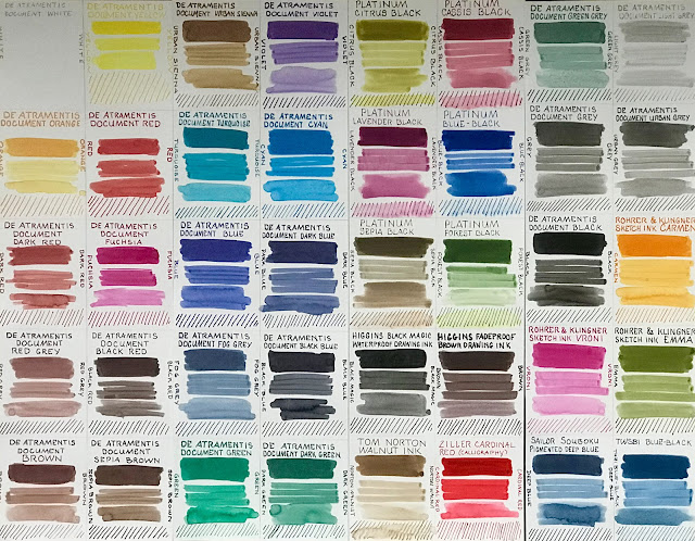
You can see the results of the testing of the De Atramentis Document Inks in this post, as well as my comments regarding other attributes of those inks, which I've been exploring during and after the six months of testing. Below is a photo of all the ink swatches before half of each went into the window. It's a combination of the Document inks, some others that Brian Goulet sent me (from Goulet Pen Company), and some fountain pen, drawing, and calligraphy inks that I had here in the studio and wanted to test. This post will focus only on the De Atramentis Document Inks.
Brian Goulet (of Goulet Pen Company) and I have collaborated on other lightfastness testing projects in the past. (You can scroll through them here, among others I've done for assorted art materials.) In the fall of 2021, we discussed collaborating to test the lightfastness claims of the De Atramentis Document Inks. Brian sent me samples of all of the De Atramentis Document Inks that I didn't already have, plus a bunch of other inks that he thought would be interesting to test. We went into this with extremely low expectations, based upon our previous experiences with lightfastness as it relates to fountain pen inks.
Setting Up the Swatches
The tests were done on Strathmore 500 2-ply Bristol Plate. I used this paper because it is completely archival, 100% cotton rag, has a smooth surface, and doesn't contain optical brighteners. I didn't want the results to be subject to any degradation or changes in the paper. (I learned that one the hard way!)
The top swatch of each color is a two-swipe Q-tip dip of the ink, once from left to right, then over it from right to left, repeated three times to yield an easily-visible, wide area of color. (See image above.) The following swatch was done with single Q-tip swipes. The third swatch of each color is the ink blended/thinned with water. At the bottom of each sample is a series of parallel, slanted lines, made with undiluted ink and a glass dip pen. When that was thoroughly dry, I scrubbed at it with a wet brush to test how waterproof the inks were. The De Atramentis Document Inks did not budge. They are all completely waterproof.
The swatches were then cut down the middle in strips. One strip was placed in a south-facing window in the Northeastern US for six months. The other half remained in a dark closet. Although the window is south-facing, the strength and length of the light in winter is a lot less than what it would have been during the summer months.
During the time that the samples were in the window, I experimented with these inks in my artwork and calligraphy. I used them with fountain pens from extra fine to broad nibs, dip pens, Pilot Parallel pens, watercolor brushes, Pratikpens, assorted brands of fude nib pens, and brush pens like the Pentel Pocket Brush Pen. I even refilled some "non-refillable" markers with them. It was a good all-around test drive of what the inks could or could not do, and I was impressed!
After six months of testing, with over 1800 hours of indirect and direct sunlight exposure (through double pane glass and a screen), most of the Document Inks did extremely well. Not perfect, but much better than I expected. Fuchsia, Red and Yellow were especially welcome surprises. Lets get to the images...
The warm colors totally outperformed my expectations. On the images below, there is a red "W" on the side of the sample that was in the window. Sometimes it's on the left and sometimes on the right, but the "window" halves are always in the middle of the sheets. The other half was kept in a dark closet.
Document White (below left): Obviously, you cannot see white ink on white paper in a photo, but there was no yellowing nor color shift that I could see with the naked eye.
Document Yellow (below right): No apparent change.

Document Orange (above left): Almost no change. Extremely slight fading that is barely visible. However, the color itself is actually weaker and less saturated than it appears in the photo. The lightfastness is impressive, but the color disappointing.
Document Red (above right): No change. This is almost a dead ringer for Noodler's Fox, but it's completely waterproof and lightfast, and dries faster too.
Document Dark Red (below left): No change.
Document Fuchsia (below right): No change (Huge surprise!)

The swatches were then cut down the middle in strips. One strip was placed in a south-facing window in the Northeastern US for six months. The other half remained in a dark closet. Although the window is south-facing, the strength and length of the light in winter is a lot less than what it would have been during the summer months.
During the time that the samples were in the window, I experimented with these inks in my artwork and calligraphy. I used them with fountain pens from extra fine to broad nibs, dip pens, Pilot Parallel pens, watercolor brushes, Pratikpens, assorted brands of fude nib pens, and brush pens like the Pentel Pocket Brush Pen. I even refilled some "non-refillable" markers with them. It was a good all-around test drive of what the inks could or could not do, and I was impressed!
Results
After six months of testing, with over 1800 hours of indirect and direct sunlight exposure (through double pane glass and a screen), most of the Document Inks did extremely well. Not perfect, but much better than I expected. Fuchsia, Red and Yellow were especially welcome surprises. Lets get to the images...
The warm colors totally outperformed my expectations. On the images below, there is a red "W" on the side of the sample that was in the window. Sometimes it's on the left and sometimes on the right, but the "window" halves are always in the middle of the sheets. The other half was kept in a dark closet.
Document White (below left): Obviously, you cannot see white ink on white paper in a photo, but there was no yellowing nor color shift that I could see with the naked eye.
Document Yellow (below right): No apparent change.

Document Orange (above left): Almost no change. Extremely slight fading that is barely visible. However, the color itself is actually weaker and less saturated than it appears in the photo. The lightfastness is impressive, but the color disappointing.
Document Red (above right): No change. This is almost a dead ringer for Noodler's Fox, but it's completely waterproof and lightfast, and dries faster too.
Document Dark Red (below left): No change.
Document Fuchsia (below right): No change (Huge surprise!)

Document Urban Sienna (below left): No change. This is my favorite of the browns, though until now I've been using the regular Document Brown, which I like a lot.
Document Violet (below right): Visible shift showing a loss of the blue pigment. The portion in the window has turned noticeably more red-violet.

Document Turquoise (above left): Window side is showing the beginnings of loss of blue, becoming more green, and lightening a bit. The change is slight, but can be seen in the photo.
Document Cyan (above right): This sample looks like the window side is on the verge of change, showing just a hint of difference. It might not be visible on your screen. (Personally, I love this color, and I'm still going to use it!)
Document Blue (below left): There is a loss of the blue pigment; the side that was in the window has grayed a bit.
Document Dark Blue (below right): The blue has shifted slightly, to more of a blue-grey.

Document Fog Grey (below left): The blue component of the ink has shifted more to grey.
Document Black Blue (below right): Window side is very slightly warmer (less blue) than the control side. The difference isn't nearly as obvious as it is for the Fog Grey.

Document Green (above left): The color has shifted toward yellow as it's lost a bit of the blue. The difference is slight, but if you stare at the image for a minute, you should see it (depending on your monitor). I actually like the yellower version better, so the change doesn't bother me!
Document Dark Green (above right): Again, you might have to stare at the sample enough to see the slight color shift, which is from a bluer green to a less blue green. Difference is slight, but there.
Document Green Grey (below left): This one has a more obvious color shift and fading.
Document Light Grey (below right): Looks perfect to me! No change.

Document Grey (above left): No changes.
Document Urban Grey (above right): No changes. This is my favorite of the Document Greys. It's a little warmer and lighter than the Document Grey.
Document Red Grey (below left): No noticeable changes.
Document Black Red (below right): No noticeable changes.

Document Brown (above left): No changes.
Document Sepia Brown (above right): No changes.
Document Black (below): No changes

My overall thoughts: There is a blue component to some of the Document Ink mixes that appears to be at the root of small color shifts that I see in the blues, and color mixes that contain blue pigment. Those all shift slightly away from the blue. Some of these changes are very hard to see in the photos, and might not even be visible to you, depending on your monitor. If I'd kept the samples exposed for a full year, they might be more obvious. The many colors that did not shift are very impressive -- especially the bright warm colors, which are often fugitive even when lightfastness claims are made!
It's hard to remember what changed and what didn't, so
These colors changed, though some were very slight:
That's pretty amazing for fountain pen inks, right? I am overjoyed!
So, would I call them "Lightfast"? Well, I don't have a scientific enough setup to make those claims. I'd say those that showed no changes at all are "lightfast enough" for my own standards. But it's a relative word; with another 6-12 months in the window, perhaps they would also show signs of change. The Document Inks ALL did very well compared with other inks out in the marketplace for fountain pens. The Rohrer & Klingner Sketchinks did well too. (I'll discuss those in an upcoming post.) Only you can decide what you're comfortable with in terms of creating, selling or displaying your art, and what to use for which application. This is why I do testing for myself, and encourage others to do the same. We can't always trust the materials suppliers to do it to our own standards. There are some companies I rely on for accurate information. The rest I test because they continue to inspire my lack of confidence. I hate to be negative, but my results often do not correspond with what manufacturers tell us about their products. De Atramentis has really come through for us on most of these inks!
De Atramentis Document Inks are certainly more lightfast than other inks that Brian and I have collaborated on for testing in the past. Noodler's La Reine Mauve, Noodler's Kung te Cheng, and Platinum Carbon Black come to mind as being among the few fountain pen inks that did well in our previous tests. (You can check out all of my previous lightfastness tests here.)
Standing up well to light exposure isn't the only think that the De Atramentis Document Inks have going for them. They've impressed me in other ways too:
Document Urban Grey (above right): No changes. This is my favorite of the Document Greys. It's a little warmer and lighter than the Document Grey.
Document Red Grey (below left): No noticeable changes.
Document Black Red (below right): No noticeable changes.

Document Brown (above left): No changes.
Document Sepia Brown (above right): No changes.
Document Black (below): No changes

My overall thoughts: There is a blue component to some of the Document Ink mixes that appears to be at the root of small color shifts that I see in the blues, and color mixes that contain blue pigment. Those all shift slightly away from the blue. Some of these changes are very hard to see in the photos, and might not even be visible to you, depending on your monitor. If I'd kept the samples exposed for a full year, they might be more obvious. The many colors that did not shift are very impressive -- especially the bright warm colors, which are often fugitive even when lightfastness claims are made!
It's hard to remember what changed and what didn't, so
To Summarize...
These 15 Document Ink colors did not change at all:- Urban Sienna
- Light Grey
- Grey
- Urban Grey
- Black
- White
- Yellow
- Red
- Dark Red
- Fuchsia
- Red Grey
- Black Red
- Brown
- Sepia Brown
These colors changed, though some were very slight:
- Orange had an extremely slight fade. Barely visible change.
- Fog Grey becomes less blue and more grey.
- Green lost some of its blue.
- Dark green fades a bit.
- Violet becomes redder. It's a noticeable shift in this color.
- Turquoise becomes a bit more green as it loses some of the blue.
- Cyan shifts a tiny bit toward blue-green. The change is extremely slight in this color.
- Blue turns grayer.
- Dark Blue turns grayer.
- Black Blue lost some of the blue.
- Green Grey becomes a slightly yellower green, but is still a green grey.
- Basically, all ink mixes that contained some of that blue component showed small changes. These changes are slight, but noticeable to the naked eye (some more than others).
That's pretty amazing for fountain pen inks, right? I am overjoyed!
So, would I call them "Lightfast"? Well, I don't have a scientific enough setup to make those claims. I'd say those that showed no changes at all are "lightfast enough" for my own standards. But it's a relative word; with another 6-12 months in the window, perhaps they would also show signs of change. The Document Inks ALL did very well compared with other inks out in the marketplace for fountain pens. The Rohrer & Klingner Sketchinks did well too. (I'll discuss those in an upcoming post.) Only you can decide what you're comfortable with in terms of creating, selling or displaying your art, and what to use for which application. This is why I do testing for myself, and encourage others to do the same. We can't always trust the materials suppliers to do it to our own standards. There are some companies I rely on for accurate information. The rest I test because they continue to inspire my lack of confidence. I hate to be negative, but my results often do not correspond with what manufacturers tell us about their products. De Atramentis has really come through for us on most of these inks!
De Atramentis Document Inks are certainly more lightfast than other inks that Brian and I have collaborated on for testing in the past. Noodler's La Reine Mauve, Noodler's Kung te Cheng, and Platinum Carbon Black come to mind as being among the few fountain pen inks that did well in our previous tests. (You can check out all of my previous lightfastness tests here.)
Other Important Attributes of De Atramentis Document Inks
Standing up well to light exposure isn't the only think that the De Atramentis Document Inks have going for them. They've impressed me in other ways too:
- Compared with other relatively light-resistant inks, these De Atramentis inks dry REALLY FAST! That's a huge advantage to sketchbook artists, bullet journal writers, or anybody who needs to be able to quickly add watercolor to a sketch, close a book they've written/sketched in, or turn the page and get on with things.
- The inks have superb flow. I thought that because they are pigmented inks, they'd be very dry in my pens. Not so at all. My favorite pens retain their wet writing capabilities. After several months of using them only in relatively inexpensive pens, some colors have gained access to my Pilot Falcons. That's proof of my confidence in them!
- In spite of containing pigment particles, they have not clogged my pens, with the exception of the white. That clogged one inexpensive fude nib pen, but not an even finer tipped pen, so it may have been an issue with the pen or type of feed, as they were different brands. Many pigmented inks have not been so kind.
- They are completely waterproof. No matter what I tried, I could not get the ink to run once it was set. That means I can use them fearlessly under watercolor or other media, or for calligraphy/writing on envelopes, without worrying that the ink will run.
My Personal Favorites:
- Cyan -- I absolutely love this color. It might be my favorite of the entire line.
- Urban Grey -- Slightly warmer and slightly lighter than Document Grey. This has pretty much replaced my Lexington Gray, as it's lightfast, slightly lighter in value, and still dries fast like Lexington does.
- Yellow -- Brilliant primary yellow color. It surprised the heck out of me that this color didn't fade. I use it a lot for preliminary lines, then sketch over it with darker colors or watercolor. I've also used it as a mixing color with other colors in the line.
- Red - Similar in color to Noodlers Fox, but lightfast and waterproof.
- Fuchsia -- Such a beautiful, bright fuchsia, and it didn't fade at all with the light exposure. It's amazing.
- Urban Sienna -- Warmest of their browns.
- Black -- Perhaps not quite as dark as Platinum Carbon Black, but dries a LOT faster, flows well, and in several months, has not clogged any of my fountain pens nor brush pens. In fact, I let it take up residence in my Pilot Falcon SF, and always keep a brush pen and a fude nib pen inked up with it in my sketch kit.
- White -- I was sure this would clog up my fountain pen to the point of being useless. But aside from a clog in one pen, it works well. I've tried it in an inexpensive pilot fountain pen with a fine nib, which has worked great, and after months has not clogged at all. A Jinhao fude nib fountain pen didn't fare quite as well and eventually clogged. In all fairness, I haven't been using it often, so it sat for some time before clogging, and I was able to clear the clog. It's not as opaque as, say, the Uniball Signo white gel pen, but for sketching purposes, that can be a good thing. You can get degrees of white, hitting your whitest highlights a couple of times. The fact that I can keep it in a fountain pen is a huge plus. I haven't yet tried it in a brush pen, but I can feel in my soul that the time for that is coming very soon!
Please leave your questions and feedback in the comments. If you have experiences with these inks, please let us know what your favorites are, or any tips or issues you have. We can all learn from your experiences!
Lastly, I'd like to leave a huge Thank You to Brian Goulet and the Goulet Pen Company for supplying ink samples for testing, and for being such a wonderful source of information and support to fountain pen users. Please thank him by supporting the Goulet Pen Company for your purchases of these inks and your fountain pen supplies.
--------------------------------------------------------------------------------------
Upcoming posts:
- Remaining lightfastness test results from this round of ink testing. (Some of the Rohrer & Klingner SketchInks, plus some calligraphy inks and drawing inks)
- Upcoming Holidays in Ink (plus other media) 2022 planning - dates from late November through New Years. Time to start making my sketchbook and "idea dump" lists!
- New Sketchbook Tour from this year's plein air season and travels.
Stay tuned for more to come.... I'm trying to find a new blog subscription service for those who have wanted to subscribe, as Feedburner is no longer adding new subscriptions. I appreciate your patience with my search!
What a fabulously helpful post, Jamie! Your tests and your write-up are so full of useful tidbits and helpful information. Thank you!
ReplyDeleteThank you for your supportive comments on this project, Melissa. I know you're a big fan of these inks as well!
DeleteThank you for doing all this hard work! I'm a historian and always looking for the best permanent inks that don't clog my pens. You might have convinced me to switch from Lexington Gray.
ReplyDeleteReina, I well understand your love of Lexington Gray! It was my go-to gray for well over 10 years. I'm so glad that there are now several great fast-drying, lightfast options!
DeleteWhat a wonderful post! It's exactly what I needed. I'm new to fountain pens, having purchased my first one in July. I'm not artistic by any stretch of the imagination, but I do want to have a set of pens "ready to go" with various colors that don't require a lot of thought. (Such as, I don't want to have one blue that's good for taking notes and another that's safe for signing checks / addressing envelopes.) I think these inks are exactly what I need to use. A couple of questions... First, I noticed that Goulet doesn't classify these inks as quick-drying although your research indicates they are AND Goulet's testing pictures indicate that they are. (For example, see the Document Blue.) I love Goulet Pens and rely on their videos and website for information. Any thoughts on why they're not classified as quick-drying? Second, does anyone post "ink recipes" ... the results of mixing different ratios of a manufacturer's colors?
ReplyDeleteDavid, I'm so glad you find the information helpful. I agree that they should be classified as quick-drying! Perhaps it was an oversight, and maybe the company just doesn't advertise that beneficial characteristic! As for the ink recipes, our monitors all vary, and color is a highly individualized preference. I'd suggest starting with the primaries of yellow, fuchsia, and cyan, and create your own recipes. If you don't have a background in color theory, you'll learn a ton in the process! Let me know how that goes!
DeleteCheck out Jane Blundell‘s website. She has recipes for mixing DeAtramentis inks.
DeleteThis is amazing, thank you so much! I think there may be a couple of colours you didn't try like Moss Green and Purple-Violet, but those may be newer. Any chance of an update with those colours though? Thanks again! All the best
ReplyDeleteI'll have to double check my samples! I'm fairly certain those two colors were not sent to me. I do not plan to do any more tests with the Document Ink line unless they change their formulation and get rid of the blue they're using in their mixes. For a warmer green that held up fantastic in lightfastness testing, I'd recommend the Rohrer & Klingner Sketchink "Emma". It's a stunning color (much more character than the De Atramentis Document Greens) and didn't change at all in the lightfastness tests.
DeleteCouple of questions: Document ink will flow well in a Extra Fine nib? And: does the binder in the ink has acrylic content? Thankyou!
ReplyDelete