Showing posts with label Still life. Show all posts

Tuesday

Holidays in Ink Week 2


How are you all doing at the start of Week 2 of the Holidays in Ink Challenge? Please let me know in the comments! I began Day 1 on November 24 with the page spread of herons and flamingos above. The first page or two in a new sketchbook is always a bit intimidating for me, so I selected a more familiar subject from the prompt list to begin. I've been wanting to study the leg anatomy of the longer-legged birds, heads of herons, and upside-down beaks of flamingos, so I did some anatomy studies on the page as well. My process prompt was Line Quality. I aimed for longer, more expressive lines, and to avoid chicken-scratchy, short, choppy strokes. (Materials list for all of the sketches in this post is at the end.)

Saturday

Project Megasketch -- A Perfect Solution for Your Winter Blues


If you're an artist who doesn't like winter, maybe this post is for you! I used to hate winter. If you live in a cold climate and you're a plein air painter, you probably know what I'm talking about.  One solution for the Winter Blues is to give yourself a special winter art project to break free from your own mold.

Last winter, I embarked upon a drawing/painting/sketching challenge to see objects in a different way, and learn to capture them faster. My hope was that when I ventured out again in the spring to paint, the drawing/blocking in stage would be quicker and more accurate. I wanted to tackle subjects that I found difficult, or required a lot of maintenance and practice, such as perspective, drawing straight lines and round elipses, and being able to sketch a portrait likeness in just a few minutes. I wanted to improve on capturing the elegance and directions of tree branches, the graceful movements of animals, the bustling activity of people walking, and copy some works of the masters to explore their methods. I experimented with mixed media, and broke out all those fun art supplies that I rarely have time to use, or that have been sitting on the shelf untested.


I dubbed this venture Project Megasketch, and began it last November. I finished in April. Maybe it can help you get through the Winter Blues this year, while venturing into new art territory. For those who want to give it a try yourselves, or just follow my project along for ideas, stay tuned. Yours may have different subject matter and goals, but you can create a project that will benefit your art with the development of skills and exploration of techniques by following the process. I'll post regular prompts and examples from my project to help get you started and inspire you in the weeks and months to come. There aren't many rules to follow.

Project Megasketch Rules:


  1. Complete 600 pages, minimum size 9x12"-11x15", in any media. (Or set a different number of pages and size if that's too overwhelming. Make the challenge your own.)
  2. Fill each page. No cheating with half-empty pages!
  3. Work for sale or publication doesn't count. (More about this below.)
  4. Set dates to start and finish. It's okay to adjust that later if you have to. Life happens!
  5. Challenge yourself, but have some fun too.
  6. Trust the process.


Having read this far, if you're still interested, get a few sketchbooks the same size, or one enormous

Just Splashing Around


Every once in awhile, we need to just throw paint. That's what I was in the mood for when I did these two acrylic sketches! They were done from life, from potted plants in my studio. I let the paint spatter and drip, painted into it, made some drips, and just kept doing that until I had enough! This two page spread is about 14x10" in my homemade blue Pescia journal. It was painted with the same Golden Airbrush paints described in my previous post, as well as some Golden Fluid Acrylics for a bit more body to the paint.

I still have two blank pages to fill in this journal. I think my "Kinda Blue" theme played itself out. I was ready to be cheerful by the time I got to the paint-slinging phase here! I will definitely finish it up though as soon as the desire to sketch on something blue surfaces.

Thank you for following along through this journal. This week I'll be posting my review of the new Golden High Flow acrylics.

Friday

Sketching with Mary on a Rainy Day

6x18", Watercolor
Across a two page spread in a Stillman & Birn Beta hardbound 6x9" sketchbook (prototype)

It's not always easy to find a composition that will work across a two page spread in a landscape format book. My friend Mary had this long boat sculpture that helped ease my way across the spread! She came over to sketch on a rainy day in April. We set out spring flowers from our gardens and all sorts of odds and ends and had a blast. Bleeding Hearts and Bluebells were in abundance that day.

Thursday

Dogwood Blossoms

Image can be clicked for a larger version
6x18" on Stillman & Birn Beta paper
Watercolor

My favorite way to work in watercolor is to Just Do It. No pencil lines (or just a few for compositional guidance), no ink......Just straight in directly with a brush and pigment, getting as much down in a single pass as possible. There's something very unique about the way watercolor glows and jumps off the page when it's not fussed with. About six months ago, I ditched the non-transparent colors in my watercolor palette, and found that also made a huge difference in getting the paint and paper to give each other their very best.

That's not to say that I don't need to occasionally bail myself out with opaque lights like Cadmium Yellow or even Titanium White, or that I don't enjoy working with opaque color at times too --- especially on a toned surface. I do. But in restructuring my palette over the past six months, I decided to use gouache for that purpose. After all, if you need to go opaque, that's the way to do it. I took one of the Schmincke palettes that comes with two rows of half pans, removed the metal plate, and squeezed five (yes, five!) rows of half pans into it. Three of those rows were watercolor, and two were gouache. You may recall the post I did about that palette not too long ago. Here's my color chart from that set, as of last week:

It gave me a lot to choose from, but it proved to be heavy for hiking in the mountains. So last week, I pulled out my old palette, which is this one:


I discovered that by removing the metal plate and turning the half pans sideways, I could fit a fourth row into that smaller palette, and it's a lot lighter too. It was hard deciding which colors would stay and which would go, but this is the configuration I eventually ended up with:
 Yep, I'm down to one row of gouache, and kept three rows of transparent watercolor pigments. The dogwood blossoms sketch was one of my test drives for this new setup. So far, it seems to be working, and I'm happy with the lighter weight. Of course, when I need to travel super-light, I can always resort to the mini set I posted yesterday.

This is all a long-winded way of saying that as artists, our ideas continue to change, evolve, and come back around. It's all part of the fun of exploring our world of materials. What we work with depends on what we're painting, what we're painting on, how much time we have, what we're able to carry, and where we're going. And of course as watercolor painters well know, one can never have too many palettes! ;)

I know I promised a tour of my little red sketch kit for today, but I realized I need to take one more photo and do the image adjustment before I can write that post. It will come soon though!

When you're short on sketch time, make a grid!

11x17", across a two page spread in a Stillman & Birn 8.5x11" hardbound sketchbook
Watercolor, Pitt Brush Pens, Fountain Pens, or whatever else I had next to me at the time!
You can click this image to enlarge it. 

It's that time of year when after a winter of being indoors and mostly sketching, I can get out and return to my life as a plein air painter! I have not stopped sketching by any means, but my more finished work is now being done in paint or on separate sheets of rag paper. (You can always check in to see those on my other blog.) 

I feel it's very important to continue sketching, and not give that up when the going gets tough. One of the things I do when time gets tight is I make a grid and sketch a series over time. I have several grids going at any given time on different themes. I try to select themes that hone specific skills. This one was started a few weeks ago as a means of practicing elipses and symmetry. Whenever I had a morning without having to immediately dash off somewhere, I sketched my coffee mug. I sketched the last mug this morning. These were all done directly in ink, so warts and all, I had to live with whatever came out of the pens. 

I'm really enjoying this larger sketchbook, and it certainly presents great opportunities for gridded series! I have a few portrait grids going (32 portrait boxes across a  two page spread!) and some other subjects too. Way fun. Great practice. Quick to do. No excuses!

Wednesday

Flowers for Mom

Watercolor on acrylic-primed Strathmore Aquarius II watercolor paper

I made some cards to send letters to my Mom, who is over 1,000 miles away from me. I cut about a half dozen cards from Aquarius II paper, and toned a few of them with some diluted acrylic traditional and iridescent paints. The surfaces have just a bit of shimmer to them. After I took this photo, I signed the image and put a border around the sketch. I forgot to take another photo of it when it was finished, and now it's already been sent off to her.

These flowers were from a family birthday party that my husband and I attended, so it was a perfect addition to the letter telling her about the event. It does take a lot of time to make cards for people, but what a nice way to be able to share our sketches!


Friday

Watercolor and Gouache are cohabitating in my palette!

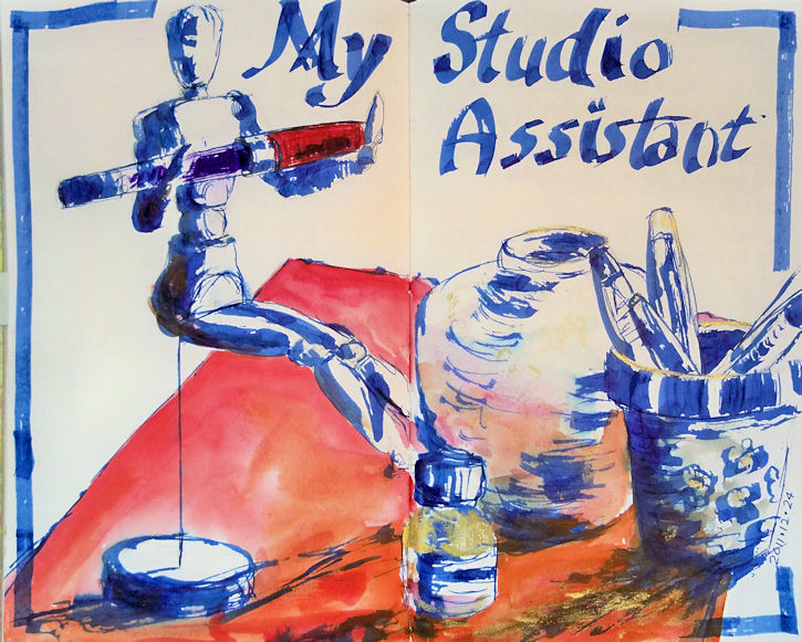
Lexington Gray ink in a Lamy Safari fountain pen
Watercolor and Gouache
Stillman & Birn Epsilon 8.5x11" hardbound sketchbook

I finally found a way to set up my palette to fit watercolor and gouache together. I test drove it the other day and it worked fabulously well. A number of people have been asking me about this palette and how I did the reconfiguration, so here goes.....

I bought this palette online from Wet Paint Art Supply  in Minnesota. Apparently they are only made by special order, so Wet Paint ordered a bunch. Their customers liked them so much that they sold out almost immediately and ordered a lot more! The palette only comes with 12 colors (in two rows of six), with room for a third row of your own half pans and colors, for a total of 18. So, how did I transform this into something that will hold 32 half pans and one whole pan?

There is a metal plate with holders for the pans. It weighs a ton. I took that out. I fiddled with half pans in the empty space to see how many I could fit, and what the best configuration would be. I discovered that four rows of seven colors each would fit with the pans placed vertically,  but that I could squeeze in a fifth row if I had the pans run horizontally. In that last row, because of the curves on the corners of the palette, only five would fit. But I could fit a whole pan vertically in place of one of the half pans --- there was enough space to accommodate that. I am always needing extra white gouache when I'm painting with gouache, so I decided I'd keep my white in that one.

I took out a roll of adhesive magnetic strip. It comes rolled up like a roll of tape. I bought mine a long time ago and I don't remember what brand it was, but it looks something like this. I bought it in a craft store. I cut five strips that fit across the width of the palette. Since they were curled from being in the roll, I heated them with a hair dryer, which softened them a bit, and pressed them under a few very heavy coffee table books overnight. The next day, they were flat. With the adhesive side up (bare magnetic side down), I placed them in the palette, approximating where they would go.

I'd already decided which colors would go where the night before. I filled the pans that weren't already loaded, and wrote the names of the colors on each pan with a black fine point Sharpie. Starting with the top row, I peeled the paper strip off the magnet, revealing the adhesive, and stuck each pan down onto the adhesive strip, working across the row. I put in three rows of watercolor pigments (21 colors), then the 12 pans of gouache.

One thing about working watercolor and gouache together is that the opacity of the gouache, plus the chalkiness of white paint, can get into your transparent watercolor and destroy all that beautiful luminosity. This is why I always kept them in separate palettes. Since this metal palette has two sides, it keeps them separated easily. I'm used to having just two mixing areas for watercolor --- one for warm colors and one for cool. So the two sides of the top mixing area provide the wells I need. However, for gouache I need more areas, since I have to be able to mix value as well as color. All those little wells in the lower area are perfect for my gouache!

I was also able to eliminate the opaque watercolors from my palette. Usually I have cadmium red, a couple of cadmium yellows, cadmium orange, chromium oxide green, and a couple of other opaque watercolors in my watercolor palette. Now I can just substitute gouache when I need those, and keep all my watercolors transparent. That gives me an even larger color range than I had before.

I made the chart above so that I could keep track of what colors were in which pans, until I get to know my own system better. I also knew that initially, I'd be making some changes; that's why I numbered the pans on my sketch, instead of writing in color names. When I change a color, I can just change the name on the numbered list of pigments. I've already swapped out a few and shifted some around.

I've been looking for a way to do this for several years, but never found quite the right thing. This works for me at last!

Sunday

Sketching at Melissa's House

Private Reserve Chocolat and Private Reserve Velvet Black Inks, mixed about 3:1 
in a Platinum Preppy fountain pen, and washed with a waterbrush.
A little watercolor
Stillman & Birn Epsilon 5.5x8.5" hardbound sketchbook

My friend Melissa invited a group of us over to her house to sketch on Friday. I was delighted to see that unlike mine, her amaryllis actually had a flower stalk on it --- with a bud! I knew I had to sketch that.

Since I recently found those deer jawbones to sketch, I also had to draw this deer skull that Melissa had, which seemed to be the remainder of the head!

Wednesday

Pitt Big Brush Pens in the Greenhouse

Click image for a larger, clearer view.
Pitt Big Brush Pens
Stillman & Birn Epsilon 5.5x8.5" hardbound sketchbook

It's time for sketching on some white paper! The greenhouse was filled with all sorts of statues, flowers and plants. There is a big turnover, so every time we go, the displays are different. I loved the shapes in this statue, and it was beautifully set off by the colorful flowers surrounding it. I've been making color charts on a lot of my sketches with the pens. It helps me identify the colors until I get to know them a bit better. I tested out four greens here, but decided to only use two of them. I felt the Light Green and May Green would be too bright for my subject, and the bright red was already ample distraction!

Webcast alert! Remember that tonight (Wednesday 2/15) I'll be a call-in guest for the Goulet Pen Company's webcast, Write Time at Nine. I'll put up a link here before the broadcast. The Goulets will probably get the link up before I do, so if it's not here, try their blog: http://inknouveau.com . Hope to see you there! I'll be revealing the preliminary results of the lightfastness testing that I'm doing with the Noodler's Eternal Inks, and fielding any ink-related questions pertaining to sketching and artwork.

The Life of an Amaryllis Part II

Watercolors, Pitt Big Brush Pens, Noodler's Sequoia ink (diluted) in a Kaweco Sport BB
Stillman & Birn 5.5x8.5" Epsilon hardbound book
Page background prepared in advance with diluted fluid and iridescent acrylics

I don't know how long it's supposed to take before an amaryllis starts to flower, but mine isn't showing any interest in doing so! This is my second sketch in this Life of an Amaryllis series. You can see the first installment here.

Thursday

Deer Jawbone

Stillman and Birn Epsilon 5.5x8.5" hardbound sketchbook
Background prepared with diluted fluid acrylics
Drawing done with Prismacolor Pencils
Border and lettering done with an Eversharp Symphony Fine point fountain pen and 
Private Reserve Copper Burst ink.

While out walking last weekend, my husband and I came upon an area covered with tan and gray fur. There in the middle were both jawbones from a deer that must have fallen victim to a pack of coyotes or some other wild animals. It was pretty creepy, but wow, what a sketching subject! I had to bring this back to the studio. Colored pencils seemed an ideal medium for some of the details and subtle coloring of the subject.

Wednesday

Found Objects

 You can click the image above for a larger, clearer view.

When I go out hiking or walking the dog, I'm often on the lookout for things to bring home to sketch. Sometimes it's a few bits of pottery, or an interesting rock, or leaves and flowers. This time I found an old rusted beer can (which my husband estimates to be about 50 years old!), an old rusted piece of a stove (I think!), and a broken piece of glass with interesting, rounded shapes. I sketched them with different values of warm and cool Pitt Brush Pens, then used some watercolor over the top.

You may notice a difference in the border style here. I've been experimenting with more decorative border and letter styles in another sketchbook, then trying some of them out here in my art journal.

Tuesday

Little Juniper Bonsai

Click image for a larger, clearer view
Page was prepared with diluted acrylic paints--fluids and iridescent
Sketch Ink is Private Reserve Copper Burst in a Pilot Petit
Writing ink is Private Reserve Sepia and Noodler's Golden Brown
Sketchbook is a Stillman & Birn Epsilon, 5.5x8.5" hardbound

I was walking around the greenhouse at Adams Fairacre Farms in Wappinger, New York. As I rounded a corner, I noticed a little bonsai garden tucked away on one of the display tiers. I fell in love with this twisty little juniper bonsai. It made a perfect pen and ink subject. I definitely want to do more of these next time I go back there! I selected this teal page spread for it's greenish tones, and also because I felt this color ink would stand out so nicely against it. I just got a bottle of this Private Reserve Copper Burst, and it immediately became my favorite brown ink.

Saturday

Copper Weathervanes at Adams Fairacre Farms and more glittery stuff

You can click this image for a larger, clearer view
Stillman & Birn Epsilon 5.5x8.5" Hardbound Sketchbook
Collage, ink, gesso, and acrylic background
Private Reserve Copper Burst ink in a Pilot Petit fountain pen
Noodler's Midnight Blue ink in a Kaweco Sport EF fountain pen
Watercolor
Schmincke Dry Copper Gouache

I have the most challenging time adjusting these iridescent images. The copper is really stunning, but in a photo it looks dull and brown without the shimmer of the light on it. If you can imagine the shimmer that you see in spots, spread throughout areas of the sketch, you'll have a better idea of how this looks in real life. The border and box shadow are copper iridescent acrylic, and there's a light coating on the multi-layered page background too. In fact, that background has eight layers of assorted media on it! If you click the image, you can see through parts of it to various background layers of patterned ink and shapes.

I was sketching at Adams Fairacre Farms in Wappinger, NY this past week. I had prepared several page spreads in advance, including this one with the copper background. When I walked by a display of large copper weather vanes, I knew I'd found the perfect subjects for those pages! Combined with my love of birds, it was irresistible! I sketched them with Private Reserve Copper Burst, added some Noodler's Midnight Blue for contrast, and blended/shaded a bit with a waterbrush.

I loved the Schmincke Reichgold Dry Gouache so much that a couple of weeks ago, I got three more jars of different colors:

This was a perfect opportunity to dip into the copper version, so I mixed up some of that after I got home, and added it to areas of the weathervanes, and painted the page title with it.

Friday

Louise King Mud Ponies on Parade

Click image for a larger, clearer view.
Stillman & Birn Gamma 9x6" Hardbound Sketchbook
Private Reserve Velvet Black ink
Private Reserve Chocolat ink mixed with PR Velvet Black
Noodler's Sequoia ink pluse PR Chocolat/Velvet Black mix

I sketched my little herd across the two page spread using fountain pens filled with the listed inks. Afterwards, they were washed with a waterbrush. This Gamma paper has an ivory-toned surface that lends itself to certain colors and applications. I like these inks on it a lot. This sketchbook opens up to a large spread of 18". It's nice to have that spacious feel to expand a sketch, and still have room to write a bit!

Back in the days when my sister lived in New York, she gave me a Louise King "Mud Pony" clay sculpture as a holiday gift for a few years in a row. I've always treasured this little herd of ponies, and I'd like to get a few more of them too....someday! Here's a little video about her and her clay horses:


Sunday

Tall Sketch with a Muted Palette

Watercolor in a 9x6" Stillman & Birn Gamma Hardbound sketchbook

I decided to test drive my new little mini, warm-toned, muted palette in a Stillman and Birn Gamma sketchbook, which has ivory paper. I gave myself the additional challenge of working a two page spread in a landscape format book (6x9"), holding it in a vertical orientation. This made the sketch 18" top to bottom.

I cut a paper template with a 2x6" opening beforehand, so I could peer through the window to size up potential subjects and compositions, and get an idea of how they would fit on the page. I'll keep that tucked inside the book.

Compositionally, I was really pleased with the way this glass pitcher and flowers worked in the tall format, and I am loving these colors on the ivory paper, even though I've decided that some of them will definitely be switched out of the palette. But I think you can see that it's difficult to showcase the 1:3 verticals in a digital image on a short computer screen. If it fits on the screen, it looks like a skinny ribbon of a sketch! And you enlarge it, then you can't see the whole thing. Here's an image to show you what I mean:


The logistics of actually holding the book vertically and painting this were more awkward than I'd anticipated. I clipped the book to a 12x18 piece of coroplast, which I'd cut previously to hold open some 8.5x11" sketchbooks. But this book was in fact longer than 18" when open, so it extended past the support a bit on either side. Fortunately, in this instance I was working in my kitchen, which has an enormous granite peninsula. Out on location, it would be difficult to work this vertical format.

For a painting that will be matted and framed, I think this vertical 3:1 ratio is a stunner. For sketches that will be seen mostly on a computer screen, not so much! I thought that working this way both horizontally and vertically would be an interesting exploration of 1:3 ratio compositions, and I haven't necessarily changed my mind about that yet. I'm going to pursue some horizontals this way. I can certainly see a benefit to the format for many landscape applications as studies for future paintings. More to come as I work my way through this challenge.

Tuesday

Wedding Flowers

My first big event of 2012 was my niece's wedding! She got married on New Year's Day, so we spent a few days in Maryland to take in the festivities. The table bouquets were white hydrangeas, assorted yellow flowers, and peacock feathers. I got to take one of them back to the hotel with me and sketched it that night during the first half of the Giant game, while the guys cheered on our home team. Even I gave in and watched the second half. Some things are a requirement!

The feathers had so much sheen to them that after I finished painting, I mixed up some of the Schmincke dry gold gouache and added some sparkle to them. Unfortunately, that isn't visible on the photo. However, you can see the coppery shimmer on the border from the iridescent acrylics that I used to prepare the page ground and border.

Inks used: Private Reserve Copper Burst and Private Reserve Sepia
Pens: Pilot Parallel 1.1mm, Pilot Petite
Winsor Newton and Daniel Smith watercolors
Winsor Newton, Schmincke and Holbein gouache
Pages prepared in advance using Golden Fluid and Golden Fluid Iridescent acrylics, and F&W Acrylic Inks
Painted across a two page spread in a 5.5x8.5" Stillman and Birn Hardcover Alpha sketchbook

Studio Assistant

As I've been working my way through this Stillman & Birn Alpha journal, and doing my multi-part review, many people have asked me, "What if I work on the white paper instead of pages prepared with a colored ground? How will the paper perform then?" Of course with a sketchbook, that's how most folks work! So I saved several page spreads of plain paper toward the back of the book, and will write something up about working on the plain paper in a couple of days.

I've been wanting a studio assistant for a long time! This particular one doesn't do much, but she can manage to hold onto my wonderful TWSBI ROC 100,  which is more than I can do sometimes. This sketch was done across a two page spread using a 6mm Pilot Parallel with blue ink. I've used this pen often for title lettering, but have never tried sketching with it. It has a very wide, stiff nib, so unless the paper is absolutely, perfectly flat, the pen skips spots. That means it doesn't write evenly in a sketchbook. I thought that might make it interesting for sketching though. The pen is designed to give that very wide 6mm line on one end, and very thin line about 0.3-0.5mm when used on its side. I'm not quite sure yet how I feel about the result, but I think it's worthy of further experimentation. I have these pens in all the other sizes too, which I've found much more useful so far than this 6mm one, yet there's something I really like about the way this pen lays down the lines.

My initial intent was to leave the entire sketch blue, coloring in only the TWSBI pen with red and purple. (It's currently filled with purple ink.) But then I thought adding the red to the cloth all the objects were resting on would give the blue a bit more pop and add another dimension to the sketch. I used Winsor Newton Cadmium Red and Permanent Rose watercolor. It wasn't necessarily a bad idea to do that, but it did completely change the focal point away from my studio assistant holding the pen! So I decided that since I did that, I may as well mix up a little of that Schmincke bottle of gold gouache powder, and color the bottle and a bit on the red beside it. Sometimes it's better to stick with the original plan, and sometimes it's better to let the painting lead you to a different idea. I'm not sure which one this was!