Monday

Holidays in Ink Week 5


I've been excited to have a go at the Black and White on Toned Paper prompt (Process #6). When working on a toned surface, I nearly always select a warm color or neutral  gray. This time, I decided to pick up the cool colors of sky and water, using a sheet of periwinkle-colored cardstock that has been living in the studio closet for several years. I'm loving the strong contrasts and power of these Notan style sketches. I used the paper color as my midtone value, adding just black and white for lights and darks. I definitely want to do more of these moving forward.

I made Sumi ink this week for the first time, using a Sumi ink stick and stone.

Holidays in Ink Week 4


I can't believe we're more than half way through this challenge, and heading into Week 4. If you're doing the challenge also, let me know in the comments how it's going. I'm glad there are still over two and a half weeks left, since I still have a lot of untapped prompts, and nearly 30 blank pages remaining in this sketchbook!

The sketch above, in bright, primary colors, was the result of several days spent mostly doing monochromatic work. I was DYING for some bright color at that point, so I pulled out my most saturated, brightest watercolors, and gifted myself with a fiesta day of color intensity. Normally I'd do a composite with several different poses, but I loved the image of this dancer, so I sketched the same pose several times, as if it were a dance company chorus, letting the colors mingle and the images float across the page from one to the next. The linework was added after the watercolor dried.

Holidays in Ink Week 3


The Holidays in Ink Challenge certainly got me out of my comfort zone this week. I had some new art adventures, discovered more about what inspires me, and had some flops and successes. Leave me a comment and let me know how it's going for you too! If you've posted your sketches somewhere, feel free to leave a link there too. If you haven't started this challenge yet, but would like to, you can read all about it and get the prompt lists (which are totally optional) at this link.

Day 7 involved a Process Prompt I knew I would put off forever if I could: Blind Contour drawing! But I was determined to tackle it. I had beautiful, fresh flowers to inspire me for the Flowers subject prompt, so that helped ease the pain. I did the sketch with a red Bic Cristal Xtra-Bold 1.6mm ballpoint pen (Amazon Affiliate Link), and then splashed some watercolor over it with a loose approach. (Image below.) Starting with the pen in the upper left hand corner and working across the page helped me guess where I was. I also tried to keep my hand still and work around a center point of the flower, then shift my hand over for the next bloom. I confess, I did peek just a few times to be sure I was filling the page! I don't think I've done blind contours since a figure drawing class 20 years ago, and it was more fun than I thought it would be. The inaccuracies gave me some interesting and unexpected shapes to work with. I like the red lines poking through the watercolor. These Bic Cristal pens are great for sketching, with their very wide ballpoints yielding lots of variation when wanted, and intense colors. At under $5 for a set of 24, the price is hard to beat for some favorite art tools during this challenge!

Tuesday

Holidays in Ink Week 2


How are you all doing at the start of Week 2 of the Holidays in Ink Challenge? Please let me know in the comments! I began Day 1 on November 24 with the page spread of herons and flamingos above. The first page or two in a new sketchbook is always a bit intimidating for me, so I selected a more familiar subject from the prompt list to begin. I've been wanting to study the leg anatomy of the longer-legged birds, heads of herons, and upside-down beaks of flamingos, so I did some anatomy studies on the page as well. My process prompt was Line Quality. I aimed for longer, more expressive lines, and to avoid chicken-scratchy, short, choppy strokes. (Materials list for all of the sketches in this post is at the end.)

Monday

Holidays in Ink Challenge Week 1


Yesterday, I panicked! In spite of my posts and preparation so far, it suddenly dawned on me that Holidays in Ink was starting in two days, and I felt totally unprepared. I had no idea what I was going to sketch when the time came, and I didn't want to get sidetracked thinking about that when it was time to sketch. Are you feeling like that too?

So, yesterday I sat down and made a plan for the first few days, using the prompt lists in the Holidays in Ink post. I can always adjust it, but at least I have a plan. Once I did that, I felt 1000% better. 


You can play along with my plan, create your own from the prompt lists on this post, or do something entirely different. Feel free to post your plan in the Comments. Here's what I plan to do:

Holidays in Ink Materials

It's hard to believe that the Holidays in Ink Challenge will be starting in a week! I'm getting so excited about it that it's difficult to stop myself from diving in for a head start.  Grabbing supplies for the project from my studio shelves, drawers, and boxes is part of what's made me so eager. Here are some mouth-watering images of some of the things I intend to savor over the next couple of months. I've added Amazon Affiliate links to make it easier for you to source any of these supplies that you might want to add to your own.

Saturday

Holidays in Ink Challenge 2020-21 -- Details and Prompt Lists


During the busy holiday season, I'll be taking this Holidays in Ink Challenge, enabling me to just sketch with pen and paper when the going gets tough! Come play along if your life gets as hectic as mine from Thanksgiving through New Year's Day, or if you'd like a challenge to push your artistic boundaries and inspire you. Many artists have asked me to include a list of prompts. As a result, I've decided to make two lists ("Subject Prompts" and "Process Prompts"), which are included below. It's posted well in advance of the start date, so you'll have time to gather whatever you need in materials or references to complete your personal challenge.

NITTY GRITTY DETAILS

Tuesday

Art Retail Therapy at the Dollar Store


Most of us are experiencing a greater-than-usual sense of cabin fever this year due to the pandemic. With stores having reopened, I donned a mask and gloves, and headed to my favorite Dollar Tree store for an inexpensive dose of what I call "A.R.T." --- Art Retail Therapy! I always find loads of fun and useful studio items here, and everything at Dollar Tree is truly $1, unlike many of the other "dollar" stores. They carry two types of metal clips I cannot be without in the studio or outside painting, plus a bunch of other art related items I use all the time. The little 6-packs of white paint palettes will come in very handy during Holidays in Ink, when working monochromatically with different dilutions of a color, or for limited palettes. I also love the challenge of finding things that I can repurpose for art use.

The watercolor palette at the bottom of the image above was made from one of the $1 Colormates eye

Saturday

Arteza Real Brush Pens -- Review and Comparisons


In preparation for my Holidays in Ink challenge, I've got my eyes open for supplies that might be interesting to work with. That's not to say that I don't have PLENTY right here in the studio, but when I saw this 48-color set of Arteza Real Brush Pens on Amazon Prime Day, my willpower abandoned me! I decided to dive in and give them a test drive, since I love working with ink and brush pens. I did a few sketches and tests with them, along with several comparisons with other non-waterproof inks and brush pens that I'm already using. 

Sunday

Holidays in Ink, Anyone?


Here in the northeastern United States, October is the month when we plein air painters flock outside to capture the very short burst of peak color in the landscape. It's a time I look forward to all year. Not only is it the best color we will get, but it's the last opportunity before colder temperatures drive us indoors. I've always lamented the fact that Inktober happens in October. I love working in ink, but it's the last thing I want to do in October. Every winter, I come up with a personal, motivational studio art project to expand my own horizons, and try to make the most of the days indoors. This year, from Thanksgiving until after New Year's Day, I'm going to do Holidays in InkYou're all invited to join me if you'd like an interesting art challenge around the holidays.  Here are the basic details:

Saturday

Sketchbook in a Tin


A friend of mine gave me a really cute tin filled with 30 cold press Hannemule watercolor postcards. (https://amzn.to/3cceRSN.) You can see the tin in the image above on the upper right corner. It's been super easy to tuck it into a sketch bag with a small pan set of watercolors or gouache, or a favorite brush pen (https://amzn.to/3mAWTOC) for monochromatic studies. The cards are 4x6" with rounded corners. I'd classify the paper as

Friday

Update on the Makeup Kit to Painting Set Conversion


I've been enjoying my gouache paintbox that I converted from a makeup kit in my previous post, and have some updates for my readers. In this post, you'll find:

  • Solutions for issues that came up while using this box or a similar box. 
  • Link and photos of an available, relatively inexpensive makeup kit that will work well for those of you who have wanted to do something similar.
  • A couple of dollar store painting kit options to show you.

(If the full post with images does not appear below, click here.)

Wednesday

Makeup Kit to Painting Set Conversion


About five years ago, my daughter abandoned a makeup kit in the bathroom closet. It opened to reveal slide out trays with metal pans filled with eyeshadow, little screw cap pots for lip gloss, a mirror set into the lid, and even a small mascara tube. I have to confess that I coveted it from the first moment I laid eyes on it, hoping to someday convert it into a painting kit. The last time she came to visit, she gave it to me. Yes, I do wish I'd asked her sooner! 

(If the full post with images does not appear below, please click the post title above.)

Monday

Megasketch Monday -- My Big Regret

Part of my current "Inspiration Wall" in the studio
Project Megasketch has influenced and improved my art and creativity in more ways that I can count. However, if there were a single thing I wish I'd done differently, it would be this: I wish I'd taken the book apart from the very beginning, and used only one side of each page.  That is my big regret.

Initially, I didn't see that a 600 page bound volume would be a problem. As the page numbers grew, the negative aspects of a double-sided, single volume multiplied. I didn't realize the full impact until the project was over.  If you're part way through the project, and working in a stitch-bound book, you may want to consider changing to a loose sheet system. I wish I had for so many reasons.

To arrive at our destination, we need to use what we've learned, see the path we are on, and use that for inspiration in moving ahead.
  • What has inspired you on your megasketch journey so far? 
  • Which sketches represent what you need to see more of in your work, or a direction you'd like to pursue further? 
  • What have you done that could serve as references for a series, or to chase an idea all the way to its conclusion? 
  • Which ones teach lessons, alerting you when you've taken a wrong turn?
I use a wall in my studio to answer these questions. It influences the way I work. The image above

Wednesday

Transform an Old Book into an Art Journal

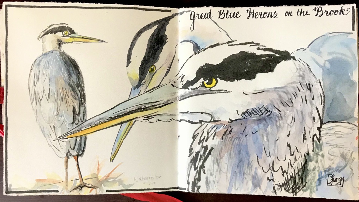
Watercolor over thin white gesso layer, calligraphy marker
For many years, at least a portion of my sketches have been done in old books that I've repurposed as sketchbooks. A lot of friends have been asking me about my process for reusing old books as art journals, so this post is for you....and anybody else who wants to know!

The images in this post are from a 9x12" old hardbound music book, so the two page spread gives me a 12x18" painting surface. This size is a bit cumbersome to take out on location, so I have also collaged in some paintings/sketches done on location, or on other types of paper that I wanted to experiment with.


These two facing pages were lightly sized with white gesso. A small plein air painting was collaged 
onto the left side. Watercolor and gouache were used to paint the Red-winged blackbirds from photos 
I took at the scene, and capture the feel of the marshy location. 

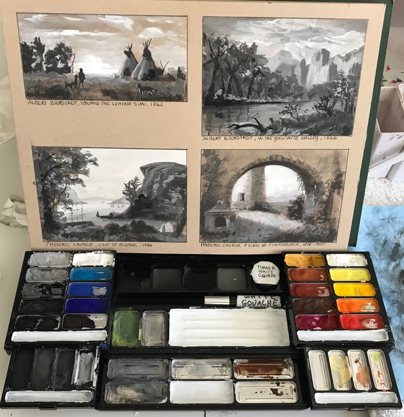
I generally start with a well-constructed, stitch-bound book that can open completely flat. I like books that are more than just text, contain some kind of graphic content, some blank areas, and do not have glossy paper. Although it's nice if the pages are thick, they don't have to be. The book can be hardcover or softcover. You can also use these steps to transform a traditional sketchbook into something that can accommodate heavy media use. So far I've used mostly hardcover books because I put them through a lot of abuse! Choose a size and format that will work for you. Is it for studio experimentation, or will you want to carry it around? Page size, book weight, paper thickness, content, and number of pages are all critical factors.

Watercolor, applied directly onto the pages (no sizing)
You might have some great, old books lying around the house. If none match exactly what you're

Friday

Lightfastness Tests -- Faber Castell Polychromos Pastels


Faber Castell Polychromos Pastels have been a go-to pastel for artists because they are individually rated for lightfastness, and provide a wide range of colors among the harder brands of soft pastels. Having a lightfastness rating does not mean that a color will never fade; it just means that the company is telling you the degree to which the color is lightfast, compared with other colors.

For these tests, I assumed that the earth colors and grays are about as lightfast as you can get, so I didn't test the entire line of Polychromos. Instead, I pulled out 74 colors from the full set that I thought would be most inclined to fade or shift color. The samples have been in my south-facing studio window in the northeastern US for at least a few hours a day for the past five years. The

Monday

Megasketch Monday -- The Long, Meandering Mural Sketch (13x44")

Pentel Pocket Brush Pen filled with Platinum Carbon Black ink, 13x44" mural drawing

Here's a fun challenge for you Megasketchers. One day, I wasn't really sure what I wanted to draw. I felt like working from nature, or nature references. I wanted to do something creative, and not just copy a reference. I wanted to force myself to go right in with high contrast and ink, and for the sketch to be able to evolve.

Wednesday

Rewetting Gouache -- Tips and Tricks


A couple of my gouache (left) and watercolor (right) palettes with some little sketches.
The small, airtight plastic container has titanium white gouache in it.
Lately, many people are saying online that you cannot or should not rewet gouache after it has dried. But I've been rewetting gouache forever. That's why I love gouache as a travel medium. If you don't mind traveling with tubes of paint, and taking the time on location to set up your gouache palette, then just keep doing what you're doing and ignore this post! Personally, I want the advantages of oil or acrylic if I'm going the wet paint route. Gouache offers me portability and compact simplification when those are a priority, such as when out on location or working in a sketchbook. It does not have the feel of that luscious, smooth, wet paint out of the tube, but it serves my purposes.

(Note: "Acryla Gouache" is acrylic paint, not gouache. It cannot be rewet. This post applies only to gouache, which is opaque watercolor, and remains water soluble even after it has dried.)

If you've been struggling with rewetting your gouache, or the appearance of the rewet gouache on your painting, I have a few tips that may be helpful for you:

Thursday

Thursday Thoughts -- A Goal Without a Plan is Just a Wish

Although people generally start their New Years Resolutions on January 1, that's one of the worst days for me to begin new challenges and goals. At that time, I'm still inside the holiday whirlwind of activity. It's not until at least a week later that I'm able to begin tuning back into my regularly scheduled life.

That's one of the reasons why a couple of weeks ago, I shared my quote for this year,  "A year from now, you'll wish you had begun today." It's all about renewal on a daily/weekly/monthy/quarterly as well as annual basis. It doesn't have to happen only on January 1.

Starting a challenge or a new personal goal takes more than just thinking about it and coming up with

Monday

Megasketch Monday -- Practice Does Not Make Perfect


As a musician, one of the things we learn early on is that practice does not make pefect; rather, perfect practice makes perfect. If you play the same phrase over and over, with the same mistakes, you're teaching yourself to make those errors every time. The more ingrained they get, the harder it becomes to correct them. I think this holds true for how we practice and see things in art too. This is one of the reasons why it's harder to see issues in our own work than in the work of others. Mistakes that we make again and again become invisible to us. When we play back a recording of ourselves playing a piece, or look at our art in the mirror, we get a new perspective on what we've done. Mistakes jump out like a sore thumb.

When I was practicing circles and ellipses, I was concerned that I'd develop faulty muscle memory if I drew a lot of them that weren't exactly symmetrical. I was afraid that I'd stop seeing the symmetry if I got it wrong. (See my previous post, "Lines, Ellipses, Perspective, Cross Contours," if you haven't already.)  Apparently, this concerned somebody else too. I searched around the internet and