
In spite of an overflowing cabinet of fountain pen inks, I purchased the 2021 Inkvent Calendar by Diamine to have 25 new inks to explore during the Holidays in Ink Challenge. (Twenty-four of them are shown in the image above.) Diamine will be releasing these inks in bottles for individual purchase in early 2022, for those who weren't fortunate enough to snap up one of the collections. This post showcases my personal favorites from the set. And, yes, I have a LOT of favorites!
I had to learn how to quickly assess each color in order to make the best use of its properties for the Holidays in Ink Challenge every day. Posts about that process, and a flip-through of my Holidays in Ink sketchbook will follow soon. (You can receive email notifications of those posts by subscribing on the upper right corner of my Hudson Valley Sketches blog site.) Photos in this post are mostly close-ups or crops of sketchbook pages for the purpose of showcasing specific characteristics of the inks, rather than the artwork. You'll be able to see each sketch in its entirety in upcoming posts. Many of the images below contain chromatography strips from testing the inks. I'll explain that in an upcoming post. I managed to squeeze all the test strips into the book alongside the sketches!

To avoid contaminating the inks in the original bottles, I transferred 5 ml. of each into glass bottles. This way, I can dip into them with pens and brushes without getting ink too far up the tool, not make such a mess or risk spilling a whole bottle of a color, travel with the full set easily, and top off as needed. They all fit perfectly into this little plastic pencil box.
Some general comments about the Diamine Inkvent 2021 Red Edition collection:
- These inks were easy to work with, washing off my hands and flushing out of pens easier than most.
- They dried quickly on the page, including saturated colors that are usually very slow to dry.
- When erasing pencil lines in drawings, or baselines for calligraphy, the dry Inkvent inks didn't smear. Not even the sheen and shimmer ones. That's quite different from my experiences with some of the other brands of sheening inks out there!
- As with most Diamine inks, when used for ink & wash techniques, you tend to lose the line due to how easily it washes off. This can be good or bad depending on how you work. Sometimes I was grateful for that quality. Other times I was frustrated by having to wait for a sketch to dry, and then having to restate my lines. But it definitely made it easier to flush out pens to switch colors!
- These inks overall were spectacular, with a wide range of colors and properties. There aren't any that I won't have a use for. That being said, this post is about my favorites, so let's get to it......
For Ink and Wash Sketching
If you're an artist who has been looking for inks that yield a wide color range when used for ink and wash techniques, these are the inks that would be of the most interest to you:
Seize the Night (#1) - The chromatography test strip was so different from what I got when writing with this ink! I did a page layout and the lettering, and sketched the little bottle in the lower right, still thinking all I'd get would be the brassy brownish color. When I did the upper corners in ink and wash, and the little landscapes wet-in-wet behind the doors, I was totally blown away by the vibrant purples (less vibrant in this image than in life) and contrasting bronze. Inkvent was off to a great start!

Ash (#3) - This medium value, gray ink bleeds out into pinks, soft grays, and turquoise, with a lovely, soft feel to it.

Tempest (#4) - Oh my gosh! What a stunner. Turquoise, green, blue, pink, and charcoal settle out in washes. The ink is dark enough to get a full value range. And in case that's not enough to put a huge grin on your face, there is gold shimmer! How did I live without this one for so long?

Harmony (#5) - If you're a fan of an analogous color palette, here's one for you. This ink is a soft red-violet in mass tone and a mid value. It's a great ink to write and sketch with. Even in a wet writer, it doesn't get too dark to actually see the color. In washes, the colors are pink and violet, with a hint of blue settling out on some edges. (See #5 in the thumbnail images at the top of this post.)
Winter Spice (#6) -- This is a super strong, sheening and shimmering ink. In wet writing, it appears as sepia with green sheen and blue shimmer. In wash, it produces warm reds, pinks, mid tone browns, sepia, and some green edging and sheen, topping it all off with blue shimmer. Fabulous color! I used it for a two page spread of Nocturnes in my sketchbook.

The shimmer wasn't visible on the image above due to the light angle, so I took the photo below from a steep angle so you could catch a bit of the blue shimmer.
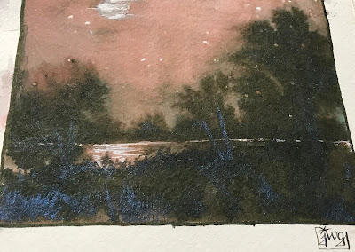
Storm (#9) - For writing and line work, this ink is very dark blue with shimmer. In wash, it yields warm and cool violets, pinks and turquoise. Another stunner! (See Thumbnail #9 in first image above, and the image with the Primary Triad.)
Nightshade (#15) - I absolutely love this ink. It is slightly darker and a bluer violet than Harmony, washing easily into turquoise, pinks, and purples. It's the only ink of the collection that I've actually filled a pen with, since it's a gorgeous writing ink too. (Most of the inks I tested by dipping a clean fountain pen, dip pen, or glass pen into the ink, or used brushes. That made it easier to switch between inks each day.) I'll be using this one constantly for everything from sketches to regular daily writing to calligraphy. I loaded it into a wet writing Kaweco Sport with a BB nib -- so smooth and dreamy! For the sketch below, I did the ink lines first, and then used a waterbrush to pull out ink for the shading. That doesn't show as much color variation as adding ink to already-wet paper, but you can still see the reds peeking through in places, as well as some cooler blues.

The first five inks listed above fell within the first six days of Inkvent. I thought that set the stage for a whole Inkvent of highly chromatic inks, but after the first week, there were only two more with great chromatic range. I had to remind myself that I've never tested 25 inks and found seven of them with fabulous color separation, and I need to be happy about that! The ratio is usually about 1 in 20, and even then, the chromatic qualities are rarely as good as all of the ones in this collection. These are among the best I've ever sampled, and outperformed my expectations for the set by a long shot. Since most appeared within the first week, I had extra time to work with those during the Holidays in Ink Challenge.
Primary Triad
As more inks emerged without chromatic properties, I got restless and began combining some in my sketches for color variation. Diamine did a great job with the color placement within the set. As the days ticked by, I found no shortage of fabulous palettes of colors on consecutive days. Days 7, 8 and 9 yielded a wonderful primary triad. All of these inks have a very dark mass tone, delivering a wide value range as well as color depth:

Candlelight (#7) -- Beautiful warm yellow, like honey. Fabulous writing ink, displaying shading properties and rich color. Candlelight is dark enough to read easily, even though it is within the yellow family.
Raspberry Rose (#8) -- Alizarin crimson lookalike. A great ink to write with.
Storm (#9) -- This ink has wonderful chromatic properties by itself, but also worked well as a blue mixing color, producing lovely olive greens when combined with Candlelight, rich purples with Raspberry Rose, and topping it all off with some festive shimmer.
Sparkly Fun:
Party Time (#11) is a bright fuchsia ink with a tiny bit of blue shimmer. I like that it's light enough so that even when writing text, you can see the actual color. The shimmer is not very pronounced, yielding a festive hint of blue sparkle here and there. Many inks are so saturated and dark that if you write with a wet pen, you cannot even see what color it is. If you like magenta with flair, this is the one for you!

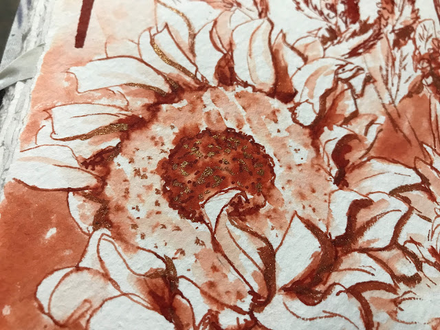
Vintage Copper (#16) is a stunning, rusty orange color with a touch of gold shimmer. It's dark enough to read easily, without the color being so dark as to disappear into blackness. The color has depth and character. With the bit of gold shimmer (closeup below taken at an angle to show the shimmer), it's irresistible.
Analogous Palette Triad:
One of my favorite triads for non traditional work is turquoise, violet and pink. I have entire sketchbooks dedicated to this palette, so I was thrilled that days 18, 19 and 20 gave me this combination on consecutive days, along with some shimmery glam. These are fantastic colors for letter writing, though I used them in my book mostly to tint the background for a two-page spread of scribble portraits. I'm delighted to have all of them:

Sub Zero (#18) - Blue leaning to turquoise, with green-gold shimmer.
Festive Joy (#19) - If you love a clean violet, you should have a bottle of this. It's so delicious that I want to drink it. Not too blue, not too red. It's the most saturated violet in the set.
Pink Ice (#20) - Pink with a warm shimmer, dark enough to write letters and have it be easily legible. It's a beautifully soft pink, as opposed to a strongly saturated fuchsia that can make your eyes bleed after awhile! This color makes me smile. I think it will make my penpals smile too. It'll be great for Valentines Day!
Warm & Cool Duo
I paired these two because they were the only two inks I hadn't yet used at the end of the Holidays in Ink Challenge! As complements of one another, they worked well together for sketching. I ended up loving them as individual colors for both sketching and writing:

Brandy Snap (#21) has some interesting properties, including lovely shading characteristics. Its color is hard to describe and holds one's attention. I'd say it's like a deep, warmer version of raw sienna, showing as yellow ochre in washes. The chromatography strip looks completely different than the mass color of the ink, but tells the story of where it gets its warmth!
Thunderbolt (#17) is a standard, well-behaved, clean ultramarine blue ink. It's not too dark to show off its color in line work, writing or calligraphy, and washes easily.
Just one more that I cannot leave out!
All the Best (#25) is nothing short of bottled festivity. It comes as a full 30ml. of highly saturated red-magenta, with green sheen and blue-violet shimmer for Christmas Day. You simply can't ignore it. Since it's on this sketchbook page below with Wonderland, Black Ivy, and Yuletide, and all of their chromatography strips, I may as well just show you the entire two page spread so that you can see all four ink colors:

My image of All the Best above doesn't adequately display the sheen and shimmer, but here are a couple of swatches of it, courtesy of my friend Melissa Fischer:

I just went back and counted my "favorite" inks above, and there are 17 of them from the Diamine collection of 25. That says a lot for what Diamine has done with Inkvent 2021. Yep, those last four colors are pretty great, even if they didn't make my Favorites list. I needed to make the cuts somewhere! I absolutely had to include all of the inks with great chromatography because they're so hard to come by, but it was very difficult to pare down the other colors. It all comes down to what you need at a given time. In this case, the choices were also dependent on what worked for me for this particular Holidays in Ink Sketchbook Challenge. I'm glad that I got the full set because even those I didn't list among my faves are very nice inks that I'll be able to use.
If you didn't get the full collection, and are interested in purchasing individual bottles when they become available, I hope the descriptions and images above can help you make your choices. From an artist's perspective, buying inks is a true trial and error process. We need to know not just the mass color of the ink, but how it will act in sketches on paper, whether our lines will be retained in washes, if and how the color will change with the addition of water on the paper, or floated into a wash, and how much of a value range we can get. These are elements that the ink vendors' photos cannot often tell us. Hopefully this post has provided you with some useful information regarding these specific inks.
If you got the Diamine Inkvent Calendar 2021, I'd love to hear your own thoughts on the inks in the comments. You can now see a full flip-through of the sketchbook here on YouTube.
I'll discuss more about my quick testing process over the next few weeks in upcoming posts. There is a lot to gain by making chromatography strips, as it can tell us something about a color's potential in just a minute. Many factors then come into play regarding how to get the most from each ink, depending on its characteristics. This is where materials and techniques make huge differences, such as paper type, dilution methods, tools used, etc., as we adapt to each ink's qualities. So, stay tuned for upcoming posts:
- Chromatography Testing -- How do I do it, why do I do it, and what does it tell me?
- Getting the Most from Your Inks: Choosing materials and techniques based on a particular ink's characteristics, or choosing an ink that will work with your materials!
- Holidays in Ink 2021-2022 Sketchbook Video Flip-Through
- Favorite Art Supplies of the Year
- Additional inks that yield good color variations for ink and wash
- Fountain Pen Ink Lightfastness Testing of supposedly "Lightfast" inks and others.
If you'd like to read about the Holidays in Ink project, including materials lists, you can see them all by clicking here and scrolling down the list. You can click any titles that interest you to see the full post on that topic.
If you'd like to subscribe so that you don't miss a post, just enter your email address on the upper right of my blog. I do not share email addresses, and you'll be alerted when a new post appears.
Happy Bew Year Jaimie ! You have made big ! substantives ! progress! Nick Bouteneff
ReplyDeleteNick, hi! Thank you so much, and best wishes for a very Happy New Year!
Delete