Monday

Holidays in Ink and Ink Storage


Holidays in Ink has just begun today! If you didn't have a chance to get started, don't worry; this Challenge is not a Sketch-a-Day type. Rather, you choose the sketchbook you think you can fill during the next six weeks. The goal is to complete the book. You still have plenty of time to do that before January 2, when Holidays in Ink ends!

In the meantime, if your studio is anything like mine or friends of mine, you're probably struggling with getting your inks organized. I don't like dipping into the bottles because it can contaminate the inks. I don't like the skinny plastic vials because they are too thin for some pens or brushes to dip in, and also they are so deep that the ink gets on areas where I'll be putting my hand when I write. My solution has been to get packs of 5ml. glass bottles from Dollar Tree. I can dip into these without making such a mess. They are more convenient to store because they aren't as tall, making them less likely to tip over too. I refill these little bottles using a pipette as needed, so there is zero risk of contaminating my large bottles of ink as I move from color to color. 

Wednesday

Holidays in Ink 2021-22 -- PDF of Prompt List


Last year, I wrote out the Holidays in Ink Prompt Lists across a two page spread in my sketchbook, and used those pages to organize my approach. It's always helpful to have a printed list too. Melissa Fisher made a printable version for us last year. She has once again created a PDF file that we can print out of the new Holidays in Ink prompts for the 2021-22 Challenge. Thank you so much, Melissa!

She has also written a blog post about how she plans to use Holidays in Ink as a sort of  meditative/religious retreat for herself, to balance the hectic holiday season. I love seeing how people use this Challenge to meet their own goals, and fulfill their personal journeys. Art can bring together so many different world views in a unifying, encouraging, and therapeutic way.

The Rat Race of Life lately has prevented me from sorting out exactly what my own "bigger goal" will be during Holidays in Ink this year, though I have some rough ideas. If not solidified in advance, that purpose often reveals itself through the process of creation, allowing the challenge to develop with the flow of the ink. (This is why I often create the title page last!) When in doubt, follow the process.

If you missed the main post for Holidays in Ink with the dates, prompts, etc., here's a link. We have less than a week to go before it begins!

Thursday

Holidays in Ink 2021-22 Information and Prompt List

Holidays in Ink 2021-22 is almost here! Everything you need to know is in this post.


DATES: Monday, November 22 through Sunday, January 2 (Six weeks/42 Days)

GOAL: Complete your sketchbook within the specified 42 days, regardless of how many days you sketch. (Select your sketchbook accordingly!) Pages must be filled and must include ink. Those are the only rules. If you wish, you can use some or all of the prompts below, either individually (one per sketch) or by combining them in your sketches (two or more in a single sketch).

SOCIAL MEDIA: There is certainly no requirement to post or share your work, but if you wish to do so, you can use the #holidaysinink hashtag.

PROMPT LIST (optional):
Take several days to do one prompt, or do several prompts in one day, or even a few in a single sketch. Skip around; there is no official order to the list. (If the Prompt List does not appear below, click to see the rest.) 

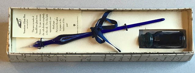
I'm loving these glass dip pens!


My dad gave me this glass pen about 30 years ago, which was handmade in Venice, Italy. I use it all the time for testing new colors, and doing ink and wash. It's so easy to wipe clean when switching between colors. Naturally, I don't bring it out on location because I'm always afraid of dropping it and breaking the delicate tip. As a gift from my dad, it's irreplaceable. Even working in my studio, I worry about dropping it. I needed an inexpensive version that I wouldn't be so afraid to use. 

Monday

Holidays in Ink 2021-2022; Sketchbook and Materials Part 1


Part of the fun of any art project or challenge is gathering the materials and test driving ideas. Since Holidays in Ink is 42 days long (Nov. 22-Jan. 2), I made a hardbound sketchbook with 46 pages, allowing for sketches for six weeks, a title page, index/table of contents/prompt list, and some test pages in back. I love this splotchy fabric cover, and thought it was perfect for an inky theme!

I used Strathmore 400 watercolor paper because it doesn't crack when folded, I like the way it handles ink, and I happen to have some full sheets here in the studio. It has some texture, yet is smooth enough to do some calligraphy. The paper has a different texture on each side. Since I often work across the spread, I made sure that the facing page textures matched when folding the signatures. 

Holidays in Ink 2021-2022. What's the plan?

Everybody has been asking me if I am planning another Holidays in Ink challenge this year, and the answer is most definitely, "YES!" I hope you'll join me from Monday, November 22 through Sunday, January 2 to complete this challenge. Melissa Fischer is teaming up with me once again to come up with prompt lists that can inspire us and improve our art. 

Your mission, should you decide to accept it, is to complete a Holidays in Ink sketchbook from cover to cover during the dates of the challenge. That's it. You don't have to follow prompt lists nor make your own sketchbook if you don't want to.

If you'd like to play along with us, here's how you can get ready:

  • Look at your own hectic, topsy-turvy calendar for the six weeks beginning November 22. According to your schedule/travel plans/family gatherings, etc., and how large you plan to work, calculate how many pages you can realistically fill during that time. (I don't mean a two minute sketch on a page; I mean filled pages, even if it takes a few days to fill a page.) That will be your personal goal for the challenge. Select an appropriate sketchbook based on that information. Make sure it's paper you love, that will handle ink however you like to work. Or you can make a sketchbook, or cut paper to size and use a folder as your "book". Make sure you have a couple of extra pages in the back of your book to test out inks and materials, and a title page or two in the front.
  • Compile a list of any additional supplies you'll need, or things you'd like to try that you don't have. Order those now, so you'll have them in plenty of time. Supply chain issues could leave you stranded if you wait till the last minute. Consider doing this with a friend or two or three, and sharing some new inks among you to divide the costs. (If you'd like to check out some of my favorite materials from last year's challenge, you can see them on this post.)

If you've never done bookbinding, this is a great opportunity to take on a bookbinding project before the challenge begins! (Make a small one first to test drive the process.) There are lots of great YouTube videos on bookbinding, with hundreds of options to explore. I especially like Sea Lemon and Nik the Booksmith on YouTube. 

There will be a prompt list posted before the challenge starts, for those of you who would like to work from a list. If you want to be sure not to miss the posts related to this challenge, you can subscribe to this blog by entering your email address on the upper right. You will then receive email notifications of new posts.

I'm doing my paper and materials testing now, and will probably bind my own sketchbook for the challenge, or rebind an existing book. Melissa and I have ordered the new Diamine Inkvent 2021 Calendar, so we will be exploring the 25 brand new inks in that collection, as well as using inks we already have. We're looking forward to lots of linework with fountain pens, dip pens, and even ballpoints (great for travel!), plus wet on wet washes, calligraphy and lettering, and more compositional study. We hope you'll join us! Stay tuned for the prompt lists.

Sketchbook Video Flip Through -- Holidays in Ink Challenge


Happy New Year, everybody! I can't believe Holidays in Ink is over. I'm still mentally processing everything from this challenge. Here's a video tour of the sketchbook I created during the challenge.

A note about the figurative works: Except for the dancers in primary colors, they were done during weekly figure drawing Zoom sessions that I do with a few friends. We've been working from master paintings, allowing 20 minutes for each. The figures are therefore a bit more stylized than they would be if we'd been using photographs.

Holidays in Ink Week 5


I've been excited to have a go at the Black and White on Toned Paper prompt (Process #6). When working on a toned surface, I nearly always select a warm color or neutral  gray. This time, I decided to pick up the cool colors of sky and water, using a sheet of periwinkle-colored cardstock that has been living in the studio closet for several years. I'm loving the strong contrasts and power of these Notan style sketches. I used the paper color as my midtone value, adding just black and white for lights and darks. I definitely want to do more of these moving forward.

I made Sumi ink this week for the first time, using a Sumi ink stick and stone.

Holidays in Ink Week 4


I can't believe we're more than half way through this challenge, and heading into Week 4. If you're doing the challenge also, let me know in the comments how it's going. I'm glad there are still over two and a half weeks left, since I still have a lot of untapped prompts, and nearly 30 blank pages remaining in this sketchbook!

The sketch above, in bright, primary colors, was the result of several days spent mostly doing monochromatic work. I was DYING for some bright color at that point, so I pulled out my most saturated, brightest watercolors, and gifted myself with a fiesta day of color intensity. Normally I'd do a composite with several different poses, but I loved the image of this dancer, so I sketched the same pose several times, as if it were a dance company chorus, letting the colors mingle and the images float across the page from one to the next. The linework was added after the watercolor dried.

Holidays in Ink Week 3


The Holidays in Ink Challenge certainly got me out of my comfort zone this week. I had some new art adventures, discovered more about what inspires me, and had some flops and successes. Leave me a comment and let me know how it's going for you too! If you've posted your sketches somewhere, feel free to leave a link there too. If you haven't started this challenge yet, but would like to, you can read all about it and get the prompt lists (which are totally optional) at this link.

Day 7 involved a Process Prompt I knew I would put off forever if I could: Blind Contour drawing! But I was determined to tackle it. I had beautiful, fresh flowers to inspire me for the Flowers subject prompt, so that helped ease the pain. I did the sketch with a red Bic Cristal Xtra-Bold 1.6mm ballpoint pen (Amazon Affiliate Link), and then splashed some watercolor over it with a loose approach. (Image below.) Starting with the pen in the upper left hand corner and working across the page helped me guess where I was. I also tried to keep my hand still and work around a center point of the flower, then shift my hand over for the next bloom. I confess, I did peek just a few times to be sure I was filling the page! I don't think I've done blind contours since a figure drawing class 20 years ago, and it was more fun than I thought it would be. The inaccuracies gave me some interesting and unexpected shapes to work with. I like the red lines poking through the watercolor. These Bic Cristal pens are great for sketching, with their very wide ballpoints yielding lots of variation when wanted, and intense colors. At under $5 for a set of 24, the price is hard to beat for some favorite art tools during this challenge!

Tuesday

Holidays in Ink Week 2


How are you all doing at the start of Week 2 of the Holidays in Ink Challenge? Please let me know in the comments! I began Day 1 on November 24 with the page spread of herons and flamingos above. The first page or two in a new sketchbook is always a bit intimidating for me, so I selected a more familiar subject from the prompt list to begin. I've been wanting to study the leg anatomy of the longer-legged birds, heads of herons, and upside-down beaks of flamingos, so I did some anatomy studies on the page as well. My process prompt was Line Quality. I aimed for longer, more expressive lines, and to avoid chicken-scratchy, short, choppy strokes. (Materials list for all of the sketches in this post is at the end.)

Monday

Holidays in Ink Challenge Week 1


Yesterday, I panicked! In spite of my posts and preparation so far, it suddenly dawned on me that Holidays in Ink was starting in two days, and I felt totally unprepared. I had no idea what I was going to sketch when the time came, and I didn't want to get sidetracked thinking about that when it was time to sketch. Are you feeling like that too?

So, yesterday I sat down and made a plan for the first few days, using the prompt lists in the Holidays in Ink post. I can always adjust it, but at least I have a plan. Once I did that, I felt 1000% better. 


You can play along with my plan, create your own from the prompt lists on this post, or do something entirely different. Feel free to post your plan in the Comments. Here's what I plan to do:

Holidays in Ink Materials

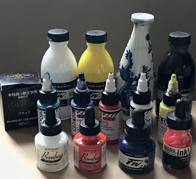
It's hard to believe that the Holidays in Ink Challenge will be starting in a week! I'm getting so excited about it that it's difficult to stop myself from diving in for a head start.  Grabbing supplies for the project from my studio shelves, drawers, and boxes is part of what's made me so eager. Here are some mouth-watering images of some of the things I intend to savor over the next couple of months. I've added Amazon Affiliate links to make it easier for you to source any of these supplies that you might want to add to your own.

Saturday

Holidays in Ink Challenge 2020-21 -- Details and Prompt Lists


During the busy holiday season, I'll be taking this Holidays in Ink Challenge, enabling me to just sketch with pen and paper when the going gets tough! Come play along if your life gets as hectic as mine from Thanksgiving through New Year's Day, or if you'd like a challenge to push your artistic boundaries and inspire you. Many artists have asked me to include a list of prompts. As a result, I've decided to make two lists ("Subject Prompts" and "Process Prompts"), which are included below. It's posted well in advance of the start date, so you'll have time to gather whatever you need in materials or references to complete your personal challenge.

NITTY GRITTY DETAILS

Tuesday

Art Retail Therapy at the Dollar Store


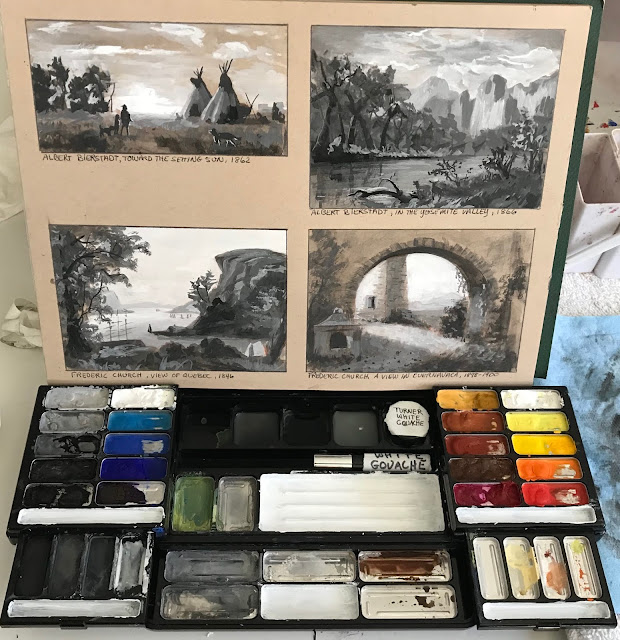
Most of us are experiencing a greater-than-usual sense of cabin fever this year due to the pandemic. With stores having reopened, I donned a mask and gloves, and headed to my favorite Dollar Tree store for an inexpensive dose of what I call "A.R.T." --- Art Retail Therapy! I always find loads of fun and useful studio items here, and everything at Dollar Tree is truly $1, unlike many of the other "dollar" stores. They carry two types of metal clips I cannot be without in the studio or outside painting, plus a bunch of other art related items I use all the time. The little 6-packs of white paint palettes will come in very handy during Holidays in Ink, when working monochromatically with different dilutions of a color, or for limited palettes. I also love the challenge of finding things that I can repurpose for art use.

The watercolor palette at the bottom of the image above was made from one of the $1 Colormates eye

Saturday

Arteza Real Brush Pens -- Review and Comparisons


In preparation for my Holidays in Ink challenge, I've got my eyes open for supplies that might be interesting to work with. That's not to say that I don't have PLENTY right here in the studio, but when I saw this 48-color set of Arteza Real Brush Pens on Amazon Prime Day, my willpower abandoned me! I decided to dive in and give them a test drive, since I love working with ink and brush pens. I did a few sketches and tests with them, along with several comparisons with other non-waterproof inks and brush pens that I'm already using. 

Sunday

Holidays in Ink, Anyone?


Here in the northeastern United States, October is the month when we plein air painters flock outside to capture the very short burst of peak color in the landscape. It's a time I look forward to all year. Not only is it the best color we will get, but it's the last opportunity before colder temperatures drive us indoors. I've always lamented the fact that Inktober happens in October. I love working in ink, but it's the last thing I want to do in October. Every winter, I come up with a personal, motivational studio art project to expand my own horizons, and try to make the most of the days indoors. This year, from Thanksgiving until after New Year's Day, I'm going to do Holidays in InkYou're all invited to join me if you'd like an interesting art challenge around the holidays.  Here are the basic details:

Saturday

Sketchbook in a Tin


A friend of mine gave me a really cute tin filled with 30 cold press Hannemule watercolor postcards. (https://amzn.to/3cceRSN.) You can see the tin in the image above on the upper right corner. It's been super easy to tuck it into a sketch bag with a small pan set of watercolors or gouache, or a favorite brush pen (https://amzn.to/3mAWTOC) for monochromatic studies. The cards are 4x6" with rounded corners. I'd classify the paper as

Friday

Update on the Makeup Kit to Painting Set Conversion


I've been enjoying my gouache paintbox that I converted from a makeup kit in my previous post, and have some updates for my readers. In this post, you'll find:

  • Solutions for issues that came up while using this box or a similar box. 
  • Link and photos of an available, relatively inexpensive makeup kit that will work well for those of you who have wanted to do something similar.
  • A couple of dollar store painting kit options to show you.

(If the full post with images does not appear below, click here.)

Wednesday

Makeup Kit to Painting Set Conversion


About five years ago, my daughter abandoned a makeup kit in the bathroom closet. It opened to reveal slide out trays with metal pans filled with eyeshadow, little screw cap pots for lip gloss, a mirror set into the lid, and even a small mascara tube. I have to confess that I coveted it from the first moment I laid eyes on it, hoping to someday convert it into a painting kit. The last time she came to visit, she gave it to me. Yes, I do wish I'd asked her sooner! 

(If the full post with images does not appear below, please click the post title above.)

Monday

Megasketch Monday -- My Big Regret

Part of my current "Inspiration Wall" in the studio
Project Megasketch has influenced and improved my art and creativity in more ways that I can count. However, if there were a single thing I wish I'd done differently, it would be this: I wish I'd taken the book apart from the very beginning, and used only one side of each page.  That is my big regret.

Initially, I didn't see that a 600 page bound volume would be a problem. As the page numbers grew, the negative aspects of a double-sided, single volume multiplied. I didn't realize the full impact until the project was over.  If you're part way through the project, and working in a stitch-bound book, you may want to consider changing to a loose sheet system. I wish I had for so many reasons.

To arrive at our destination, we need to use what we've learned, see the path we are on, and use that for inspiration in moving ahead.
  • What has inspired you on your megasketch journey so far? 
  • Which sketches represent what you need to see more of in your work, or a direction you'd like to pursue further? 
  • What have you done that could serve as references for a series, or to chase an idea all the way to its conclusion? 
  • Which ones teach lessons, alerting you when you've taken a wrong turn?
I use a wall in my studio to answer these questions. It influences the way I work. The image above

Wednesday

Transform an Old Book into an Art Journal

Watercolor over thin white gesso layer, calligraphy marker
For many years, at least a portion of my sketches have been done in old books that I've repurposed as sketchbooks. A lot of friends have been asking me about my process for reusing old books as art journals, so this post is for you....and anybody else who wants to know!

The images in this post are from a 9x12" old hardbound music book, so the two page spread gives me a 12x18" painting surface. This size is a bit cumbersome to take out on location, so I have also collaged in some paintings/sketches done on location, or on other types of paper that I wanted to experiment with.


These two facing pages were lightly sized with white gesso. A small plein air painting was collaged 
onto the left side. Watercolor and gouache were used to paint the Red-winged blackbirds from photos 
I took at the scene, and capture the feel of the marshy location. 

I generally start with a well-constructed, stitch-bound book that can open completely flat. I like books that are more than just text, contain some kind of graphic content, some blank areas, and do not have glossy paper. Although it's nice if the pages are thick, they don't have to be. The book can be hardcover or softcover. You can also use these steps to transform a traditional sketchbook into something that can accommodate heavy media use. So far I've used mostly hardcover books because I put them through a lot of abuse! Choose a size and format that will work for you. Is it for studio experimentation, or will you want to carry it around? Page size, book weight, paper thickness, content, and number of pages are all critical factors.

Watercolor, applied directly onto the pages (no sizing)
You might have some great, old books lying around the house. If none match exactly what you're

Friday

Lightfastness Tests -- Faber Castell Polychromos Pastels


Faber Castell Polychromos Pastels have been a go-to pastel for artists because they are individually rated for lightfastness, and provide a wide range of colors among the harder brands of soft pastels. Having a lightfastness rating does not mean that a color will never fade; it just means that the company is telling you the degree to which the color is lightfast, compared with other colors.

For these tests, I assumed that the earth colors and grays are about as lightfast as you can get, so I didn't test the entire line of Polychromos. Instead, I pulled out 74 colors from the full set that I thought would be most inclined to fade or shift color. The samples have been in my south-facing studio window in the northeastern US for at least a few hours a day for the past five years. The

Monday

Megasketch Monday -- The Long, Meandering Mural Sketch (13x44")

Pentel Pocket Brush Pen filled with Platinum Carbon Black ink, 13x44" mural drawing

Here's a fun challenge for you Megasketchers. One day, I wasn't really sure what I wanted to draw. I felt like working from nature, or nature references. I wanted to do something creative, and not just copy a reference. I wanted to force myself to go right in with high contrast and ink, and for the sketch to be able to evolve.

Wednesday

Rewetting Gouache -- Tips and Tricks


A couple of my gouache (left) and watercolor (right) palettes with some little sketches.
The small, airtight plastic container has titanium white gouache in it.
Lately, many people are saying online that you cannot or should not rewet gouache after it has dried. But I've been rewetting gouache forever. That's why I love gouache as a travel medium. If you don't mind traveling with tubes of paint, and taking the time on location to set up your gouache palette, then just keep doing what you're doing and ignore this post! Personally, I want the advantages of oil or acrylic if I'm going the wet paint route. Gouache offers me portability and compact simplification when those are a priority, such as when out on location or working in a sketchbook. It does not have the feel of that luscious, smooth, wet paint out of the tube, but it serves my purposes.

(Note: "Acryla Gouache" is acrylic paint, not gouache. It cannot be rewet. This post applies only to gouache, which is opaque watercolor, and remains water soluble even after it has dried.)

If you've been struggling with rewetting your gouache, or the appearance of the rewet gouache on your painting, I have a few tips that may be helpful for you:

Thursday

Thursday Thoughts -- A Goal Without a Plan is Just a Wish

Although people generally start their New Years Resolutions on January 1, that's one of the worst days for me to begin new challenges and goals. At that time, I'm still inside the holiday whirlwind of activity. It's not until at least a week later that I'm able to begin tuning back into my regularly scheduled life.

That's one of the reasons why a couple of weeks ago, I shared my quote for this year,  "A year from now, you'll wish you had begun today." It's all about renewal on a daily/weekly/monthy/quarterly as well as annual basis. It doesn't have to happen only on January 1.

Starting a challenge or a new personal goal takes more than just thinking about it and coming up with

Monday

Megasketch Monday -- Practice Does Not Make Perfect


As a musician, one of the things we learn early on is that practice does not make pefect; rather, perfect practice makes perfect. If you play the same phrase over and over, with the same mistakes, you're teaching yourself to make those errors every time. The more ingrained they get, the harder it becomes to correct them. I think this holds true for how we practice and see things in art too. This is one of the reasons why it's harder to see issues in our own work than in the work of others. Mistakes that we make again and again become invisible to us. When we play back a recording of ourselves playing a piece, or look at our art in the mirror, we get a new perspective on what we've done. Mistakes jump out like a sore thumb.

When I was practicing circles and ellipses, I was concerned that I'd develop faulty muscle memory if I drew a lot of them that weren't exactly symmetrical. I was afraid that I'd stop seeing the symmetry if I got it wrong. (See my previous post, "Lines, Ellipses, Perspective, Cross Contours," if you haven't already.)  Apparently, this concerned somebody else too. I searched around the internet and

A Few Words for the New Year

Every year, I choose a quote for the year, and write it into my planner. This year, my quote is:

A year from now, you'll wish you had begun today.

As we close out 2019, it's an opportunity to look backward and forward simultaneously, take stock of where we are and where we want to be, express gratitude, and make positive changes in our lives. Many of us make a list of New Years Resolutions. But this quote reminds me that every day should be like that -- reflecting, trying to become a better person, implementing new strategies for success in all areas of our lives, and making better choices. We don't have to wait for a new year in order to take action, begin again, or start something new. 

Whether your goals are art-related, work-related, health-related, in the area of personal development, or spiritual, there's no time like the present. Any day can be a new beginning, and this year we get an extra day!

Happy New Year, everybody. I'll be back to my regular posts next week.

Jamie

Sunday

Megasketch Monday -- Silhouette Power

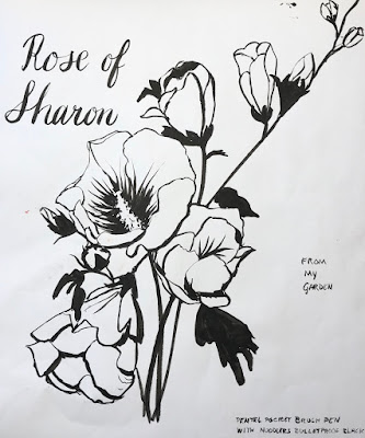
Pentel Pocket Brush Pen with Platinum Carbon Black ink

If you open up the Roger Tory Peterson Field Guide to the Birds, the first thing you see is a two page spread of bird silhouettes. What always surprises me is that each bird is so identifiable from its silhouette alone. Their poses are also perfectly in character, sitting on wires, standing on a fence post, walking along the ground, or looking up and chirping. Silhouettes seem simple, yet they can tell a

Saturday

Twenty White Gouache and White Watercolor Brand Comparisons


When I want a bright white highlight on a sketch, I often count on white gouache to do the job. All whites are created equal, right? Wrong. In fact, even all Titanium Whites are not created equal. On my sketches, I've noticed if a brand of white gouache isn't a brilliant white, or isn't opaque enough, or has an annoying sheen to it. Whether this is due to different brands of the pigment itself, or differences in the color of the binders, the whites are not the same. Consistency, texture, ease of application, and sheen also vary, which affect their use and appearance.

Over the years, as I accumulated and used new gouache and watercolor whites, I made swatches of them on gray paper to see how they measured up against one another. Today, I noticed that there were 20 swatches on the sheet, so I thought it was time for a little Reveal Party.

Monday

Megasketch Monday -- Drawing Trees

Gouache on black paper
Painted from life in Trish's back yard

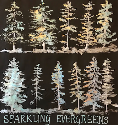
For landscape painters, being able to capture the character of a tree, or the silhouette of a distant tree line, is an important aspect of making a successful painting. Project Megasketch gifted me with ample time to study many different ways of drawing and painting these beautiful and graceful living structures. Toward the end of the project, I combined what I'd practiced with some experimental approaches. I hope this post inspires you to push forward with a favorite subject of your own to develop skills and style. It doesn't have to be trees!

Ink and wash, from one of my own photos

Some I sketched from my own reference photos, like the unique tree (above) that resides at the Bronx Zoo. I tried to keep in mind what I'd learned about tree contours in the time I'd spent with the online

Thursday

Lightfastness Tests -- Charvin Water Soluble Pastel Painting Sticks


In January, 2015, I made swatches of the 48 colors in the Charvin Water Soluble Pastel Painting Sticks set, and cut the strips down the center. I put half of each strip by a south-facing window of my studio, and the other half wrapped up in a dark closet. In another month, it will have been five years since I started the test. By art longevity standards, five years is not a long time.


In case you're not sure which pastels I'm referring to, above is a photo of the set. Here is a link to them on the Jerrys website. They claim to be pure pigment and lightfast. They are certainly well priced! As you can see in the image below, the colors are rated by the manufacturer, some as "**** Excellent" and some as "***Good". But if you know me, you know I often need to prove things for

Monday

Megasketch Monday -- Abstract Art and Doodles

Golden High Flow in an empty Montana marker


While many artists are happiest when doodling or playing around with abstract concepts, I get bored to tears. Pushing around paint or pens without a specific image in my mind always felt like a waste of time. I was determined to spend at least a small part of my Project Megasketch time trying to understand what it was about these genres that appealed to others. Maybe it could become appealing to me too. Hopefully I could learn something from it that would be useful in my representational work, or in my appreciation of abstract art in general. Maybe it would improve the quality of my line

Saturday

Making Friends with Manikins


One of the challenges of Project Megasketch was finding enough subject matter to sketch from life during the winter months. One great solution was the trio of manikins that resides in my studio. If you don't have a manikin, you're missing out. They are fabulous for many different types of studies, such as basic shapes, foreshortening, cross contours, perspective, proportion, motion, dramatic light and shadow, and so much more. Even a great model can't hold an action pose for as long as a manikin!


Set up your manikin in as natural a pose as possible. It can take awhile to find something interesting, that looks like the way a person might actually move. Once you find a pose you like, instead of changing the pose for each sketch, rotate the manikin. Draw the pose from many different angles.

Monday

Lines, Ellipses, Perspective, Cross Contours, Bugs and Animals, Oh My!


One of the most important goals in my 600-page Project Megasketch was to develop line quality, and move away from chicken-scratchy type sketches that destroy the flow of beautiful lines and graceful forms. It's difficult to place a line exactly where we want it as it curves around a form, or moves straight across the page.  We compensate by trying again, and again, and again. What we end up with is a hatchet-job of a sketch, created with lots of small lines in an attempt to correct what we didn't do right in the first place. Even if one of those many lines is correct, the sum of the parts is not pleasing.

I searched online to find a process that would lead to an improvement in the quality of my line work, and came upon Draw A Box.  I think it's one of the best free resources for drawing on the internet. Don't miss the opportunity to take advantage of it! If you've decided to take on Project Megasketch, I'd highly recommend that you make it part of your Megasketch journey.


You may get tired of drawing lines and ellipses after several days of it, but the eventual payoff is huge. Don't skip over it. I stopped counting the pages toward Project Megasketch that I spent on the lines and ellipses because there were so many of them. I found them invaluable as warm ups. A couple of months later, I pulled out some vases, pots, pitchers and bottles to sketch. I wanted to see if it helped as much as I hoped. I found that I could draw them directly with ink in just a couple of minutes, and even if they weren't perfect, the improvement in my ellipses when applied to drawings was dramatic.

Saturday

Project Megasketch -- A Perfect Solution for Your Winter Blues


If you're an artist who doesn't like winter, maybe this post is for you! I used to hate winter. If you live in a cold climate and you're a plein air painter, you probably know what I'm talking about.  One solution for the Winter Blues is to give yourself a special winter art project to break free from your own mold.

Last winter, I embarked upon a drawing/painting/sketching challenge to see objects in a different way, and learn to capture them faster. My hope was that when I ventured out again in the spring to paint, the drawing/blocking in stage would be quicker and more accurate. I wanted to tackle subjects that I found difficult, or required a lot of maintenance and practice, such as perspective, drawing straight lines and round elipses, and being able to sketch a portrait likeness in just a few minutes. I wanted to improve on capturing the elegance and directions of tree branches, the graceful movements of animals, the bustling activity of people walking, and copy some works of the masters to explore their methods. I experimented with mixed media, and broke out all those fun art supplies that I rarely have time to use, or that have been sitting on the shelf untested.


I dubbed this venture Project Megasketch, and began it last November. I finished in April. Maybe it can help you get through the Winter Blues this year, while venturing into new art territory. For those who want to give it a try yourselves, or just follow my project along for ideas, stay tuned. Yours may have different subject matter and goals, but you can create a project that will benefit your art with the development of skills and exploration of techniques by following the process. I'll post regular prompts and examples from my project to help get you started and inspire you in the weeks and months to come. There aren't many rules to follow.

Project Megasketch Rules:


  1. Complete 600 pages, minimum size 9x12"-11x15", in any media. (Or set a different number of pages and size if that's too overwhelming. Make the challenge your own.)
  2. Fill each page. No cheating with half-empty pages!
  3. Work for sale or publication doesn't count. (More about this below.)
  4. Set dates to start and finish. It's okay to adjust that later if you have to. Life happens!
  5. Challenge yourself, but have some fun too.
  6. Trust the process.


Having read this far, if you're still interested, get a few sketchbooks the same size, or one enormous

Tuesday

What happens when you take a year off social media and blog posting?


Well for one thing, you end up with a heck of a lot more time. I logged about a thousand pages of sketches and paintings during the year, experimented with a whole host of media and subjects that I can't wait to tell you all about, spent more time socializing and painting with friends, took on a bunch of artistic challenges, played more music, and the list goes on. But I also missed the online associations. I didn't get Facebook notifications when it was somebody's birthday, and missed hearing about important events in my friends' lives. Thanks to all of my real life artist friends who I see on a regular basis, I never felt like I was in an artistic vacuum, but I didn't get to see all the works that used to travel by on my news feed on social media. 


I also removed my work from the public eye for a year. I retrieved my paintings from all my galleries, did not enter any shows, and posted none of my 1,000 new sketches and paintings. Overall, I have to say that the experience was very freeing! Since nobody would see my work, I wasn't concerned with whether or not it was marketable, or if anybody would show up for show openings. I was free to explore subjects that challenged me, work on drawing, experiment with line work, study anatomy and perspective, copy paintings of the masters, practice constructive drawing techniques, play with abstraction and mixed media, and use whatever I wanted for reference without worrying about copyright restrictions. As a very self-motivated individual, I ended up painting and sketching more than ever, with the time I saved from my self-imposed removal from online interactions.

Now that the year is up, I'm ready to see where this online reincarnation takes me, and how/if it affects the way I've been working for the past year. The sketch above was done in an old, large format music book. It's a watercolor from Muscoot Farm, where my favorite vantage points always end up being smack in the middle of the farm road! The music writing on this page seems to work out well with the composition of the sketch. I got excited about doing the whole book this way, but some other sketches didn't fare as well. After fighting with those, I found it generally better to knock back the music notation a level or two with a thin application of gesso, although that posed some other problems! As the days go by, I'll take you along on my recent art journey. Perhaps you'll get some ideas for your own sketching process too.

Sunday

Three Day Sketching Retreat


Last week, I had an opportunity to spend a few days at a sketching retreat at the Holy Cross Monastery along the Hudson River. I'd long admired the monastery when painting across the river at the Vanderbilt Mansion in Hyde park. When my friend Melissa Fischer organized a sketching retreat there, I jumped at the chance to go and explore the grounds, and immerse myself in my sketchbook. I had just hung a big solo show, which had taken me away from sketching for awhile. It felt great to get out there in the chilly fall air, amidst some beautiful colors and scenes. 

I made this sketchbook specifically for the retreat. It's made out of a single full sheet of watercolor paper, cut into thirds and then folded. I figured it would give me just the right number of pages to fill in a few days. I had just one page left in it when I returned, so it worked out perfectly! This is Fabriano Artistico Cold Press 140 lb paper. Most of the sketches are watercolor. There is one monochrome gouache sketch across a three-page spread, and a pencil sketch of an old oak tree that became a sort of Rite of Passage for all the sketchers there!