Showing posts with label watercolor. Show all posts

Sunday

Get Ready for Holidays in Ink (plus other media) 2022-23!


It's almost that time! You're invited to join me and a bunch of my friends for this fun, educational, and motivational, annual adventure. We'll combine inks with other media to complete a sketchbook during the holiday season. This post outlines what you need to know in order to play along.

DATES:

Monday, November 21, 2022 - Friday, January 6, 2023

GOAL:

Based on how quiet or hectic your personal holiday season is, select or make a sketchbook that you will easily be able to fill during those dates. When November 21 arrives, start your book. Use some ink. Incorporate other media if you wish. That's it!

SUGGESTIONS:

THE SKETCHBOOK

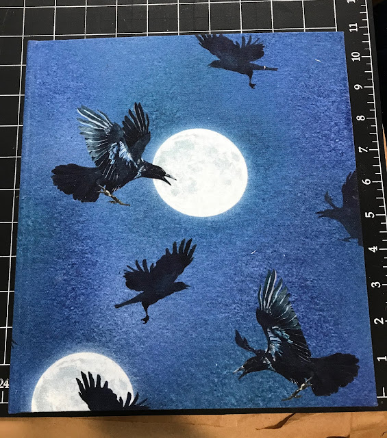
You do not have to complete a page a day, nor even a sketch every day. Well, of course you could. But I will not be doing that. Personally, I've opted to complete 36, two-page spreads during the 47 days of Holidays in Ink. I found a fabric with ravens in moonlight that I loved, turned it into bookcloth, and made my sketchbook a couple of weeks ago. 


Monday

Holidays in Ink Week 3


The Holidays in Ink Challenge certainly got me out of my comfort zone this week. I had some new art adventures, discovered more about what inspires me, and had some flops and successes. Leave me a comment and let me know how it's going for you too! If you've posted your sketches somewhere, feel free to leave a link there too. If you haven't started this challenge yet, but would like to, you can read all about it and get the prompt lists (which are totally optional) at this link.

Day 7 involved a Process Prompt I knew I would put off forever if I could: Blind Contour drawing! But I was determined to tackle it. I had beautiful, fresh flowers to inspire me for the Flowers subject prompt, so that helped ease the pain. I did the sketch with a red Bic Cristal Xtra-Bold 1.6mm ballpoint pen (Amazon Affiliate Link), and then splashed some watercolor over it with a loose approach. (Image below.) Starting with the pen in the upper left hand corner and working across the page helped me guess where I was. I also tried to keep my hand still and work around a center point of the flower, then shift my hand over for the next bloom. I confess, I did peek just a few times to be sure I was filling the page! I don't think I've done blind contours since a figure drawing class 20 years ago, and it was more fun than I thought it would be. The inaccuracies gave me some interesting and unexpected shapes to work with. I like the red lines poking through the watercolor. These Bic Cristal pens are great for sketching, with their very wide ballpoints yielding lots of variation when wanted, and intense colors. At under $5 for a set of 24, the price is hard to beat for some favorite art tools during this challenge!

Saturday

Sketchbook in a Tin


A friend of mine gave me a really cute tin filled with 30 cold press Hannemule watercolor postcards. (https://amzn.to/3cceRSN.) You can see the tin in the image above on the upper right corner. It's been super easy to tuck it into a sketch bag with a small pan set of watercolors or gouache, or a favorite brush pen (https://amzn.to/3mAWTOC) for monochromatic studies. The cards are 4x6" with rounded corners. I'd classify the paper as

Friday

Update on the Makeup Kit to Painting Set Conversion


I've been enjoying my gouache paintbox that I converted from a makeup kit in my previous post, and have some updates for my readers. In this post, you'll find:

  • Solutions for issues that came up while using this box or a similar box. 
  • Link and photos of an available, relatively inexpensive makeup kit that will work well for those of you who have wanted to do something similar.
  • A couple of dollar store painting kit options to show you.

(If the full post with images does not appear below, click here.)

Wednesday

Makeup Kit to Painting Set Conversion


About five years ago, my daughter abandoned a makeup kit in the bathroom closet. It opened to reveal slide out trays with metal pans filled with eyeshadow, little screw cap pots for lip gloss, a mirror set into the lid, and even a small mascara tube. I have to confess that I coveted it from the first moment I laid eyes on it, hoping to someday convert it into a painting kit. The last time she came to visit, she gave it to me. Yes, I do wish I'd asked her sooner! 

(If the full post with images does not appear below, please click the post title above.)

Transform an Old Book into an Art Journal

Watercolor over thin white gesso layer, calligraphy marker
For many years, at least a portion of my sketches have been done in old books that I've repurposed as sketchbooks. A lot of friends have been asking me about my process for reusing old books as art journals, so this post is for you....and anybody else who wants to know!

The images in this post are from a 9x12" old hardbound music book, so the two page spread gives me a 12x18" painting surface. This size is a bit cumbersome to take out on location, so I have also collaged in some paintings/sketches done on location, or on other types of paper that I wanted to experiment with.


These two facing pages were lightly sized with white gesso. A small plein air painting was collaged 
onto the left side. Watercolor and gouache were used to paint the Red-winged blackbirds from photos 
I took at the scene, and capture the feel of the marshy location. 

I generally start with a well-constructed, stitch-bound book that can open completely flat. I like books that are more than just text, contain some kind of graphic content, some blank areas, and do not have glossy paper. Although it's nice if the pages are thick, they don't have to be. The book can be hardcover or softcover. You can also use these steps to transform a traditional sketchbook into something that can accommodate heavy media use. So far I've used mostly hardcover books because I put them through a lot of abuse! Choose a size and format that will work for you. Is it for studio experimentation, or will you want to carry it around? Page size, book weight, paper thickness, content, and number of pages are all critical factors.

Watercolor, applied directly onto the pages (no sizing)
You might have some great, old books lying around the house. If none match exactly what you're

Rewetting Gouache -- Tips and Tricks


A couple of my gouache (left) and watercolor (right) palettes with some little sketches.
The small, airtight plastic container has titanium white gouache in it.
Lately, many people are saying online that you cannot or should not rewet gouache after it has dried. But I've been rewetting gouache forever. That's why I love gouache as a travel medium. If you don't mind traveling with tubes of paint, and taking the time on location to set up your gouache palette, then just keep doing what you're doing and ignore this post! Personally, I want the advantages of oil or acrylic if I'm going the wet paint route. Gouache offers me portability and compact simplification when those are a priority, such as when out on location or working in a sketchbook. It does not have the feel of that luscious, smooth, wet paint out of the tube, but it serves my purposes.

(Note: "Acryla Gouache" is acrylic paint, not gouache. It cannot be rewet. This post applies only to gouache, which is opaque watercolor, and remains water soluble even after it has dried.)

If you've been struggling with rewetting your gouache, or the appearance of the rewet gouache on your painting, I have a few tips that may be helpful for you:

Sunday

Megasketch Monday -- Silhouette Power

Pentel Pocket Brush Pen with Platinum Carbon Black ink

If you open up the Roger Tory Peterson Field Guide to the Birds, the first thing you see is a two page spread of bird silhouettes. What always surprises me is that each bird is so identifiable from its silhouette alone. Their poses are also perfectly in character, sitting on wires, standing on a fence post, walking along the ground, or looking up and chirping. Silhouettes seem simple, yet they can tell a

Saturday

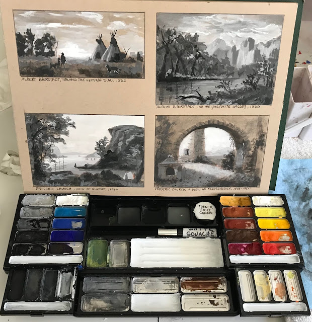
Twenty White Gouache and White Watercolor Brand Comparisons


When I want a bright white highlight on a sketch, I often count on white gouache to do the job. All whites are created equal, right? Wrong. In fact, even all Titanium Whites are not created equal. On my sketches, I've noticed if a brand of white gouache isn't a brilliant white, or isn't opaque enough, or has an annoying sheen to it. Whether this is due to different brands of the pigment itself, or differences in the color of the binders, the whites are not the same. Consistency, texture, ease of application, and sheen also vary, which affect their use and appearance.

Over the years, as I accumulated and used new gouache and watercolor whites, I made swatches of them on gray paper to see how they measured up against one another. Today, I noticed that there were 20 swatches on the sheet, so I thought it was time for a little Reveal Party.

Monday

Megasketch Monday -- Drawing Trees

Gouache on black paper
Painted from life in Trish's back yard

For landscape painters, being able to capture the character of a tree, or the silhouette of a distant tree line, is an important aspect of making a successful painting. Project Megasketch gifted me with ample time to study many different ways of drawing and painting these beautiful and graceful living structures. Toward the end of the project, I combined what I'd practiced with some experimental approaches. I hope this post inspires you to push forward with a favorite subject of your own to develop skills and style. It doesn't have to be trees!

Ink and wash, from one of my own photos

Some I sketched from my own reference photos, like the unique tree (above) that resides at the Bronx Zoo. I tried to keep in mind what I'd learned about tree contours in the time I'd spent with the online

Tuesday

What happens when you take a year off social media and blog posting?


Well for one thing, you end up with a heck of a lot more time. I logged about a thousand pages of sketches and paintings during the year, experimented with a whole host of media and subjects that I can't wait to tell you all about, spent more time socializing and painting with friends, took on a bunch of artistic challenges, played more music, and the list goes on. But I also missed the online associations. I didn't get Facebook notifications when it was somebody's birthday, and missed hearing about important events in my friends' lives. Thanks to all of my real life artist friends who I see on a regular basis, I never felt like I was in an artistic vacuum, but I didn't get to see all the works that used to travel by on my news feed on social media. 


I also removed my work from the public eye for a year. I retrieved my paintings from all my galleries, did not enter any shows, and posted none of my 1,000 new sketches and paintings. Overall, I have to say that the experience was very freeing! Since nobody would see my work, I wasn't concerned with whether or not it was marketable, or if anybody would show up for show openings. I was free to explore subjects that challenged me, work on drawing, experiment with line work, study anatomy and perspective, copy paintings of the masters, practice constructive drawing techniques, play with abstraction and mixed media, and use whatever I wanted for reference without worrying about copyright restrictions. As a very self-motivated individual, I ended up painting and sketching more than ever, with the time I saved from my self-imposed removal from online interactions.

Now that the year is up, I'm ready to see where this online reincarnation takes me, and how/if it affects the way I've been working for the past year. The sketch above was done in an old, large format music book. It's a watercolor from Muscoot Farm, where my favorite vantage points always end up being smack in the middle of the farm road! The music writing on this page seems to work out well with the composition of the sketch. I got excited about doing the whole book this way, but some other sketches didn't fare as well. After fighting with those, I found it generally better to knock back the music notation a level or two with a thin application of gesso, although that posed some other problems! As the days go by, I'll take you along on my recent art journey. Perhaps you'll get some ideas for your own sketching process too.

Monday

Last of the Rose of Sharon


You know the summer season is winding down when your very last Rose of Sharon bush has nearly finished blooming. I'm trying to make the most of the few blossoms that are left. This is across a two page spread in a Stillman & Birn Alpha Softcover sketchbook.

Tuesday

Let's Change the Subject


Watercolor in a Stillman & Birn Zeta hardbound book

It's that time of year when change happens. The days are getting much shorter. They are about to get shorter still when we go off Daylight Savings Time this coming weekend. The weather is getting colder. The leaves are falling off the trees. Most of them are down now, and I expect the rain that comes in a couple of days will remove most of what's left. Winter won't be far behind.

As a painter, this combination of events has many repercussions. I'm touching up plein air pieces that have been done over the past three seasons and not yet quite finished, picking out the bugs and blades of grass and bits of sand and dirt, and getting them ready for holiday sales. I'm varnishing and framing a lot of paintings (just varnished 21 pieces a few days ago), and getting them to the galleries for the holiday shows. I'm preparing for The Big Move into the studio for the winter.

I actually look forward to this annual change. It gives me a chance to dive into other subject matter that I love, but don't have time for during the seasons of better weather. I have an opportunity to listen to great music while I work in the studio, tackle some larger pieces, and do my commission work. I can get back to open studio figure drawing and painting, portraiture, and mix it up with a bit of still life. I experiment with materials, new color combinations, and explore style.

I anticipate it won't be long before our plein air group starts our regular winter portrait sketch-a-thons. We gather in somebody's house and take turns doing 20 minute portrait sittings for one another. It's great fun, and we don't have to pay a model! I like to do some sketches from photos as a warmup for the seasonal change. This week I've been focusing on eyes. I'd like to improve my ability to capture expression this year, and a lot of that happens in the eyes. I'm not doing any underdrawing, and just going in directly with a brush and watercolors.


After doing the first few, I got frustrated with my palette, added some colors and swapped out others. I'm finding I need a slightly different selection of pigments for portrait work. Mainly I really missed my cadmium red and cadmium orange. I'm also liking ultramarine violet, and sometimes cobalt violet. I took out the phthalo blue, kept cerulean and ultramarine, and added cobalt.

I'm trying to do a quick portrait sketch after dinner at night, again without any preliminary drawing and just jumping in --- sink or swim. They're a bit fast and rough, but I'm rusty. They'll get better as the season moves along. I'm looking for photos that have good eye images, since that's my focus for now. I went straight in with color on a pre-toned surface again. (The streaky blue and red below are part of that toning process.)


Getting back to my winter fare feels good. I'm looking forward to diving in more as the weather gets colder. I feel inspired by the change. My pet birds, Mango and Coconut, will be happy to have me back in the studio. The dogs' beds are already under my work table. Bring it on!
Sunday

When Ideas Are Brewing


When ideas are brewing in my head, it often takes awhile for them to emerge as finished paintings. I often play with those ideas in my sketchbook at night, or in a small format on loose pieces of paper. I had some color ideas I wanted to explore last night, so I pulled out my little half-pan watercolor travel setup for these, and used squirrel mop and sable brushes.

I usually keep a few pieces of good rag watercolor paper taped to boards and some are subdivided for sketches like this. Setting up a sheet this way is something I got from a workshop I took with the amazing David Taylor. He always advised doing these small thumbnail sketches on the side of the page in a small taped-off section. That way you can test drive your ideas (a few times if necessary) before taking them to a larger version. It speeds the process along, and you can immediately apply what you learn to the next one. I was torn between working in my sketchbook and working on the rag paper. (I love the way a hardbound sketchbook keeps all my ideas from wandering away!) But in this case, I needed to see how the colors would blend on rag paper. 

Technically, I'm not too pleased with these. However, I am happy with the way the colors are working, and I think with some more practice I'll be able to get what I'm after. Then I'll scale them up and start exploring the idea with assorted materials and techniques. One thing I've had to accept over the past few months is that the way I'm wanting to work with watercolor and acrylic requires a larger palette for those media for wash mixtures. It's always a juggling act to try to determine how much stuff we can take out painting on location, considering the need to pack light and carry it all!

Wednesday

Best of the Year, Part I


Happy 2013 to all my viewers! I'd like to start off the new year by sharing my favorite discoveries and new products of the past year. Some are new to the market, while others are things I'd just not explored before and hope to work with more in the year to come. I hope that some of you will enjoy using them too.

Today's post is about my favorite pigment of 2012: PR206. It is actually a Quinacridone red, but looks more earthy than many of the Quins. This pigment gives me a warm red, transparent earth color. It can easily be mixed with earthy yellows to yield the equivalent of a transparent red oxide. When mixed with ultramarine blue, it creates a dark, muted violet. I started using this color in my watercolor palette after taking a class with David Taylor. It became such a staple in my palette that I searched for the same pigment in oils and acrylics. The past few years have found me working transparently a lot more in both oils and acrylics, so this pigment was a natural fit --- especially for underpainting and glazing. I did several paintings using it as my only red. The pigment goes by many different names, so you need to look carefully for the pigment number, which is PR206.

Here are a few manufacturers that make it for different mediums.

Watercolor
Daniel Smith --- Quinacridone Burnt Scarlet
Winsor Newton --- Brown Madder

Oils
Maimeri Puro --- Avignon Orange
Daniel Smith --- Quinacridone Burnt Scarlet

Acrylics
Golden Fluid --- Quinacridone Burnt Orange
Golden Heavy Body --- Quinacridone Burnt Orange
Golden OPEN --- Quinacridone Burnt Orange


Click here to see Best of the Year, Part II.

Friday

Kaaterskill Falls from the Top

8.5x11" across a two page spread of a 5.5x8.5"
Stillman & Birn Beta Hardbound Sketchbook
Ink and Watercolor

On the way back from the Inspiration Point hike that I posted about yesterday, we detoured to the top of Kaaterskill Falls, where you can sit alongside Lake Creek just where it plunges over the 270 foot waterfall. There are dramatic distant vistas of the mountains from up there, plus beautiful rock outcroppings and intimate cascades. It was one of the favorite spots of the Hudson River School artists, and it's one of my favorites as well! They have done quite a bit of trail work there recently and the footing is vastly improved from the top of the mountain down to the top of the falls.

Thursday

Hike to Inspiration Point

8.5x11" across a two page spread in a 5.5x8.5"
Stillman & Birn Beta hardbound sketchbook
Ink and Watercolor

I went to Inspiration Point several times this past summer and fall. For some reason, it has beckoned me this year! The twisted birch tree on the left seems to end up being my sketching subject on the trips more often than not. I love the contrast in the trunk, and the way the backlit leaves light up against the mass of Kaaterskill High Peak behind them. The ink and watercolor were done on location. Once home, I added the border and lettering with a Pitt Big Brush Pen

Monday

From a hike to Palenville Overlook

Stillman & Birn Beta hardbound sketchbook
Watercolor
Noodler's Luxury Blue Ink
Lamy Safari with EF nib


Sketched during our lunch break on a hike to Palenville Overlook with friends.

Sunday

Hunter Mountain Fire Tower

Stillman & Birn 5.5x8.5" hardbound Beta sketchbook
Watercolors
Lamy Safari with EF nib and Noodler's Luxury Blue
Pitt Big Brush Pen (for page border only)

Text:
We took the easier route to the fire tower by riding the chair lift up to the Colonel's Chair, and then hiking the two miles uphill to the tower from there. The views from the tower were spectacular, though beter for experiencing than for painting. We were grateful for having made the decision to bring sweatshirts along! They were certainly needed on the chair lift ride up in the morning, as well as up on the tower, where the wind was brisk and chilly.

Once back down on firm ground, we sat on some rocks by the ranger's cabin and had peanut butter sandwiches, and I pulled out my paints to sketch the scene. The top of the tower was blocked off. We couldn't figure out why they would do that, but perhaps they were trying to discourage people from spending the night up there or making a mess.

As usual, the trip down was a lot easier than it was going up!

Wednesday

Hiking the Old Stage Road


7.5x15" across a two page spread in a
custom Arches 140# Rough sketchbook

These sketches were painted during another one of the hikes I took with my husband this summer. We've always wanted to hike the old stage road up to the Catskill Mountain House site. It's a strenuous walk up the steep slope of the eastern escarpment of the mountains. We thought we'd be smart and leave one car at the bottom, drive up to the top where there's a parking lot, and walk the road downhill instead of uphill! We walked down leisurely, figuring we had all the time in the world before meeting friends later for dinner. As we arrived at the bottom, I realized that I'd left my car key locked in my husband's car at the top of the mountain! We had no choice but to turn around and walk all the way back up to his car. Needless to say, I don't think I'll ever make that mistake again when hiking point to point!