I was able to get a few days to sketch on Mt. Desert Island. I didn't have time to write on location, so I left room for it, and did the writing when I got home. Here's a quick video flip through of the sketches. (View at slow motion if you don't want to miss anything; I flipped through rapidly.) This signature of pages will be bound into a sketchbook with my other sketches at the end of the season. That enables me to travel light, and select from many types of paper.
Artist Jamie Williams Grossman shares product reviews, artist tips and materials, lightfastness tests, sketches
Showing posts with label Gouache. Show all posts
Showing posts with label Gouache. Show all posts
Friday
Update on the Makeup Kit to Painting Set Conversion
I've been enjoying my gouache paintbox that I converted from a makeup kit in my previous post, and have some updates for my readers. In this post, you'll find:
- Solutions for issues that came up while using this box or a similar box.
- Link and photos of an available, relatively inexpensive makeup kit that will work well for those of you who have wanted to do something similar.
- A couple of dollar store painting kit options to show you.
(If the full post with images does not appear below, click here.)
Wednesday
Makeup Kit to Painting Set Conversion
About five years ago, my daughter abandoned a makeup kit in the bathroom closet. It opened to reveal slide out trays with metal pans filled with eyeshadow, little screw cap pots for lip gloss, a mirror set into the lid, and even a small mascara tube. I have to confess that I coveted it from the first moment I laid eyes on it, hoping to someday convert it into a painting kit. The last time she came to visit, she gave it to me. Yes, I do wish I'd asked her sooner!
(If the full post with images does not appear below, please click the post title above.)
Thursday
Stillman and Birn Nova Trio Sketchbook Review
Wednesday
Transform an Old Book into an Art Journal
 |
| Watercolor over thin white gesso layer, calligraphy marker |
The images in this post are from a 9x12" old hardbound music book, so the two page spread gives me a 12x18" painting surface. This size is a bit cumbersome to take out on location, so I have also collaged in some paintings/sketches done on location, or on other types of paper that I wanted to experiment with.
I generally start with a well-constructed, stitch-bound book that can open completely flat. I like books that are more than just text, contain some kind of graphic content, some blank areas, and do not have glossy paper. Although it's nice if the pages are thick, they don't have to be. The book can be hardcover or softcover. You can also use these steps to transform a traditional sketchbook into something that can accommodate heavy media use. So far I've used mostly hardcover books because I put them through a lot of abuse! Choose a size and format that will work for you. Is it for studio experimentation, or will you want to carry it around? Page size, book weight, paper thickness, content, and number of pages are all critical factors.
 |
| Watercolor, applied directly onto the pages (no sizing) |
Rewetting Gouache -- Tips and Tricks
 |
| A couple of my gouache (left) and watercolor (right) palettes with some little sketches. The small, airtight plastic container has titanium white gouache in it. |
(Note: "Acryla Gouache" is acrylic paint, not gouache. It cannot be rewet. This post applies only to gouache, which is opaque watercolor, and remains water soluble even after it has dried.)
If you've been struggling with rewetting your gouache, or the appearance of the rewet gouache on your painting, I have a few tips that may be helpful for you:
Saturday
Twenty White Gouache and White Watercolor Brand Comparisons
Over the years, as I accumulated and used new gouache and watercolor whites, I made swatches of them on gray paper to see how they measured up against one another. Today, I noticed that there were 20 swatches on the sheet, so I thought it was time for a little Reveal Party.
Monday
Megasketch Monday -- Drawing Trees
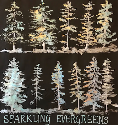
Gouache on black paper
Painted from life in Trish's back yard
For landscape painters, being able to capture the character of a tree, or the silhouette of a distant tree line, is an important aspect of making a successful painting. Project Megasketch gifted me with ample time to study many different ways of drawing and painting these beautiful and graceful living structures. Toward the end of the project, I combined what I'd practiced with some experimental approaches. I hope this post inspires you to push forward with a favorite subject of your own to develop skills and style. It doesn't have to be trees!
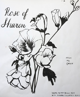
Ink and wash, from one of my own photos
Some I sketched from my own reference photos, like the unique tree (above) that resides at the Bronx Zoo. I tried to keep in mind what I'd learned about tree contours in the time I'd spent with the online
Saturday
Making Friends with Manikins
One of the challenges of Project Megasketch was finding enough subject matter to sketch from life during the winter months. One great solution was the trio of manikins that resides in my studio. If you don't have a manikin, you're missing out. They are fabulous for many different types of studies, such as basic shapes, foreshortening, cross contours, perspective, proportion, motion, dramatic light and shadow, and so much more. Even a great model can't hold an action pose for as long as a manikin!
Set up your manikin in as natural a pose as possible. It can take awhile to find something interesting, that looks like the way a person might actually move. Once you find a pose you like, instead of changing the pose for each sketch, rotate the manikin. Draw the pose from many different angles.
Project Megasketch -- A Perfect Solution for Your Winter Blues
If you're an artist who doesn't like winter, maybe this post is for you! I used to hate winter. If you live in a cold climate and you're a plein air painter, you probably know what I'm talking about. One solution for the Winter Blues is to give yourself a special winter art project to break free from your own mold.
Last winter, I embarked upon a drawing/painting/sketching challenge to see objects in a different way, and learn to capture them faster. My hope was that when I ventured out again in the spring to paint, the drawing/blocking in stage would be quicker and more accurate. I wanted to tackle subjects that I found difficult, or required a lot of maintenance and practice, such as perspective, drawing straight lines and round elipses, and being able to sketch a portrait likeness in just a few minutes. I wanted to improve on capturing the elegance and directions of tree branches, the graceful movements of animals, the bustling activity of people walking, and copy some works of the masters to explore their methods. I experimented with mixed media, and broke out all those fun art supplies that I rarely have time to use, or that have been sitting on the shelf untested.
I dubbed this venture Project Megasketch, and began it last November. I finished in April. Maybe it can help you get through the Winter Blues this year, while venturing into new art territory. For those who want to give it a try yourselves, or just follow my project along for ideas, stay tuned. Yours may have different subject matter and goals, but you can create a project that will benefit your art with the development of skills and exploration of techniques by following the process. I'll post regular prompts and examples from my project to help get you started and inspire you in the weeks and months to come. There aren't many rules to follow.
Project Megasketch Rules:
- Complete 600 pages, minimum size 9x12"-11x15", in any media. (Or set a different number of pages and size if that's too overwhelming. Make the challenge your own.)
- Fill each page. No cheating with half-empty pages!
- Work for sale or publication doesn't count. (More about this below.)
- Set dates to start and finish. It's okay to adjust that later if you have to. Life happens!
- Challenge yourself, but have some fun too.
- Trust the process.
Having read this far, if you're still interested, get a few sketchbooks the same size, or one enormous
Monday
Saturday
Monday
Sketching at Kaaterskill Falls
(Click image for a larger, clearer view.)
A few days ago, I hiked up to the base of Kaaterskill Falls with some friends for an hour or so of sketching. I had previously done a multi-layered monoprint across this two page spread in my Stillman & Birn Zeta hardbound book. The little picture area borders were printed at that time (and later embellished with markers), so I used them to make vignettes of scenes at the falls. The first one, on the upper left, is the grand view of Kaaterskill Falls, which is the tallest waterfall in New York State, and appears in many Hudson River School paintings. The little round sketch to its right is a rock study. Rocks give me a wonderful way to examine how value and color change as the form turns toward and away from the light. The third little sketch (the oval) is my friend Athena, who was sitting next to me painting the falls in watercolor. The last tiny sketch is unfinished, because everybody was packing up to go at that point. I tossed all my stuff into my backpack and we hit the trail! These were all done in gouache over the acrylic background.
Wednesday
More Watercolor and Gouache Palette Talk
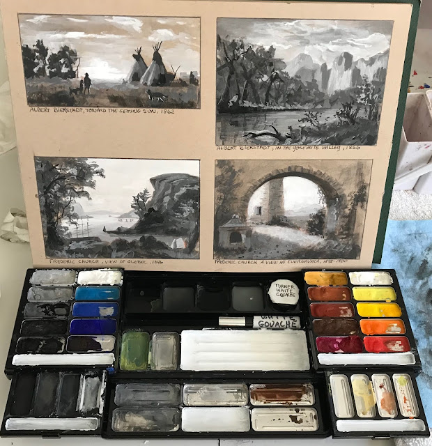
Many people have been asking me about this watercolor palette over the past couple of days. I have explained in a previous post what I did, but perhaps that got overlooked because I didn't provide a photo of the actual conversion (above). When I bought this palette, it came with twelve half pans, secured in metal holders. I hated the paints. I took out those paints, replaced the colors with my favorite tube colors, and over the years have reconfigured it many different ways. If you're interested in one of these, I've found the palette alone for a very reasonable price at Wet Paint Art --- click here.
I really like the size of this palette. It's small and portable, even when the flaps are opened up, and not too heavy for a metal palette. If you look at the image below, you'll see that you can not only fit half pans into two rows, but if you use the middle section (which is meant to hold brushes), you can fit a third row in there too.
For a long time, that's the way I configured this palette --- with three rows of paints, like the image below:
When looking for a way to incorporate my gouache pigments in the same palette as my watercolors, I needed more space. I removed the metal plate and clips that hold the half pans in the case. By doing that, plus turning all the half pans so they ran horizontally, I could fit in another entire row of half pans! Using just the outer metal case and removing the inside dividers also lightened the palette considerably. I secured the half pans in the case using the white tacky putty you can get at Staples or in craft stores to hold posters onto walls.
In the first photo at the top of this post, the bottom row of paint is gouache. You can read more about my pigment choices and this setup on this post. Remember that if you put watercolor and gouache into the same palette, you have to be sure to keep them separate when you mix your colors! Allowing the gouache paints to migrate into the watercolor pans will diminish the transparency of your watercolors. I use the bottom metal flap to mix my gouache, and that leaves the top two, larger mixing areas for my watercolors. Since I generally go from transparent to opaque (if I go opaque at all), I use the entire palette for watercolors, then just the bottom for gouache near the end of the process. I clean off the bottom mixing area before using it again for watercolor.
Friday
Another Card for Mom
If you haven't read the recent post by Robert Genn about the importance of sketches and small studies, it's a great read, as well as a reminder of the important role this kind of work plays in the creative process and artistic development.
Thursday
Afternoon in the Figure Studio
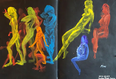
11x17" across the spread in an altered book
Golden Black Gesso
Winsor Newton, Holbein, and Schmincke Gouache
These poses were just 30 seconds to a few minutes each in an open studio life drawing session with a fabulous model. Since the poses are so short, I usually do them in some sort of a montage format. I had this page spread prepared in advance using Golden Black Gesso, and since I happened to have gouache and watercolor with me yesterday (thanks to my new palette setup), I thought it would be fun to play with different gouache colors on the black background. I loved the way it turned out, and my only regret was that I hadn't prepared more pages this way. I think I'm going to prepare some black supports with "glittery stuff" like I used for some of my aquarium sketches, and bring them to life drawing next week. Way fun!
(Sorry about the glare on the right page; I just couldn't seem to get an image without glare on one side or the other.)
Friday
Watercolor and Gouache are cohabitating in my palette!
Lexington Gray ink in a Lamy Safari fountain pen
Watercolor and Gouache
Stillman & Birn Epsilon 8.5x11" hardbound sketchbook
I finally found a way to set up my palette to fit watercolor and gouache together. I test drove it the other day and it worked fabulously well. A number of people have been asking me about this palette and how I did the reconfiguration, so here goes.....
I bought this palette online from Wet Paint Art Supply in Minnesota. Apparently they are only made by special order, so Wet Paint ordered a bunch. Their customers liked them so much that they sold out almost immediately and ordered a lot more! The palette only comes with 12 colors (in two rows of six), with room for a third row of your own half pans and colors, for a total of 18. So, how did I transform this into something that will hold 32 half pans and one whole pan?
There is a metal plate with holders for the pans. It weighs a ton. I took that out. I fiddled with half pans in the empty space to see how many I could fit, and what the best configuration would be. I discovered that four rows of seven colors each would fit with the pans placed vertically, but that I could squeeze in a fifth row if I had the pans run horizontally. In that last row, because of the curves on the corners of the palette, only five would fit. But I could fit a whole pan vertically in place of one of the half pans --- there was enough space to accommodate that. I am always needing extra white gouache when I'm painting with gouache, so I decided I'd keep my white in that one.
I took out a roll of adhesive magnetic strip. It comes rolled up like a roll of tape. I bought mine a long time ago and I don't remember what brand it was, but it looks something like this. I bought it in a craft store. I cut five strips that fit across the width of the palette. Since they were curled from being in the roll, I heated them with a hair dryer, which softened them a bit, and pressed them under a few very heavy coffee table books overnight. The next day, they were flat. With the adhesive side up (bare magnetic side down), I placed them in the palette, approximating where they would go.
I'd already decided which colors would go where the night before. I filled the pans that weren't already loaded, and wrote the names of the colors on each pan with a black fine point Sharpie. Starting with the top row, I peeled the paper strip off the magnet, revealing the adhesive, and stuck each pan down onto the adhesive strip, working across the row. I put in three rows of watercolor pigments (21 colors), then the 12 pans of gouache.
One thing about working watercolor and gouache together is that the opacity of the gouache, plus the chalkiness of white paint, can get into your transparent watercolor and destroy all that beautiful luminosity. This is why I always kept them in separate palettes. Since this metal palette has two sides, it keeps them separated easily. I'm used to having just two mixing areas for watercolor --- one for warm colors and one for cool. So the two sides of the top mixing area provide the wells I need. However, for gouache I need more areas, since I have to be able to mix value as well as color. All those little wells in the lower area are perfect for my gouache!
I was also able to eliminate the opaque watercolors from my palette. Usually I have cadmium red, a couple of cadmium yellows, cadmium orange, chromium oxide green, and a couple of other opaque watercolors in my watercolor palette. Now I can just substitute gouache when I need those, and keep all my watercolors transparent. That gives me an even larger color range than I had before.
I made the chart above so that I could keep track of what colors were in which pans, until I get to know my own system better. I also knew that initially, I'd be making some changes; that's why I numbered the pans on my sketch, instead of writing in color names. When I change a color, I can just change the name on the numbered list of pigments. I've already swapped out a few and shifted some around.
I've been looking for a way to do this for several years, but never found quite the right thing. This works for me at last!
Sunday
More Sun Conures
Image can be clicked for a larger, clearer view
Golden Black Gesso
Diluted Golden Interference Acrylics
Winsor Newton, Holbein, and Schmincke Gouache
Sakura Gelly Roll Pen
Stillman & Birn Epsilon 5.5x8.5" hardbound sketchbook
I was back sketching at the Animal Kingdom store again last week. As usual, I was first drawn to my avian buddies in the rain forest room. Sammie and the Cruisers were yacking up a storm, and clearly didn't like it when I paid attention to Duke, the Blue and Gold Macaw. So, I let them once again be the focus of my morning. The only full page spreads I have left in this journal are prepped with Golden Black Gesso and Interference Acrylics. I thought it would make for a good nighttime visit with the brilliance of the coloring of the conures, hence my title "Midnight with Sammie and the Cruisers," even though it wasn't midnight. I was thinking of using the other black and iridescent page spreads for some of the salt water fish that have those beautiful flourescent colors, but most of the big colorful ones were sold! I imagine they'll have some new ones before our next visit.
We only stayed for a little while because the weather was so gorgeous that we decided to go sketch at a farm after lunch. I still need to get the farm sketches photographed, so I'll share those soon.
Tuesday
Birds and Mammals at Animal Kingdom
Stillman and Birn Epsilon 5.5x8.5" hardbound sketchbook
Gouache
Noodler's Apache Sunset ink
I was back at Animal Kingdom with my sketch group last week. One of the staff members came in and gave us lots of peanuts and goodies to feed the parrots who were out loose in the rain forest room, so we had a great time sketching in there. I focused on the Sun Conures this time, and was actually very happy with these sketches until I got home. Then I decided to spray the sketch with iridescent acrylic paint. Big mistake. It clouded the brightly colored image and made the ink run. I guess it was well worth the disappointment for the lesson learned.
We all went out for a wonderful lunch together at Eveready Diner. When we returned, I decided to draw some furry critters. Of course as soon as I started to sketch the baby guinea pigs, every single one of them went to hide in their little house! So, that was that! The rabbit was more cooperative, and also their store mascot guinea pig named Rosie. (Sorry about the glare on the sketch.) You can click either sketch to enlarge the image. I still have one more to post from this excursion, which I haven't had time to photograph yet.
I've been so busy lately that it's been hard to keep up with all the photographing of my work and adjusting of images. I've been finishing up a large oil painting commission (stay tuned for that on my Hudson Valley Painter website), plus as usual I'm doing a lot of color and media experiments. I'm working on some new background ideas and new border thoughts, and have some lightfastness test results to reveal on the recent fountain pen ink tests I posted. So, stay tuned! Lots coming in the week ahead.
Subscribe to:
Posts (Atom)


