Wednesday

Makeup Kit to Painting Set Conversion


About five years ago, my daughter abandoned a makeup kit in the bathroom closet. It opened to reveal slide out trays with metal pans filled with eyeshadow, little screw cap pots for lip gloss, a mirror set into the lid, and even a small mascara tube. I have to confess that I coveted it from the first moment I laid eyes on it, hoping to someday convert it into a painting kit. The last time she came to visit, she gave it to me. Yes, I do wish I'd asked her sooner! 

(If the full post with images does not appear below, please click the post title above.)

Monday

Megasketch Monday -- My Big Regret

Part of my current "Inspiration Wall" in the studio
Project Megasketch has influenced and improved my art and creativity in more ways that I can count. However, if there were a single thing I wish I'd done differently, it would be this: I wish I'd taken the book apart from the very beginning, and used only one side of each page.  That is my big regret.

Initially, I didn't see that a 600 page bound volume would be a problem. As the page numbers grew, the negative aspects of a double-sided, single volume multiplied. I didn't realize the full impact until the project was over.  If you're part way through the project, and working in a stitch-bound book, you may want to consider changing to a loose sheet system. I wish I had for so many reasons.

To arrive at our destination, we need to use what we've learned, see the path we are on, and use that for inspiration in moving ahead.
  • What has inspired you on your megasketch journey so far? 
  • Which sketches represent what you need to see more of in your work, or a direction you'd like to pursue further? 
  • What have you done that could serve as references for a series, or to chase an idea all the way to its conclusion? 
  • Which ones teach lessons, alerting you when you've taken a wrong turn?
I use a wall in my studio to answer these questions. It influences the way I work. The image above

Wednesday

Transform an Old Book into an Art Journal

Watercolor over thin white gesso layer, calligraphy marker
For many years, at least a portion of my sketches have been done in old books that I've repurposed as sketchbooks. A lot of friends have been asking me about my process for reusing old books as art journals, so this post is for you....and anybody else who wants to know!

The images in this post are from a 9x12" old hardbound music book, so the two page spread gives me a 12x18" painting surface. This size is a bit cumbersome to take out on location, so I have also collaged in some paintings/sketches done on location, or on other types of paper that I wanted to experiment with.


These two facing pages were lightly sized with white gesso. A small plein air painting was collaged 
onto the left side. Watercolor and gouache were used to paint the Red-winged blackbirds from photos 
I took at the scene, and capture the feel of the marshy location. 

I generally start with a well-constructed, stitch-bound book that can open completely flat. I like books that are more than just text, contain some kind of graphic content, some blank areas, and do not have glossy paper. Although it's nice if the pages are thick, they don't have to be. The book can be hardcover or softcover. You can also use these steps to transform a traditional sketchbook into something that can accommodate heavy media use. So far I've used mostly hardcover books because I put them through a lot of abuse! Choose a size and format that will work for you. Is it for studio experimentation, or will you want to carry it around? Page size, book weight, paper thickness, content, and number of pages are all critical factors.

Watercolor, applied directly onto the pages (no sizing)
You might have some great, old books lying around the house. If none match exactly what you're

Friday

Lightfastness Tests -- Faber Castell Polychromos Pastels


Faber Castell Polychromos Pastels have been a go-to pastel for artists because they are individually rated for lightfastness, and provide a wide range of colors among the harder brands of soft pastels. Having a lightfastness rating does not mean that a color will never fade; it just means that the company is telling you the degree to which the color is lightfast, compared with other colors.

For these tests, I assumed that the earth colors and grays are about as lightfast as you can get, so I didn't test the entire line of Polychromos. Instead, I pulled out 74 colors from the full set that I thought would be most inclined to fade or shift color. The samples have been in my south-facing studio window in the northeastern US for at least a few hours a day for the past five years. The

Monday

Megasketch Monday -- The Long, Meandering Mural Sketch (13x44")

Pentel Pocket Brush Pen filled with Platinum Carbon Black ink, 13x44" mural drawing

Here's a fun challenge for you Megasketchers. One day, I wasn't really sure what I wanted to draw. I felt like working from nature, or nature references. I wanted to do something creative, and not just copy a reference. I wanted to force myself to go right in with high contrast and ink, and for the sketch to be able to evolve.

Wednesday

Rewetting Gouache -- Tips and Tricks


A couple of my gouache (left) and watercolor (right) palettes with some little sketches.
The small, airtight plastic container has titanium white gouache in it.
Lately, many people are saying online that you cannot or should not rewet gouache after it has dried. But I've been rewetting gouache forever. That's why I love gouache as a travel medium. If you don't mind traveling with tubes of paint, and taking the time on location to set up your gouache palette, then just keep doing what you're doing and ignore this post! Personally, I want the advantages of oil or acrylic if I'm going the wet paint route. Gouache offers me portability and compact simplification when those are a priority, such as when out on location or working in a sketchbook. It does not have the feel of that luscious, smooth, wet paint out of the tube, but it serves my purposes.

(Note: "Acryla Gouache" is acrylic paint, not gouache. It cannot be rewet. This post applies only to gouache, which is opaque watercolor, and remains water soluble even after it has dried.)

If you've been struggling with rewetting your gouache, or the appearance of the rewet gouache on your painting, I have a few tips that may be helpful for you:

Thursday

Thursday Thoughts -- A Goal Without a Plan is Just a Wish

Although people generally start their New Years Resolutions on January 1, that's one of the worst days for me to begin new challenges and goals. At that time, I'm still inside the holiday whirlwind of activity. It's not until at least a week later that I'm able to begin tuning back into my regularly scheduled life.

That's one of the reasons why a couple of weeks ago, I shared my quote for this year,  "A year from now, you'll wish you had begun today." It's all about renewal on a daily/weekly/monthy/quarterly as well as annual basis. It doesn't have to happen only on January 1.

Starting a challenge or a new personal goal takes more than just thinking about it and coming up with

Monday

Megasketch Monday -- Practice Does Not Make Perfect


As a musician, one of the things we learn early on is that practice does not make pefect; rather, perfect practice makes perfect. If you play the same phrase over and over, with the same mistakes, you're teaching yourself to make those errors every time. The more ingrained they get, the harder it becomes to correct them. I think this holds true for how we practice and see things in art too. This is one of the reasons why it's harder to see issues in our own work than in the work of others. Mistakes that we make again and again become invisible to us. When we play back a recording of ourselves playing a piece, or look at our art in the mirror, we get a new perspective on what we've done. Mistakes jump out like a sore thumb.

When I was practicing circles and ellipses, I was concerned that I'd develop faulty muscle memory if I drew a lot of them that weren't exactly symmetrical. I was afraid that I'd stop seeing the symmetry if I got it wrong. (See my previous post, "Lines, Ellipses, Perspective, Cross Contours," if you haven't already.)  Apparently, this concerned somebody else too. I searched around the internet and

A Few Words for the New Year

Every year, I choose a quote for the year, and write it into my planner. This year, my quote is:

A year from now, you'll wish you had begun today.

As we close out 2019, it's an opportunity to look backward and forward simultaneously, take stock of where we are and where we want to be, express gratitude, and make positive changes in our lives. Many of us make a list of New Years Resolutions. But this quote reminds me that every day should be like that -- reflecting, trying to become a better person, implementing new strategies for success in all areas of our lives, and making better choices. We don't have to wait for a new year in order to take action, begin again, or start something new. 

Whether your goals are art-related, work-related, health-related, in the area of personal development, or spiritual, there's no time like the present. Any day can be a new beginning, and this year we get an extra day!

Happy New Year, everybody. I'll be back to my regular posts next week.

Jamie

Sunday

Megasketch Monday -- Silhouette Power

Pentel Pocket Brush Pen with Platinum Carbon Black ink

If you open up the Roger Tory Peterson Field Guide to the Birds, the first thing you see is a two page spread of bird silhouettes. What always surprises me is that each bird is so identifiable from its silhouette alone. Their poses are also perfectly in character, sitting on wires, standing on a fence post, walking along the ground, or looking up and chirping. Silhouettes seem simple, yet they can tell a

Saturday

Twenty White Gouache and White Watercolor Brand Comparisons


When I want a bright white highlight on a sketch, I often count on white gouache to do the job. All whites are created equal, right? Wrong. In fact, even all Titanium Whites are not created equal. On my sketches, I've noticed if a brand of white gouache isn't a brilliant white, or isn't opaque enough, or has an annoying sheen to it. Whether this is due to different brands of the pigment itself, or differences in the color of the binders, the whites are not the same. Consistency, texture, ease of application, and sheen also vary, which affect their use and appearance.

Over the years, as I accumulated and used new gouache and watercolor whites, I made swatches of them on gray paper to see how they measured up against one another. Today, I noticed that there were 20 swatches on the sheet, so I thought it was time for a little Reveal Party.

Monday

Megasketch Monday -- Drawing Trees

Gouache on black paper
Painted from life in Trish's back yard

For landscape painters, being able to capture the character of a tree, or the silhouette of a distant tree line, is an important aspect of making a successful painting. Project Megasketch gifted me with ample time to study many different ways of drawing and painting these beautiful and graceful living structures. Toward the end of the project, I combined what I'd practiced with some experimental approaches. I hope this post inspires you to push forward with a favorite subject of your own to develop skills and style. It doesn't have to be trees!

Ink and wash, from one of my own photos

Some I sketched from my own reference photos, like the unique tree (above) that resides at the Bronx Zoo. I tried to keep in mind what I'd learned about tree contours in the time I'd spent with the online

Thursday

Lightfastness Tests -- Charvin Water Soluble Pastel Painting Sticks


In January, 2015, I made swatches of the 48 colors in the Charvin Water Soluble Pastel Painting Sticks set, and cut the strips down the center. I put half of each strip by a south-facing window of my studio, and the other half wrapped up in a dark closet. In another month, it will have been five years since I started the test. By art longevity standards, five years is not a long time.


In case you're not sure which pastels I'm referring to, above is a photo of the set. Here is a link to them on the Jerrys website. They claim to be pure pigment and lightfast. They are certainly well priced! As you can see in the image below, the colors are rated by the manufacturer, some as "**** Excellent" and some as "***Good". But if you know me, you know I often need to prove things for

Monday

Megasketch Monday -- Abstract Art and Doodles

Golden High Flow in an empty Montana marker


While many artists are happiest when doodling or playing around with abstract concepts, I get bored to tears. Pushing around paint or pens without a specific image in my mind always felt like a waste of time. I was determined to spend at least a small part of my Project Megasketch time trying to understand what it was about these genres that appealed to others. Maybe it could become appealing to me too. Hopefully I could learn something from it that would be useful in my representational work, or in my appreciation of abstract art in general. Maybe it would improve the quality of my line

Saturday

Making Friends with Manikins


One of the challenges of Project Megasketch was finding enough subject matter to sketch from life during the winter months. One great solution was the trio of manikins that resides in my studio. If you don't have a manikin, you're missing out. They are fabulous for many different types of studies, such as basic shapes, foreshortening, cross contours, perspective, proportion, motion, dramatic light and shadow, and so much more. Even a great model can't hold an action pose for as long as a manikin!


Set up your manikin in as natural a pose as possible. It can take awhile to find something interesting, that looks like the way a person might actually move. Once you find a pose you like, instead of changing the pose for each sketch, rotate the manikin. Draw the pose from many different angles.

Monday

Lines, Ellipses, Perspective, Cross Contours, Bugs and Animals, Oh My!


One of the most important goals in my 600-page Project Megasketch was to develop line quality, and move away from chicken-scratchy type sketches that destroy the flow of beautiful lines and graceful forms. It's difficult to place a line exactly where we want it as it curves around a form, or moves straight across the page.  We compensate by trying again, and again, and again. What we end up with is a hatchet-job of a sketch, created with lots of small lines in an attempt to correct what we didn't do right in the first place. Even if one of those many lines is correct, the sum of the parts is not pleasing.

I searched online to find a process that would lead to an improvement in the quality of my line work, and came upon Draw A Box.  I think it's one of the best free resources for drawing on the internet. Don't miss the opportunity to take advantage of it! If you've decided to take on Project Megasketch, I'd highly recommend that you make it part of your Megasketch journey.


You may get tired of drawing lines and ellipses after several days of it, but the eventual payoff is huge. Don't skip over it. I stopped counting the pages toward Project Megasketch that I spent on the lines and ellipses because there were so many of them. I found them invaluable as warm ups. A couple of months later, I pulled out some vases, pots, pitchers and bottles to sketch. I wanted to see if it helped as much as I hoped. I found that I could draw them directly with ink in just a couple of minutes, and even if they weren't perfect, the improvement in my ellipses when applied to drawings was dramatic.

Saturday

Project Megasketch -- A Perfect Solution for Your Winter Blues


If you're an artist who doesn't like winter, maybe this post is for you! I used to hate winter. If you live in a cold climate and you're a plein air painter, you probably know what I'm talking about.  One solution for the Winter Blues is to give yourself a special winter art project to break free from your own mold.

Last winter, I embarked upon a drawing/painting/sketching challenge to see objects in a different way, and learn to capture them faster. My hope was that when I ventured out again in the spring to paint, the drawing/blocking in stage would be quicker and more accurate. I wanted to tackle subjects that I found difficult, or required a lot of maintenance and practice, such as perspective, drawing straight lines and round elipses, and being able to sketch a portrait likeness in just a few minutes. I wanted to improve on capturing the elegance and directions of tree branches, the graceful movements of animals, the bustling activity of people walking, and copy some works of the masters to explore their methods. I experimented with mixed media, and broke out all those fun art supplies that I rarely have time to use, or that have been sitting on the shelf untested.


I dubbed this venture Project Megasketch, and began it last November. I finished in April. Maybe it can help you get through the Winter Blues this year, while venturing into new art territory. For those who want to give it a try yourselves, or just follow my project along for ideas, stay tuned. Yours may have different subject matter and goals, but you can create a project that will benefit your art with the development of skills and exploration of techniques by following the process. I'll post regular prompts and examples from my project to help get you started and inspire you in the weeks and months to come. There aren't many rules to follow.

Project Megasketch Rules:


  1. Complete 600 pages, minimum size 9x12"-11x15", in any media. (Or set a different number of pages and size if that's too overwhelming. Make the challenge your own.)
  2. Fill each page. No cheating with half-empty pages!
  3. Work for sale or publication doesn't count. (More about this below.)
  4. Set dates to start and finish. It's okay to adjust that later if you have to. Life happens!
  5. Challenge yourself, but have some fun too.
  6. Trust the process.


Having read this far, if you're still interested, get a few sketchbooks the same size, or one enormous

Tuesday

What happens when you take a year off social media and blog posting?


Well for one thing, you end up with a heck of a lot more time. I logged about a thousand pages of sketches and paintings during the year, experimented with a whole host of media and subjects that I can't wait to tell you all about, spent more time socializing and painting with friends, took on a bunch of artistic challenges, played more music, and the list goes on. But I also missed the online associations. I didn't get Facebook notifications when it was somebody's birthday, and missed hearing about important events in my friends' lives. Thanks to all of my real life artist friends who I see on a regular basis, I never felt like I was in an artistic vacuum, but I didn't get to see all the works that used to travel by on my news feed on social media. 


I also removed my work from the public eye for a year. I retrieved my paintings from all my galleries, did not enter any shows, and posted none of my 1,000 new sketches and paintings. Overall, I have to say that the experience was very freeing! Since nobody would see my work, I wasn't concerned with whether or not it was marketable, or if anybody would show up for show openings. I was free to explore subjects that challenged me, work on drawing, experiment with line work, study anatomy and perspective, copy paintings of the masters, practice constructive drawing techniques, play with abstraction and mixed media, and use whatever I wanted for reference without worrying about copyright restrictions. As a very self-motivated individual, I ended up painting and sketching more than ever, with the time I saved from my self-imposed removal from online interactions.

Now that the year is up, I'm ready to see where this online reincarnation takes me, and how/if it affects the way I've been working for the past year. The sketch above was done in an old, large format music book. It's a watercolor from Muscoot Farm, where my favorite vantage points always end up being smack in the middle of the farm road! The music writing on this page seems to work out well with the composition of the sketch. I got excited about doing the whole book this way, but some other sketches didn't fare as well. After fighting with those, I found it generally better to knock back the music notation a level or two with a thin application of gesso, although that posed some other problems! As the days go by, I'll take you along on my recent art journey. Perhaps you'll get some ideas for your own sketching process too.

Sunday

Three Day Sketching Retreat


Last week, I had an opportunity to spend a few days at a sketching retreat at the Holy Cross Monastery along the Hudson River. I'd long admired the monastery when painting across the river at the Vanderbilt Mansion in Hyde park. When my friend Melissa Fischer organized a sketching retreat there, I jumped at the chance to go and explore the grounds, and immerse myself in my sketchbook. I had just hung a big solo show, which had taken me away from sketching for awhile. It felt great to get out there in the chilly fall air, amidst some beautiful colors and scenes. 

I made this sketchbook specifically for the retreat. It's made out of a single full sheet of watercolor paper, cut into thirds and then folded. I figured it would give me just the right number of pages to fill in a few days. I had just one page left in it when I returned, so it worked out perfectly! This is Fabriano Artistico Cold Press 140 lb paper. Most of the sketches are watercolor. There is one monochrome gouache sketch across a three-page spread, and a pencil sketch of an old oak tree that became a sort of Rite of Passage for all the sketchers there! 

Tuesday


Gouache, across a two page spread in a gray-toned sketchbook.

My friend Mary came over one day to sketch. We sat on the little dock in my back yard and I did this gouache painting of the brook. I added the quote later. I've put quotes into all the sketches in this book, but sometimes it takes awhile to find the right quote for a particular scene! Below is an image of my scene with the sketch and my setup.


Monday

Last of the Rose of Sharon


You know the summer season is winding down when your very last Rose of Sharon bush has nearly finished blooming. I'm trying to make the most of the few blossoms that are left. This is across a two page spread in a Stillman & Birn Alpha Softcover sketchbook.

Wednesday

Wow, it's been nearly four years since I've posted my sketches! I've been doing a lot of them in the past couple of years, so perhaps it's time for me to resume my sketches blog and ruminating about art materials.

For those in the Hudson Valley area, I have a solo show opening coming up, and will bring a few of my sketchbooks to the opening reception for people who want to be able to look through them in person. The opening is Sunday, September 30 from 3-5pm, at the Hendrick Hudson Library, 185 Kings Ferry Road, Montrose NY. If you cannot make it to the opening, you can see the show until October 28 during regular library hours. It's a wonderful space with over 80 linear feet of hanging space! You can click here for library hours and directions.

I'm currently working mostly in two sketchbooks. One is a gray-toned Stillman & Birn Nova. It's become a book of sketches with quotes. I started it with just gray scale gouache sketches, and added quotes as I found them that represented my thoughts and feelings about the scene and my state of mind. These are all gouache.


Friday

Sketching from the Window


Today I did a monochrome tree sketch in acrylic, using the 14x22" spread provided by my Stillman & Birn 11x14" Alpha sketchbook. While I feel I could have worked on this much longer, I met my goals with it and also ran out of time. Sometimes I need to remind myself that I don't have to treat a sketch as if it's a finished painting! I have so many "sketches" in my books that I later wished I'd done on canvas or a piece of paper not bound into a book.


I use the Golden Heavy Body Neutral Gray acrylics when I do these. I keep them in a plastic container that has a waterproof seal. They last for years this way. I just add more paint as I run low. Having the values premixed means I don't need a palette, and I also don't need to spend time mixing.  I can just dip in and paint. The heavy bodied paints dry so fast that I can close the sketchbook pretty soon after I finish. The book is clipped to an 18x24" board, so it stays open easily. I rest the top on the window sill and the bottom on my lap as I paint. It's a very comfortable way to work if you have a really deep window ledge!

I don't do any pencil drawing when I work this way. I sketch in a few lines with light, diluted paint --- just enough to know where my basic forms will lie. Then I start blocking in the large shapes, initially working back to front, and then back and forth pushing layers and adding details as needed. I'll likely do some journaling on the left side of the page that I left blank. The S&B Alpha paper is so strong that there is no problem with painting acrylics on both sides of a page.

Tuesday

Let's Change the Subject


Watercolor in a Stillman & Birn Zeta hardbound book

It's that time of year when change happens. The days are getting much shorter. They are about to get shorter still when we go off Daylight Savings Time this coming weekend. The weather is getting colder. The leaves are falling off the trees. Most of them are down now, and I expect the rain that comes in a couple of days will remove most of what's left. Winter won't be far behind.

As a painter, this combination of events has many repercussions. I'm touching up plein air pieces that have been done over the past three seasons and not yet quite finished, picking out the bugs and blades of grass and bits of sand and dirt, and getting them ready for holiday sales. I'm varnishing and framing a lot of paintings (just varnished 21 pieces a few days ago), and getting them to the galleries for the holiday shows. I'm preparing for The Big Move into the studio for the winter.

I actually look forward to this annual change. It gives me a chance to dive into other subject matter that I love, but don't have time for during the seasons of better weather. I have an opportunity to listen to great music while I work in the studio, tackle some larger pieces, and do my commission work. I can get back to open studio figure drawing and painting, portraiture, and mix it up with a bit of still life. I experiment with materials, new color combinations, and explore style.

I anticipate it won't be long before our plein air group starts our regular winter portrait sketch-a-thons. We gather in somebody's house and take turns doing 20 minute portrait sittings for one another. It's great fun, and we don't have to pay a model! I like to do some sketches from photos as a warmup for the seasonal change. This week I've been focusing on eyes. I'd like to improve my ability to capture expression this year, and a lot of that happens in the eyes. I'm not doing any underdrawing, and just going in directly with a brush and watercolors.


After doing the first few, I got frustrated with my palette, added some colors and swapped out others. I'm finding I need a slightly different selection of pigments for portrait work. Mainly I really missed my cadmium red and cadmium orange. I'm also liking ultramarine violet, and sometimes cobalt violet. I took out the phthalo blue, kept cerulean and ultramarine, and added cobalt.

I'm trying to do a quick portrait sketch after dinner at night, again without any preliminary drawing and just jumping in --- sink or swim. They're a bit fast and rough, but I'm rusty. They'll get better as the season moves along. I'm looking for photos that have good eye images, since that's my focus for now. I went straight in with color on a pre-toned surface again. (The streaky blue and red below are part of that toning process.)


Getting back to my winter fare feels good. I'm looking forward to diving in more as the weather gets colder. I feel inspired by the change. My pet birds, Mango and Coconut, will be happy to have me back in the studio. The dogs' beds are already under my work table. Bring it on!

Sunday

Palette Perceptions


I'm continuing with some palette ideas I started last winter and spring. You can see a couple more of them in this post from May. I'm interested in exploring how our perception of a scene changes with a warm or a cool palette, and the way a limited color range serves to harmonize a painting. This study was done 11x17" across a two page spread in a 8.5x11" Stillman and Birn Epsilon Hardbound sketchbook. I know it's not designed for wet media, but it works great. Their books will open completely flat if you break them in before you start using them, which makes it ideal for working across the spread. I used the new Golden High Flow acrylics, and just a bit of water instead of medium. I'm trying to arrange a setup that's easy to work with in the field at the same time, and hope to test drive that out on location tomorrow. I used six colors for this one. I'm very close to being happy with the selections, but I'm going to make a couple of palette changes today and try again.

Wednesday

Importance of Composition and Color Studies en Plein Air


I don't always do compositional sketches before embarking on a painting. When working out on location, the time to paint is always too short as it is. However, sometimes there are many elements we plan to move around or change. The sketches above are about 4.5x6", done in my Stillman & Birn hardbound sketchbook. The top one is acrylic over a pencil sketch, and the bottom one is watercolor over pencil.

In the top sketch, there was actually no pathway at all going into the field. I felt the scene needed a way to draw the viewer into the composition. I did the sketch in pencil to test drive my ideas. After setting up to paint applying some color over my pencil sketch gave me a chance to try out some color mixes too. When I stepped in to do the actual painting (in acrylic), which was 15x20, I'd resolved many potential problems before I even lifted my brush. This is the finished painting, which will be going up on my Hudson Valley Painter blog soon.


Based on the sketch I'd done, I made further changes when doing the painting. The sketch gave me a chance to consider more options.

The sketch of Croton Gorge Dam was done because the scene was so complex. I wasn't planning to make changes as much as I was trying to wrap my head around what would go where in the confusing mass of shapes, textures and perspective. It took three sketches before I had something I felt I could work with. The first two failures made me extremely grateful that I hadn't just jumped in on my 16x20" painting. Once I did this third sketch of the gorge, waterfall, dam, and bridge, I took out my watercolors and splashed some color on just to get a better idea of what it would look like. I felt I finally had a good working design, and broke out the larger panel for my painting and my acrylics.


This one still needs a few studio tweaks, but I don't think I could have captured this scene effectively if I hadn't taken the time to do the sketches. In this case, the sketches were more complicated and took a lot more time than usual. That proved to me how much I needed to do them, and how far off the mark my painting would have been if I'd neglected that step. It would have ended up as poorly designed as my first sketch of the day (which was so bad that I actually erased it even though it was in my sketchbook!)

The moral of my story to myself is that sometimes it is well worth the time and effort to Sketch Before You Paint. It's the artist's equivalent to Think Before You Speak, and Look Before You Leap!

A Day at the Farm

11x17" (across the spread) in a Stillman & Birn Zeta Sketchbook
Background monoprinted in several layers with a Gelli Printing Plate

My plein air group went to Green Chimneys today, which is a residential facility for children. Their philosophy is that children benefit greatly from caring for and interacting with animals. They have a wonderful farm on the campus. Many of the animals here have been rescued and are in the rehabilitation process, not so unlike the children that reside here.

It was over 90 degrees today, and you'd never know we were into September. Due to the heat and my love of the animals, I decided to spend the few hours there sketching instead of working on a single painting. Of course the animals were in constant motion, so the sketches were gestures, done as they moved about. The sketch above (which you can click on to enlarge it), was actually the last one of the day. It was done across a two page spread of an 8.5x11" Stillman and Birn Zeta hardbound book, which gave me a full 11x17" work area. This is extremely heavyweight paper (180lb) and is fabulous for multi-media work. I've been using a large Gelli Printing Plate to print textured layers of color across the pages. I've done it in both Zeta and Epsilon books. I love having a toned, textured ground to sketch against, especially when working in monochrome. I sketched with a Faber Castell Pitt Calligraphy Pen. I wished I'd brought a bunch of Pitt Brush Pens with me, but alas, I did not.


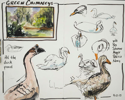
Above is a two page spread in a smaller Zeta book, without a toned ground. The book is 5.5x8.5", which gives me a letter-size space when working across the spread. When we first arrived at the location, we gathered near a small pond filled with several different types of ducks, geese, and some beautiful swans. They were all highly entertaining! I started out with the little watercolor thumbnail sketch of the pond scene, then did some gesture sketches of the geese and swans, using the same Walnut Brown Calligraphy Pen, and a little watercolor.


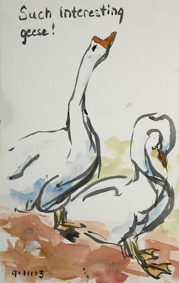
I got tired of the brown and wanted to work with a brush, so for the sketch above, I pulled out a Pentel Aquash Grey (or maybe Light Black?) brush pen, plus my Kuretake brush pen, which was filled with Platinum Carbon Black ink. I added orange gouache for the beaks and cerulean blue watercolor for the shadows. I liked these two gestures. The goose on the left kept ducking his head down into the water to drink, then would raise it way up. Every time he stretched his neck and head up, I put in a few more lines!


11x17" across the spread, Stillman & Birn Zeta Hardbound book
Golden Fluid Acrylics background, printed with a Gelli Plate
Sketch done with Golden High Flow Acrylics

My friend Bea called me over to the other side of the pond to witness some swan antics. One kept swimming back and forth in front of me. I found this page that I'd printed using paper doilies on the printing plate to keep some clear areas, and decided to put the swans there. I worked on several views at once, changing from one to the other as he changed direction, swimming around in a circle. I mixed a violet out of some of the new Golden High Flow Acrylics, using Ultramarine Blue and Quinacridone Red, and did the sketches directly with a watercolor brush. The orange is Pyrrole Orange, a color I am becoming quite addicted to!