Here's a sketchbook that can be made on the fly with a single sheet of paper, no matter where you are! (You may have to pause the video if I'm flipping the pages too fast.) Instructions for making it are in Alisa Golden's book, Making Handmade Books. It's a little tricky to get the hang of it, but I made a few with scrap paper, and now I'm sure I can do it on the fly with whatever is at hand! A much larger book can be made by simply increasing the size of the sheet of paper. (This one was made with a piece of copy paper.)
Showing posts with label Reviews. Show all posts
Showing posts with label Reviews. Show all posts
Wednesday
What if you were stranded somewhere without a sketchbook?
Here's a sketchbook that can be made on the fly with a single sheet of paper, no matter where you are! (You may have to pause the video if I'm flipping the pages too fast.) Instructions for making it are in Alisa Golden's book, Making Handmade Books. It's a little tricky to get the hang of it, but I made a few with scrap paper, and now I'm sure I can do it on the fly with whatever is at hand! A much larger book can be made by simply increasing the size of the sheet of paper. (This one was made with a piece of copy paper.)
Monday
Bits 'N Pieces

(Click image for a larger view of the sketch.)
A couple of weeks ago, my husband and I were out exploring at our place up in the Catskills. Buried under the leaves in the dirt, we found fragments of old cups and plates. They were so interesting, and some so beautiful, that I brought in some of the pieces to see if I could trace their origins. Today I pulled out one of the large plate pieces to sketch. I used Prismacolor pencils, which turned out to be a great choice in this 5.5x8.5" Stillman & Birn Epsilon book. The smooth surface proved perfect for colored pencil work.
Well, y'all know me by now, and it wasn't long before I was noticing that I had both old Berol Prismacolors and new Sanford Prismas. I had to do some color swatch tests too while I was at it to see if they were really the same. It turned out that of the ones I sampled, only the Marine Green was significantly different, with the Sanford having a more yellow-green appearance when compared to the more muted green of the Berol. I compared them dry as well as washed with a bit of Turpenoid on a Q tip.
The green ink is Noodler's Sequoia --- one of my favorites for ink and wash. "Bits 'N Pieces" was written with Noodler's Bulletproof Black in an Eversharp Symphony Flex fountain pen with a Fine nib.
Here's a photo of the piece of the plate, along with the sketch and some of the newer and older Prismacolors. (This one is also clickable to enlarge.)

Sunday
Breaking Out the Candles

I know I promised some comparisons of black inks, but I've faced some unforeseen circumstances with this snowstorm in the Northeastern US. The images of the results from those tests are on my desktop computer, so I'll have to wait until our house has power back before I can post them. We really got pounded!
I did the sketch above when I pulled out the candles today. You can click to read the text; it should enlarge enough to be fairly easy to read.
I test drove some new things in this sketch, like the new Noodler's #41 Brown (2012) that I reviewed the other day. In using it with watercolors, it didn't run at all on this Stillman & Birn Alpha paper, even though on the test I was able to get it to move a bit with hard scrubbing.
I also used one of my new Eversharp Symphony flex pens (this one with a B nib). After much practice by candlelight last night, I was finally able to better understand how to use these things. The title "Breaking Out the Candles" was written with that pen, using Noodler's Midnight ink.
I also have to say, this Stillman and Birn Alpha book totally rocks! I will give more of a full scale review once I've done some more work in it. Initially I thought the paper wasn't opaque enough for me, but today I realized the silver lining of that feature; I can slip a piece of lined paper behind the sketch to keep my writing straight! I'm also loving this 8.5x11" size. Usually I'm sketching out on location and don't want to bring along such a large book, but having that 11x17" space to spread out across two pages is a wonderful thing. It opens fairly flat, so it's quite easy to work across the gutter, which can be a challenge in some stitchbound/hardbound sketchbooks.
The journal writing on the page was done with Noodler's Kung Te-Cheng, one of my favorite writing inks, and it's completely waterproof to boot.
Friday
Review of the New 2012 Noodlers #41 Brown Ink
As many of you may know, Nathan (owner of Noodler's Ink Company) has been unable to continue making his popular #41 Brown. Artists, calligraphers, and fountain pen aficionados have all been wondering how they're going to continue to satisfy their addictions for a favorite color. Nathan reformulated the ink with different ingredients, and it is now available, bottled as Noodlers #41 (2012). I just received a sample of it, and did some comparisons with the new and old #41s on different types of papers.
It would certainly have been more scientific to test them in the same type of pen, but all my pens were inked up already. I had my old #41 in a Lamy Safari with an Extra Fine nib. The new Noodlers #41 went into a Sheaffer 100 with a Fine nib. Still, I think I found out everything I need to know except for how the new one will do on lightfastness tests, and that will take awhile.
Let's take a look at the images, and I'll explain some of the things I did. You should be able to click them to view larger sizes. Since inks react differently on different papers, I tested them on three different types of paper today. This first test was done on an Ampad Quad Ruled Steno Book. I dried the page with a hair dryer on high heat, then scrubbed the left side of the cross-hatched section of each sample with a clean waterbrush. (That's the kind of brush that has the water right in the barrel of the brush.)

As you can see above, the new formulation hardly bled at all, even when scrubbing with the wet brush. The old formulation displayed the one characteristic that has always bugged me about this ink, and ran enough to easily contaminate watercolors used in conjunction with an ink drawing. Before I started jumping for joy and thinking I'd finally found a true waterproof brown ink to use with watercolors, I figured I'd better test drive it on some paper I might actually use for journal art.
Below are samples of #41 New and #41 Old in a Stillman and Birn Epsilon book, made specifically for pen and ink. I let both samples sit for a few minutes, then scrubbed with the waterbrush on the left side of the crosshatched sections. Then I dried them with a hair dryer on high heat, let it cool, and tested the waterbrush on the right sides of the samples. As you can see below, both the old and new versions ran on this sized paper with the wet brush. However, the new #41 bled much less than it's older counterpart.Plus, the color that did wash out was much more neutral, rather than the more orange hue from the old version.

I don't usually scrub so hard when working with watercolor over ink. Generally it's just one or two passes with the brush. I decided to try on one more paper and see what happened with just a single pass over the dried ink with the brush, as well as with scrubbing. For this I used a Stillman and Birn Alpha book, to see how they would act on a slightly more textured, sized paper. The ink was dried with a hair dryer before using a wet brush on it. I ran the wet brush down the left side of each of the crosshatched sections and also the more densely colored squares. Then I scrubbed with it on the right sides of each.

Again, the new Noodler's #41 Brown outperformed the old. In fact, the single pass with the waterbrush on the crosshatched sample of the new ink didn't bleed at all. Are the two inks exactly the same color? No. When viewed side by side, you can see differences, but you probably wouldn't notice those color shifts without the direct comparison.
In closing, congratulations to Nathan for not only formulating a replacement, but for improving upon the original as well! I think I see a bottle of the new #41 in my near future. (Anybody interested in a swap for a bottle of the old, now unavailable #41 ink? ;) )
Tomorrow: Some comparisons of "waterproof" blacks!
Thursday
Eleven More Lightfastness Results Revealed
These are the last sheets of my lightfastness tests for now. I'll be putting these back into the window to see how they fare over the next six months, and will give you an update then. I'll also be setting up testing for an additional 30 or so colors, which I will add to the window next week. Pretty soon, I won't be able to see out of my window! LOL I should have some preliminary results from those in a month or so. It amazes me that fountain pen ink can begin to fade in such a short time, but it does!


Here is the list for the colors tested in this post.
- Noodler's Brown #41 (old version)
- Noodler's Golden Brown
- Diamine Chocolate Brown
- Diamine Saddle Brown
- Caran D'Ache Grand Canyon
- Noodler's Brown
- J. Herbin Eclat de Saphir (#1 on second test sheet)
- Diamine Marine (#2 on second test sheet)
- Diamine Majestic Purple (#3 on second test sheet)
- Noodler's Navajo Turquoise (#4 on second test sheet)
- Noodler's Black Swan in English Roses (#5 on second test sheet)
You can click the images to see larger versions. The left sides were exposed to sunlight in my window since last April. The right sides were kept inside a box in a cabinet.

I was surprised that the browns above didn't fade and/or shift more than they did. However, they all changed enough to avoid awarding gold stars to any of them. I still plan to use my favorites (like Caran D'Ache Grand Canyon) in my sketchbooks.
But check these out! J. Herbin Eclat de Saphir (#1), Diamine Marine (#2), and Diamine Majestic Purple (#3) vanished so quickly that they should be in a magic show!

It is worth noting that the sheets on the right, which were kept in darkness, have had no problem with retaining vivid colors, so please don't get nervous if you've been using these inks inside a book. They should be absolutely fine! These tests only reveal what happens when an ink is exposed to sunlight. If the inks you've used are not exposed to light, then these results are irrelevant.
If you'd like to see the previous lightfastness tests, click here. You'll always be able to find them easily by clicking on the "Lightfastness Tests" category on the left sidebar.
If you'd like to see the previous lightfastness tests, click here. You'll always be able to find them easily by clicking on the "Lightfastness Tests" category on the left sidebar.
I have a bunch of wonderful new pens and new inks to review coming up in the next few days, along with a new drawing project I'm starting. So much to sketch, so much to sketch with, so much to photograph and share, and so little time!
Wednesday
Lightfastness Results of Fifteen More Ink Samples
As promised, here are the results of my lightfastness testing to date of the following inks:
Test sheet 2:

Test sheet 3:
 You can click them to see larger, clearer images. I'm sorry that I'm not a better photographer, but even so, individual results are pretty clear. Most colors experienced fading, color shifting or both, but I feel the following inks had very little, if any, change:
Noodler's Bulletproof Black and J. Herbin Gris Nuage are both real workhorses for me, so I was delighted to see them perform so well. Some inks had so little change that I wouldn't worry at all about using them, though I still wouldn't be comfortable with exposure to UV light:
I found it interesting that so many of the greenish grays lost some of their blue component, resulting in a yellowish-olive/umber tone, like Parker Quink Black, Private Reserve Gray Flannel, and Noodler's Lexington Gray. Diamine Graphite turned from a greenish gray to a more neutral gray. Iroshizuku Yama-guri (one of my personal favorite inks) lost some of the cool color, transitioning to a much pinker color, whereas Diamine Damson lost some of its rosy glow and turned to a bluer, cooler violet. And who would have guessed that Caran D'Ache Storm would bleach out to pale orange?
Stay tuned for more lightfastness results tomorrow on 11 additional colors. To see previous lightfastness test results, click here. You'll always be able to find them easily by clicking "Lightfastness tests" on the left sidebar.
- Noodler's Bulletproof Black
- Parker Quink Black
- Private Reserve Gray Flannel
- Diamine Graphite
- Diamine Grey
- Noodler's Lexington Gray
- J. Herbin Gris Nuage
- Iroshizuku Kiri-same
- Omas Grey
- Iroshizuku Fuyu-syogen
- Iroshizuku Yama-guri
- J. Herbin Cacao du Brasil
- Diamine Damson
- Caran D'Ache Storm
- J. Herbin Poussiere de Lune
Test sheet 2:

Test sheet 3:

- Noodler's Bulletproof Black
- Diamine Gray
- J. Herbin Gris Nuage
Noodler's Bulletproof Black and J. Herbin Gris Nuage are both real workhorses for me, so I was delighted to see them perform so well. Some inks had so little change that I wouldn't worry at all about using them, though I still wouldn't be comfortable with exposure to UV light:
- Omas Grey
- J. Herbin Cacao du Brasil
- J. Herbin Poussiere de Lune
I found it interesting that so many of the greenish grays lost some of their blue component, resulting in a yellowish-olive/umber tone, like Parker Quink Black, Private Reserve Gray Flannel, and Noodler's Lexington Gray. Diamine Graphite turned from a greenish gray to a more neutral gray. Iroshizuku Yama-guri (one of my personal favorite inks) lost some of the cool color, transitioning to a much pinker color, whereas Diamine Damson lost some of its rosy glow and turned to a bluer, cooler violet. And who would have guessed that Caran D'Ache Storm would bleach out to pale orange?
Stay tuned for more lightfastness results tomorrow on 11 additional colors. To see previous lightfastness test results, click here. You'll always be able to find them easily by clicking "Lightfastness tests" on the left sidebar.
Tuesday
More Ink Lightfastness Test Results
A sheet of sample swabs of various popular fountain pen inks has been in my studio window since March 10. The samples I tested in that round are:
One month later, I posted the changes that occurred in that short time period. Today I took down the sheets and photographed them again. It's seven and a half months that they've been in the window, and a couple of the results I found surprising. Here's what the sheets look like now:

You can click that image to see a larger version. The left side was in my south-facing studio window. The right side was kept inside a box in a cabinet, to avoid light exposure completely. The biggest surprise was that Noodler's Baystate Blue completely disappeared! Well, okay, there are a few greenish bits barely visible here and there, but I'll bet within a month, those will be gone too.
The other big surprise is actually a good thing; Noodler's Kung Te-Cheng, one of my favorite inks to work with, has stayed exactly the same as far as I can tell. That doesn't mean I'd do fine art with it to hang on my wall, but it does mean I feel totally comfortable with using it in my sketchbooks and for other purposes too. All the rest of these colors either faded dramatically, had large color shifts, or both.
It's a well known fact that fountain pen inks should not be used for fine art. They are dye-based, rather than being pigment-based like paints, and those dyes are fugitive and not meant to withstand the long term effects of ultraviolet light. Still, some hold up much better than others. Even for use in my sketchbooks, I like to know where they stand. It is worth noting that the sheets on the right, which were kept in darkness, have had no problem with retaining vivid colors, so please don't get nervous if you've been using these inks inside a book. They should be absolutely fine! These tests only reveal what happens when an ink is exposed to sunlight. If the inks you've used are not exposed to light, then these results are irrelevant.
In April, I started another round of tests with 26 more colors. It's hard to find the time to post them all at once, so I will be posting those results tomorrow and the next day. Tomorrow I'll be posting the results of::
On Thursday I will share results from testing these colors:
- Noodler's Kiowa Pecan
- Noodler's Nightshade
- Private Reserve Chocolat
- Private Reserve Avocado
- Private Reserve Velvet Black
- Noodler's Whaleman's Sepia
- Noodler's Kung Te-Cheng
- Noodler's Baystate Blue
- J. Herbin Rouge Hematite
- Diamine Red Dragon
- Noodler's Sequoia
- Noodler's Navy
- Noodler's Walnut
One month later, I posted the changes that occurred in that short time period. Today I took down the sheets and photographed them again. It's seven and a half months that they've been in the window, and a couple of the results I found surprising. Here's what the sheets look like now:

You can click that image to see a larger version. The left side was in my south-facing studio window. The right side was kept inside a box in a cabinet, to avoid light exposure completely. The biggest surprise was that Noodler's Baystate Blue completely disappeared! Well, okay, there are a few greenish bits barely visible here and there, but I'll bet within a month, those will be gone too.
The other big surprise is actually a good thing; Noodler's Kung Te-Cheng, one of my favorite inks to work with, has stayed exactly the same as far as I can tell. That doesn't mean I'd do fine art with it to hang on my wall, but it does mean I feel totally comfortable with using it in my sketchbooks and for other purposes too. All the rest of these colors either faded dramatically, had large color shifts, or both.
It's a well known fact that fountain pen inks should not be used for fine art. They are dye-based, rather than being pigment-based like paints, and those dyes are fugitive and not meant to withstand the long term effects of ultraviolet light. Still, some hold up much better than others. Even for use in my sketchbooks, I like to know where they stand. It is worth noting that the sheets on the right, which were kept in darkness, have had no problem with retaining vivid colors, so please don't get nervous if you've been using these inks inside a book. They should be absolutely fine! These tests only reveal what happens when an ink is exposed to sunlight. If the inks you've used are not exposed to light, then these results are irrelevant.
In April, I started another round of tests with 26 more colors. It's hard to find the time to post them all at once, so I will be posting those results tomorrow and the next day. Tomorrow I'll be posting the results of::
- Noodler's Bulletproof Black
- Parker Quink Black
- Private Reserve Gray Flannel
- Diamine Graphite
- Diamine Grey
- Noodler's Lexington Gray
- J. Herbin Gris Nuage
- Iroshizuku Kiri-same
- Omas Grey
- Iroshizuku Fuyu-syogen
- Iroshizuku Yama-guri
- J. Herbin Cacao du Brasil
- Diamine Damson
- Caran D'Ache Storm
- J. Herbin Poussiere de Lune
On Thursday I will share results from testing these colors:
- Noodler's Brown #41 (old version)
- Noodler's Golden Brown
- Diamine Chocolate Brown
- Diamine Saddle Brown
- Caran D'Ache Grand Canyon
- Noodler's Brown
- J. Herbin Eclat de Saphir
- Diamine Marine
- Diamine Majestic Purple
- Noodler's Navajo Turquoise
- Noodler's Black Swan in English Roses
Monday
Sketching the Lynx at the Newburgh NY Waterfront

Today I went to sketch with my friend Virginia along the Hudson River at the Newburgh Waterfront. My plan was to sketch the cafes along the boardwalk and views of the Hudson Highlands. I was pleasantly surprised to find this gorgeous ship, Lynx, docked there to model for me. The angle of the masts is really striking. As usual, I didn't remember to get a photo while at my sketching location, but I got this one later from closer to my car, so the angle is a bit different. Still, you can get an idea of the beautiful scene there. I thought probably nobody would believe the angle of the masts without a photo! It's amazing how slanted they are.
The sketch of the ship and docks was done directly with ink and a black Sakura brush pen. Then I used Noodler's Lexington Gray in a Lami Safari "F" for the rigging, and a Platinum Preppy 0.5 filled with J. Herbin Gris Nuage for the mountains in the background. Even when working in monochrome, it's nice to have some value options at your disposal! I was especially glad to have the Gris Nuage along for those soft mountains in the distance, made even softer today by the atmospheric conditions. Using the light gray ink for the mountains allowed the ship stand out in the foreground, while providing a nice backdrop shape.
Tuesday
Reviews of La Reine Mauve ink and Journaling Templates

I got some great new art supplies to add to my journaling arsenal last week! I found this set of journaling templates by Karen Foster Designs that are going to enable me to finally write straight! They come held together by a key chain and offer a couple of different line width options. The widest is about 4", and I do wish there was a 5" and a 6" also, but I can just slide the template over to extend the lines.
In addition to Noodler's Kung Te-Cheng ink, which I reviewed yesterday, I also got their La Reine Mauve, Zhivago, and a couple of sample bottles of the new Blue Nose Bear. The brush pen and fountain pen shown above came with the Kung Te-Cheng ink --- a little bonus for having to purchase such a large bottle of it. I'm glad I love that one so much, because I don't think I'm ever going to run out of it!
The purple writing and drawing on this page was done with La Reine Mauve. How much do I love this ink? Let me count the ways! I purchased this to be a more vibrant purple version of the Kung Te-Cheng, and it does not disappoint! The ink has nice flow properties, and vibrant as it is, once down, it stays put. This is in the Noodler's line of bulletproof, eternal inks, so I don't have to worry about water spills or using watercolors over a drawing. And what a great color! La Reine Mauve only comes in a 1 oz bottle, so it's a bit on the pricey side, but worth every penny for its high performance and beauty.
More ink reviews coming soon! If you'd like these posts delivered to your email, you can just enter your email address in the box on the right sidebar.
Monday
Remnants and Review of Noodler's Kung Te-Cheng Ink

I picked these flowers from around my property before the Hurricane Irene hit, and painted them out on the patio after the storm departed. Even the mug is a remnant from a former time; it was left in a cabinet by previous owners of the house!
I got a delivery of some new inks last week, and used this opportunity to break out my brand new bottle of Noodler's Kung Te-Cheng. I used it for both the journal writing and the sketch above. For awhile, I was most interested in inks that would wash for my ink and wash sketches. But lately I've been yearning for more colors that will stay put. They are more useful in combination with watercolors, since they don't bleed and dirty the color. I've also been thinking that if I were to ever spill water on one of my journals by accident, all the text would bleed if the ink wasn't waterproof. I tried a small sample of Kung Te-Cheng six months or so ago, and loved the color, which is midway between blue and violet, and muted enough to not be overpowering. Perhaps the biggest surprise came when I did lightfastness tests of 13 inks. Many of them faded a lot within just a few weeks, but Kung Te-Cheng hung tough and easily outperformed all the others in terms of lightfastness. So, I knew it was just a matter of time before I treated myself to a bottle! It's only available in a 4.5oz size, but comes with an eyedropper-converted Platinum Preppy fountain pen and a brush pen to use with the ink! You can get it from one of my favorite suppliers, Goulet Pen Company. If you don't want to order this huge bottle without trying it first, you can order a sample of it. More ink reviews are on the way in the very near future!
Tuesday
Review of the Nomadic Wise-Walker Messenger Bag

I have been dreaming of getting this Nomadic messenger bag for sketching materials ever since I saw it on the internet. The messenger bag I'd been using for sketching supplies was a bit larger than what I needed, and had a couple of serious drawbacks that the Nomadic bag addressed. My husband got it for me as a Mother's Day gift, and it is just perfect for my needs! I unpacked my old bag last night and loaded up the new one.

Here's the front of the bag. I selected the blue color, and it's a nice dark, neutral navy. It has a zippered pocket right on the front where you can keep identification, money, or anything you might need to get to quickly without having to open up the whole bag. As you can see, it easily stands upright, which is an important factor for me, since I keep lots of fountain pens inside it.

One thing this bag has that my other lacked is this wide, long shoulder pad. Since the strap adjusts from both sides, I finally have a bag that allows me to shorten the strap enough while keeping the shoulder pad centered. This is an excellent feature that more bags and straps should employ.

On each side, there is a mesh compartment for a water bottle. This particular bottle is oversized at 20 oz, yet still fits in there. A regular 16 oz. bottle would fit better. Not having to carry the water inside the bag is a great feature. It makes it much easier to take a sip while walking without having to open up the bag, or to pour extra water into a palette cup for painting. My old bag didn't have these water holders on the sides.
The bag is divided into two main sides. I set up one for sketching materials, and one for painting. Usually I do one and then the other, so it helps to have my materials organized this way. Here's a peek at the sketching side:

As you can see, there's room straight across the bag for loads of pens, pencils, waterbrushes and markers. A pocket in the front of that compartment can hold my sketchbook. There is another large pocket behind the pens that runs the length of the bag. I keep some tissues, erasers, a ruler, viewfinder, and other sketching supplies in there.

One really neat feature is these mesh pockets because they are translucent. I label all my pens so I can tell what ink is in which pen. I used to have to remove them from the pockets of my old messenger bag to read the labels and find the pen I needed, but now I can store them with the labels facing outward, and I can see what every color is! This is a huge advantage for me and a timesaver.
Turning the bag around and lifting the big flap, you can see into the main compartment of the bag:

If you carry a 9x12" spiral sketchbook, this is where you'll probably be keeping it, and it will fit easily. In front of that large, open area there is a zippered compartment where I keep my watercolor sets:


- Viewfinder
- Sunglasses
- Reading glasses
- Extra clips
- Palette cup
- Lots of waterbrushes and travel brushes
- Correction fluid
- Two watercolor sets
- Hand wipes
- Small sketchbook
- Insect repellent
- Sponges
- Date stamp
- Masking tape
- 7x10 watercolor block
- Drawing board
- Tissues
- Paper towels
- Viewfinder
- Small water bottle
- Garbage bag
If you think you'd like a Nomadic Wise-Walker too, you can find them at Jetpens in black, blue or gray. You can see lots more photos of the bag there as well.
Stillman & Birn Beta Series Sketchbook Review

Above is a waterfall sketch that I did last night while test driving the Stillman & Birn Beta Series sketchbook. There are five different paper types in the S&B sketchbook lineup. I've been working with all of them, and as I accumulate enough knowledge about their performance, I'll post reviews here. Hopefully I'll be reviewing all five within the next few weeks.
Features of the Beta series are a heavy, bright white paper with some texture and excellent sizing. Although it is called "rough surface", I don't find it to be rough at all compared with the rough watercolor papers I've used. It weighs in at 180lb --- 270gsm. As you can see from the color brilliance in the sketch above, this paper really allows the color to sit up on top and show itself well. There is no show-through from one page to the next, and the paper doesn't buckle with my watercolor work.
I use fountain pens with various inks and waterbrushes in my sketchbooks too, so I put this book through its paces with my pens too.

Using a hard touch with the fountain pens sometimes resulted in the tip catching in the paper fibers, but with a light touch it was not at all a problem. You can see that the writing is not skipping, and the inks sit on top of the paper enough to wash beautifully with a waterbrush. The little watercolor test revealed the same brilliant color results as on the sketch.

If you've lamented over the fact that watercolor sketchbooks are often only available in landscape format, you can now celebrate! These babies are available in 6x8, 7x10, and 9x12 portrait formats, plus a 7x7" square! For those who prefer stitch-bound books, that will be your only disappointment, as these are only available spiral bound. I'm one of those folks who definitely prefers a stitch-bound book, but this spiral series will end up converting me when I need the heavier paper.
Here's a link to a series of posts done using this sketchbook.
These sketchbooks are available at Utrecht Art Supplies and Wet Paint Art Supplies.
Monday
Rondo Goes to the Spa plus Reviews of Private Reserve Chocolat ink and Platinum Preppy Fountain Pen

This sketch was done with Private Reserve Chocolat. Initially, I wasn't so crazy about this ink because so much red appeared in the wash areas. However, as I used it more, I was able to control it better, and keep the ink more to the brown tones by putting down a lot of ink and not overbrushing. Now I love this ink! It's got a deep, rich, chocolate brown color that allows for plenty of value changes. Also, in spots where there was a lot of water but not much brush action, you can see it separate into red and green. If you look at the area above the flag, you can see that happening. (You might have to click the image to enlarge it in order to see the effect.) How cool is that?!
I used a Platinum Preppy fountain pen with a .05 nib for this one. I find this fountain pen to be very fast, so it can keep up with my quick sketching and lay down plenty of ink. They only cost a few dollars, so I have a lot of them and swap them out as I work with different colors. I converted this one to an eyedropper pen so it can hold lots of ink, and I don't need a cartridge nor converter. Brian Goulet has a wonderful video showing how easy it is to do this conversion.
The Goulet Pen Company sells the O rings and silicone grease that you need in order to do the conversion, as well as the .05 Preppy pens.
Saturday
International Fake Journal Month --- The World According to Rondo

Along with Rondo's adventures, I'll be discussing inks this month. Each post will feature a new ink I've been working with, so if you're interested in inks that work well for sketching purposes, stay tuned! This sketch was done with Private Reserve Velvet Black. I love the rich darkness of this ink, which makes the values spring to life. It washes into a subtle violet with a waterbrush, which I find so much more appealing than the blacks that just wash to gray. It also holds a line really well, so even though I can use it for ink and wash techniques, the lines of my sketch stay put.
The sketchbook I'll be using as my fake journal is a Maruman Art Spiral. It's very heavily sized and works well for wash techniques, and at 24 pages long, it's ideal for this project. Those who know me are aware of my intense dislike for spiral journals, so I hope I survive the month with this one. The spiral is very small, so hopefully it will be less pesky than most, and I'll be able to do some two-page spreads.
If you'd like to keep following as I showcase more inks and Rondo's little world, just add your email address in the Subscribe box on the right sidebar. I don't plan to post every day, since I have some painting commissions to do and shows I need to paint for, and of course plein air season is getting underway! But I do hope to get in at least 10 sketches in this project, and maybe more.
(Too see all of my International Fake Journal posts, click here. They will appear in reverse order --- from the newest down to the oldest.)
Tuesday
Three Gray Inks Reviewed --- J. Herbin Gris Nuage, Noodler's Lexington Gray, Diamine Grey

I want a gray ink to use with watercolors, so I've spent the past two or three days testing several candidates. Each of the little sketches above was done with one ink, so I could start to get an idea of how they would perform when used with watercolors.
- J. Herbin Gris Nuage is a very light, silvery ink. It looks purplish in the bottle. If you want something to use with watercolor that leaves a very light line like a hard pencil, or to fill a brush for light midtone areas, this is the perfect ink for that.
- Noodler's Lexington Gray is my personal favorite so far. It's completely bulletproof, considerably darker than the Gris Nuage, and is not as blue-violet in color. It's a nice mid-to-dark value, so it's easy to see on the page. The lines are not as obvious as with dark black ink, so it has less of an outlined, coloring book look to it, and it allows the color to sing, since it doesn't overpower with value.
- Diamine Grey is highly washable. It's a nice color and value, but it washes so easily that I can't keep my lines. It mixes with the color and everything gets dirty.
Thursday
Fabriano Venezia Sketchbook Journal
I recently got this Fabriano Venezia journal and have been looking forward to dipping into it. New journals are always a little intimidating until a few pages are underway. The nicer the paper, the harder it is to get started in them! Leaving the first page blank often helps, so I skipped over that one and filled the next two pages with some watercolor sketches.
This journal is stitch bound, with very thick pages that take ink and watercolor quite well. I’m impressed with it so far, and looking forward to trying some other mediums with it, though I suspect it will remain mostly an ink/watercolor journal. It is currently at the top of my “favorite journals” list! One negative thing worth noting is that the journal does not open as flat as a Moleskine does. It’s so easy to draw/paint across two pages on the Moleskines; not so much on this one.
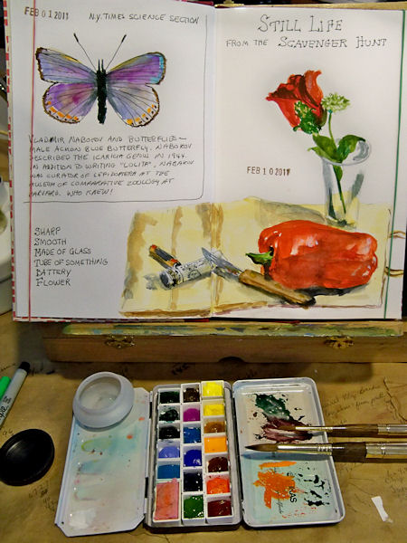
In the photo above, you can see my little half pan box. This is actually only supposed to contain 12 half pans, with the center section empty for a travel brush, but I reconfigured it with 18 half pans and a whole pan that holds my little piece of sponge. When doing these quick sketches, I like having lots of colors. The two brushes shown are Escoda sable travel brushes. They come apart and the brush can go inside the gold sleeve, protecting it for travel. Last time I traveled with them though, they drove the security people crazy on the Xray machine!
Here’s an image that you can click on to enlarge it and see the pages better:
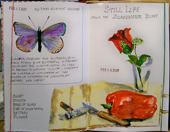
The butterfly was sketched from a New York Times article on Bladimir Nabakov’s butterfly research, and the little still life is from a sketching Scavenger Hunt posted to the Artwork from Life forum on Wetcanvas.
Subscribe to:
Posts (Atom)