Showing posts with label Monochrome Sketches. Show all posts

Wednesday

Showing Off


This was sketched with Quink Black ink, a Pilot Parallel calligraphy fountain pen on its side, and a waterbrush to do the washes. This paper is a little rough for a steel calligraphy nib, so I did the writing on the top of the page with a marker. You can click the image to enlarge it, if you'd like a closer look.

The Quink ink washes into a subtle blue-gray and the tiniest hint of raw sienna color. It's quite nice.

Monday

Rondo Goes to the Spa plus Reviews of Private Reserve Chocolat ink and Platinum Preppy Fountain Pen


This sketch was done with Private Reserve Chocolat. Initially, I wasn't so crazy about this ink because so much red appeared in the wash areas. However, as I used it more, I was able to control it better, and keep the ink more to the brown tones by putting down a lot of ink and not overbrushing. Now I love this ink! It's got a deep, rich, chocolate brown color that allows for plenty of value changes. Also, in spots where there was a lot of water but not much brush action, you can see it separate into red and green. If you look at the area above the flag, you can see that happening. (You might have to click the image to enlarge it in order to see the effect.) How cool is that?!

I used a Platinum Preppy fountain pen with a .05 nib for this one. I find this fountain pen to be very fast, so it can keep up with my quick sketching and lay down plenty of ink. They only cost a few dollars, so I have a lot of them and swap them out as I work with different colors. I converted this one to an eyedropper pen so it can hold lots of ink, and I don't need a cartridge nor converter. Brian Goulet has a wonderful video showing how easy it is to do this conversion.


The Goulet Pen Company sells the O rings and silicone grease that you need in order to do the conversion, as well as the .05 Preppy pens.

Sunday

Fine China for Gourmet Dining and Review of Noodler's Nightshade Ink


(Click image to enlarge)
This is Rondo's fine china. In case you're wondering, yes, this really is what his bowls look like, except they're yellow!

This journal is about 6.5x9", so this sketch is 6.5x18 across the two page spread. Now you can see why I don't like spiral journals! I really like expanding beyond the center line, so I feel limited by journals with a crater in the middle. Of course, stitch-bound journals with a really deep gutter are also difficult to work with. The paper in this Art Spiral book is a little different on one side than the other, but it worked out okay.

This ink is Noodler's Nightshade, one of my favorites. I generally prefer neutral colors, and though this is on the borderline, it doesn't cross over into screaming raspberry or violet. It's just muted enough to make it work, and vivid enough for some excitement. Lines can wash away if you're not a bit careful with the waterbrush, but the ink is so strong that it only takes a small touch to get plenty of wash going. I've also found that if I pass over a line with the brush and let it set, I can wash it again when it's dry and my lines will stay.


Saturday

International Fake Journal Month --- The World According to Rondo

It's "International Fake Journal Month"! What that means is that hundreds of sketch artists around the globe will be taking on a new persona, who will compose their April sketchbook journal. I have chosen my Bichon Frise, Rondo, to introduce you to his kingdom. My journal is titled The World According to Rondo. Here he is on one of his thrones, doing what he does best: supervising.

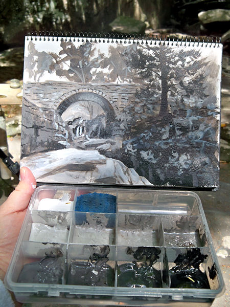
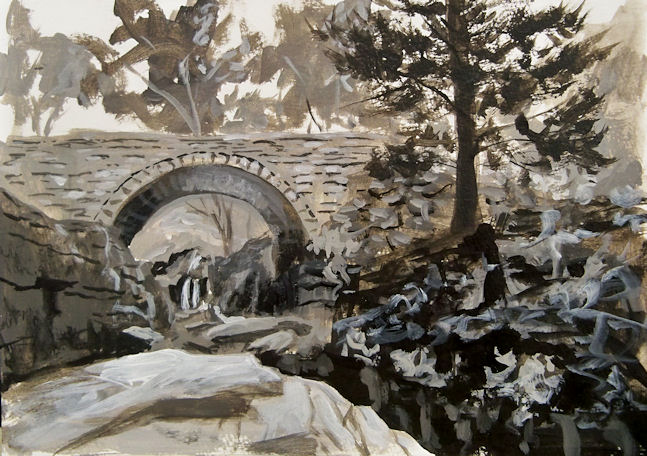
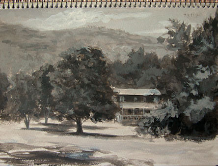
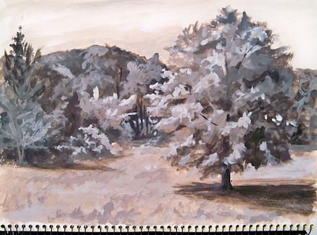
Along with Rondo's adventures, I'll be discussing inks this month. Each post will feature a new ink I've been working with, so if you're interested in inks that work well for sketching purposes, stay tuned! This sketch was done with Private Reserve Velvet Black. I love the rich darkness of this ink, which makes the values spring to life. It washes into a subtle violet with a waterbrush, which I find so much more appealing than the blacks that just wash to gray. It also holds a line really well, so even though I can use it for ink and wash techniques, the lines of my sketch stay put.

The sketchbook I'll be using as my fake journal is a Maruman Art Spiral. It's very heavily sized and works well for wash techniques, and at 24 pages long, it's ideal for this project. Those who know me are aware of my intense dislike for spiral journals, so I hope I survive the month with this one. The spiral is very small, so hopefully it will be less pesky than most, and I'll be able to do some two-page spreads.

If you'd like to keep following as I showcase more inks and Rondo's little world, just add your email address in the Subscribe box on the right sidebar. I don't plan to post every day, since I have some painting commissions to do and shows I need to paint for, and of course plein air season is getting underway! But I do hope to get in at least 10 sketches in this project, and maybe more.

(Too see all of my International Fake Journal posts, click here. They will appear in reverse order --- from the newest down to the oldest.)

The Old Tioronda Hat Works Factory

Yesterday I went back to Madam Brett Park in Beacon, NY and sketched the old, abandoned Tioronda Hat Works factory buildings. Built in the 1800s, this factory was powered by the creek and waterfall that I sketched and painted the day before. I really didn't have time yesterday to pull out my oil paints, so that gave me a chance to test drive this Noodler's Nightshade fountain pen ink. I thought I'd find it too strong in color, but I think I like it for some monochrome work! It seemed to suit these old brick buildings.

Friday

Tioronda Falls Ink and Wash


9x12" across a two page spread in my Fabriano Venezia book

I'm still working on my ink and wash ideas. I did this with a Platinum Preppy fountain pen with a .5 nib and Private Reserve Velvet Black ink. I can't even say what a fun time it was doing this sketch! Going out for plein air work with just a sketchbook, pen, and waterbrush is extremely liberating! No easels, paints, brushes, solvents, and umbrellas to cart around. I could get used to this! I have a couple of technical issues that I need to resolve in terms of getting this medium to do what I want it to do, but each time I sketch with it, I learn something.

Thursday

Painting Shades of Gray in Devil's Kitchen


100916-SOG-Devils-Kitchen-with-box-600v
I went back to Devil’s Kitchen in Platte Clove, this time to capture some of the strong contrasts in the morning light. Remember this little container, filled with Golden’s Neutral Gray Heavy Body Acrylics? The lid supports my Shades of Gray watercolor sketchbook, and having the premixed shades and tints has turned value sketching from a chore into one of my favorite ways to paint.
Here’s a picture of just the sketch. You can click it to enlarge it. The actual size is about 6×9″.
100916-SOG-Platte-Clove-Devils-Kitchen-650
The deep chasm in the right foreground is called Hell’s Hole. My goal was to take the viewer along that chasm and under the bridge, to the waterfall beyond. Although I’d not planned to do a color version of this scene, now that I’ve seen it in black and white, I really want to go back and do it again in color.
If you click here, you can see this bridge painted in oils from the other side on my Hudson Valley Painter site!

Wednesday

Road Beside the Red Barns --- Monochrome Value Study


100807-SOG-4-450
This is another entry in my Shades of Gray, monochrome value study book. It was painted en plein air while out sketching with my friend Karen the other day. I’d already done the full color sketch of the red barns (which I posted a couple of days ago), and was waiting for Karen to finish up her painting. That was the perfect opportunity to pull out my container with the acrylic values already laid out and look for a second composition. I loved this curvy road going off into the distance, and it presented me with a wide range of values to work with.

Friday

Painting Black and White Oils


Lindas-Pond-bw-6x8-450
6×8″, Oils on sealed, primed hardboard
Email me at JamieWG@aol.com if interested in this painting.
The little monochrome painting above was done at a pond up the road from me that has wonderful mountain views. I asked for permission to park and paint there, and the gentleman in the driveway said that his wife was also an artist, and that I should go knock on her studio door and say hi! Well, I did that and made another new artist friend in the area! It turns out that she will be in a show with me next weekend. Such a small world! Her studio overlooks this dramatic view, and she had an especially beautiful winter scene that she’d done from the window.
I used the opportunity to do a monochrome painting, then a limited palette painting. I’ll go back again and do a full color version.
In addition to the value paintings I’ve been doing in acrylic, I have an oil painting setup to do monochrome studies easily and quickly in oils. I use the Judson’s Guerrilla Painter 6×8 watercolor box, Gamblin Light, Medium and Dark Portland Grays, plus Ivory Black and Titanium White. I also keep three colors in here for limited palette studies: Transparent Yellow Oxide, Transparent Red Oxide and Ultramarine Blue. (You can click this image to enlarge it a bit.) It has a cover, and fits right inside my 6×8″ Guerrilla pochade box.
Oils-greys-and-limited-palette-600

Thursday

Painting Monochrome at Home --- Shades of Gray Number 3


100729-SOG-3-Artists-Nest-adj
Golden Neutral Gray Heavy Body Acrylics in a watercolor sketchbook
I’m starting to really love doing these monochrome studies. They are such wonderful practice for improving the way we see values. Having the pre-mixed Neutral Grays has made all the difference in the world, and has turned this from a tedious chore into a fascinating adventure.
I sat outside in the yard in a comfortable chair after standing up and painting all morning, and painted this study under the shade of my favorite tree, with a cool breeze blowing.

Monday

Monochrome Morning in the Back Yard


SOG-2-450
Continuing on with my monochrome value studies in acrylics, this one was added to my Shades of Gray sketchbook this morning. This was also done with the Golden Neutral Gray acrylics plus black and white. I think I’m starting to really enjoy these, much to my surprise!

Tuesday

Shades of Gray --- An Approach to Value Studies


Shades-of-Gray-Paints-600
I set out Golden Heavy Body Acrylic Titanium White, Carbon Black, and all the Neutral Grays in between that Golden makes in a plastic container with compartments and a seal. Value studies are so important, but premixing all those grays ahead of time can be cumbersome enough to put it off time and time again. Now I have no excuses, and this container makes it so easy to pop the lid and paint at a moment’s notice.
Shades-of-Gray-cover-500
This book is about 6×9″. I’m reserving it for my value studies in acrylic, and have dubbed it “Shades of Gray”.
Here’s the first page. The cow was painted from a photo I took on Friday. The little landscape was painted here by the lakeshore this morning.
Shades-of-Gray-1-500v

Thursday

Monochrome Oil Sketch of Troy


091203-Troy-in-Monochrome-20x16-b-500v
20×16″, Oils on Canvas covered hardboard
Email me at JamieWG@aol.com if interested in this painting.
You may remember two weeks ago when I sketched Troy in pastel. We had no open studio last Thursday since it was Thanksgiving, but today I went back, oils in hand, for another sketch. I used Rembrandt Ivory Black, Gamblin Torrit Grey, and Winsor Newton Artist Titanium White with a little Winsor Newton Griffin Titanium White mixed in to speed drying. I also used Weber Res-n-gel medium.
Troy will keep the same pose for three weeks, and most of the artists are keeping their spots and working all three weeks on the same painting. I waited until after the posing started for any returning artists to reclaim their previous spots before setting up in a new position, but go figure…. (Yes, you know what’s coming!)… As soon as I got set up, someone came in late and said, “You’re in my spot!”
I didn’t really care where I painted from; I just didn’t want to miss the posing time. There is never enough time with the model! Anyway, this ended up being about two hours of posing time altogether. I always seem to have difficulty getting the head situated exactly where I want it on the canvas. This time, I really took my time with placement and it ended up right where I wanted it to be! Amazing!

Saturday

The Hickory Tree


Click image for a larger, clearer view:
090227-sketch-hickory-tree-600
10×10″, Cretacolor sepia and white leads in my kraft paper sketchbook